Individual Investors Still Singing the Blues
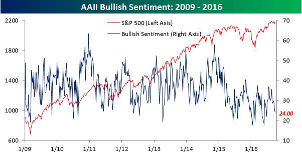
We’re starting to run out of analogies and metaphors for the current state of sentiment on the part of individual investors. In this week’s sentiment survey from AAII, bullish sentiment declined from 24.83% down to 24.00%, which is the lowest level since the week leading up to the Brexit vote. With this week’s decline, bullish sentiment has now been below 40% for 48 straight weeks and 82 out of the last 83 weeks. Perhaps the only thing that would be more depressing than the current investor funk would be if it was occurring in an environment where stock prices were also reflective of the bearish attitude. Thankfully, reality and sentiment are portraying two completely different environments.
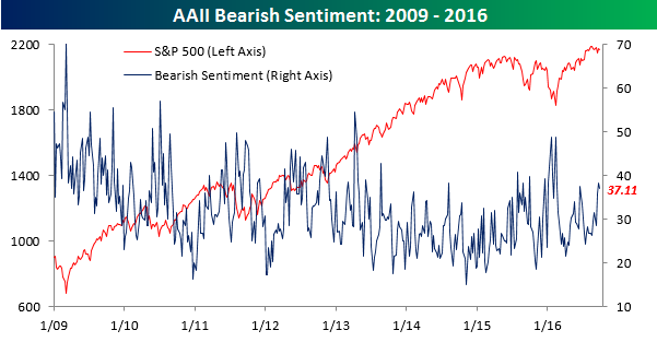
Bearish sentiment actually also declined slightly this week, but at a level of 37.11%, it’s still near its highest levels of 2016.
The Closer 9/28/16 – Crude Agreement
Looking for deeper insight on global markets and economics? In tonight’s Closer sent to Bespoke clients, we discuss oil inventories, OPEC, and the longer-term signals being sent by the crude oil term structure.

The Closer is one of our most popular reports, and you can sign up for a trial below to see it and everything else Bespoke publishes free for the next two weeks!
Click here to start your no-obligation free Bespoke research trial now!
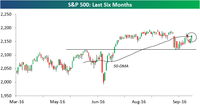
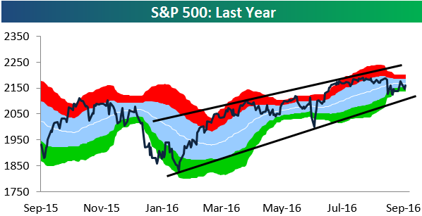
S&P 500 Re-Takes 50-DMA
A late-day rally into the close left the S&P 500 back above its 50-day moving average. As shown in the six-month candle chart of the index below, the S&P traded down to support at its highs from early June a couple of weeks ago, and it held that support very nicely. Now let’s see if the bulls can push it back up to new highs in the coming days and weeks.
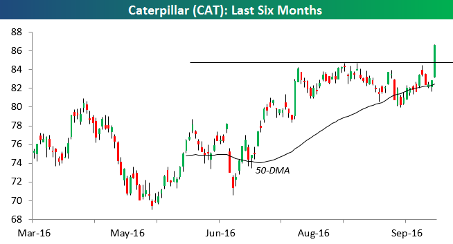
One stock that helped propel the S&P (and Dow) today was Caterpillar (CAT). With a gain of 27% this year, CAT is currently the top performing Dow stock of 2016. As shown below, the stock experienced a massive upside breakout today.
CAT was added to the Bespoke Model Portfolio back in April at $79.73. Today’s move gives us a gain of 10% on the trade. If you would like to see the rest of Bespoke’s Model Portfolio, please choose a monthly or annual membership option now.
Nasdaq Trying for 10% Gain in Q3 2016
The Nasdaq 100 is currently up just under 10% so far in the third quarter (up 9.92% as of this morning). The current gain would be the best Q3 for the index since 2013, and if it eclipses +10.63%, it will be the best Q3 since 2010.
Below is a table showing the performance of the Nasdaq 100 in Q3 since the index’s inception in 1986. For each year, we also include the index’s YTD change at the end of Q3 as well as its change in Q4. Of the 31 years since 1986, the Nasdaq 100 has been up in the third quarter 21 times for a median change of +5.19%. In Q4, however, its median change has been even stronger at +6.35%.
We’ve shaded years based on performance in Q3 and YTD through Q3 to see how the index performed in Q4. Years shaded in dark green were up in the third quarter and also up YTD through the third quarter. In these years (which includes 2016), the Nasdaq 100 has seen a median gain of 6.21% in Q4. That’s pretty much right where the median for all Q4s has been. Light green shaded years saw gains in Q3, but the index was still down YTD through Q3. In these years, the median Q4 change has been low at just +2.72%. Light red shaded years saw declines in Q3 but were up YTD through Q3. Only two years (1986 and 1988) fit this criteria, and in both years Q4 was relatively flat. Finally, dark red shaded years saw declines in Q3 and were down YTD through Q3. Surprisingly, in these years where the Nasdaq has had a rough time through the first three quarters of the year, the index has posted the biggest median gains in Q4 at +11.56%.

Chart of the Day: S&P 500 Sector Weightings
ETF Trends: Hedge – 9/28/16
Mexico continues to be pounded lower as market participants use it as a proxy for a Trump Presidency. Homebuilders, Italy, GBP, and EUR have also underperformed over the last few days. On the green side of the slate, Indonesia, Taiwan, and Biotech continue to rally while steel and iron ore-related names get something of a bounce. Natural gas has also broken out and is trending higher.

Bespoke provides Bespoke Premium and Bespoke Institutional members with a daily ETF Trends report that highlights proprietary trend and timing scores for more than 200 widely followed ETFs across all asset classes. If you’re an ETF investor, this daily report is perfect. Sign up below to access today’s ETF Trends report.
See Bespoke’s full daily ETF Trends report by starting a no-obligation free trial to our premium research. Click here to sign up with just your name and email address.
Fixed Income Weekly – 9/28/16
Searching for ways to better understand the fixed income space or looking for actionable ideals in this asset class? Bespoke’s Fixed Income Weekly provides an update on rates and credit every Wednesday. We start off with a fresh piece of analysis driven by what’s in the headlines or driving the market in a given week. We then provide charts of how US Treasury futures and rates are trading, before moving on to a summary of recent fixed income ETF performance, short-term interest rates including money market funds, and a trade idea. We summarize changes and recent developments for a variety of yield curves (UST, bund, Eurodollar, US breakeven inflation and Bespoke’s Global Yield Curve) before finishing with a review of recent UST yield curve changes, spread changes for major credit products and international bonds, and 1 year return profiles for a cross section of the fixed income world.
This week, we focus on the history of global bond defaults. We also discuss rising prepayment rates for US mortgages.
Our Fixed Income Weekly helps investors stay on top of fixed income markets and gain new perspective on the developments in interest rates. You can sign up for a Bespoke research trial below to see this week’s report and everything else Bespoke publishes free for the next two weeks!
Click here to start your no-obligation free Bespoke research trial now!
Sector Trendlines
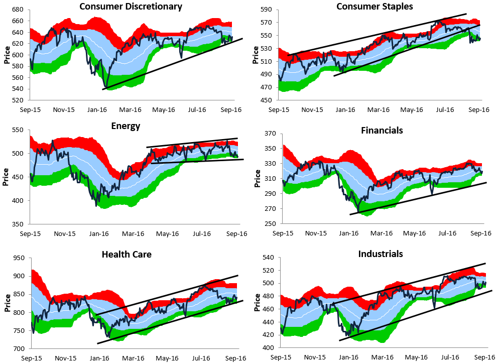
Below we provide Bespoke trading range charts for the S&P 500 and ten sectors. In each chart, the white line represents the index’s 50-day moving average. The light blue shading represents the “normal” trading range, which is one standard deviation above and below the 50-DMA. The red zone represents between one and two standard deviations above the 50-DMA and is considered overbought territory, while the green zone represents between one and two standard deviations below the 50-DMA and is considered oversold territory.
For the S&P 500, the trading range has gotten extremely tight. We thought it was tight back in April and May, but it’s even tighter now. The current distance between the top end of the S&P’s normal range and the bottom end of its normal range is just 1.5%, so it doesn’t take a big move for the index to go from overbought to oversold or vice versa.
The S&P 500 is currently sitting below its 50-DMA, but it’s still within a long-term uptrend channel that has been in place since the February lows.
Looking at sectors, while Consumer Discretionary has been weak lately, it has still managed to hold above the bottom of its uptrend channel. The same can’t be said for Consumer Staples, which recently broke below its uptrend channel.
The Energy sector is trading within a tight slightly upward sloping channel, and it’s currently at the bottom of this channel trying to hold support. If it can hold, we should see a move back towards the top end of the channel soon. The Financial sector is sitting in somewhat of a no man’s land right now. It’s well above the bottom of its channel but has downside momentum.
Industrials and Health Care are both still trading inside of uptrend channels as well, and they’re currently closer to the bottom of their channels than the top. Materials has broken below the bottom of its uptrend channel, while Technology is the one and only sector that’s at the top end of its range. Both Telecom and Utilities broke their uptrend channels weeks ago and have now formed short-term downtrends.

Sector Performance Quarter and Month to Date
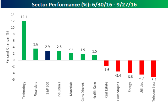
Just three days remain in the third quarter, and with a gain of 2.9% for the S&P 500, it hasn’t been that bad for the overall market. But there’s a big caveat here. The chart below shows S&P 500 sector performance so far in Q3. Of the eleven sectors, just two are outperforming the S&P 500 (Technology and Financials). Essentially, if you didn’t have exposure to the Technology sector, which is up 12.1% this quarter, you are likely to have trailed the market. Thankfully, Technology is the largest sector in the S&P 500, so it is likely that most investors have some exposure. Of the nine sectors that are underperforming, five are actually in the red for the quarter with the biggest declines coming in defensive sectors like Telecom Services (-5.2%) and Utilities (-4.4%). Other sectors known for their yields like Consumer Staples and Real Estate, are also down on the quarter, so it was certainly a quarter where investor preferences switched back to growth over yield.
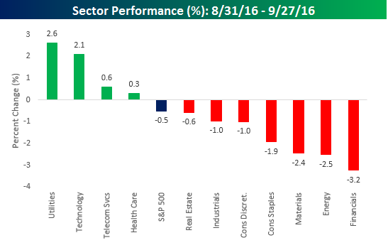
In just the month of September, you could argue that it could have been worse. While the S&P 500 is down 0.5%, given that September has historically been the cruelest month for equities, that’s not so bad. Sectors leading the way this month were Utilities (2.6%) and Technology (2.1%), and anytime these two sectors share the leaderboard, it makes you scratch your head. Here again, Technology’s gain has been holding things up as seven of eleven sectors are lagging the S&P 500, including Financials (-3.2%), Energy (-2.5%), and Materials (-2.4%).