Fixed Income Weekly – 10/19/16
Searching for ways to better understand the fixed income space or looking for actionable ideals in this asset class? Bespoke’s Fixed Income Weekly provides an update on rates and credit every Wednesday. We start off with a fresh piece of analysis driven by what’s in the headlines or driving the market in a given week. We then provide charts of how US Treasury futures and rates are trading, before moving on to a summary of recent fixed income ETF performance, short-term interest rates including money market funds, and a trade idea. We summarize changes and recent developments for a variety of yield curves (UST, bund, Eurodollar, US breakeven inflation and Bespoke’s Global Yield Curve) before finishing with a review of recent UST yield curve changes, spread changes for major credit products and international bonds, and 1 year return profiles for a cross section of the fixed income world.
We update our charts on the term structure of credit spreads this week, also taking a look at average maturity time and duration profile of IG credit.

Our Fixed Income Weekly helps investors stay on top of fixed income markets and gain new perspective on the developments in interest rates. You can sign up for a Bespoke research trial below to see this week’s report and everything else Bespoke publishes free for the next two weeks!
Click here to start your no-obligation free Bespoke research trial now!
ETF Trends: Hedge – 10/19/16
Gold miners continue to slowly recover from their catastrophic selloff of the last couple months, while Brazil, the Philippines, and South Africa have all gained in the past week. On the loosing side of the ledger, biotech continues to decline along with US cyclicals like Retail, Homebuilders, and small cap growth stocks.

Bespoke provides Bespoke Premium and Bespoke Institutional members with a daily ETF Trends report that highlights proprietary trend and timing scores for more than 200 widely followed ETFs across all asset classes. If you’re an ETF investor, this daily report is perfect. Sign up below to access today’s ETF Trends report.
See Bespoke’s full daily ETF Trends report by starting a no-obligation free trial to our premium research. Click here to sign up with just your name and email address.
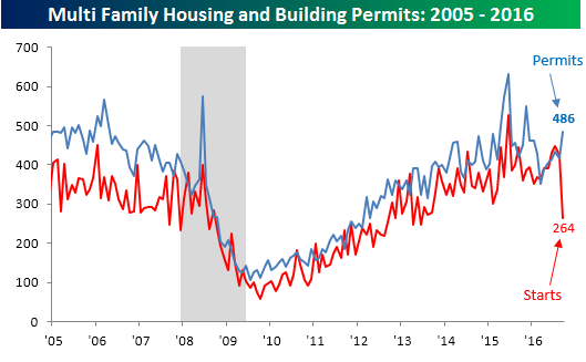
Big Divergence in Multi-Family Housing Starts and Building Permits
Today’s winner for wackiest chart of the day comes courtesy of this morning’s report on Housing Starts and Building Permits. Overall, the report was mixed relative to expectations. Housing Starts came in weaker than expected, showing a 9.0% m/m decline, which was the largest monthly drop since last October. Building Permits, meanwhile, handily exceeded forecasts and grew by 6.3% m/m for its largest monthly increase since last November. While the headline numbers showed a wide divergence, all of it was attributable to trends in multi-family units, which have tended to be more volatile, especially over the last several months.
The chart below shows multi-family housing starts and building permits going back to 2005. September’s data was head scratching to say the least. In the case of multi-family starts, they plunged 38% m/m and 41% y/y to an annualized rate of 264K-the lowest level since June 2013. Meanwhile, multi-family Building Permits surged 17% m/m to 486K (annualized). That spread of 222K between the two series represents the sixth widest gap going all the way back to 1959 and the widest since January 1990.
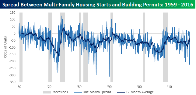
The chart below shows the historical monthly spread between multi-family Housing Starts and Building Permits going back to 1959. We have also included shading to indicate recessions and a 12-month moving average. Looking at the chart, prior large monthly gaps between the two series haven’t been indicative of anything regarding the economic cycle. Looking at the twelve-month moving average, though, there has been a trend where the spread tends to get more negative the later it gets into the economic cycle. In other words, starts and permits tend to be around equal early on in the economic cycle, but as the cycle ages the number of permits that never lead to ground-breaking increases. In the current cycle, we have seen a similar trend as the gap has steadily widened throughout the cycle. That being said, so far in 2016, we have seen some narrowing of that gap,
The Closer 10/18/16 – European Bank Lending Teeters
Looking for deeper insight on global markets and economics? In tonight’s Closer sent to Bespoke clients, we take a look at the latest Bank Lending Survey from the ECB, which covers both supply (lending standards) and demand for loans from broad sectors of the economy. We also highlight today’s report from the US Treasury on August international capital flows.
The Closer is one of our most popular reports, and you can sign up for a trial below to see it and everything else Bespoke publishes free for the next two weeks!
Click here to start your no-obligation free Bespoke research trial now!
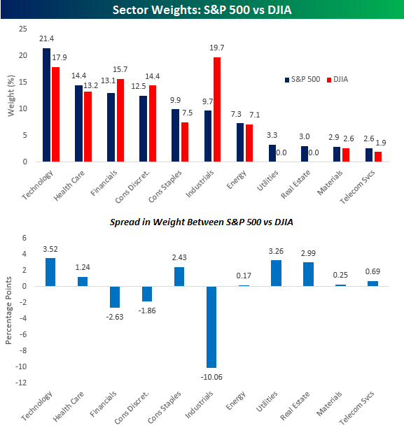
Sector Weights of S&P 500 vs Dow Jones
In a post earlier today, we noted that despite the quirky manner in which the Dow Jones Industrial Average (DJIA) is constructed, it tends to track the broader S&P 500 pretty well over time, including so far in 2016. The fact that the two have tracked each other so closely is even more impressive given the way different sectors are weighted in each index. The chart below compares the percentage weighting of each sector in the S&P 500 versus the Dow. Then, in the bottom chart, we show the spread between the weighting of each sector in the S&P 500 minus its weight in the Dow.
While the weighting for many sectors is roughly similar in both instances, some have large variances. The largest disparity is in the Industrials sector where its weight in the Dow is about double its weight in the S&P 500. While this disparity is large, when you consider the fact that it is called the Dow Jones Industrial Average, it makes sense that the index would be weighted towards Industrials. Similarly, the DJIA has no stocks from the Utilities sector, but that’s because Dow Jones has a Utilities index as well. Besides these two rather wide divergences, relative to the S&P 500, the DJIA is underweighted in Technology, Real Estate, and Consumer Staples, while it’s overweighted in Financials and Consumer Discretionary.
ETF Trends: US Indices & Styles – 10/18/16
Biotech continues to get hit hard, while a number of oil-related names have also gotten hit fairly hard over the last week or so. SEK has been the worst performing currency of those that trade as ETFs, while Banks have lagged thanks to a pause in yield curve steepening and bond selling. On the plus side, Brazil continues to surge while gold has had a nice recovery off recent lows, benefiting miners. Rate rallies (lower yields) have granted some reprieve for REITs and Utilities while EM has done fairly well on a country level.
Bespoke provides Bespoke Premium and Bespoke Institutional members with a daily ETF Trends report that highlights proprietary trend and timing scores for more than 200 widely followed ETFs across all asset classes. If you’re an ETF investor, this daily report is perfect. Sign up below to access today’s ETF Trends report.
See Bespoke’s full daily ETF Trends report by starting a no-obligation free trial to our premium research. Click here to sign up with just your name and email address.
Chart of the Day – Updated S&P 500 Intraday Trading Pattern
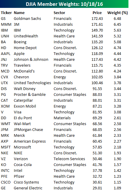
DJIA Member Weights
With four of its larger components reporting earnings since yesterday’s close, there have been some moderate changes in the weightings hierarchy of the thirty components of the Dow Jones Industrial Average (DJIA). Before going further, for those unfamiliar with the way the DJIA is constructed, the index is made up of 30 stocks which are weighted based on their price. Therefore, stocks with higher share prices have a higher weighting, while those with lower share prices have a lower weighting. Therefore, regardless of how large a company is in terms of revenues, earnings, or market cap, if it has a high relative share price, it gets a larger weighting in the DJIA. The only place where stock splits really matter is when they occur among DJIA components, where a 2-1 split will immediately result in a company having its Dow weighting cut by essentially half.
With that explanation out of the way, the table below lists the 30 Dow components and their individual weightings in the index. With today’s better than expected earnings report, Goldman Sachs (GS) now has the largest weighting in the index ahead of 3M and IBM. Even after its weak earnings report on Monday evening, IBM holds on to the third spot, but with UnitedHealth (UNH) putting up a strong report this morning, the gap between the two has really narrowed. One standout stock with respect to its weighting in the index is Apple (AAPL). Despite being the largest publicly traded company in the United States, AAPL only has the 7th highest weighting in the Dow, even though its market cap is greater than the combined market caps of Goldman (GS), 3M (MMM), IBM, UnitedHealth (UNH), and Boeing (BA)! With a share price of less than $60, Microsoft’s (MSFT) weight is even more distorted at 2.2%, even though its market cap is equal to the combined market caps of the DJIA’s four largest components.
Whatever the shortcomings are for the way the DJIA is constructed, though, the index has withstood the test of time, and whenever someone from Main Street wonders how Wall Street is doing, they ask, “Where’s the Dow?” Yes, there are some years where the awkward construction of the DJIA creates wide divergences between its return and broader measures of the US equity market like the S&P 500, but more often than not, the DJIA tracks the S&P 500 pretty closely. This year, for example, the YTD returns of the two indices are within 50 bps of each other as the S&P 500 is up 4.7% while the DJIA is up 4.2%.

Bespoke CNBC Appearance (10/18)
Bespoke co-founder Paul Hickey appeared on CNBC’s Closing Bell for the full hour yesterday afternoon. You can view clips of Paul discussing earnings reports from both Netflix and IBM below. See all of Bespoke’s premium earnings analysis by starting a 14-day no-obligation free trial now!
Netflix Beats Wall Street Expectations
IBM Beats on Top and Bottom Line