How Did The Labor Market Impact The Election?
In the wake of last week’s election, we wondered how much impact jobs had on the election. Using BLS data for the states (current as of September), we ran correlations between state labor market data and state voting data. It’s worth noting that votes are still (seriously, still) being counted in California, so these aren’t necessarily official vote totals, but they’re currently the best we’ve got so far, courtesy of Cook Political Report’s tracker which you can find here. For labor market data, we used the unemployment rate, the change in the unemployment from the year prior, and the change in employment versus the year prior. To measure voting, we used the Democrats’ margin in each state in 2016, the change in that margin versus 2012, and the change in total votes cast (for all candidates) versus the year before.
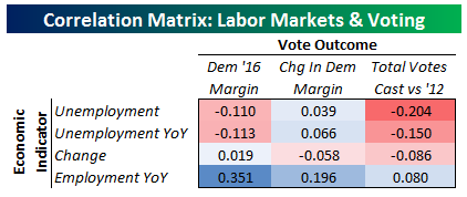
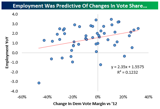
As shown, the best predictor of any change in our three vote outcomes was growth in employment. While none of the 9 correlations we ran are very strong, by far the strongest predictor of how states voted was growth of employment; higher employment growth favored Dems, lower employment growth favored the GOP. Again, this wasn’t an extremely strong predictor, only accounting for about 12% of the total variation in voting margins. But it was the most important one of the variables we tried. Below we show a scatter plot of the two variables.
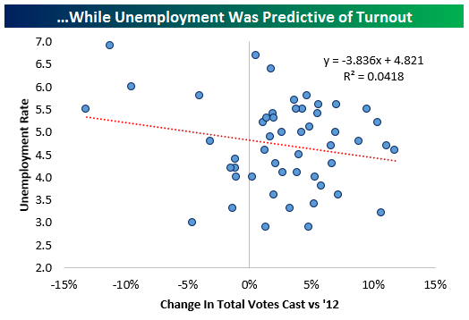
A weaker, but still present, correlation was between the unemployment rate and turnout as measured by the change in votes cast per state versus 2012. Higher unemployment rates were associated with higher voter turnout, and vice-versa. Below we chart a scatter plot of the two variables.
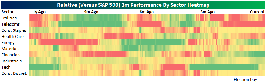
Assessing Sector Rotation Post-Trump
Below we update our sector rotation graph. The graph shows 3m trailing performance for the past year, heatmapped to show it on a relative basis. As shown, into election day, Financials and Tech were the big outperformers up 4.4% and 4.2% respectively in the three months ending November 8th. Telecoms were down 11%, by far the worst performer on a sector basis. Health Care had also underperformed, down 6.9%. Since election day, some fortunes have reversed. Versus 3 months ago, Tech is now up only 1.84% and Telecoms are down 8.47%. Utilities have seen underperformance really ramp up; they’re now down 8.1% in the last three months. Financials have also seen the previous trend accelerate and are now up 14% over the last three months. While there were a number of dramatic performance shifts in single stocks or industries, at the sector level the election seemed to accelerate a number of existing trends more than create new ones.
A Banner Week For Economic Data
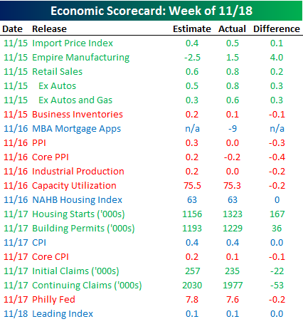 The Economic Scorecard to the right is published each week in our Bespoke Report newsletter and shows how all the week’s economic indicators came in relative to expectations. This week was a busy one for data, and a plurality of reports came in better than expected. Of the 20 indicators released, nine came in better than expected, seven were weaker, and four were either inline or had no estimates. What was even more encouraging about this week’s data is that all but one of the inflation related indicators came in weaker than expected. In an environment where interest rates are rising on concerns of possible inflation pressures, the fact that these indicators are weaker than expected is music to a bulls ears. President-elect Trump campaigned on the premise that economic growth was either non-existent or sluggish at best, but just days after getting elected, Retail Sales came in at a 4.3% y/y growth rate, Housing Starts hit their highest levels of the recovery, and jobless claims hit a 43-year low!
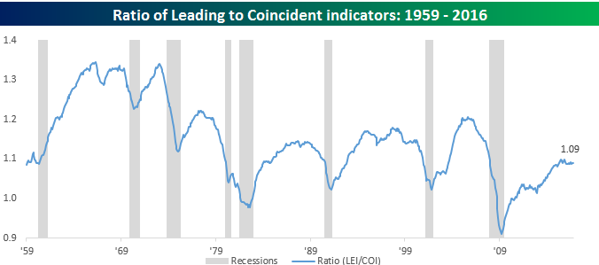
The last economic indicator of the week was Leading Indicators, which was released earlier this morning and was inline with forecasts. From time to time, we have published the chart below which shows the ratio of leading to coincident indicators over time. Last year around this time, there was concern that the US economy was starting to roll over as weakness in the oil patch pulled down the manufacturing sector. We cited this chart as evidence that while there had been a slowdown, the economy wasn’t rolling over. As shown in the chart, historically the ratio between leading and coincident indicators begins to roll over well before the onset of a recession. While the ratio has stopped rising in the current period, rather than rolling over, it is exhibiting a pattern similar to the middle of prior extended expansions.
ETF Trends: International – 11/18/16
After a 5% rally in front-month WTI on Wednesday (courtesy of OPEC chatter), week-over-week performance for oil-related ETFs has been solid. Health Care Providers have also bounced back from post-election lows, while Banks have fallen off recent highs but are still up solid versus a week ago. Worst performers include other FX, silver, and European equities.

Bespoke provides Bespoke Premium and Bespoke Institutional members with a daily ETF Trends report that highlights proprietary trend and timing scores for more than 200 widely followed ETFs across all asset classes. If you’re an ETF investor, this daily report is perfect. Sign up below to access today’s ETF Trends report.
See Bespoke’s full daily ETF Trends report by starting a no-obligation free trial to our premium research. Click here to sign up with just your name and email address.
B.I.G. Tips – Caterpillar Sales Show Improving Trends
The Closer 11/17/16 – Convexity Rules
Log-in here if you’re a member with access to the Closer.
Looking for deeper insight on global markets and economics? In tonight’s Closer sent to Bespoke Institutional clients, we update tracking of petroleum inventories and analyze today’s producer price index and industrial production releases.

The Closer is one of our most popular reports, and you can see it and everything else Bespoke publishes by starting a no-obligation 14-day free trial to our research!
Bespoke’s Sector Snapshot — 11/17/16
We’ve just released our weekly Sector Snapshot report (see a sample here) for Bespoke Premium and Bespoke Institutional members. Please log-in here to view the report if you’re already a member. If you’re not yet a subscriber and would like to see the report, please start a 14-day trial to Bespoke Premium now.
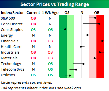
Below is one of the many charts included in this week’s Sector Snapshot, which is our trading range screen for the S&P 500 and its ten sectors. We discuss in more detail how to read the chart in the full version of the report, but basically the dot is where the sector is currently trading, while the tail end is where it was trading one week ago. As shown, the S&P 500 and four sectors are currently in overbought territory, while two sectors — Utilities and Consumer Staples — are oversold. Massive rotation continues into sectors expected to benefit from the GOP-controlled political landscape that will be in place for at least the next two years.
To see our full Sector Snapshot with additional commentary plus six pages of charts that include analysis of valuations, breadth, technicals, and relative strength, start a 14-day free trial to our Bespoke Premium package now. Here’s a breakdown of the products you’ll receive.
ETF Trends: US Sectors & Groups – 11/17/16
As yields have yet to slow down, so go banks with KRE and KBE still at the top of the best performers list. Microcaps also continue to surge as does the Russell 2000, on a 10 day win streak. Japan is the only country that’s made an appearance in the top 20, and only then after hedging out the effect of the plunging yen. Gold continues to get hit, as do a number of EMs and other international markets with USD exposure.
Bespoke provides Bespoke Premium and Bespoke Institutional members with a daily ETF Trends report that highlights proprietary trend and timing scores for more than 200 widely followed ETFs across all asset classes. If you’re an ETF investor, this daily report is perfect. Sign up below to access today’s ETF Trends report.
See Bespoke’s full daily ETF Trends report by starting a no-obligation free trial to our premium research. Click here to sign up with just your name and email address.
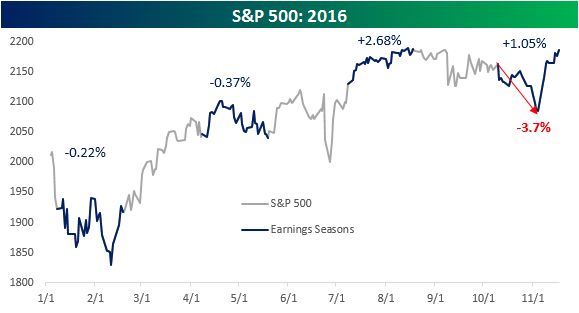
Earnings Season Gets an Election Bailout
Earnings season came to a close today and finished off on a weak note as Wal-Mart (WMT) reported what the market considered to be poor earnings. For earnings season as a whole, though, equities saw modestly positive returns with the S&P 500 gaining around 1%. It definitely wasn’t a straight line higher over the last six weeks, though, as the S&P was down as much as 3.7% just prior to the election. In fact, were it not for the post-election rally, the current reporting period would have quite possibly been the worst since the Q3 2012 reporting period.
The chart below shows the S&P 500’s performance during the four earnings seasons of 2016. Looking at the chart, there has been a shift in the market’s reaction to earnings in the second half of the year compared to the first half. In the first half of 2016, the bulk of the gains came in the periods between the Q4 and Q1 reporting periods, while stocks dropped during the actual reporting periods. In the second half of the year, though, we have seen gains during each reporting period, with interim declines during the earnings off-season.