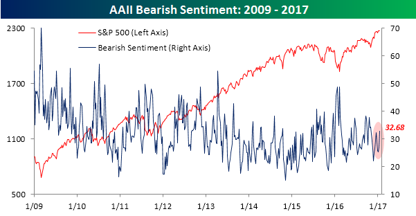
Bullish Sentiment Fading
After a burst of exuberance following the election, the recent sideways action in markets is causing individual investors to rethink their bullish views. In the latest survey from AAII, bullish sentiment dropped from 43.64% down to 37.01%. Believe it or not, that 6.6 percentage point decline represents the largest weekly drop in bullish sentiment since March. As you are also probably aware, it has now been 107 weeks since bullish sentiment was 50% or above. Three more weeks below 50% and it will be tied for the longest sub-50% run in the history of the survey.

While bullish sentiment drifts back into its pre-election range, bearish sentiment has been on the rise. This week’s reading of 32.68% is the highest since the November election, and as shown in the chart below it also represents the first ‘higher high’ in bearish sentiment in quite some time.
Bespoke’s Sector Snapshot: 1/19/17
We’ve just released our weekly Sector Snapshot report (see a sample here) for Bespoke Premium and Bespoke Institutional members. Please log-in here to view the report if you’re already a member. If you’re not yet a subscriber and would like to see the report, please start a 14-day trial to Bespoke Premium now.
Below is one of the many charts included in this week’s Sector Snapshot, which highlights our trading range screen for the S&P 500 and ten sectors. As shown, all ten sectors remain comfortably above their 50-day moving averages, which is a healthy sign for the broad market.
To see our full Sector Snapshot with additional commentary plus six pages of charts that include analysis of valuations, breadth, technicals, and relative strength, start a 14-day free trial to our Bespoke Premium package now. Here’s a breakdown of the products you’ll receive.
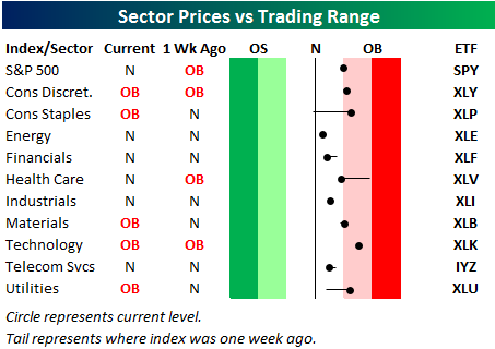
S&P 500 Sector Trading Range Charts
Get Bespoke’s 2017 Outlook Report with a 30-day free trial to Bespoke’s premium research! Click here to learn more.
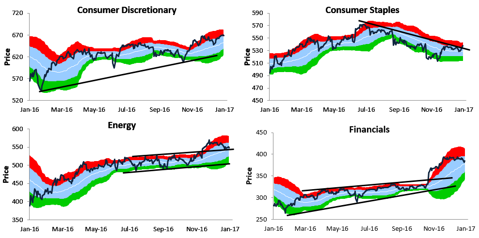
Below is a look at our trading range charts for the ten main S&P 500 sectors (REIT sector excluded). For each chart, the dark line represents price, while the white line represents the 50-day moving average. The light blue shaded area represents each sector’s “normal” trading range, which is between one standard deviation above and below the 50-DMA. Moves into the red zone are considered overbought, while moves into the green zone are considered oversold.
Most cyclical sectors are currently trading in nice uptrends, but you’ll notice that the two main defensive sectors — Consumer Staples and Utilities — both recently broke above the top of their downtrend channels. Health Care recently broke above its downtrend channel as well. Another sector worth highlighting is Energy. After breaking above a tight range following the election, the Energy sector has pulled back to a key support level. If it can hold above this support in the coming days, it should represent an attractive entry point. If it doesn’t hold, look for a move back down to the bottom of its prior sideways channel.
You can access these trading range charts weekly along with additional sector analysis in our Sector Snapshot report that’s available to Bespoke Premium and Institutional members.
![]()
The Closer 1/18/17 – Fed From On High
Log-in here if you’re a member with access to the Closer.
Looking for deeper insight on global markets and economics? In tonight’s Closer sent to Bespoke Institutional clients, we review the Beige Book, Chair Yellen’s speech from this afternoon, industrial production, and CPI.

The Closer is one of our most popular reports, and you can see it and everything else Bespoke publishes by starting a no-obligation 14-day free trial to our research!
ETF Trends: US Sectors & Groups – 1/18/17
Volatile natural gas retains its place high on our best performers list, with UNG up over 9% in the last five sessions. Steel producers also continue to rally along with South Korea and hard-hit Turkey. Gold miners continue to benefit from the performance of the yellow metal, while a variety of EM equity markets are up a healthy amount in recent days. Biotechs have been weak, as have Banks (flattening UST curve), while dollar bulls, defense, and Health Care have all underperformed.

Bespoke provides Bespoke Premium and Bespoke Institutional members with a daily ETF Trends report that highlights proprietary trend and timing scores for more than 200 widely followed ETFs across all asset classes. If you’re an ETF investor, this daily report is perfect. Sign up below to access today’s ETF Trends report.
See Bespoke’s full daily ETF Trends report by starting a no-obligation free trial to our premium research. Click here to sign up with just your name and email address.
B.I.G. Tips — The Most Loved and Hated Stocks in the S&P 500
Chart of the Day: Cummins (CMI) Holding Support
Fixed Income Weekly – 1/18/17
Searching for ways to better understand the fixed income space or looking for actionable ideals in this asset class? Bespoke’s Fixed Income Weekly provides an update on rates and credit every Wednesday. We start off with a fresh piece of analysis driven by what’s in the headlines or driving the market in a given week. We then provide charts of how US Treasury futures and rates are trading, before moving on to a summary of recent fixed income ETF performance, short-term interest rates including money market funds, and a trade idea. We summarize changes and recent developments for a variety of yield curves (UST, bund, Eurodollar, US breakeven inflation and Bespoke’s Global Yield Curve) before finishing with a review of recent UST yield curve changes, spread changes for major credit products and international bonds, and 1 year return profiles for a cross section of the fixed income world.
In this week’s note, we look at the driving factor in Treasury yields since they peaked in December, as well as that influence’s (low) predictive value for the economy.
Our Fixed Income Weekly helps investors stay on top of fixed income markets and gain new perspective on the developments in interest rates. You can sign up for a Bespoke research trial below to see this week’s report and everything else Bespoke publishes free for the next two weeks!
Click here to start your no-obligation free Bespoke research trial now!
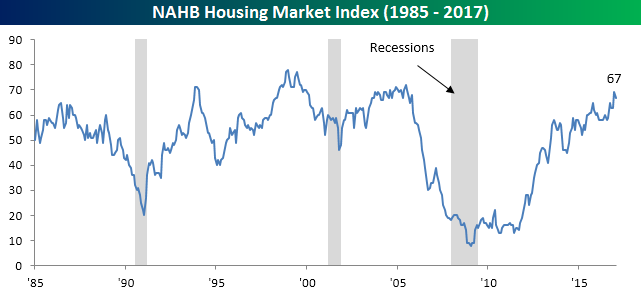
Homebuilder Confidence Ebbs
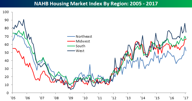
After a post-election surge in December, homebuilder confidence pulled back more than expected to kick off the year. While economists were forecasting the NAHB homebuilder sentiment survey to come in at a level of 69 this month, the actual reading came in two points lower at 67, and down three points from December’s originally reported reading of 70. We would note that last month’s initial reading was also revised down one point, so the m/m decline was just two points. Looking at the chart below, even after this month’s decline, sentiment remains above every other reading of this expansion prior to December.
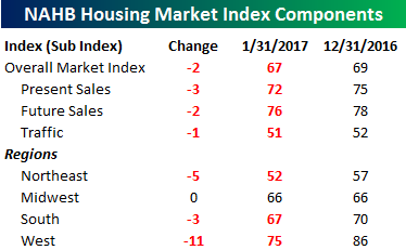 The table to the right shows the breakdown of this month’s report by traffic as well as present and future sales along with sentiment broken down by region. Every component of the overall index declined in January, with the biggest decline coming in Present Sales while Traffic saw the smallest decline. In terms of regions, sentiment on the coasts saw the largest decline, while homebuilder sentiment in the Midwest, which includes the rust belt states that went in favor of Trump, was unchanged at its highs for the cycle. Even for the other three regions, though, it is important to remember that January’s decline in sentiment comes from what were the highest levels of the cycle.
Bespokecast Episode 5 — Meb Faber — Now Available on iTunes, GooglePlay, Stitcher and More
 We’re happy to announce that the newest episode of Bespokecast is now available to the general public both here and via the various podcast platforms. Be sure to subscribe to Bespokecast on your preferred podcast app of choice to gain access to our full collection of episodes. We’d also love for you to provide a review as well!
In our newest conversation on Bespokecast, we speak with investor, blogger, analyst, and commentator Meb Faber. Meb is the CIO of Cambria Investments, has written three books on investing as well as 10 white papers and countless blog posts. You can follow his work at MebFaber.com. Cambria’s ETFs cover a broad swathe of US and global equity markets as well as asset allocation and fixed income. For Meb and Cambria, evidence-based investing is at the core of their investment approach, and we spend much of the podcast discussing the specific investment strategies this leads to. We were thrilled to record this conversation and are very excited with how it turned out. We hope you feel the same!
Each new episode of our podcast features a special guest to talk markets with, and Bespoke subscribers receive special access before it’s made available to the general public. If you’d like to try out a Bespoke subscription in order to gain access to these podcasts in advance, you can start a two-week free trial to check out our product. To listen to episode 5 or subscribe to the podcast via iTunes, GooglePlay, OvercastFM, or Stitcher, please click below.