ETF Trends: US Sectors & Groups – 2/23/17
Utilities are the best performers over the last week along with a remarkable lineup of four consecutive emerging markets ETFs. India, Turkey, and Poland have all rallied while the Mexican peso’s 3.6% rally over the last three days (keyed by a new program to defend the peso’s value, which we discussed in The Closer earlier this week. In the US equity market, REITs, mortgage-related firms, staples, and low vol stocks have outperformed. The worst performers have been natural gas (a familiar story), metals and mining (US Steel down almost 8% today on fears of a delay in fiscal stimulus plans), and energy companies.

Bespoke provides Bespoke Premium and Bespoke Institutional members with a daily ETF Trends report that highlights proprietary trend and timing scores for more than 200 widely followed ETFs across all asset classes. If you’re an ETF investor, this daily report is perfect. Sign up below to access today’s ETF Trends report.
See Bespoke’s full daily ETF Trends report by starting a no-obligation free trial to our premium research. Click here to sign up with just your name and email address.
Bespoke’s Sector Snapshot — 2/23/17
We’ve just released our weekly Sector Snapshot report (see a sample here) for Bespoke Premium and Bespoke Institutional members. Please log-in here to view the report if you’re already a member. If you’re not yet a subscriber and would like to see the report, please start a 14-day trial to Bespoke Premium now.
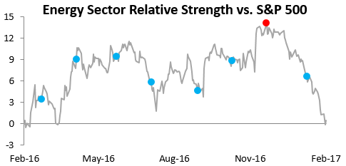
Below is one of the many charts included in this week’s Sector Snapshot, which highlights the relative strength of the Energy sector versus the S&P 500 over the last year. A rising line means the sector is outperforming the broad S&P 500, while a falling line means the sector is underperforming. As you can see, Energy has seen extreme underperformance versus the market recently, ever since the Fed hiked rates last December (red dot).
To see our full Sector Snapshot with additional commentary plus six pages of charts that include analysis of valuations, breadth, technicals, and relative strength, start a 14-day free trial to our Bespoke Premium package now. Here’s a breakdown of the products you’ll receive.
An Amazing Streak Comes to an End
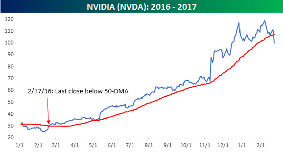
While the DJIA is putting in a solid effort at maintaining its impressive winning streak, another potentially more impressive streak looks to be coming to an end today. With a decline of over 9% today, not only are shares of NVIDIA (NVDA) now trading down for the year, but they are also well below their 50-day moving average (DMA), a level the stock hasn’t closed below in over a year! That’s right, the last time NVDA closed below its 50-DMA was back on 2/17/16. At its peak earlier this year, the stock rallied over 330% from that day last February, and even after the recent pullback the stock is still up over 262% since then.
What makes the streak that NVDA broke today so impressive is how long it was compared to every other stock in the S&P 500. At 256 trading days, NVDA’s streak was more than twice as long as the second-longest streak. As shown in the chart below, shares of Western Digital (WDC) now have the longest current streak of closes above the 50-DMA at just 117 trading days. Even five months is impressive, but it’s like comparing a big-leaguer to a triple-A player.
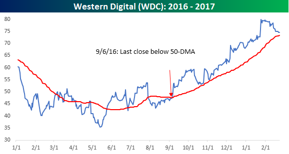
Chart of the Day: Low Volatility Leads To Low Volatility
the Bespoke 50 — 2/23/17
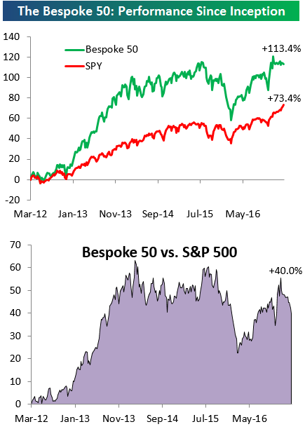
Every Thursday, Bespoke publishes its “Bespoke 50” list of top growth stocks in the Russell 3,000. Our “Bespoke 50” portfolio is made up of the 50 stocks that fit a proprietary growth screen that we created a number of years ago. Since inception in early 2012, the “Bespoke 50” has beaten the S&P 500 by 40 percentage points. Through today, the “Bespoke 50” is up 113.4% since inception versus the S&P 500’s gain of 73.4%.
To view our “Bespoke 50” list of top growth stocks, sign up for Bespoke Premium ($99/month) at this checkout page and get your first month free. This is a great deal!
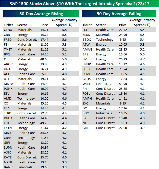
Looking For Action? S&P 1500 Most Volatile Stocks
For traders with a short-term time horizon who are looking for big moves over a short period, we have updated our list of the S&P 1500 stocks trading above $10 that have the largest intraday high-low ranges (based on the average percent spread between the intraday high and low over the last 50 days). The stocks are grouped based on whether they have a rising or falling 50-day moving average (DMA). Stocks highlighted in gray are new to the list since our last update.
Along with an overall decline in market volatility, individual stock volatility has also been on the decline. Of the 50 stocks highlighted in the table, just 13 have seen an average daily range of more than 5% over the last 50 trading days. In terms of the breakdown between stocks in uptrends and downtrends, up trending stocks have the edge at 29 to 21, but given the run the market has been on, we would have expected the disparity to be even wider. The two most volatile stocks in the S&P 1500 are currently Century Aluminum (CENX) and CARBO Ceramics (CRR), which are both in short term uptrends (rising 50-DMA) and have seen average daily moves of 5.8%. Given that both stocks are trading at around $15 per share, though, their average daily range is still less than a dollar. In terms of dollar moves instead of percentage moves, the biggest mover is Eagle Pharmaceuticals (EGRX). With a share price of $73.74 and an average daily range of 4.6%, EGRX trades in an average range of over $3 per share every day.
Looking at the list below, there aren’t a whole lot of household names on it. Some of the more notable names, though, include US Steel (X), Advanced Micro (AMD), Restoration Hardware (RH), and Fossil (FOSL). In terms of sector representation, stocks from seven out of eleven sectors comprise the list, with Health Care (14), Energy (12), Materials (9), and Consumer Discretionary (8) dominating the list. Not surprisingly, not a single stock from the Utilities, Telecom Services, Consumer Staples, or Real Estate sectors made the list.
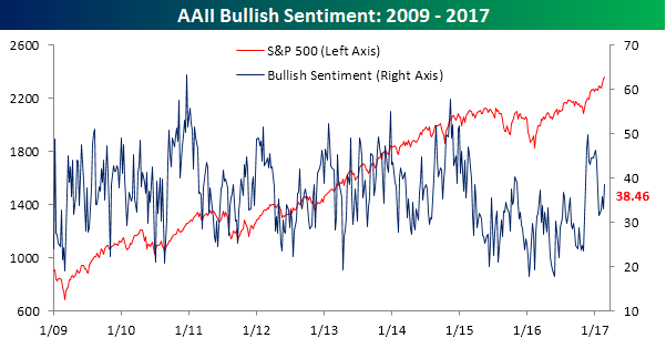
Bullish Sentiment Rises But Still Low
With nine straight record closes for the DJIA, it should come as a surprise to no one that bullish sentiment increased in the latest week. What continues to amaze us, however, is the level of sentiment. According to the latest sentiment survey from AAII, bullish sentiment rose by 5.4 percentage points to 38.46%. This marks the sixth straight week where bullish sentiment has come in below 40%, but more importantly, it’s a record 112th straight week where bullish sentiment has come in below 50%.
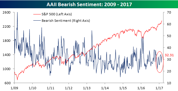
While bullish sentiment increased, bearish sentiment was relatively unchanged at 32.31% (32.36% last week). In other words, nearly one-third of investors are flat out bearish. Also, if you look at the right-hand side of the chart (red circle), bears have been sneakily trending higher in the last several weeks.
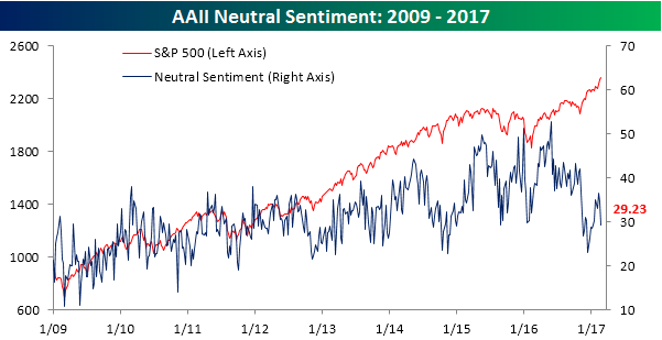
Pretty much all of the increase in the bullish camp this week came from neutrals which fell below 30% for the first time since the Inauguration.
103 Weeks Below 300K
Jobless claims for the latest week came in slightly higher than expected Thursday morning, rising from 238K up to 244K, which was 4K above the consensus estimate of 240K. There’s not much new here in the headline number; jobless claims remain exceptionally low by historical standards and have now been below 300K for 103 weeks. That’s the longest streak since 1970 – a time when the US population was a lot larger than it is now.
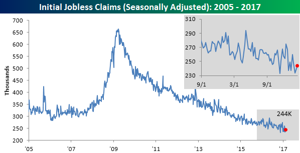
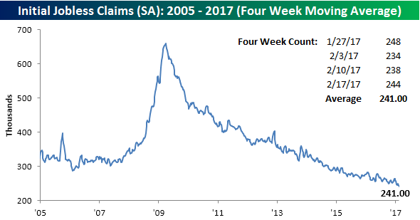
Even with the increase in the weekly print, the four-week moving average dropped by over 3K, falling to 241K. That’s a new post-recession low and a level that hasn’t been seen since 1973.
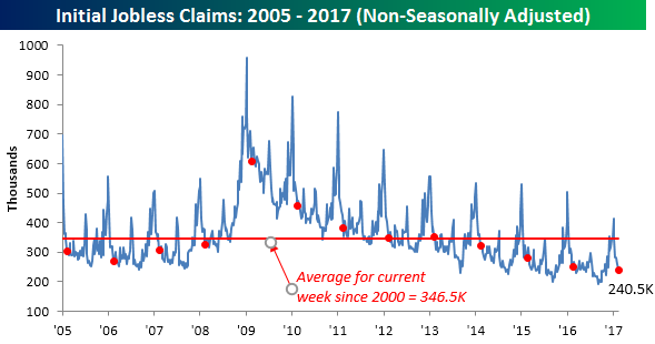
On a non-seasonally adjusted basis, claims were also solid, falling from 245.9K down to 240.5K. For the current week of the year, this is more than 100K below the average level since 2000 and is the lowest level for the current week going back to 1969.
S&P 500: 50-Day and 200-Day Moving Average Spreads
Like what you see? Start a 14-day free trial to access our premium content.
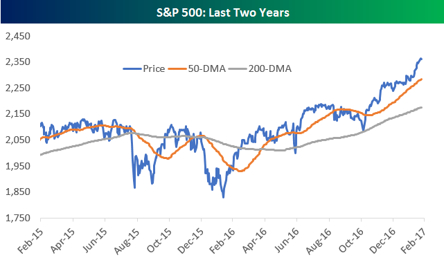
Below is a chart of the S&P 500 going back two years, with the index’s 50-day moving average and 200-day moving average included. As you can see, the S&P has moved well above both its 50-day and 200-day at this point, and it’s currently trading at the top of an uptrend channel that began forming over a year ago.
Below is a chart showing the 50-day moving average spread for the S&P 500 since October 2008. This simply measures the percentage that the S&P’s price is trading from its 50-day. While there’s been a lot of talk recently about how extended the market has gotten, at +3.45%, the S&P isn’t really trading that far above its 50-day on a relative basis. There have been multiple occasions over the the last five years where this reading hit 5%.
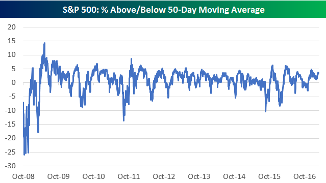
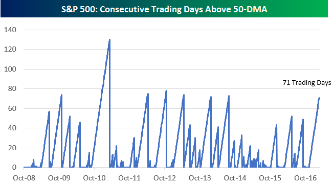
While the index isn’t that far above its 50-day, it has been trading above its 50-day for quite some time now. In fact, it has been 71 trading days since the index last closed below its 50-DMA. As shown in the chart of these streaks below, 71 trading day streaks haven’t been that uncommon either. However, given where the index is trading at the moment, it’s going to take a pretty significant drop for the streak to break, meaning at this point we’ll likely surpass the 80-trading day level that hasn’t been topped since 2010.
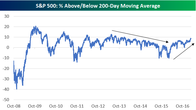
And while the S&P isn’t that far extended above its 50-day, it has moved pretty far above its 200-day. At +8.57%, the S&P’s 200-day moving average spread is at its highest level since mid-2014. Notably, the 200-day spread trended lower from early 2013 through late 2015, but since the start of 2016, this reading has been trending higher.
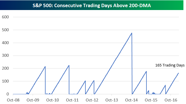
The S&P has now closed above its 200-day for the last 165 trading days. Below is a chart showing streaks of closes above the 200-day going back to 2008. It’s going to take a massive rally from here to eclipse the 477 trading day streak that we saw from late 2012 to late 2014!
The Closer — Minutes Roll Along, But Not Yet Off — 2/22/17
Log-in here if you’re a member with access to the Closer.
Looking for deeper insight on global markets and economics? In tonight’s Closer sent to Bespoke Institutional clients, we review key points from the Fed minutes. We also chart up the latest housing data on existing home sales updated today.

The Closer is one of our most popular reports, and you can see it and everything else Bespoke publishes by starting a no-obligation 14-day free trial to our research!