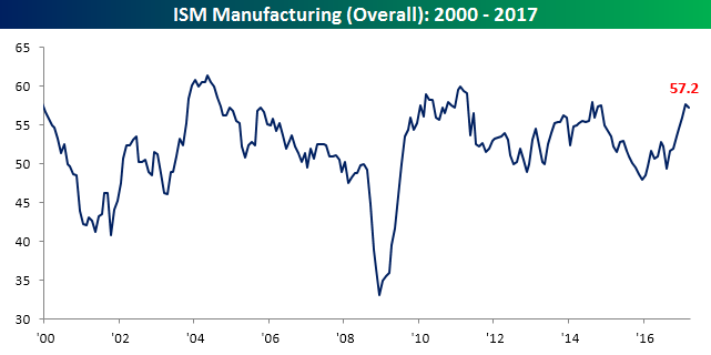
Modest Pullback in ISM Manufacturing
After hitting its highest level in over two years in February, ISM Manufacturing for March saw a modest pullback. Economists were expecting the headline reading to fall to 57.2 from last month’s reading of 57.7, and that is exactly where it came in. it will be interesting to see how the next few months play out from here because prior rallies in the ISM Manufacturing report throughout this cycle have all peaked around these levels.
The table below lists the month/month and year/year changes for the ISM Manufacturing report and each of its components. Breadth was mixed this month as five components increased m/m and five declined. The biggest gainers were Employment, Export Orders, and Prices Paid. On the downside, Production saw the largest decline, but this came after it hit its highest level since March 2011 last month. On a y/y basis, breadth was much more positive as Customer Inventories is the only component that is down relative to last year.
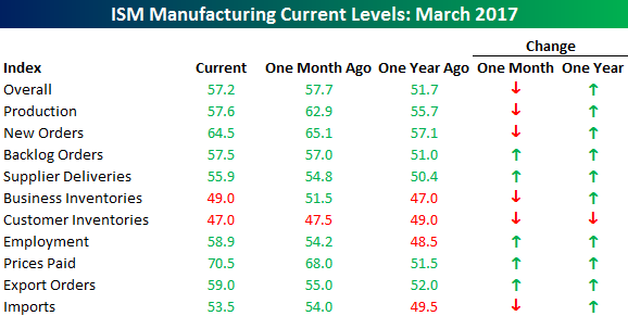
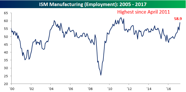
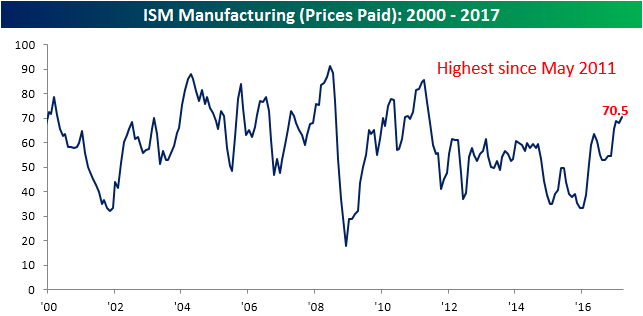
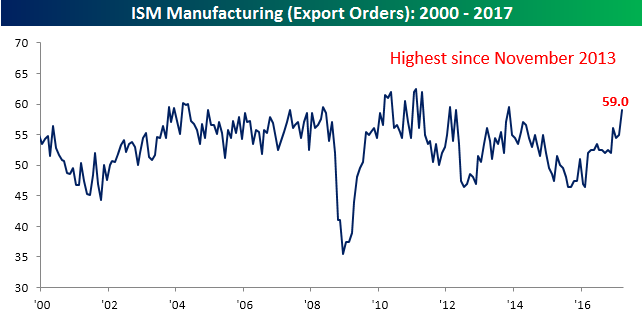
As mentioned above, Employment, Export Orders and Prices Paid saw the largest m/m increases this month. All three components have surged on a y/y basis as well. As shown in the charts below, Employment is currently at its highest level since April 2011, Prices Paid is at its loftiest level since May 2011, while Export Orders hasn’t been this strong since November 2013. The last time Employment surged more on a y/y basis was from August 2009 through August 2010.
Want to see more? Start a two-week no obligation free trial to Bespoke’s premium research platform.
First Day Following A Strong Quarter
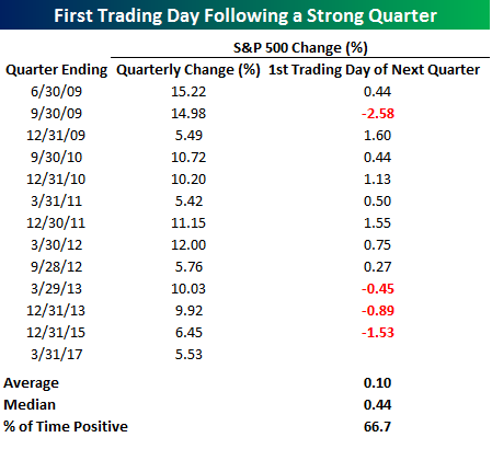
Q1 of 2017 marked the 13th quarter during the current bull market where the S&P 500 rallied more than 5%. In a blog post last week, we highlighted the fact that the S&P 500 tended to consistently close out strong quarters on a weak note, which is exactly what we saw in Friday’s trading as equities sold off moderately right ahead of the closing bell. So is there any pattern to the first trading day of a new quarter following a strong quarter?
The table below lists the S&P 500’s daily change on the first trading day following a quarter where the S&P 500 was up more than 5%. Up until the last three strong quarters, the first day following a strong quarter was consistently positive as the S&P 500 was up nine out of ten times. However, with three straight occurrences where the S&P 500 declined, the overall results, while still positive, are not as strong. Overall, the S&P 500 has averaged a gain of 0.10% (median: +0.44%) to open new quarters following a strong quarter with gains two-thirds of the time.
Auto Sales Off To A Poor Start In March Reporting
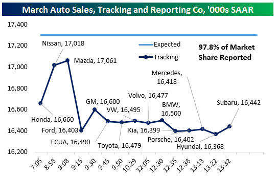
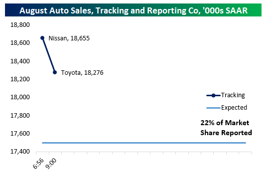
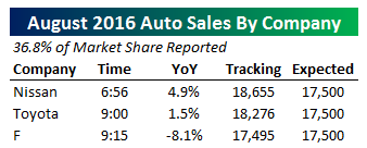 We only have three auto manufacturers reported as-of 9:15 AM EST, but as-of that time of writing Honda got March US Auto Sales off to a poor start. To be specific, the 70 bps YoY drop was made much worse because March 2017 has a more favorable combined calendar and day trade adjustment than a year ago. Nissan and Mazda both did much better, each seeing sales rise by 3-5% YoY NSA. With 20% of the auto industry reported (by volume), sales are tracking a miss but things look much less grim than they did right after Honda announced its sales just after 7:00 AM. We will continue to update our tracker as new results come in throughout the day.
Update 1 9:24 AM EST: Ford missed, delivering -7.2% YoY sales growth versus -5.9% expected by analysts; both are NSA, with no adjustment for the number of sales days in the month. That said, the consequences were brutal for the overall industry sales pace which by our calculation is tracking 16.403mm seasonally adjusted annual rate in March with about 1/3rd of the industry reported.
Update 2 9:59 AM EST: Things are not getting better for the auto industry as reports roll in. After Ford’s huge hit to our tracker (shaving over 650,000 SAAR from the sales pace in one fell swoop) GM made a positive impact despite missing estimated (+7.0%) significantly with the 1.6% sales gain versus a year ago. Fiat-Chrysler also missed, delivering a 5% volume drop versus expectations for roughly unchanged YoY sales. Toyota was even worse, with US sales falling 2.1%. With 80% of the industry reported, the sales pace we are tracking is only marginally above dismal February 2015 numbers, and stands a chance of coming in at the lightest pace in almost 3 years.
Update 3 1:52 PM EST: With smaller auto OEMs reporting vehicle sales throughout the early afternoon, we’re only missing Audi’s numbers and have 97.8% of the market reported as of this writing. Based on our calculations using Bureau of Economic Analysis seasonal adjustment data, we are tracking a big miss in auto sales, with actual pace coming in almost 900,000 SAAR short of what economists expected. To find a weaker number, we have to go all the way back to September of 2014, when the industry delivered sales of 16.24mm SAAR. As shown in the bottom graph, if this sales pace holds it will represent a major decline versus recent prints.
Global PMIs Mixed
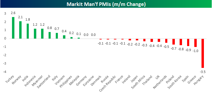
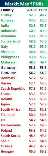 It’s the first day of the month and that means its PMI day for the manufacturing sector. While the figures for the US will be released later this morning, PMI readings out of Asia and Europe have been mixed so far. The table to the right lists all the datapoints for March that we have seen so far today sorted by the m/m change from February to March. Countries leading the way with the biggest m/m gains this month were Turkey, Norway, and India. Overall, of the ten countries where growth accelerated this month, six of them were in Asia, while four were in Europe. Along with the Eurozone region as a whole, Germany’s manufacturing PMI was also unchanged at a lofty 58.3. To the downside, fifteen PMI readings showed m/m declines in March led lower by Hungary, Greece, and Spain. In terms of the geographical breakdown, 11 of the 15 countries that saw m/m declines in March came from Europe, whereas just three were in Asia.
Finally, we would note that although more countries saw sequential declines in their March manufacturing PMIs, just three (Malaysia, South Korea, and Greece) have levels that are below 50. For the vast majority of the world, the manufacturing sector is in growth mode.
Bespoke Brunch Reads: 4/2/17
Welcome to Bespoke Brunch Reads — a linkfest of the favorite things we read over the past week. The links are mostly market related, but there are some other interesting subjects covered as well. We hope you enjoy the food for thought as a supplement to the research we provide you during the week.
Research
Measuring Stock Performance Against The Market by Gideon Vigderhous, PhD (Stocks & Commodities)
A summary of partial correlation methods developed by Vigderhous, with Bespoke’s Interactive Earnings Database as source material. [Link; 3 page PDF]
Chinese Financial Markets
Have a Donkey to Trade? China Has an Exchange for That (Bloomberg)
There are greater than 1,000 venues for exchanging financial assets of one kind or another across China, with over 140 regional agricultural exchanges alone, trading a dizzying array of products. [Link]
Will China Succeed in Efforts to Woo Foreigners Into Its Bond Markets? by Peng Qinqin and Dong Tongjian (Caixin)
An interview with Mark Austen, the CEO of the Asia Securities Industry and Financial Markets Association on the problems and possibilities of Chinese interest rates. [Link]
Privacy
Congress just voted to let internet providers sell your browsing history by Taylor Hatmaker (TechCrunch)
In a vote passed via tie-breaker from Vice President Mike Pence, the Senate passed House legislation that removes restrictions placed on ISPs by the Obama Administration which prevent them from selling user browsing data without consent. In other words, your internet activity can now be sold without your consent. [Link]
This Is What It’s Actually Like To Live In A Surveillance State by Otillia Steadman (Buzzfeed)
A look at the reality of living under an authoritarian regime which spies on its own citizens. For former East Germans, the consequences – not to mention the experience itself – have lasting impact to this day. [Link]
Commodities
Fracking 2.0: Shale Drillers Pioneer New Ways to Profit in Era of Cheap Oil by Erin Ailworth (WSJ)
Drilling rigs run from iPhones, a former subsidiary of Enron, and the 64 other apps it uses to produce more oil than Exxon Mobil in the continental US. [Link; paywall]
The DNA of oil wells: U.S. shale enlists genetics to boost output by Ernest Scheyder (Reuters)
Apps are one thing but shale producers are also exploiting information signals from the DNA of living organisms which decompose into the valuable oil sought by US shale drillers. [Link]
Coal isn’t dead, but it won’t revive Appalachia, either by Alexandra Scaggs (FT Alphaville)
A series of reasons that the jobs, output, and cultural primacy of coal in the Appalachian mountains is unlikely to return to its much-harkened-to past. [Link; registration required]
Political Research
Creating a National Precinct Map by Ryne Rohla (Decision Desk HQ)
A fascinating effort at data collection that maps (nearly) every precinct in the country and compares them to voting results. The country-level map isn’t terribly different from more common county-level maps, but we highly recommend zooming in to take a look at your area’s results at an extremely granular level. [Link]
Is Europe an optimal political area? by Alberto Alesina, Guido Tabellini, and Francesco Trebbi (Brookings Papers on Economic Activity)
There are limits to the relatively small sample sizes used, but with that caveat we found this paper’s conclusion (that the European Union’s polities are less culturally different than those of the United States) fascinating. [Link; 58 page PDF]
Consumer Banking
Former Citizens Bankers Say They Faked Data for Customer-Meeting Program by Rachel Louise Ensign (WSJ)
In yet another example of an effort by a large bank to drum up business getting gamed, Citizens Financial representatives often invented meeting reports for sit-downs that didn’t even happen. [Link; paywall]
Chase Had Ads on 400,000 Sites. Then on Just 5,000. Same Results. by Sapna Maheshwari (NYT)
It turns out that for online display advertising, algorithms, huge site counts, and other advertising staples are not much better than careful selection of a smaller footprint by human beings. [Link; soft paywall]
Political Headlines
This Is Almost Certainly James Comey’s Twitter Account by Ashley Feinberg (Gizmodo)
The 2017 version of gumshoe reporting appears to require expertise in the Twitter search function and a decent bit of persistence. After reading the story, make sure to check out the response from the alleged account here. [Link]
The Reclusive Hedge-Fund Tycoon Behind The Trump Presidency by Jane Mayer (The New Yorker)
The latest in a series of profiles dedicated to the conservative head of Renaissance Technologies, one of the best-performing hedge funds of all time. [Link]
New Transport
The Great Nevada Lithium Rush to Fuel the New Economy by Paul Tullis (Bloomberg)
A new mineral is replacing silver and gold as metallic contributors to the Nevada economy, with global demand surges thanks to the demands of car batteries. [Link]
The 22-Year-Old at the Center of the Self-Driving Car Craze by Alex Webb, Lizette Chapman, and Alex Barinka (Bloomberg)
With billions of dollars of market share at stake, lidar, algorithms, camera sensors, and GPS adaptations are becoming ripe targets for takeovers and industrial espionage. [Link; auto-playing video]
New Diseases
The Trauma of Facing Deportation by Rachel Aviv (The New Yorker)
Hundreds of young people in Sweden have fallen into catatonic, uber-apathetic states when faced with the stress of deportation since the early 2000s. [Link]
City States
Who Is the City-Statey-est Of Them All? by Lyman Stone (In A State of Migration)
A surprisingly large country has earned Stone’s title for the most city-statey-est (not a technical term, as far as we are aware). A fascinating use of data. [Link]
Airlines
Airlines Make More Money Selling Miles Than Seats by Justin Bachman (Bloomberg)
Airline credit cards are up to 50% of airline income according to new research from Sifel Nicolaus, with 1.5-2.5 cents per dollar spent on cards with their branding flowing through to airline revenue. [Link; auto-playing video]
Southwest Airlines’ Digital Transformation Takes Off by Neal Ungerleider (Fast Company)
On-the-fly migrations between technical patterns are amongst the most complicated challenges businesses face. In this article, we get a peak at Southwest’s efforts in that respect. [Link]
The Future of Investing
BlackRock cuts ranks of stockpicking fund managers by Stephen Foley (FT)
In a strategic shift, one of the world’s largest managers have fired active management portfolio managers to replace them with quantitative strategies. [Link; paywall]
Hedge Funds Are Training Their Computers to Think Like You by Saijel Kishan (Bloomberg)
Efforts to apply deep learning (an approach that works similarly to the way neurons in the human brain do) is being trained on investing, after many previously-hyped strategies basically struck out. [Link]
Dreams From The West Coast
Silicon Valley’s Quest To Live Forever by Tad Friend (The New Yorker)
What do you take when you combine Hollywood stars, venture capitalists, and a bunch of scientists? Why, Goldie Hawn posing questions about mitochondria and glutathione, of course! [Link]
Amazon’s Ambitions Unboxed: Stores for Furniture, Appliances and More by Nick Wingfield (NYT)
Retail stores are dead! Long hail the retail stores! [Link; soft paywall]
Ancient History
Who Killed the Iceman? Clues Emerge in a Very Cold Case by Rob Nordland (NYT)
A forensic investigation of a corpse that has stumped science for a quarter-century. [Link; soft paywall]
Sentiment
A Correction Now Might Not Be So Bad, Some Investors Say by Aaron Kuriloff, Corrie Driebusch, and Akane Otani (WSJ)
With equities ripping after the election, many are loathe to buy the highs until earnings have caught up a bit. But the dip-buyers are waiting. [Link; paywall]
Worthwhile Canadian Intiative
How the Yellen Fed Got Religion Over the Stock Market and Policy by Matthew Boesler (Bloomberg)
The origin story of financial conditions indices, a critical input in modern monetary policymaking. [Link; auto-playing video]
Have a great Sunday!
The Bespoke Report — 3/31/17
S&P 500 Quick-View Chart Book — 3/31/17
The Closer 3/31/17 – End of Week Charts
Looking for deeper insight on global markets and economics? In tonight’s Closer sent to Bespoke clients, we recap weekly price action in major asset classes, update economic surprise index data for major economies, chart the weekly Commitment of Traders report from the CFTC, and provide our normal nightly update on ETF performance, volume and price movers, and the Bespoke Market Timing Model.

The Closer is one of our most popular reports, and you can sign up for a free trial below to see it!
Click here to start your no-obligation two-week free Bespoke research trial now!
ETF Trends: Hedge – 3/31/17
As oil prices have rallied out of the middle of the week, oil-related ETFs have shown the biggest gains among those we track. Small caps, banks, and value-oriented names have also rallied. South Africa was a major decliner on the week, driven by a huge move lower in South African rand after the country’s President fired the Finance Minister. Chinese equities and other EM were also quite weak as was were developed market currencies versus the dollar.

Bespoke provides Bespoke Premium and Bespoke Institutional members with a daily ETF Trends report that highlights proprietary trend and timing scores for more than 200 widely followed ETFs across all asset classes. If you’re an ETF investor, this daily report is perfect. Sign up below to access today’s ETF Trends report.
See Bespoke’s full daily ETF Trends report by starting a no-obligation free trial to our premium research. Click here to sign up with just your name and email address.
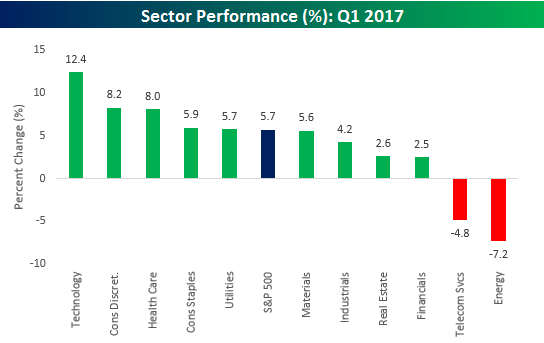
That’s a Wrap: Q1 Performance
Not a bad quarter for the bulls. With Q1 now officially in the books, 2017 has gotten off to a great start with the S&P 500 rallying 5.7% through late Friday afternoon. As shown in the sector performance chart below, Technology did most of the heavy lifting this quarter with a rally of 12.4%, or more than double the S&P 500’s gains. Behind Technology, Consumer Discretionary rallied 8.2%, while Health Care gained 8%. On the downside, the only two sectors that were down on the quarter were Energy (-7.2%) and Telecom Services (-4.8%). Besides these two sectors, others that underperformed during Q1 were Financials, Real Estate, Industrials, and Materials.
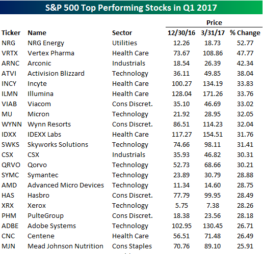
The tables below list the best and worst performing stocks during the quarter. Of the 21 stocks that gained more than 25%, shares of NRG Energy (NRG) rallied more than 50%, while Vertex Pharma gained 48%. With Technology leading the market higher, it shouldn’t come as too much of a surprise that eight of the top performing stocks in the index were from that sector, led by Activision Blizzard (ATVI) and Micron (MU) which both added more than 30%. How good a year has 2017 been for equities and Tech in general? Even Xerox (XRX) is up over 25%!
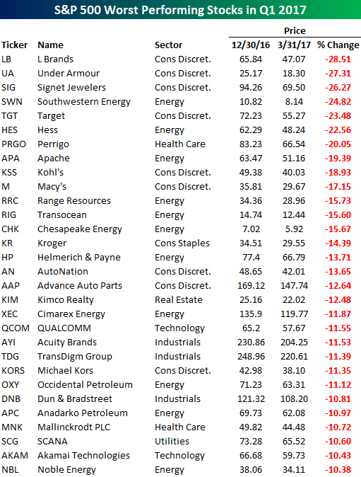
To the downside, the table below lists the 30 stocks in the S&P 500 that traded down more than 10% this quarter. Leading the way lower, L Brands (LB), Under Armour (UA), and Signet (SIG) all lost more than a quarter of their market value during Q1. Along with those three names, another six stocks from the Consumer Discretionary sector made the list. The only sector with more stocks on the list of losers was Energy. Given that it was the worst performing sector during the quarter, Energy makes sense, but Consumer Discretionary was the second best performing sector. The reason Consumer Discretionary fared so well even with so many stocks in the sector declining sharply is due in large part to Amazon.com (AMZN). With a gain of 18% and a market cap of around $425 billion, AMZN was responsible for one-third of the Consumer Discretionary sector’s gain in Q1.