ETF Trends: US Indices & Styles – 5/1/17
Biotech has finally dethroned European ETF as champions of trailing performance now that French election gains have rolled out of our five day window. On the losing side of the slate, gold miners and precious metals-related ETFs continue to underperform, as does the Energy space more broadly.

Bespoke provides Bespoke Premium and Bespoke Institutional members with a daily ETF Trends report that highlights proprietary trend and timing scores for more than 200 widely followed ETFs across all asset classes. If you’re an ETF investor, this daily report is perfect. Sign up below to access today’s ETF Trends report.
See Bespoke’s full daily ETF Trends report by starting a no-obligation free trial to our premium research. Click here to sign up with just your name and email address.
ISM Manufacturing Miss
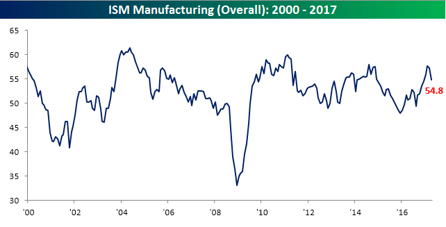
Economic data to kick off the month hasn’t exactly been positive as the April read on ISM Manufacturing came in weaker than expected, falling to its lowest level of the year. While economists were forecasting the headline reading to come in at a level of 56.5, the actual reading fell to 54.8, making it the biggest miss relative to expectations since last September’s report for the month of August.
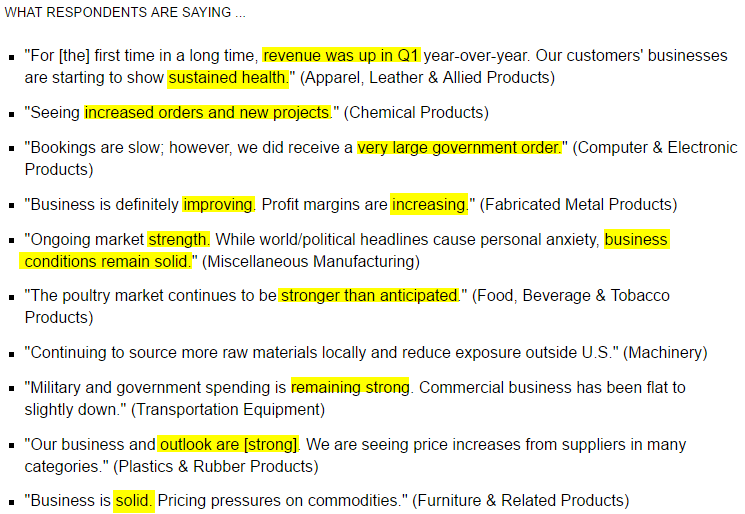
While the headline number of the April report was weaker than expected, the overall tone of comments from respondents was positive according to ISM. Below we provide a sampling of commentary from respondents included in the report. Despite the fact that the report was weaker than expected, overall conditions in the manufacturing sector appear solid.
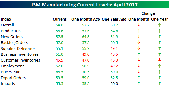
The table below breaks down this month’s report by each of its individual components. Overall breadth in the report was skewed slightly negative on a month/month basis, but relative to where things stood last year at this time, conditions are much improved.
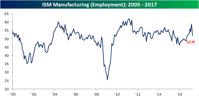
Finally, below we wanted to highlight a couple of notable charts from this month’s report. First, on the employment front, that component saw its largest monthly drop this month since November 2008. That doesn’t bode especially well for the employment report this Friday, but given the sector’s small size relative to the overall economy, it is not a major negative. If we see this type of weakness in the employment component of the ISM Services report later this week, we’ll be a lot more concerned.
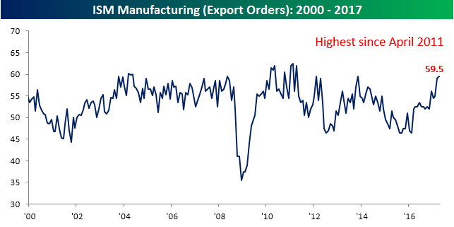
Finally, we’ve been talking a lot lately about how we expect strength in international markets to outpace the US going forward, and part of this can be seen in the measurement of export orders. In this month’s report, that component increased to 59.5, which is the highest in six years. When it comes to US vs ROW (Rest of World), ROW appears to be taking the lead.
Asset Class Returns in April
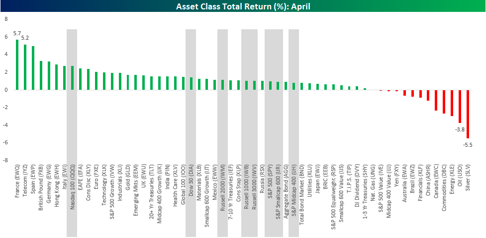
It may sound hard to believe but with April now in the history books, the year 2017 is already a third complete. In the chart below, we have summarized the returns of various asset classes in the ETF universe spanning equities (both domestic and international), currencies, fixed income, and commodities on a total return basis in US dollar terms. Given the sheer number of ETFs included in this analysis, it may be hard to read some of the labels, but if you click on the image it should enlarge. For some perspective on how US equities stacked up versus everything else, the returns of the eight major US indices are all highlighted in gray.
Overall, April was generally a positive month as just 12 of the 58 ETFs highlighted posted negative total returns. Leading the world higher, French equities surged 5.7% on a relief rally coming after the first round of elections late in the month. Behind France, The US Telecom ETF and the Spanish equity market were the only other two ETFs up more than 5% in April. German equities also saw nice gains during the month, rallying 3.2%. German manufacturers have been one of the biggest beneficiaries of the entire Euro system, so the results of the French election were a positive for German equities as well.
On the downside, commodities were weak in April as Silver (SLV) dropped 5.5%, followed by Oil (USO) and the S&P 500 Energy sector ETF (XLE). The only other ETFs down more than 1% were the Commodities ETF (RBC), Canadian equities (EWC), which are commodity focused, and China A-Shares (ASHR).
In terms of US market returns, the Nasdaq 100 ETF (QQQ) was the best performing of the major US averages, rising 2.7%. Of the remaining seven major US indices, returns were all ‘middle of the road’ and bunched in a range of 0.8% to 1.4%. In April at least, leadership came from outside of the US.
Bespoke Brunch Reads: 4/30/17
Welcome to Bespoke Brunch Reads — a linkfest of the favorite things we read over the past week. The links are mostly market related, but there are some other interesting subjects covered as well. We hope you enjoy the food for thought as a supplement to the research we provide you during the week.
Big Shifts
New Yorkers Flock to Booming Sun Belt as Trek South Resumes by Steve Matthews (Bloomberg)
A new demographic analysis of US Census data suggests that the tide of migration out of cold weather areas and into the Southeast and Southwest is accelerating. [Link]
This is the last year a car will be made in Australia by Andrew Barclay (Quartz)
Years ago, the government of Australia decided against continuing support of its auto industry in favor of pursuing comparative advantages in mining and services. The result is a 100% imported auto market but not necessarily much economic angst in a country that hasn’t suffered a recession in a generation. [Link]
NFL Draft
No Team Can Beat the Draft by Neil Pane (538)
NFL players tend to perform about in-line with where they were picked in the draft, creating a neutral expected return on a given draft place. But general managers or teams are unable to perform much better than that draft rank over time. [Link]
Investing
The Dividend Growth Myth by Meb Faber (mebfaber.com)
Succinctly put, dividend growth is not a helpful strategy for beating the market. We’ll leave it to friend-of-the-firm Faber to fill in the details. By the way, if you like Meb’s work, make sure to check out our Bespokecast interview with him here. [Link]
US Economics
CoreLogic Sees Signs of Credit Cracks by Jann Swanson (Mortgage Daily News)
New data notes an uptick in delinquencies for consumer loans, agriculture loans, and business loans despite ongoing mortgage performance improvement. A blip or the end of the current credit cycle? [Link]
Here’s What Wall Street Is Saying About Trump’s Tax Plan by Julie Verhage and Felice Maranz (Bloomberg)
The Administration’s one-pager on what it would like to see from tax reform is creating lots of speculation (about cost, impact on specific taxpayers by income, etc) from Wall Street economists and analysts. This is a good roundup. [Link; auto-playing video]
Dysaster
Fyre Festival, the Coachella for the Super Rich, Ends in Disaster by Polly Mosendz and Kim Bhasin (Bloomberg)
Promo videos featuring supermodels, promises of private island venues, and 4-6 figure ticket prices turned out to be a mirage this week as social media exploded with reports of chaos from the Exumas. A staggering disaster as far as events go. [Link]
I Worked at Fyre Festival. It Was Always Going to Be a Disaster. by Chloe Gordon (NY Mag)
Some more background on Fyre Festival, with hilarious details about management, staff turnover, and outright incompetence in the months ahead of the event. [Link]
Europe
6 takeaways from French election’s first round by Pierre Briançon (Politico)
An excellent and informed analysis of the impact on both the European and specifically French policy and political landscape of a first round that was historic in many ways. [Link]
EU prepares for post-Brexit membership for united Ireland by Alex Barker and Arthur Beesley (FT)
Could the EU lure away Northern Ireland from the UK in a bid to unite the divided island? Emphatically, yes, and they’re laying the ground work to do so. We should note that since this article was published EU27 nations agreed to the inclusion of the provisions discussed. [Link; paywall]
The Man Krugman Called a ‘Sadomonetarist’ Proves He’s Really Not by Love Liman and Johan Carlstrom (Bloomberg)
Some background on Riksbank Governor Stefan Ingves’ overcompensation for the policy mistake of raising rates too quickly after the global financial crisis. [Link]
Softwood Lumber
Why the U.S. and Canada Are Fighting About Lumber: QuickTake Q&A by Jen Skirret (Bloomberg)
Widely criticized as a classically protectionist move by the Trump Administration, the Canadian softwood lumber dispute is actually much more complicated, long-standing, and generally nuanced than that simplistic angle. This is some good background. [Link; auto-playing video]
Impact of the Duty on Canadian Lumber Announced April 25 by Paul Emrath (NAHB Eye On Housing)
The data and analysis in this article should be treated somewhat skeptically given the source, but we think the estimates provide a decent “worst-case” scenario of what the softwood lumber dispute could mean for the US economy. [Link]
Visual Technology
Google’s updated Earth app will destroy your free time by Daniel Howley (Yahoo!)
3D modelling of actual cities, additional layers of information, and a variety of other goodies make exploring the world from your couch easier than ever. Some fun views: Rio De Janeiro (link), Mount Everest (link), the Grand Canyon (link), and Vancouver BC (link). [Link; auto-playing video]
Amazon’s new $200 Echo Look camera will judge your outfits by Natt Garun (The Verge)
A new member of the Amazon Echo device family adds visual algorithms that can help you nail your look, allegedly. [Link]
Bubbles
The Media Bubble Is Worse Than You Think by Jack Shafer and Tucker Doherty (Politico)
New technologies led to the demise of the newspaper industry, which was necessarily local. But the agglomeration of reporters in large urban areas has led to a differential between the day-to-day experience of the people reporting the news and much of the rest of the country. [Link]
Booms
Ancient stone carvings confirm how comet struck Earth in 10,950BC, sparking the rise of civilisations by Sarah Knapton (The Telegraph)
Early human civilization may have been possible thanks to climatic changes that were driven by a large comet impact. [Link]
Railroads of the Raj: Estimating the Impact of Transportation Infrastructure by Dave Donaldson (MIT Department of Economics and NBER)
A week and a half ago Stanford Professor Dave Donaldson received the John Bates Clark Medal from the American Economics Association. This landmark paper alone is ample justification for the award. Using a hard data set from the British Raj in India, it quantifies the benefits of trade and reducing the costs of trade in a remarkable effort. [Link; 51 page PDF]
White Collar Crime
This white-collar crime map will have you clutching your 401ks a little tighter when you see a finance guy on the street (Fast Company)
Simultaneously raising awareness about remarkably toothless prosecution of financial crimes and the disparity between different parts of society when facing the criminal justice system, Syracuse researchers offer a way for you to help figure out if you’re at risk of being a victim. [Link]
Not an inside job: How two analysts became SEC whistleblowers by Sarah N. Lynch (Reuters)
Sharp analysts stand to make a payday off a stock not via short positions but through a whistleblowing award from the SEC which could earn them as much as $2.5 million. [Link]
Have a great Sunday!
The Bespoke Report — France Leads the Charge
S&P 500 Quick-View Chart Book: 4/28/17
Each weekend as part of our Bespoke Premium and Institutional research service, clients receive our S&P 500 Quick-View Chart Book which includes one-year price charts of every stock in the S&P 500. You can literally scan through this report in a matter of minutes or hours, but either way, you will come out ahead knowing which stocks, or groups of stocks, are leading and lagging the market. The report is a great resource for both traders and investors alike. Below, we show the front page of this week’s report which contains price charts of the major averages and ten major sectors.
To see this week’s entire S&P 500 Chart Book, sign up for a 14-day free trial to our Bespoke Premium research service.

The Closer 4/28/17 – End of Week Charts
Looking for deeper insight on global markets and economics? In tonight’s Closer sent to Bespoke clients, we recap weekly price action in major asset classes, update economic surprise index data for major economies, chart the weekly Commitment of Traders report from the CFTC, and provide our normal nightly update on ETF performance, volume and price movers, and the Bespoke Market Timing Model.

The Closer is one of our most popular reports, and you can sign up for a free trial below to see it!
Click here to start your no-obligation two-week free Bespoke research trial now!
ETF Trends: Fixed Income, Currencies, and Commodities – 4/28/17
European ETFs continue to dominate the best performers list with every ETF in the top 12 (other than possibly Turkey, depending on how you define “Europe”) part of that geographic group. Among the top 20 ETFs we track, only Biotech, Private Equity, FX-hedged Japanese equities, and Medical Devices are in the same league as European indices. Gold, silver, and coffee have gotten hit had over the past week, with currency carry strategies undereperforming as well as REITs, long bonds, and a variety of FX crosses.
Bespoke provides Bespoke Premium and Bespoke Institutional members with a daily ETF Trends report that highlights proprietary trend and timing scores for more than 200 widely followed ETFs across all asset classes. If you’re an ETF investor, this daily report is perfect. Sign up below to access today’s ETF Trends report.
See Bespoke’s full daily ETF Trends report by starting a no-obligation free trial to our premium research. Click here to sign up with just your name and email address.
GDP: MOASD
Today’s advance read on Q1 GDP came in weaker than expected this morning, missing forecasts by 0.3 percentage points. While economists were forecasting a SAAR reading of 1.0%, the actual reading came in at 0.7%. The fact that this report was weaker than expected should come as a surprise to no one. The table below was pulled from our Interactive Economic Indicator Database (available to all Institutional clients) and shows the originally reported advance read on Q1 GDP versus estimates dating back to 1999. In the last 19 years, this report has only been better than expected four times. In the last fifteen years, it has only been better than expected once, and in the last nine years, it has been weaker than expected every year! This trend gives new meaning to the phrase, “If at first you don’t succeed, try, try, try, try, try, try, try, try, and try again!” When it comes to forecasting errors, Q1 GDP has been the Mother of all Seasonal Distortions (MOASD).

The Closer — Investment, Durable Goods, Homeowners — 4/27/17
Log-in here if you’re a member with access to the Closer.
Looking for deeper insight on global markets and economics? In tonight’s Closer sent to Bespoke Institutional clients, we take a look at the strong rebound in investment in Q1 GDP stats due tomorrow morning. We also recap the durable goods report from today, quarterly US Census stats on the US housing stock, and a couple data points from Mexico and Brazil.
The Closer is one of our most popular reports, and you can sign up for a free trial below to see it!
The Closer is one of our most popular reports, and you can see it and everything else Bespoke publishes by starting a no-obligation 14-day free trial to our research!