ETF Trends: International – 5/19/17
Oil (USO) has been the best performing ETF in the universe we track over the last 5 days, with oil-related ETFs also performing well. Austria has been the best-performing European ETF and the best-performing country ETF, with Indonesia also doing well following an upgrade to investment grade for the sovereign by S&P overnight. Poor performers are dominated by Brazil and Latin American ETFs, with natural gas, retail, and the USD also getting hit hard.

Bespoke provides Bespoke Premium and Bespoke Institutional members with a daily ETF Trends report that highlights proprietary trend and timing scores for more than 200 widely followed ETFs across all asset classes. If you’re an ETF investor, this daily report is perfect. Sign up below to access today’s ETF Trends report.
See Bespoke’s full daily ETF Trends report by starting a no-obligation free trial to our premium research. Click here to sign up with just your name and email address.
B.I.G. Tips – Years Like 2017 – May Edition
The Closer — China Data Check, Market Recap — 5/18/17
Log-in here if you’re a member with access to the Closer.
Looking for deeper insight on global markets and economics? In tonight’s Closer sent to Bespoke Institutional clients, we review recent updates to data on Chinese credit, capital flows, and property prices. We also discuss a series of events in the market today ranging from central bank activity to S&P 500 sector technicals.

The Closer is one of our most popular reports, and you can sign up for a free trial below to see it!
The Closer is one of our most popular reports, and you can see it and everything else Bespoke publishes by starting a no-obligation 14-day free trial to our research!
Bespoke’s Sector Snapshot — 5/18/17
We’ve just released our weekly Sector Snapshot report (see a sample here) for Bespoke Premium and Bespoke Institutional members. Please log-in here to view the report if you’re already a member. If you’re not yet a subscriber and would like to see the report, please start a 14-day trial to Bespoke Premium now.
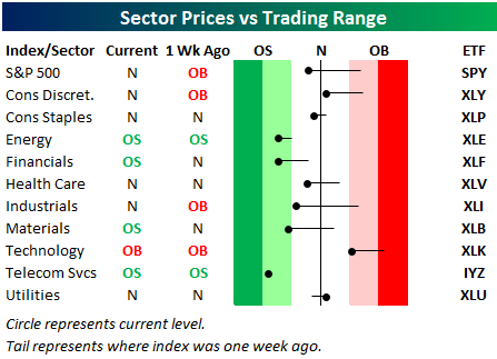
Below is one of the many charts included in this week’s Sector Snapshot, which highlights our trading range screen for the S&P 500 and ten sectors. The black vertical “N” line represents each sector’s 50-day moving average, and as shown, the S&P 500 and seven of ten sectors are now below their 50-DMAs after Wednesday’s big drop. Technology is the only sector that remains overbought.
To see our full Sector Snapshot with additional commentary plus six pages of charts that include analysis of valuations, breadth, technicals, and relative strength, start a 14-day free trial to our Bespoke Premium package now. Here’s a breakdown of the products you’ll receive.
ETF Trends: US Sectors & Groups – 5/18/17
With a catastrophic shift in fortunes for President Temer following reports of a bribery scandal, Brazil is down almost 14% over the past week. ETFs with Brazilian holdings are in a similar position, while retail is the worst-performing US sector following a brutal series of earnings reports over the past week. Gainers include long bonds, gold and gold miners, and short dollar positions.
Bespoke provides Bespoke Premium and Bespoke Institutional members with a daily ETF Trends report that highlights proprietary trend and timing scores for more than 200 widely followed ETFs across all asset classes. If you’re an ETF investor, this daily report is perfect. Sign up below to access today’s ETF Trends report.
See Bespoke’s full daily ETF Trends report by starting a no-obligation free trial to our premium research. Click here to sign up with just your name and email address.
Philly Fed Bucks the Empire Trend
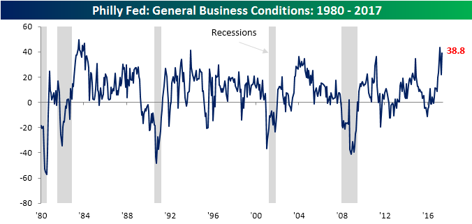
While manufacturing activity in the New York area sunk back to pre-election levels this month, the Philadelphia area continues to hum along. This month’s release of the Philly Fed General Business Conditions Index showed an increase from 22.0 in April up to 38.8. That’s the second highest level of the recovery behind only March’s reading of 43.3.
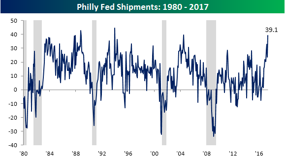
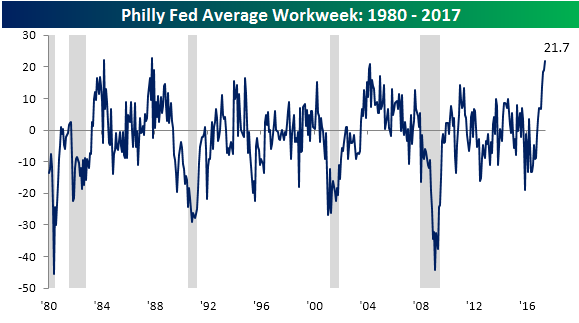
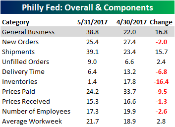 Looking at the internals of the report shows a much less robust picture though. As shown in the table to the right, just three of the report’s subcomponents increased this month while six declined. Of the three that did increase, two saw moves worth noting, which we highlight below. First, the index for Shipments rose to 39.1, which is the fifth highest reading in the history of the survey (dating back to 1980). The only months that were stronger were July 2004, December 1993, October 1988, and December 1987. In addition to Shipments, Average Workweek also surged, rising to 21.7 from 18.9. For that component, there have only been two other months (October 1987 and March 1984) of higher readings.
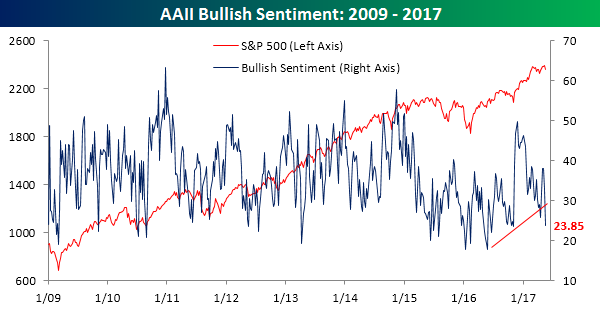
Bullish Sentiment Crashes
Individual investor sentiment took a major hit this week as Washington headlines give investors another excuse to not like equities. According to the weekly AAII survey, bullish sentiment dropped from 32.73% down to 23.85%. That drop is the largest one-week decline since July 2015 and takes bullish sentiment down to its lowest level since last November’s election. Also, in case you are still keeping score, bullish sentiment has now been below 50% for a record 124 straight weeks.
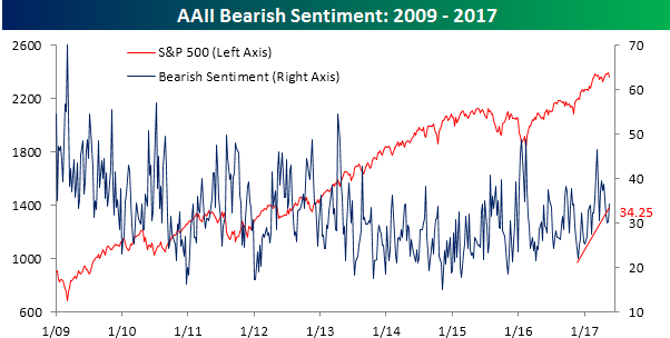
While bullish sentiment tanked, they didn’t all move into the bearish camp. As shown in the chart below, bearish sentiment increased by less than half as much as bullish sentiment declined. However, at a level of 34.25%, more than a third of individual investors consider themselves bearish.
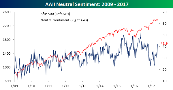
Neutral sentiment surged back above 40% this week, rising from 37.05% up to 41.9% to its highest weekly reading since the election. While investors were more than happy to sit on their hands in the weeks and months leading up the election, now it seems as though they are stepping to the sidelines to wait out what becomes of the Russia investigations.
Jobless Claims Come Through Again
It happened again this week. We know we say it a lot, but it seems that when all else fails, jobless claims provide a port in the storm. This week, first-time claims dropped to 232K from 236K last week and below consensus estimates of 240K. This was the second lowest weekly print of the economic expansion and the 115th straight week where claims were below 300K.
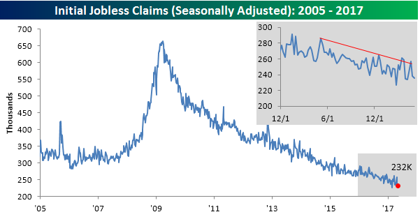
With this week’s decline in weekly claims, the four-week moving average dropped to 240.75K from 243.5K. That’s just 1K above the multi-decade low of 239.75K from early March, and barring a major spike higher (above 250K), next week’s level will be a new low.

On a non-seasonally adjusted basis, jobless claims dropped down to 206.5K from 215.2K last week. For the current week of the year, this is the lowest print since 1973, and it is more than 100K below the average for the current week of the year dating back to 2000 (318.5K).

the Bespoke 50 — 5/18/17
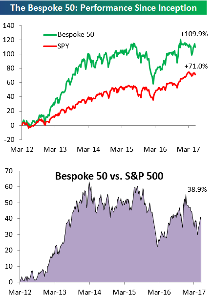
Every Thursday, Bespoke publishes its “Bespoke 50” list of top growth stocks in the Russell 3,000. Our “Bespoke 50” portfolio is made up of the 50 stocks that fit a proprietary growth screen that we created a number of years ago. Since inception in early 2012, the “Bespoke 50” has beaten the S&P 500 by 38.9 percentage points. Through today, the “Bespoke 50” is up 109.9% since inception versus the S&P 500’s gain of 71.0%. Always remember, though, that past performance is no guarantee of future returns.
To view our “Bespoke 50” list of top growth stocks, sign up for Bespoke Premium ($99/month) at this checkout page and get your first month free. This is a great deal!