Bespoke Stock Seasonality Report: 5/30/17
ETF Trends: Fixed Income, Currencies, and Commodities – 5/30/17
As Brazil continues to rebound from its lows of ten days ago, Latin American-focused ETFs and EWZ top our list of the best performers over the past five days. Momentum and the Nasdaq have been the best performers in the US equity market over the week. On the losing side of the ledger: oil and energy stocks, MLPs, and Italian equities.

Bespoke provides Bespoke Premium and Bespoke Institutional members with a daily ETF Trends report that highlights proprietary trend and timing scores for more than 200 widely followed ETFs across all asset classes. If you’re an ETF investor, this daily report is perfect. Sign up below to access today’s ETF Trends report.
See Bespoke’s full daily ETF Trends report by starting a no-obligation free trial to our premium research. Click here to sign up with just your name and email address.
Bespoke Stock Scores: 5/30/17
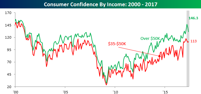
First Back to Back Drop in Consumer Confidence in a Year
Consumer Confidence for the month of May showed an unexpected decline, falling from 119.4 down to 117.9. Economists had been expecting this month’s reading to come in at 119.5. With May’s decline, Consumer Confidence saw its first back to back drop since May of last year but still remains well above its long-term average of 93.8 dating back to 1967.
Start a two-week free trial to Bespoke Institutional today.

One of the most interesting aspects of the monthly Consumer Confidence report is the breakdown in confidence among different income levels. While sentiment tends to move in the same direction across different income ranges, there are often varying degrees in the magnitude of the move. During the Obama years, even though he campaigned and often spoke about leveling the playing field for all Americans and not just the rich, those with the highest income levels saw the largest increase in confidence during his years in office.
Looking at current levels of confidence based on income levels, in the last two months, we have seen the complete opposite of the trend that has been in place for several years now. As shown in the chart below, sentiment among consumers with incomes greater than $50K has dropped over 10 percentage points in the last two months, which is the largest two-month decline in two years. Alternatively, confidence levels among consumers with incomes between $35K and $50K actually increased this month and is barely down in the last two months. Finally, for consumers with annual incomes below $15K (lower chart), confidence is at its highest level in nearly 16 years! It’s only two data points, but it will be interesting to see how this plays out in the months ahead.

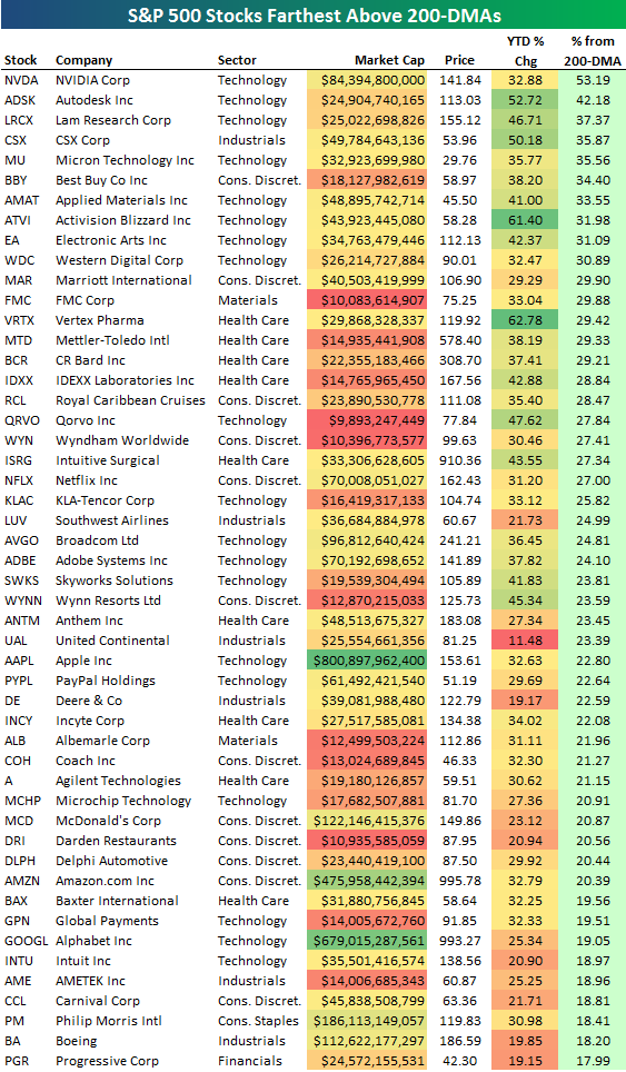
S&P 500 Stocks Farthest Above and Below 200-DMAs
The direction of a stock’s 200-day moving average (DMA) is a good way to gauge its long-term directional trend. If the 200-day moving average is rising, it’s a signal of a long-term uptrend, and vice versa for a downward sloping 200-DMA. Additionally, the distance a stock is trading above or below its 200-day is a good way to gauge how extended it is from its “normal” trading range.
The average stock in the S&P 500 right now is trading roughly 5% above its 200-day moving average. But a whopping 32% of stocks in the index are more than 10% above their 200-DMAs. That’s a healthy reading that shows just how strong equities have been.
Below is a list of the S&P 500 stocks currently trading the farthest above their 200-DMAs. As shown, NVIDIA (NVDA) is the most extended at 53.19%, followed by Autodesk (ADSK) at 42.18% and Lam Research (LRCX) at 37.37%. CSX and Micron Tech (MU) round out the top five.
Three of the mega-Tech behemoths that are getting so much love these days are on the list as well. Apple (AAPL) is 22.80% above its 200-day, Amazon.com (AMZN) is at 20.39%, and Alphabet (GOOGL) is at 19.05%. Other notables on the list include Best Buy (BBY), Netflix (NFLX), Adobe (ADBE), Wynn Resorts (WYNN), Coach (COH), Philip Morris International (PM), and Boeing (BA).
Start a two-week free trial to Bespoke Institutional today.
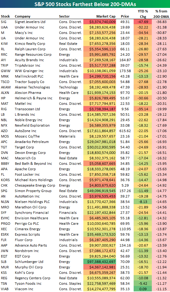
On the flip side of the equation, 11% of stocks in the S&P 500 are trading more than 10% below their 200-DMAs. Below is a list of the 50 stocks trading the farthest below their 200-days. The list is made up mostly of retailers, REITs, and Energy stocks.
Signet (SIG) tops the list at 36.83% below its 200-day, followed by Under Armour (UAA), Macy’s (M), and Kimco Realty (KIM). Other notables on the list include TripAdvisor (TRIP), AutoZone (AZO), Target (TGT), Bed Bath & Beyond (BBBY), Nordstrom (JWN), and Schlumberger (SLB).
Start a two-week free trial to Bespoke Institutional today.
Bespoke Brunch Reads: 5/28/17
Welcome to Bespoke Brunch Reads — a linkfest of the favorite things we read over the past week. The links are mostly market related, but there are some other interesting subjects covered as well. We hope you enjoy the food for thought as a supplement to the research we provide you during the week.
Big Economic Questions
The Question Isn’t Why Wage Growth Is So Low. It’s Why It’s So High. by Neil Irwin (NYT Upshot)
Over time, wages are governed by three factors: inflation, productivity, and labor bargaining power. While the latter has gotten all of the attention in recent years, wages have actually been stronger than the first two factors would predict, suggesting that low wages aren’t actually the problem to be worried about. [Link; soft paywall]
Economic dynamism falls across the US by Sam Fleming and Lauren Leatherby (FT)
The Economic Innovation Group’s index of dynamism (which includes metrics of firm creation or destruction, churn in the jobs market, labor force participation, and other statistics) has fallen across the country persistently for decades. [Link; paywall]
Econogeodemographics
Rural America Is The New ‘Inner City’ by Janet Adamy and Paul Overberg (WSJ)
Birth to death ratios, employment, wages, health outcomes: all are lagging and deteriorating in rural communities across the country. [Link; paywall]
America’s Cities Are Running Out of Room by Patrick Clark (Bloomberg)
Urban areas have many advantages, but lots of available space is not one of them. As demand for in-city and near-city housing accelerates, land space is running out. [Link; auto-playing video]
More on America’s unproductive homebuilding sector by Matthew C. Klein (FTAV)
An excellent analysis of the dismal productivity in the US homebuilding sector including some excellent charts and data. [Link; registration required]
Real Estate
Toronto Homeowners Are Suddenly in a Rush to Sell by Kim Chipman (Bloomberg)
Preliminary data from the Toronto Real Estate Board suggests a plunge in the ratio of sales to listings, a leading indicator of home price growth in the Greater Toronto Area. [Link; auto-playing video]
Is This a House or a Playground? by Stefanos Chen (WSJ)
Slides to get around, custom bunk beds, 12 foot ceilings in the basement, a custom 8-person Tempur-Pedic mattress, seven bedrooms, eleven bathrooms…this 13,000 square foot South Dakota home is a paradise for its young occupants. [Link; paywall]
Fixed Income
How I Learned to Stop Worrying and Love the Basis by Guy Debelle (RBA)
An excellent speech from the Deputy Governor of the RBA, offering explanation and detail on the cross-currency basis that should rationalize the conversation around the obscure relationship. [Link]
Policy
Mnuchin Wants Debt-Limit Increase With No Conditions Attached by Kate Davidson and Richard Rubin (WSJ)
The Treasury is now expecting to run out of cash and hit the debt limit in July, prompting the Treasury Secretary to urge Congress to raise the debt ceiling as soon as possible without any strings attached; that move would require Democrats as a Freedom Caucus statement this week opposed such a move. [Link; paywall]
Blockchain
Canada backs off blockchain interbank payment system by Neil Ainger (CNBC)
The Bank of Canada had taken a look at using a distributed ledger for the country’s interbank payment system, but after reviewing the prospects has decided against shifting to that technology. [Link]
DTCC to Launch Blockchain Credit Default Swaps Reporting in Early 2018 by Alex Lielacher (NASDAQ)
The Depository Trust and Clearing Corporation, an entity that serves as the settlement facility for the CDS (and other) markets, wants to have a parallel blockchain-based settlement platform for CDS by Q1 2018. [Link]
Media Matters
As Trump’s Problems Mount, Brietbart’s Numbers Are Cratering by Tina Nguyen (Vanity Fair)
Right-wing Brietbart got massive traffic when it went on offense against the Obama Administration and the Clinton campaign but as other media outlets see strong traffic covering the early struggles of the Trump White House, Brietbart’s rank has plummeted. There are some interesting details in the article around digital media as well: the importance of The Drudge Report, and the difficulty of measuring traffic. [Link]
Europe
Portugal exits EU budget procedure six years after bailout by Jim Brunsden, Peter Wise, and Mehreen Khan (FT)
With a budget deficit falling to 2% of GDP in 2016, Portugal is no longer in breach of Eurozone budget rules. With the announcement, on Spain, France, and Greece remain in breach of the stability and growth pact rules. [Link; paywall]
Culture and household saving by Benjamin Guin (ECB Working Paper Series)
We’re somewhat unconvinced that cultural factors are a significant explanation of national savings rates, but this paper does a good job investigating differences in regional savings rates inside countries. [Link; 67 page PDF]
AInvesting
Tudor Jones backs AI hedge funds by Robin Wigglesworth and Lindsay Fortado (FT)
Legendary macro investor Paul Tudor Jones has invested in funds that use AI to pick investments including CargoMetrics and Numerai. [Link; paywall]
Exclusive: Google launches AI investment platform by Dan Primack (Axios)
Google is going to try and use AI to pick venture investments. [Link]
Oil
The Rise of the Amateur Oil Sleuths by Georgi Kantchev (WSJ)
An overview of the diverse landscape of oil research, which is being fueled by both talented amateur analysts and high tech professionals looking for an edge. [Link; paywall]
Fails
Twitter Bug Allowed Hackers To Tweet From Any Account by Lorenzo Franceschi-Bicchierai (Vice)
A vulnerability in Twitter’s advertiser platform meant it was possible for almost anyone to tweet from the account of anyone else. That backdoor has now been closed. [Link]
Novice Nomura Trader Tells Jury How Bosses Taught Him to Lie by Chris Dolmetsch (Bloomberg)
Mortgage bond traders systemically deceived customers about how much they had paid for bonds, teaching junior employees how to do the same. [Link]
Just for the zols by George Hay (Reuters)
Zimbabwe is creating fake dollars by electronically crediting bank balances with entries in USD that are not backed by reserves, creating a discount for dollars in a bank versus physical cash. [Link]
America Second?
In the Stock Market, International Is Actually First by Jeff Sommer (NYT)
International equities are trouncing the US in recent quarters, but the dependence on international sales and profits goes deeper than foreign versus domestically listed stocks. [Link; soft paywall]
Labor Markets
The Exquisitely English (and Amazingly Lucrative) World of London Clerks by Simon Akam (Bloomberg)
A review of the go-betweens for UK barristers (attorneys appearing in court) and solicitors (attorneys who provide legal advice without appearing in court). [Link]
‘I’m ruined’: Workers realize too late that they signed away the right to other jobs by Conor Dougherty (Raleigh News & Observer/NYT)
Production workers traditionally unconstrained by obscure legal provisions in their contracts are increasingly facing non-competes and other passages designed to keep them bound to existing employers. [Link]
Sports
Winning Yankees Aren’t Faring Nearly as Well at the Ticket Office by Billy Witz (NYT)
Lots of wins and a few great personnel stories aren’t helping move tickets for the Bronx Bombers. [Link; soft paywall]
Drones
Dutch police eagle on standby at Nato summit to take down drones (Dutch News)
The NATO summit in Brussels this week was defended by eagles trained to attack drones violating the airspace above the event. [Link]
Have a great Sunday!
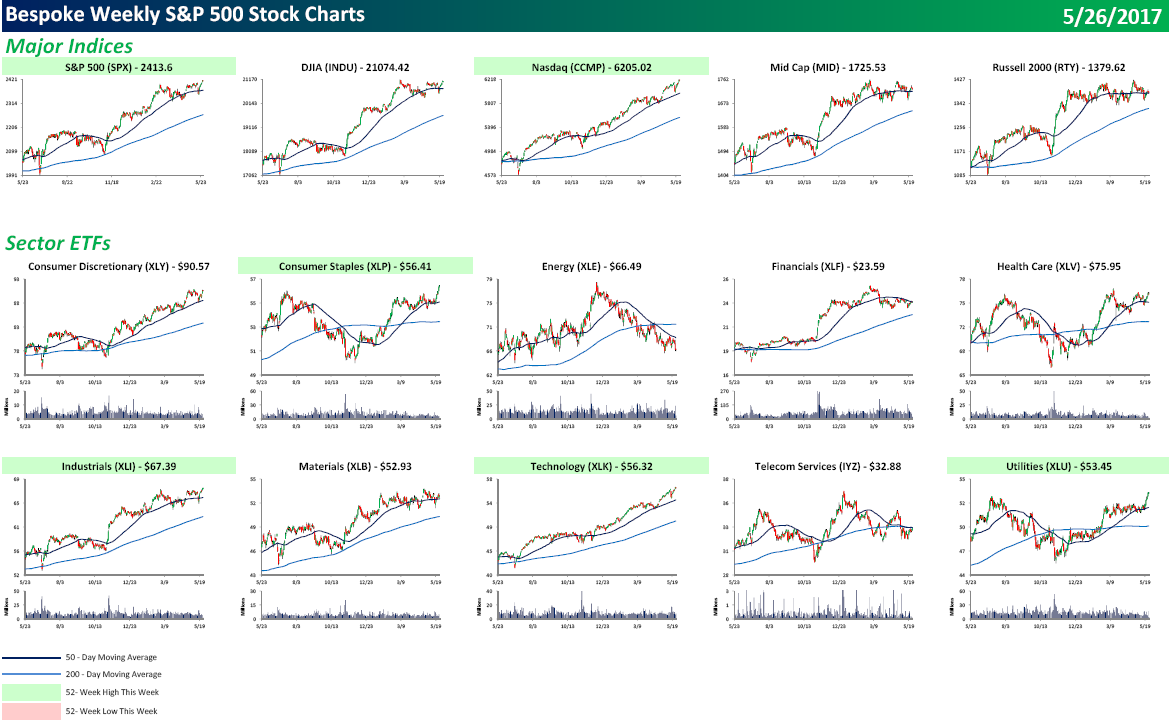
The Bespoke Report — 5/26/17
The Closer 5/26/17 – End of Week Charts
Looking for deeper insight on global markets and economics? In tonight’s Closer sent to Bespoke clients, we recap weekly price action in major asset classes, update economic surprise index data for major economies, chart the weekly Commitment of Traders report from the CFTC, and provide our normal nightly update on ETF performance, volume and price movers, and the Bespoke Market Timing Model. This week, we’ve added a section that helps break down momentum in developed market foreign exchange crosses.

The Closer is one of our most popular reports, and you can sign up for a free trial below to see it!
Click here to start your no-obligation two-week free Bespoke research trial now!
ETF Trends: International – 5/26/17
With OPEC’s deal to extend production cuts by 9 months not impressing the oil market, Energy-related equities were the worst performers on the week; 6 of the 7 worst performers were related to equities. GBP, broad commodity indices, and gold miners also declined. On the winning side of the slate over the last 5 days were Transports, Utilities, a smattering of EMs, Utilities, and momentum stocks.
Bespoke provides Bespoke Premium and Bespoke Institutional members with a daily ETF Trends report that highlights proprietary trend and timing scores for more than 200 widely followed ETFs across all asset classes. If you’re an ETF investor, this daily report is perfect. Sign up below to access today’s ETF Trends report.
See Bespoke’s full daily ETF Trends report by starting a no-obligation free trial to our premium research. Click here to sign up with just your name and email address.
S&P 500 Quick View Chart Book: 5/26/17
Each weekend as part of our Bespoke Premium and Institutional research service, clients receive our S&P 500 Quick-View Chart Book, which includes one-year price charts of every stock in the S&P 500. You can literally scan through this report in a matter of minutes or hours, but either way, you will come out ahead knowing which stocks, or groups of stocks, are leading and lagging the market. The report is a great resource for both traders and investors alike. Below, we show the front page of this week’s report which contains price charts of the major averages and ten major sectors.
To see this week’s entire S&P 500 Chart Book, sign up for a 14-day free trial to our Bespoke Premium research service.