Philly Fed Follows Empire Manufacturing South
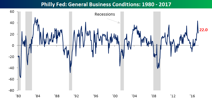
Today’s report on manufacturing in the Philadelphia region followed the trend of its sibling in New York and moved lower in April, posting a larger decline than expected. While economists were expecting the headline index to retreat from March’s multi-month high of 32.8 down to 22.5, the actual reading was slightly lower at 22.0. While both the Philly Fed and Empire Manufacturing reports declined this month, the Philly indicator still remains above levels it was at the end of 2016, even as the Empire Manufacturing report dropped to levels not seen since November.
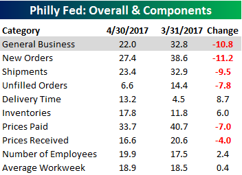 Breadth in this month’s report was also relatively weak, confirming the decline we saw in the headline reading. As shown in the table to the right, New Orders and Shipments both posted the largest declines, while the biggest increases came in Delivery Times and Inventories.
Start a 14-day free trial to unlock all of Bespoke’s market analysis.
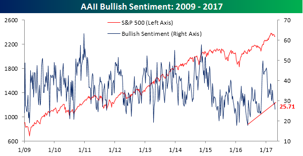
Bulls Break Down…Again
This shouldn’t come as a surprise to anyone, but as the market has come under selling pressure in the last several days, bullish sentiment on the part of individual investors has declined. According to the weekly AAII survey, bullish sentiment declined to 25.71% from 28.97%. That’s the lowest weekly print since the election and a record 120th straight week of sub-50% readings. Looking at the chart below, bullish sentiment has clearly broken its string of higher highs that had been in place since mid-2016.
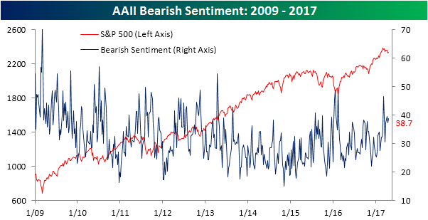
As bullish sentiment has declined, bearish sentiment has seen a small uptick, rising from 37.38% up to 38.70%. In this case, though, the chart of bearish sentiment doesn’t look nearly as significant as the chart of bullish sentiment shown above.
Start a 14-day free trial to unlock all of Bespoke’s market analysis.
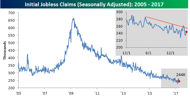
Jobless Claims Remain Low
 Read More
The Closer — Oil Order — 4/19/17
Log-in here if you’re a member with access to the Closer.
Looking for deeper insight on global markets and economics? In tonight’s Closer sent to Bespoke Institutional clients, we take a look at weekly oil market data from the EIA as well as Gallup Weekly Economic Confidence.

The Closer is one of our most popular reports, and you can sign up for a free trial below to see it!
The Closer is one of our most popular reports, and you can see it and everything else Bespoke publishes by starting a no-obligation 14-day free trial to our research!
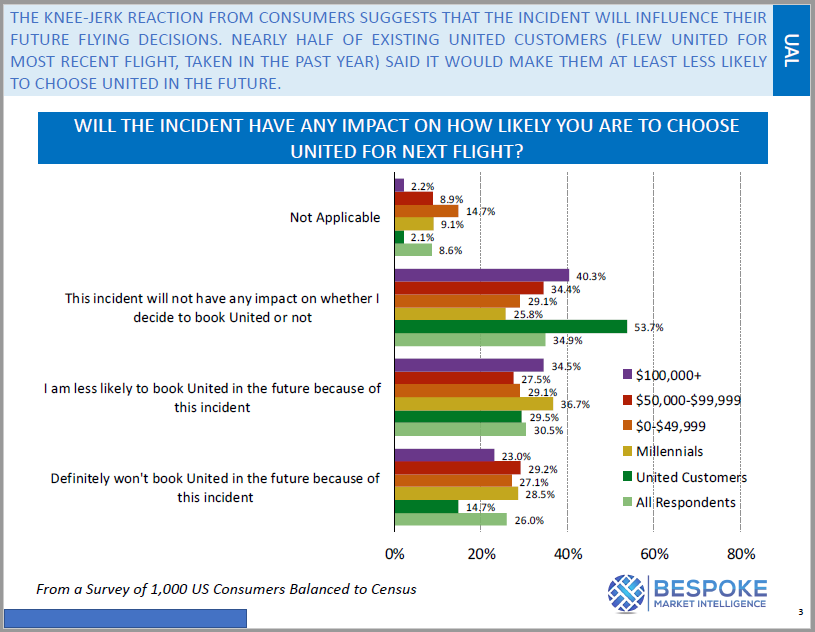
Consumer Reaction to United Airlines Passenger Removal Incident
On April 9th, airport police at Chicago O’Hare forcibly removed ticketed passenger David Dao from a United Express flight at the direction of United due to an overbooking situation. The incident was recorded on multiple smartphone devices and immediately went viral once it was posted to various social media platforms. The backlash was swift, and it only got worse after United Continental (UAL) CEO Oscar Munoz made comments about the passenger that were seen as unsympathetic.
Through our Bespoke Consumer Pulse unit, Bespoke has been able to quickly measure the impact that the incident is having on United’s reputation and bookings. We immediately began conducting a consumer survey (balanced to US census) following the video’s release, and below are three snapshots highlighting the survey’s results. Awareness of the incident approaches 90% at the $100k+ income level, and more than 50% of those making $100k+ in annual income said it will have a negative impact on their future flight bookings with United.
More than a quarter (26%) of consumers surveyed that had heard about the incident said they “definitely won’t book a flight with United in the future” as a result. That’s a big number!
So which airlines stand to benefit the most from United’s lost passengers? We’ll be sending Bespoke Consumer Pulse clients a report with the answer to that question. Click here to start a 30-day free trial if you’d like to see the report.


Fixed Income Weekly – 4/19/17
Searching for ways to better understand the fixed income space or looking for actionable ideals in this asset class? Bespoke’s Fixed Income Weekly provides an update on rates and credit every Wednesday. We start off with a fresh piece of analysis driven by what’s in the headlines or driving the market in a given week. We then provide charts of how US Treasury futures and rates are trading, before moving on to a summary of recent fixed income ETF performance, short-term interest rates including money market funds, and a trade idea. We summarize changes and recent developments for a variety of yield curves (UST, bund, Eurodollar, US breakeven inflation and Bespoke’s Global Yield Curve) before finishing with a review of recent UST yield curve changes, spread changes for major credit products and international bonds, and 1 year return profiles for a cross section of the fixed income world.
In this week’s note, we take a look at which states produce the best municipal bond returns. Below we map the 50 states, color-coded by returns. The indices are inclusive of all municipal issuers in each state, not just the state government issuers themselves.
Our Fixed Income Weekly helps investors stay on top of fixed income markets and gain new perspective on the developments in interest rates. You can sign up for a Bespoke research trial below to see this week’s report and everything else Bespoke publishes free for the next two weeks!
Click here to start your no-obligation free Bespoke research trial now!
The Tax Man Goeth
ETF Trends: US Sectors & Groups – 4/19/17
There’s been little change to the broad trend in the last couple days as South Africa, gold-linked ETFs, bonds, and oil all performing well. The worst performers in the ETF universe we track are still metals and steel-related ETFs: iron ore prices have dropped 30% in the space of less than two months. Banks, semis, and transports are all underperforming as well.

Bespoke provides Bespoke Premium and Bespoke Institutional members with a daily ETF Trends report that highlights proprietary trend and timing scores for more than 200 widely followed ETFs across all asset classes. If you’re an ETF investor, this daily report is perfect. Sign up below to access today’s ETF Trends report.
See Bespoke’s full daily ETF Trends report by starting a no-obligation free trial to our premium research. Click here to sign up with just your name and email address.
The Closer — Starts, Production, Surprises — 4/18/17
Log-in here if you’re a member with access to the Closer.
Looking for deeper insight on global markets and economics? In tonight’s Closer sent to Bespoke Institutional clients, we recap residential construction data, the Fed’s industrial production report for March, and a rollover in global economic surprise indices.
The Closer is one of our most popular reports, and you can sign up for a free trial below to see it!
The Closer is one of our most popular reports, and you can see it and everything else Bespoke publishes by starting a no-obligation 14-day free trial to our research!
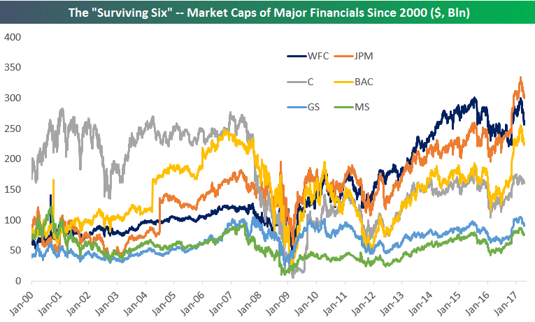
The “Surviving Six” — Changes in Market Cap of the Largest Banks and Brokers
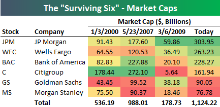 With most of the major financials reporting earnings within the past week, today we were looking at market cap levels for a group of stocks we’ll call the “Surviving Six” — the six big banks and brokers that suffered through but made it out of the depths of the Global Financial Crisis. The “Surviving Six” members are JP Morgan (JPM), Wells Fargo (WFC), Bank of America (BAC), Citigroup (C), Goldman Sachs (GS), and Morgan Stanley (MS).
At right is a table showing market cap levels for the “Surviving Six” at various points in time dating back to the start of the year 2000. Back then, Citigroup was on top by a wide margin with a market cap of $178 billion. JP Morgan (JPM) ranked second with a market cap that was half that of Citi’s. The next date highlighted in the table is May 23rd, 2007 — the day the Financial sector saw its peak prior to the collapse. On that date, Citi was still the largest of the group, but Bank of America (BAC) had moved up to 2nd with a market cap of $227.9 billion.
The third date highlighted is March 6th, 2009 — the low point of the Financial Crisis for the sector. In less than 2 years, Citi went from a market cap of $272 billion to just $5.64 billion. But hey, at least it survived! At the lows, JP Morgan (JPM) stood in first with a market cap of $59.9 billion, while Goldman (GS) had moved up to second at $38.2 billion.
Finally, today’s market caps are shown, with JP Morgan on top at just over $300 billion. Citi now ranks 4th at $162 billion, which is roughly $16 billion less than where it stood at the start of 2000. Notably, Morgan Stanley’s market cap is almost at the exact same level it was at back in 2000. Wells Fargo has impressively moved up the ranks over the years. Back in 2000, WFC was the 2nd smallest of the bunch, but now it ranks as the 2nd largest.
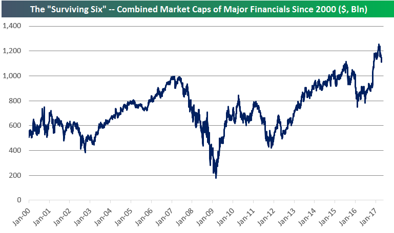
Below is a chart showing the historical market caps of the “Surviving Six” going back to 2000. It’s a fascinating look at the changing landscape of the industry over time. The second chart below shows the combined market caps of the six companies. While the S&P 500 Financial sector as a whole is still trading about 25% below its highs from 2007, you can see that the combined market caps of the “Surviving Six” has indeed taken out its 2007 high.
Start a 14-day free trial to unlock all of Bespoke’s financial markets research.