July 4th Week Returns: Fireworks or a Flop?
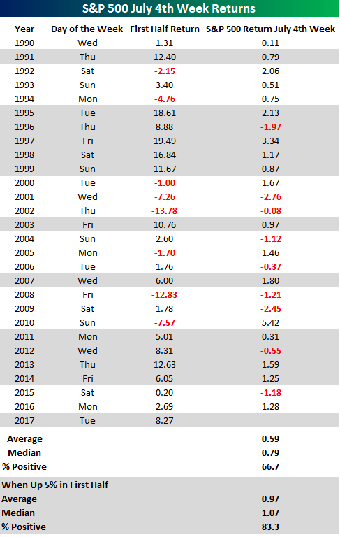
With July 4th coming around next Tuesday, we wanted to provide an update on market returns during the July 4th holiday week. Can we expect fireworks or a flop? The table below lists the S&P 500’s returns during the week of July 4th going back to 1990. For each year, we calculated the S&P 500’s return from the Friday before July 4th to the Friday after, and in those years where the 4th fell on a Friday, we calculated the return from the Friday before (6/27) through the Thursday before (7/3). As shown in the results, July 4th week has been a positive one for equity markets with the S&P 500 averaging a gain of 0.59% (median: +0.79%) and positive returns two-thirds of the time. The best July 4th week actually came back in 2010 when the S&P 500 was up over 5%. What was interesting about that week is that the strong performance came even as economic data during the week was skewed towards the negative side. Also, on the prior Friday, a well-known market strategist made a headline-grabbing call to sell stocks due to the worsening outlook for the US economy.
Given the S&P 500’s strong first half returns in 2017, we also looked at how the market performed in July 4th weeks that followed a strong first half. In the twelve prior years where the S&P 500 was up more than 5% in the first half of the year, July 4th week saw an average gain of 0.97% (median: 1.07%) with positive returns in all but two instances.
Want to see more analysis like this? Click here to start a no-obligation two-week free trial to our premium research platform.
The Closer — Nasty-daq, Twisted VIX, Growth Revised — 6/29/17
Log-in here if you’re a member with access to the Closer.
Looking for deeper insight on global markets and economics? In tonight’s Closer sent to Bespoke Institutional clients, we take a look at the technical picture for tech after big downdrafts today for large cap names in that sector. We also review today’s 3rd release of GDP for Q1.

The Closer is one of our most popular reports, and you can sign up for a free trial below to see it!
The Closer is one of our most popular reports, and you can see it and everything else Bespoke publishes by starting a no-obligation 14-day free trial to our research!
Bespoke’s Sector Snapshot — 6/29/17
We’ve just released our weekly Sector Snapshot report (see a sample here) for Bespoke Premium and Bespoke Institutional members. Please log-in here to view the report if you’re already a member. If you’re not yet a subscriber and would like to see the report, please start a 14-day trial to Bespoke Premium now.
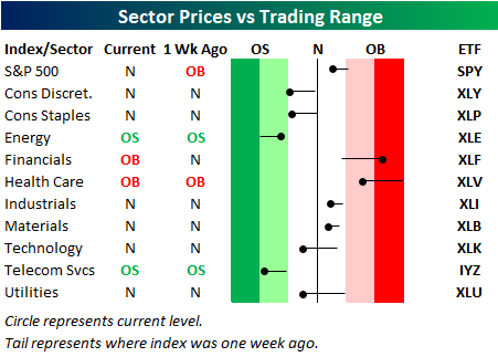
Below is one of the many charts included in this week’s Sector Snapshot, which highlights our trading range screen for the S&P 500 and ten sectors. For each sector, the dot represents where it’s currently trading, while the tail end represents where it was trading one week ago. The black vertical “N” line represents each sector’s 50-day moving average, and moves into the red or green zones are considered overbought or oversold.
As you can see, the S&P 500 has moved from overbought territory to neutral territory over the last week, and it has been led lower by Technology, Consumer Discretionary, Consumer Staples, and Utilities.
To see our full Sector Snapshot with additional commentary plus six pages of charts that include analysis of valuations, breadth, technicals, and relative strength, start a 14-day free trial to our Bespoke Premium package now. Here’s a breakdown of the products you’ll receive.
the Bespoke 50 — 6/29/17
Every Thursday, Bespoke publishes its “Bespoke 50” list of top growth stocks in the Russell 3,000. Our “Bespoke 50” portfolio is made up of the 50 stocks that fit a proprietary growth screen that we created a number of years ago. Since inception in early 2012, the “Bespoke 50” has beaten the S&P 500 by 45.0 percentage points. Through today, the “Bespoke 50” is up 120.1% since inception versus the S&P 500’s gain of 75.1%. Always remember, though, that past performance is no guarantee of future returns.
To view our “Bespoke 50” list of top growth stocks, sign up for Bespoke Premium ($99/month) at this checkout page and get your first month free. This is a great deal!

Chart of the Day: Corporate Profits Unimpressive?
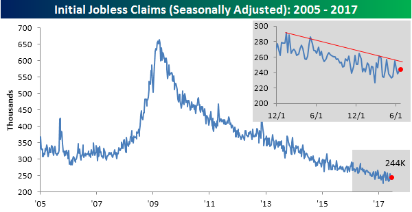
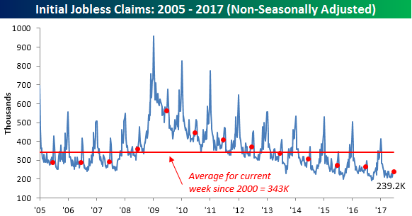
Jobless Claims Higher Than Expected But Still Sub 250K
Jobless claims came in higher than expected this week, rising to 244K from 242K. Make no mistake, though, with claims coming in below 250K for the fourth straight week and below 300K for the 121st straight week, claims are extraordinarily low by historical standards. Also, as shown in the inset chart below, claims continue to trend lower.
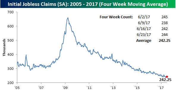
The four-week moving average for claims fell by 2.75K this week to 242.25K, which is 6.75K above the post-recession low of 235.5K seen six weeks ago back in mid-May.
On a non-seasonally adjusted (NSA) basis, jobless claims rose by just over 10K to 239.2K. While that’s up, at this time of year it is common for claims to increase, so for the current week of the year, the NSA reading was still more than 100K below its average since 2000 for the current week of the year, and the lowest weekly print for this specific week since 1973.
ETF Trends: US Indices & Styles – 6/29/17
After topping our list of worst performers last week, Coffee finds itself atop our list of best performers this week, up almost 9%. Oil ETFs made a similar transition, specifically DB Oil, which is up almost 6% after hitting a new 52-week low last week. Banks and Financials are other notable outperformers. On the losing side, Real Estate, Utilities, and Biotech are underperformers along with the US Dollar Index.

Bespoke provides Bespoke Premium and Bespoke Institutional members with a daily ETF Trends report that highlights proprietary trend and timing scores for more than 200 widely followed ETFs across all asset classes. If you’re an ETF investor, this daily report is perfect. Sign up below to access today’s ETF Trends report.
See Bespoke’s full daily ETF Trends report by starting a no-obligation free trial to our premium research. Click here to sign up with just your name and email address.
Market Hangs in Without Tech and FAANG
Remember all those stories earlier this year that the market was being powered by the performance of the large-cap technology sector and more specifically, the FAANG (originally FANG, but Apple was added after it started to rally) stocks? The “theory” was that if these stocks ever ran into trouble, look out below. Throughout this period, we took the opposite end of the argument and repeatedly highlighted that although the FAANG stocks were doing extremely well, overall breadth in the market was strong, indicating broad-based participation.
Well, this month we got the first test of the FAANG theory and how much or little it was holding up the market. Since the close on June 8th, the S&P 500 Technology sector has dropped 2.6% and the five FAANG stocks have declined over 4%.
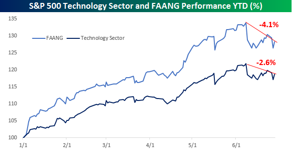
So how much did the overall market decline in reaction to the fall in the tech sector. Heading into Thursday’s trading, the S&P 500 is down less than half a percent.
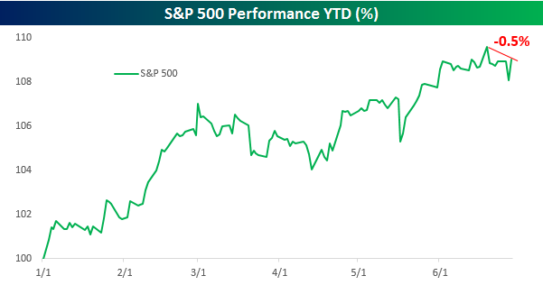
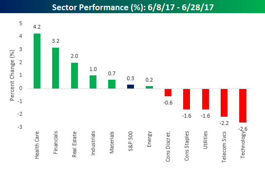
The key to the market’s resilience in the face of Tech’s weakness has been strength in sectors like Health Care (+4.2%), Financials (+3.2%), and Real Estate (+2.0%). In fact, while the S&P 500 is down half a percent from its bull market high, it is actually up 0.3% since the Technology sector peaked.
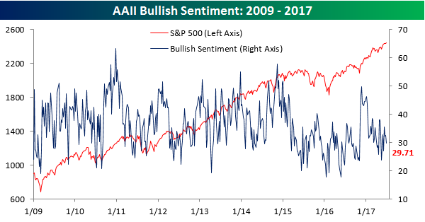
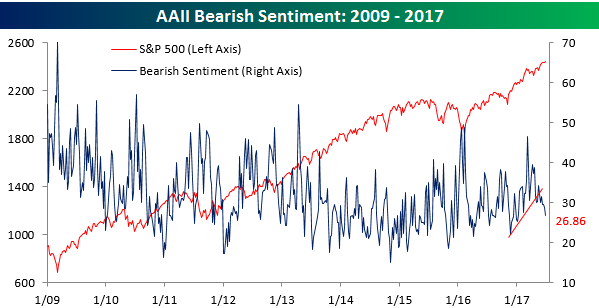
Notable Moves in Sentiment
The weekly sentiment survey results from AAII were just released, and while bullish sentiment is still nowhere near 50% and well below historical averages, there were some notable moves nonetheless. In terms of bullish sentiment, optimism declined this week falling from 32.65% down to 29.71% (what else is new). That now makes it a record 130 straight weeks where half of the investors surveyed were not bullish.
Even as bullish sentiment declined, bearish sentiment also shrank, falling from 28.91% down to 26.86%. That represents the lowest reading in bearish sentiment since the first week of the year. Looking at the chart, negative sentiment has really started to decline ever since that mini-uptrend was broken several weeks back.
With both the numbers of bulls and bears continuing to thin, there has been a bull market in neutral sentiment. In this week’s survey, the percentage of investors who couldn’t make up their minds ballooned to 43.43% or the highest reading since last August. Let’s just call them cautiously optimistic, or better yet, optimistically cautious.

The Closer — Dollar Dour, MSA Jobs, And Negative NIIP — 6/28/17
Log-in here if you’re a member with access to the Closer.
Looking for deeper insight on global markets and economics? In tonight’s Closer sent to Bespoke Institutional clients, we review which currencies have driven the 7.9% decline off January highs for the Bloomberg USD Index. We also review May metropolitan statistical area (MSA) employment and unemployment data from the BLS, and Q1 net international investment position data from the BEA.
The Closer is one of our most popular reports, and you can sign up for a free trial below to see it!
The Closer is one of our most popular reports, and you can see it and everything else Bespoke publishes by starting a no-obligation 14-day free trial to our research!