Bespoke’s Sector Snapshot — 4/27/17
We’ve just released our weekly Sector Snapshot report (see a sample here) for Bespoke Premium and Bespoke Institutional members. Please log-in here to view the report if you’re already a member. If you’re not yet a subscriber and would like to see the report, please start a 14-day trial to Bespoke Premium now.
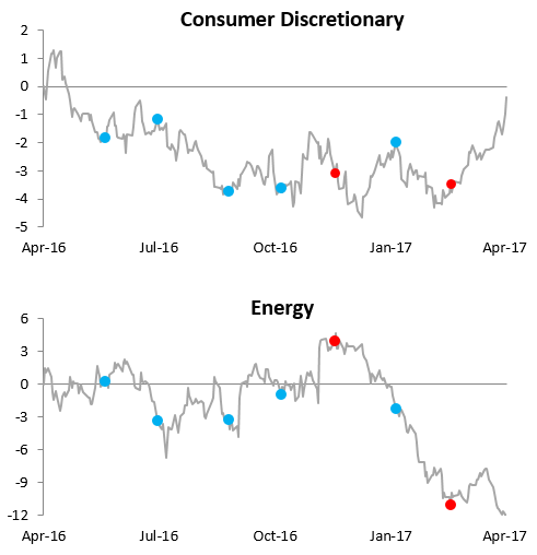
Below is one of the many charts included in this week’s Sector Snapshot, which highlights the relative strength versus the S&P 500 over the last year for the Consumer Discretionary and Energy sectors. When the line is rising, the sector is outperforming the S&P 500. When the line is falling, the sector is underperforming. As you can see, the relative strength for Consumer Discretionary has sky-rocketed over the last few weeks just as the Energy sector has fallen. There’s a clear shift going on in these two sectors.
To see our full Sector Snapshot with additional commentary plus six pages of charts that include analysis of valuations, breadth, technicals, and relative strength, start a 14-day free trial to our Bespoke Premium package now. Here’s a breakdown of the products you’ll receive.
B.I.G. Tips – Sell in May? Monthly Seasonality Report
ETF Trends: International – 4/27/17
European ETFs continue to dominate the best performance list thanks to their post-election bump but we should note most are off their best levels as the gains were added all at once but haven’t had a follow-on. Gold miners continue to suffer, down about 8%, while oil and energy ETFs also rank high on the list of best performers we track.

Bespoke provides Bespoke Premium and Bespoke Institutional members with a daily ETF Trends report that highlights proprietary trend and timing scores for more than 200 widely followed ETFs across all asset classes. If you’re an ETF investor, this daily report is perfect. Sign up below to access today’s ETF Trends report.
See Bespoke’s full daily ETF Trends report by starting a no-obligation free trial to our premium research. Click here to sign up with just your name and email address.
Chart of the Day: Intra-Month Performance in May
 Read More
the Bespoke 50 — 4/27/17
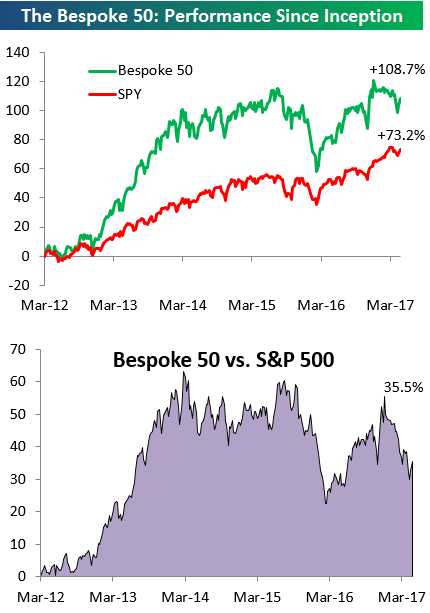
Every Thursday, Bespoke publishes its “Bespoke 50” list of top growth stocks in the Russell 3,000. Our “Bespoke 50” portfolio is made up of the 50 stocks that fit a proprietary growth screen that we created a number of years ago. Since inception in early 2012, the “Bespoke 50” has beaten the S&P 500 by 35 percentage points. Through today, the “Bespoke 50” is up 108.7% since inception versus the S&P 500’s gain of 73.2%. Always remember, though, that past performance is no guarantee of future returns.
To view our “Bespoke 50” list of top growth stocks, sign up for Bespoke Premium ($99/month) at this checkout page and get your first month free. This is a great deal!
An Anemic Year For Gas Prices
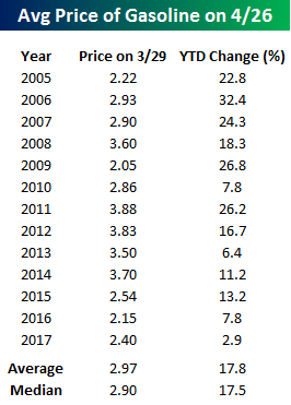 It may sound hard to believe, but one month from today marks the Saturday of Memorial Day Weekend. Memorial Day weekend typically marks the start to the summer driving season, so it is a time of year where gas prices increasingly become an area of focus. If you are planning to do much driving this year, though, you are in for a pleasant surprise at the pump when you go to fill up. Looking at the YTD change in gas prices so far this year, prices are only up 2.4%, which is the most anemic price increase at this point in the year we have seen going back to at least 2005. Since then, there have only been three other years where the YTD change through 4/26 was less than a double-digit percentage gain, and the average YTD change at this point in the year is 17.8% (median: 17.5%), so 2.9% is nothing!
While prices could certainly go up from here, if they follow anything close to the seasonal pattern, the window for price increases is rapidly coming to a close. The chart below compares the current YTD change in gas prices to a composite of the YTD change in prices for all years since 2005. As shown, prices typically rise in the first half of the year, peak in early June, move sideways for the summer, and then rapidly decline from Labor Day through year end. Therefore, if prices don’t increase much between now and early June, barring a major hurricane in the Gulf or a geopolitical shock, they are unlikely to get much of a lift in the summer.

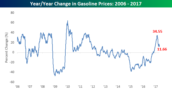
As far as the inflationary impact of gas prices in concerned, any upward pressure is likely to be contained going forward. The chart below shows the y/y change in gas prices since 2006. The surge in the y/y change that we saw towards the end of 2016 was similar to increases that we saw in other commodities and was a big contributor to the upward pressure in CPI. However, now that the base effects that contributed to the upward move in the CPI are running off, the pace of increase in y/y readings is quickly declining. After peaking out at a 34.55% y/y change in late February, gas prices are now up a relatively modest 11.7% y/y.
Bulls Get Their Groove
After dropping to its lowest level since the election, bullish sentiment on the part of individual investors surged by the most this week since the week after the election. According to the weekly survey from the American Association of Individual Investors (AAII), after just one-quarter of individual investors considered themselves bullish last week, more than 38% now put themselves in the bullish camp. So was it the French election that individual investors were so worried about (kidding)? Even with this week’s increase, a little perspective for this poll is in order, as it has now been 121 straight weeks since bulls were in the majority.
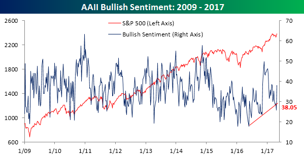
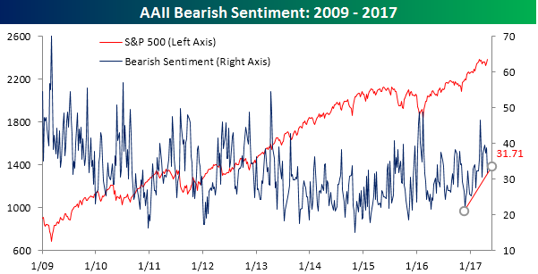
What we will be watching in this poll next week is what happens with bearish sentiment. In this week’s survey, bears decline from 38.7% down to 31.71%. Even after this week’s decline, the uptrend in bearish sentiment that has been in place since late last year remains in place (chart below). If that uptrend breaks, it could be a precursor for a move to a majority in the bullish camp.
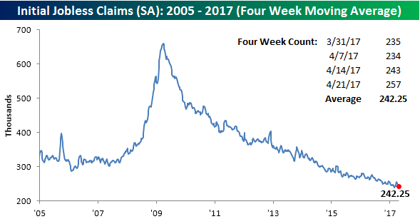
Jobless Claims Back Near Upper End of Downtrend Channel
After three solid reports, jobless claims for the latest week saw a relatively large jump, rising from 243K up to 257K. That’s considerably higher than economist estimates for a decline to 242K. As shown in the chart below, claims are now once again bumping up against the downtrend line that has been in place for some time now. Obviously, claims can’t go down forever, but this is a reading to watch closely in the next few weeks. Anything sideways would be fine, but a significant run higher would be bad news for bulls. This week’s report also covered the Easter holiday, so there’s also the possibility that the numbers were distorted by the holiday.
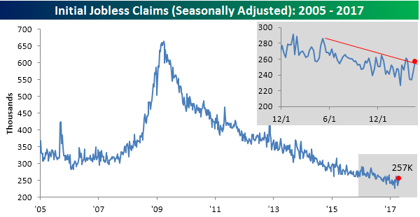
Even with the relatively large jump in claims, the four-week moving average actually declined from 242.75K down to 242.25K. That provides some consolation from the jump in the weekly reading, but a good number this week would have brought the four-week moving average to a new low (below 239.75K).
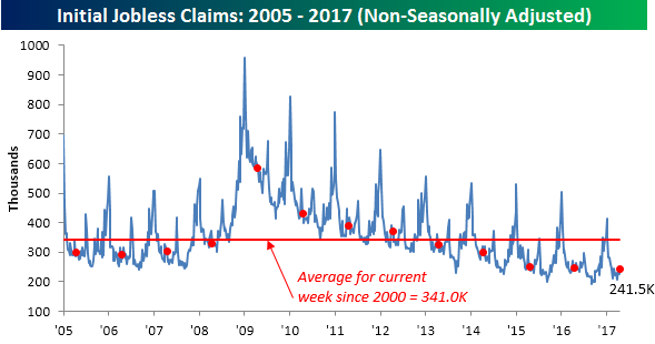
On a non-seasonally adjusted basis, jobless claims came in at 241.5K which was just under 100K below its historical average for the current week of the year since 2000.
The Closer — Western Hemisphere Wandering — 4/26/17
Log-in here if you’re a member with access to the Closer.
Looking for deeper insight on global markets and economics? In tonight’s Closer sent to Bespoke Institutional clients, we take a trip around North and South America, reviewing recent data and currency developments in Canada, Mexico, and Brazil before previewing a massive overnight data slate that includes 44 economic indicators and 3 central bank indicators released between now and the end of the day tomorrow.

The Closer is one of our most popular reports, and you can sign up for a free trial below to see it!
The Closer is one of our most popular reports, and you can see it and everything else Bespoke publishes by starting a no-obligation 14-day free trial to our research!
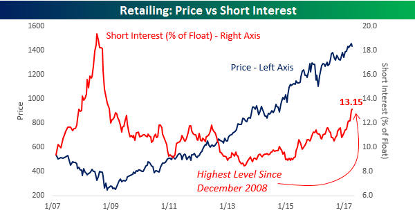
Shorts Still Piling Into Retail
The charts below are part of our semi-monthly update on short interest for stocks in the S&P 1500. To gain access to these charts for every sector and group in the S&P 1500, start a 14-day free trial to Bespoke’s research today!
Short interest figures for the middle of April were released after the close on Tuesday, and in what has become a consistent trend over the last several months, traders continue to pile into the Death By Amazon trade. The chart below compares the price of the S&P 1500 Retailing Index (left axis) to the average level of short interest (as a percentage of float) for stocks in the group (right axis). After hitting its lows for the bull market in mid-2013, the average level of short interest started trending higher and the pace really began to accelerate to the upside in early 2015. Since then, the pace of increase has only accelerated and currently stands at 13.15%. That’s the highest reading for the group since December 2008! Looking at the chart, it would appear as though investors who are shorting the group are getting taken out to the woodshed as the group’s price is right near bull market highs. This chart is quite misleading, though, as stocks like Amazon.com (AMZN) and Home Depot (HD) mask the overall trend. Underneath the surface, there is a lot of weakness in individual names.
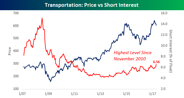
Another group that has seen a rather steady but unnoticed increase in its average level of short interest is the Transportation group. While short interest in these stocks is nowhere near as high as it is in the Retailing group, at a level of 6.56%, the group’s average short interest as a percentage of float is the highest it has been since November 2010.