Does This Sound Like a Slowing Economy
The ISM Services index for June was released earlier today, and like its manufacturing peer, the report was stronger than expected. While economists were expecting a headline reading of 56.5, the actual reading came in at 57.4 and just 0.2 points shy of the post-election high of 57.6. On a combined basis and accounting for each sector’s share of the overall economy, the ISM for June also came in at 57.4 up from 56.7 in May.
Click here to start a no-obligation two-week free trial to our premium research platform.
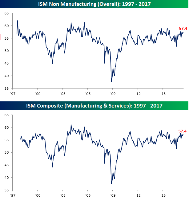
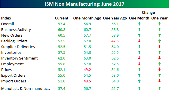
Looking at the internals of the report, most of the sub-indices in this month’s report also showed m/m increases. The only decliners on the month were Backlog Orders, Inventory Sentiment, and Employment. On the upside, the largest increases were in Inventories and Prices.
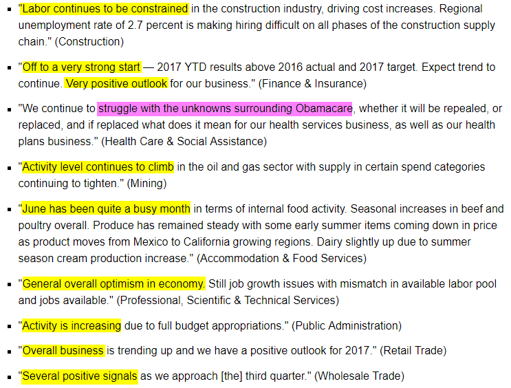
One of the most interesting aspects of this month’s report was the commentary. As shown below, despite some recent softness in economic data, there seems to be little in the way of concern on the part of respondents in the services sector. Besides uncertainty surrounding ObamaCare, activity appears to be strong and improving.
Finally, with regards to the commodities that were reported as being in short supply this month, can you see the trend?

the Bespoke 50 — 7/6/17
Every Thursday, Bespoke publishes its “Bespoke 50” list of top growth stocks in the Russell 3,000. Our “Bespoke 50” portfolio is made up of the 50 stocks that fit a proprietary growth screen that we created a number of years ago. Since inception in early 2012, the “Bespoke 50” has beaten the S&P 500 by 43.8 percentage points. Through today, the “Bespoke 50” is up 117.5% since inception versus the S&P 500’s gain of 73.7%. Always remember, though, that past performance is no guarantee of future returns.
To view our “Bespoke 50” list of top growth stocks, sign up for Bespoke Premium ($99/month) at this checkout page and get your first month free. This is a great deal!
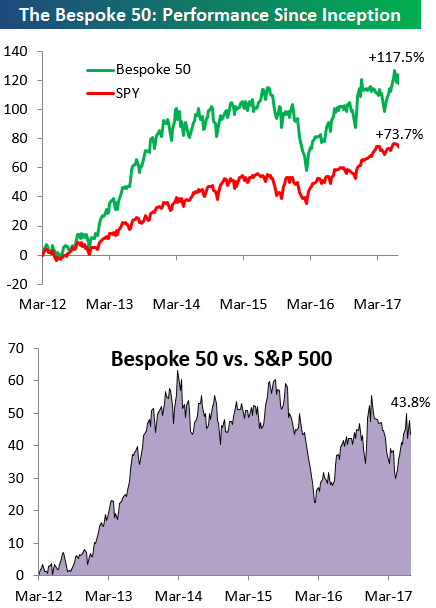
Chart of the Day: Should Bond Selling Spook Stocks?
Investor Sentiment Little Changed
There was unsurprisingly little change in investor sentiment this week given how slow it has been around the July 4th holiday. According to AAII, bullish sentiment fell by just 0.13 percentage points to 29.58%. That’s the fourth straight week that less than a third of individual investors have been bullish and a record 131 straight weeks where less than half of them have been optimistic towards equities.
Click here to start a no-obligation two-week free trial to our premium research platform.
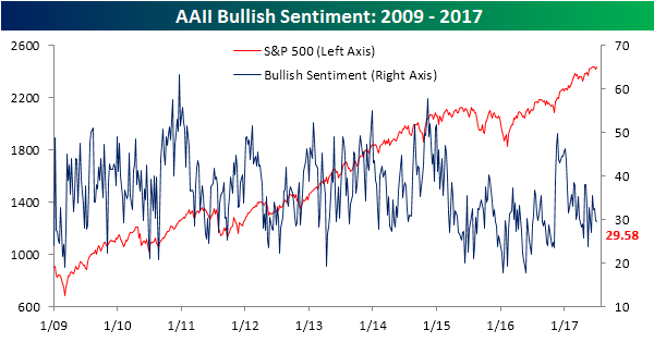
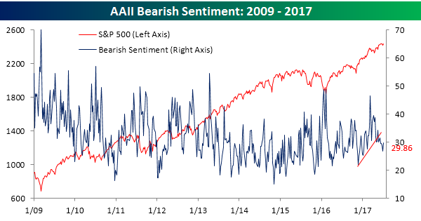
Bearish sentiment saw a larger move than bullish sentiment this week, but with a gain of just three points, the move was still small, and at a level of 29.86%, negative sentiment is nearly the exact same as bullish sentiment. You really can’t get more balanced than that!
Jobless Claims Slowly Drift Higher
Jobless Claims came in higher than expected this week (248K vs 244K), continuing the recent trend of a slow drift higher. The key word here is slow, as even though claims have risen for three straight weeks, they are only up by 10K during that span and remain below the longer term downtrend. Weekly claims still remain very low by historical standards as they have been below 250K for five straight weeks and nine of the last ten. On a longer-term time frame, claims have now been below 300K for 122 straight weeks.
Click here to start a no-obligation two-week free trial to our premium research platform.
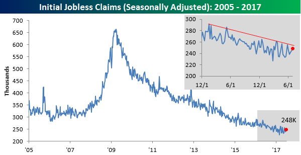
The four-week moving average increased by less than 1K this week to 243K. That’s still within 8K of the multi-decade low of 235.5K that was hit seven weeks ago in mid-May.

On a non-seasonally adjusted basis, first-time claims came in at 250.4K. That’s up over 10K from last week but is typical for this time of year. For the current week of the year, NSA claims are more than 100K below their average of 357K and haven’t been this low at this time of the year since 1973.

The Closer — Mexico, Markit, Minutes, Manufacturing — 7/5/17
Log-in here if you’re a member with access to the Closer.
Looking for deeper insight on global markets and economics? In tonight’s Closer sent to Bespoke Institutional clients, we review recovery in Mexican IMEF PMI series, global PMIs from Markit released over the last couple days, today’s Fed minutes, and the release of May Factory Orders this morning.

The Closer is one of our most popular reports, and you can sign up for a free trial below to see it!
The Closer is one of our most popular reports, and you can see it and everything else Bespoke publishes by starting a no-obligation 14-day free trial to our research!
Chart of the Day: Stratospheric Spring Wheat
“Run of the Mill” Market Returns
US equities have treated investors to healthy returns so far in 2017. And if you measure performance from either the Election or the lows in February 2016, things look even better. One of the issues with measuring market performance from an extreme high or low point is that very few people ever time the market perfectly to buy at the low. And even though it may seem like you always tend to buy things right at the exact top of the market, that is rarely the case either. In order to remove the appearance of cherry-picking returns, measuring performance based on the calendar removes these kind of biases.
Click here to start a no-obligation two-week free trial to our premium research platform.
Along those lines, the chart below shows the S&P 500’s current and average annualized total returns over the last one, two, five, ten, and twenty years. The last year has been fantastic for the bulls. With a gain of just under 18% on a total return basis, the S&P 500 has exceeded its average 12-month return by more than 800 basis points (bps). Those are extremely solid returns, but over other time frames, the returns aren’t nearly as good. For example, in the last two years, the S&P 500 has delivered an annualized gain of 10.7%, or only slightly more than the historical average of 10.4%. On a five-year time frame, returns are once again above average (14.6% vs 10.3%), but then when we go out over the last ten and twenty years, the 7.2% annualized return falls more than 300 bps short of the historical average.

To illustrate this another way, the chart below shows the current annualized returns of the S&P 500 and where they rank on a percentile basis versus all periods since the late 1920s. Even with a gain of 17.9% in the last year, the S&P 500’s one-year return ranks in just the 62nd percentile relative to all other one-year periods in its history. The best percentile rank of all the time periods is over the last five years where the 14.6% annualized gain ranks in the 67th percentile. Over the last two, ten, and twenty years, though, returns have been sub-par relative to history. The S&P 500’s two-year annualized gain of 10.7% ranks in just the 47th percentile, the ten-year 7.2% annualized gain ranks in just the 27th percentile, while the twenty-year return ranks in just the 8th percentile! In the S&P’s history, there haven’t been many twenty-year periods where performance has been worse than in the last twenty years.
Click here to start a no-obligation two-week free trial to our premium research platform.
![]()
Bespoke’s Consumer Pulse Report — June 2017
Bespoke’s Consumer Pulse Report is an analysis of a huge consumer survey that we run each month. Our goal with this survey is to track trends across the economic and financial landscape in the US. Using the results from our proprietary monthly survey, we dissect and analyze all of the data and publish the Consumer Pulse Report, which we sell access to on a subscription basis. Sign up for a 30-day free trial to our Bespoke Consumer Pulse subscription service here. With a trial, you’ll get coverage of consumer electronics, social media, streaming media, retail, autos, and much more. The report also has numerous proprietary US economic data points that are extremely timely and useful for investors.

B.I.G. Tips – It Happened Again…
In what has become an increasingly disheartening trend for investors and traders loaded up to the gills on tech stocks, while the DJIA traded up 0.60% on Monday, the Nasdaq lost ground all day and finished lower by nearly half a percent. Had the session not ended at 1 PM, the damage in Nasdaq could have been even worse. Monday’s underperformance was the third time in under a month that the Nasdaq underperformed what had been the out of favor Dow Jones Industrials by more than 1% in a given day.
Naturally, the Nasdaq’s recent underperformance has investors questioning whether the rotation represents a broader shift in investor sentiment out of the high multiple growth stocks and into more cyclical industrials. To help frame this issue, in a just published B.I.G. Tips report, we looked to see how uncommon (or common) it is to see the Nasdaq have multiple days of large underperformance (1%+) relative to the Dow in a four week period. Further, we also analyzed market performance in the period following each of these occurrences. The current period represents the fifth time during this bull market that we have seen the Nasdaq underperform the DJIA by more than 1% over a four-week span (chart below). For anyone interested in seeing this report, sign up for a monthly Bespoke Premium membership now!
