Bespoke Stock Seasonality – 7/17/17
Chart of the Day: Triple Play for New Highs
Bespoke Brunch Reads: 7/16/17
Welcome to Bespoke Brunch Reads — a linkfest of the favorite things we read over the past week. The links are mostly market related, but there are some other interesting subjects covered as well. We hope you enjoy the food for thought as a supplement to the research we provide you during the week.
See this week’s just-published Bespoke Report newsletter by starting a no-obligation two-week free trial to our premium research platform.
Economics
There Is No U.S. Wage Growth Mystery by Adam Ozimek (Economy.com)
While the unemployment rate has not been helpful predicting wage growth over the last couple of decades, when comparing ECI to prime-age employment rates Ozimek finds a very strong relationship. [Link]
Commentary on “Did the Fed’s Founding Improve the Efficiency of the U.S. Payments System?” by John A. James (St. Louis Fed)
A review of the differential between the value of the dollar across the United States prior to the introduction of the Fedwire, which unified the market. [Link; 8 page PDF]
The West Virginia Productivity Miracle. Really! by Tyler Cowen (Bloomberg)
While WV has low per capita income and lots of unemployment, lower cost of living and extremely high productivity from those employed suggest that looking down on the Appalachian state in all respects is a huge mistake. [Link]
The Hartz Myth: A Closer Look At Germany’s Labour Market Reforms by Christian Odendahl (CER)
A review of the impact of major labor market reforms in Germany during the early 2000s, which for both the good and the bad may get too much credit as driving that country’s economic outcomes since. [Link]
Baseball
A Team of Their Own by Jessica Luther (Bleacher Report)
Profiling a girls-only travel team and the experience of playing against the boys. [Link]
Odd Lots: How a Former Wall Street Trader Cracked the World of Betting on Baseball by Joe Weisenthal and Tracy Alloway (Bloomberg)
How a fund manager turned his book’s promotional budget into a winning strategy for betting in inefficient baseball markets. [Link]
Big Changes
The Decline of Marriage Is Hitting Vegas Hard by Jeanna Smialek (Bloomberg)
With increasing struggles for those in the middle and bottom of the income distribution, trips to Vegas for eloping couples have plunged in recent years. [Link]
ESPN, Broadcasters Are Said to Confront Football Ad Slump by Lucas Shaw (Bloomberg)
The sports ad market has nearly doubled since 2011, but ratings challenges and pullbacks from benchmark ad purchasers mean the NFL may see revenues decline in the coming season. [Link; auto-playing video]
Long After Protests, Students Shun the University of Missouri by Anemona Hartocollis (NYT)
Students seeking a low-stress cultural atmosphere in college have turned away from Missouri, where administration apathy and student protests fueled a confrontational environment that has turned off applicants on both sides of the issues confronted. [Link; soft paywall]
Mall Tour 2017 (Part II) by Harris Kupperman (Adventures In Capitalism)
A review of the plunging demand for anchor tenants in malls and what that could mean for the rest of the retail space. [Link]
Climate
If You Fix This, You Fix a Big Piece of the Climate Puzzle by Lisa Freidman (NYT)
What’s the best way to fight climate change? You might be surprised by the answer. [Link; soft paywall]
Long Reads
Racing the Storm: The Story of the Mobile Bay Sailing Disaster by Matthew Teague (Smithsonian Mag)
The grim tale of a yacht race caught in the maw of a brutal Gulf storm in the spring of 2015, filled with tales of harrowing survival and personal bravery. [Link]
The Surprisingly Resilient History of IGA, Which Gave Small Towns Groceries by Ernie Smith (Atlas Obscura)
The history of a national supermarket trail blazer. Given developments like Whole Foods buying Amazon or the entry of German discount chains Adli and Lidl to the US market, more pertinent than ever. [Link]
Boom Shaka Laka by Alex Abnos and Dan Greene (Sports Illustrated)
An oral history of groundbreaking NBA arcade game NBA Jam, a beloved relic of early 1990s sports fandom and video game enthusiasts alike. [Link]
Strange Geopolitics
Full transcript: Defense Secretary James Mattis’ interview with The Islander by Teddy Fischer (Mercer Island High School Islander)
When a Trump administration aide was photographed holding paper that was partially legible, Mercer Island student Teddy Fischer called and texted the number which purported to belong to Washington State native Secretary of Defense James Mattis. The result was a long interview and a memorable scoop for the student. [Link]
The Calibri Font Is Threatening to Bring Down Pakistan’s Government by Omer Benjakob (Haaretz)
Following the Panama Papers leak from law firm Mossack Fonseca, eventually leading to a Pakistani investigation of the Prime Minister’s daughter and a massive controversy based on the fonts used in documentary evidence. [Link]
Tech Behaving Badly
AI Is Making It Extremely Easy For Students To Cheat by Pippa Biddle (Wired)
Math has its own version of Cliff Notes, and the results make homework a lot less relevant in terms of gauging student progress. [Link]
Forget an IPO, Coin Offerings Are New Road to Startup Riches by Paul Vigna (WSJ)
A look at the fraud-ripe world of initial coin offerings, capital raisings which take place on blockchains outside the typical purview of regulation designed to protect investors. [Link; paywall]
Health Care
Senate Delays August Recess as Health Bill’s Fate Hangs in Balance by Kristina Peterson and Richard Rubin (WSJ)
With Republicans having a tough time forming consensus, the Senate effort to corral 50 votes is running out of calendar. [Link; paywall]
CEO’s response to employee taking mental health days triggers national dialogue by Megan Cerullo (NY Daily News)
The story of a woman who took some time off to take care of herself, and got the support of her CEO to do it. While this may seem trivial, it’s a revealing story with respect to how we think about mental health. [Link; auto-playing video]
Macro
15 Things Global Macro Investors Should Have Learned From The Great Financial Crisis And Its Aftermath by Mark Dow (Behavioral Macro)
Our first-ever guest on Bespokecast (episode link; 62 minute MP3 file) weighs in on how investors should have evolved thinking over the last 10 years or so. We don’t agree with every point necessarily but Mark writes clearly and has put some excellent thoughts to blog here. [Link]
Insurance
Introducing Cover, a consumer-centric insurance company by Karn Saroya (Cover)
A new company offers consumers the ability to shop for insurance by quickly walking around their home and letting algorithms detect which property needs protecting. [Link]
Language
This is Your Brain on Shakespeare by Daniel Honan (Big Think)
One of the most prolific and foundational writers of the English language isn’t just entertaining: his works also re-wire your brain. [Link]
Cheers to Whoever Snuck In That Star Trek Reference on Last Night’s Jeopardy by Beth Elderkin (io9)
An excellent – and profoundly important – episode of Star Trek got an oblique reference in an episode of Jeopardy this week which will bring a smile to the face of anyone that’s seen the episode. [Link]
Have a great Sunday!
Bespoke Report – 7/14/17 – Same Trend, Different Half
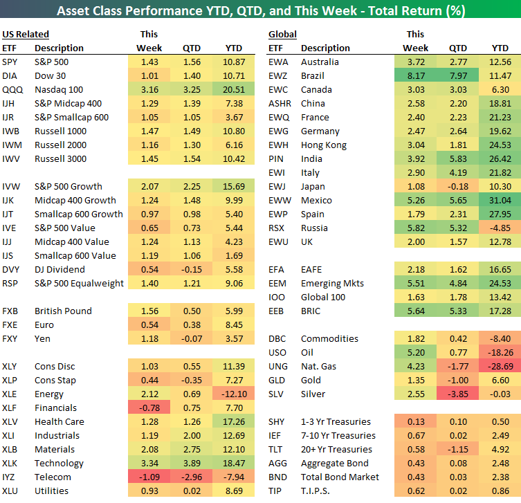
Whenever we enter a new season or phase of the calendar, we like to think of things getting off to a fresh start where everyone starts from the same point. It’s still early in the second half, but so far at least, most of the trends from Q1 remain in place this half. So much for the blank slate! Check out our ETF Matrix below to see how this has played out.
Take the Nasdaq 100 (QQQ) among US indices. YTD, QTD, and this week it is the top performing US index ETF. Among different US style ETFs, growth (IVW) leads the way in all three categories. As far as sectors are concerned, it is a similar picture as Technology (XLK), Health Care (XLV), Materials (XLB), and Industrials (XLI) are all near the top in all three categories. The one sector bucking the trend is Energy (XLE). While it is down the most YTD and lagging QTD, this week the sector outperformed every other ETF except Technology.
In International markets, it is a similar trend to a degree, except that just about everything is up, and you can thank the weakness in the US dollar for that. Finally, the Treasury market has seen middling returns, which is exactly the way it should be!
If you’d like to read our thoughts on recent performance plus the rest of this week’s Bespoke Report newsletter, take advantage of our one-month Bespoke Premium free trial offer. Sign up now at this page.
Have a great weekend!
The Closer: End of Week Charts — 7/14/17
Looking for deeper insight on global markets and economics? In tonight’s Closer sent to Bespoke clients, we recap weekly price action in major asset classes, update economic surprise index data for major economies, chart the weekly Commitment of Traders report from the CFTC, and provide our normal nightly update on ETF performance, volume and price movers, and the Bespoke Market Timing Model. This week, we’ve added a section that helps break down momentum in developed market foreign exchange crosses.

The Closer is one of our most popular reports, and you can sign up for a free trial below to see it!
Click here to start your no-obligation two-week free Bespoke research trial now!
Bespokecast Episode 14 — Herb Greenberg — Now Available on iTunes, GooglePlay, Stitcher and More
 We’re happy to announce that the newest episode of Bespokecast is now available to the general public both here and via the various podcast platforms. Be sure to subscribe to Bespokecast on your preferred podcast app to gain access to our full collection of episodes. We’d also love for you to provide a review as well!
In our newest conversation on Bespokecast, we sit down with Herb Greenberg of Pacific Square Research. Herb has had an unconventional career for an analyst, spending almost his entire career before founding Pacific Square as a journalist for a variety of news outlets including CNBC, The San Francisco Chronicle, and Crain’s Chicago Business. It was fascinating to hear his perspective on the intellectual task of evaluating companies, and how his earlier endeavors as a reporter helped to shape that approach. We also talked about the differences between Miami and California, the time management challenge of writing research, and some of the name’s he’s focused on recently. We hope you enjoy the conversation! You can also join a huge following Herb has on Twitter here. Please note that not all podcasting services pick up our episodes right away, so there may be a small delay between when you read this and when the podcast hits your feed. You can listen to the current episode immediately by clicking the button below.
To listen to our newest episode or subscribe to the podcast via iTunes, GooglePlay, OvercastFM, or Stitcher, please click the button or links below.

S&P 500 Quick-View Chart Book — 7/14/17
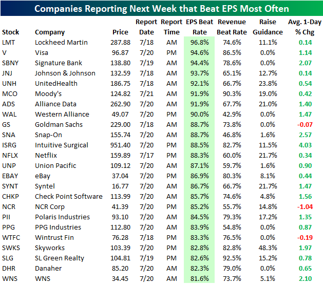
These Companies Beat Earnings the Most Often
Using our Interactive Earnings Calendar, below is a list of the stocks reporting earnings next week that have historically beaten consensus analyst earnings estimates the most often. To make the list, the company must have at least 5 years (20 quarters) worth of earnings reports.
As shown, Lockheed Martin (LMT) is an earnings beast with a 96.8% beat rate. Since 2001, Lockheed has reported 63 times and it has only missed estimates once! Even more remarkably, the stock has beaten estimates on every quarterly report since April 2004, which is 53 quarterly beats in a row!
Visa (V), SBNY, JNJ, UNH, MCO, ADS, and WAL are the additional companies reporting next week that have EPS beat rates of 90% or more. These stocks simply deliver! All eight of them have historically averaged a gain on their earnings reaction days as well (far right column).
Other key stocks that make the list include Goldman Sachs (GS), Netflix (NFLX), eBay (EBAY), Intuitive Surgical (ISRG), and Check Point Software (CHKP).
Start a two-week free trial to Bespoke’s research platform to see more earnings season analysis.
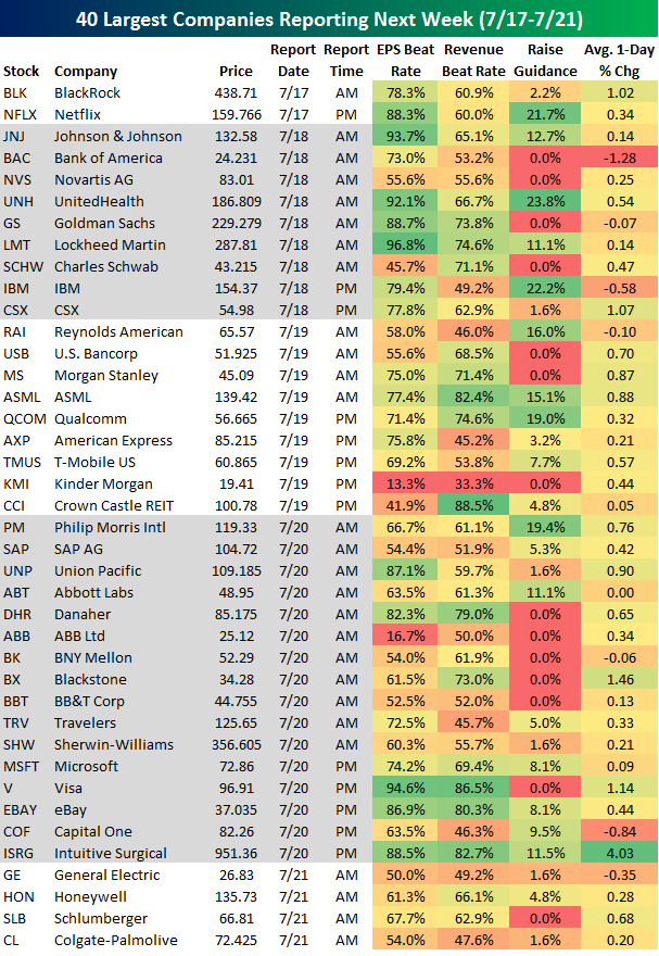
Key Earnings to Watch Next Week
Using our Interactive Earnings Calendar, below is a list of the 40 largest companies set to report earnings next week. On Monday we kick things off with Blackrock (BLK) in the morning and Netflix (NFLX) after the close. JNJ, Bank of America (BAC), Goldman (GS), and IBM are the biggest names on deck for Tuesday, while Morgan Stanley (MS), Qualcomm (QCOM), and American Express (AXP) take the lead on Wednesday. Thursday is the busiest day next week with companies like Microsoft (MSFT), eBay (EBAY), Visa (V), and Travelers (TRV) set to report, and then General Electric (GE), Honeywell (HON), and Schlumberger (SLB) close out the week on Friday.
Of the stocks listed below, Lockheed Martin (LMT), Johnson & Johnson (JNJ), UnitedHealth (UNH), and Visa (V) have historically beaten earnings estimates at the highest rate (all above 90%), while Intuitive Surgical (ISRG) has historically reacted the most positively on its earnings reaction day (far right column). Bank of America (BAC), IBM, and Capital One (COF) have historically reacted the most negatively on their earnings reaction days.
ETF Trends: US Indices & Styles – 7/14/17
Six countries lead our list of best performing ETFs in this week’s ETF Trends Report, most notably Brazil, Turkey, and South Africa, who are all up more than 7%. Oil and Steel are other noteworthy outperformers. Banks, Telecoms, and Financials are among the worst performing ETFs this week. Interestingly, only 14 of the ETFs that we track saw decreases.

Bespoke provides Bespoke Premium and Bespoke Institutional members with a daily ETF Trends report that highlights proprietary trend and timing scores for more than 200 widely followed ETFs across all asset classes. If you’re an ETF investor, this daily report is perfect. Sign up below to access today’s ETF Trends report.
See Bespoke’s full daily ETF Trends report by starting a no-obligation free trial to our premium research. Click here to sign up with just your name and email address.