Jobless Claims Exceptionally Strong
Jobless claims came in slightly better than expected this week, falling from 245K down to 240K compared to expectations of 243K. It has now been nine weeks that claims have been at or below 250K, but more importantly, it was the 126th straight week that claims were under 300K. That hasn’t happened since 1970!
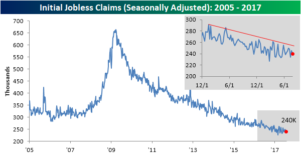
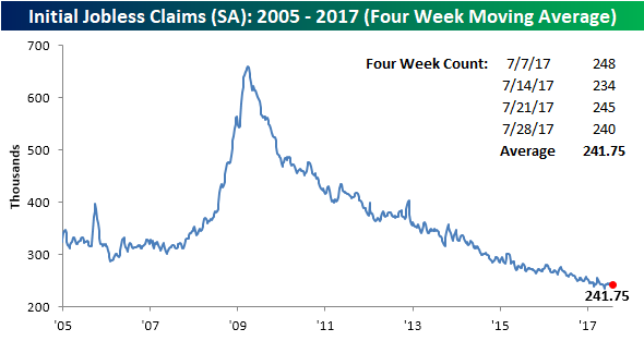
With this week’s decline, the four-week moving average dropped down to 241.75K, which is just over 6K more than the multi-decade low of 235.5K that was hit eleven weeks ago. While claims are close to a new low, don’t expect that level from mid-May to go down anytime soon.
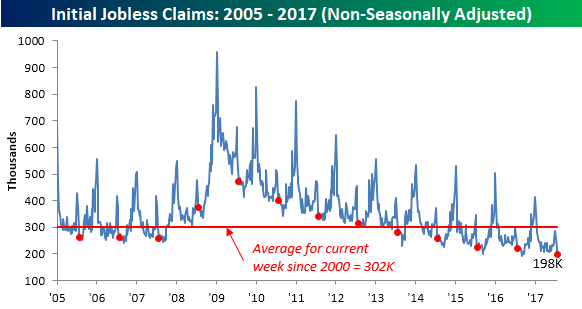
The real headline in this week’s report was in the non-seasonally adjusted reading, where claims dropped below 200K! That’s a pretty amazing feat for any time of the year, but for the current week of the year, it’s more than 100K below the average of 302K going back to 2000. And guess when the last time claims were this low for the current week of the year? The answer to that question is NEVER! Or at least not since they have been tracking jobless claims going all the way back to 1968!
Bespoke CNN and CNBC Appearances (8/3/17)
Bespoke co-founder Paul Hickey appeared on CNN’s OutFront with Erin Burnett and CNBC’s Power Lunch on Thursday to discuss our market thoughts. To view either of the segments, please click on the images below.


the Bespoke 50 — 8/3/17
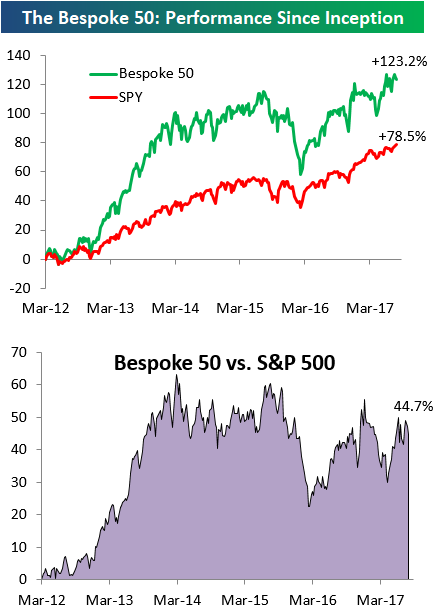
Every Thursday, Bespoke publishes its “Bespoke 50” list of top growth stocks in the Russell 3,000. Our “Bespoke 50” portfolio is made up of the 50 stocks that fit a proprietary growth screen that we created a number of years ago. Since inception in early 2012, the “Bespoke 50” has beaten the S&P 500 by 44.7 percentage points. Through today, the “Bespoke 50” is up 123.2% since inception versus the S&P 500’s gain of 78.5%. Always remember, though, that past performance is no guarantee of future returns.
To view our “Bespoke 50” list of top growth stocks, sign up for Bespoke Premium ($99/month) at this checkout page and get your first month free. This is a great deal!
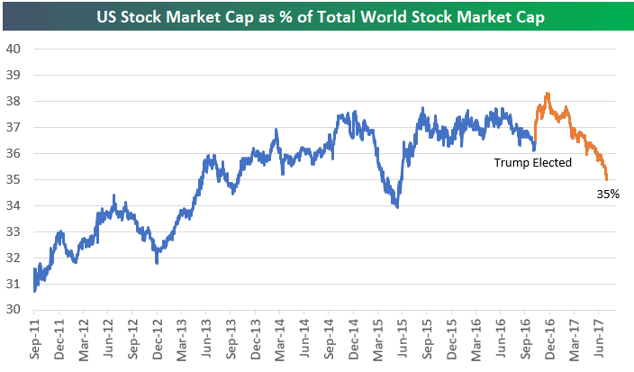
US Stock Market Continues to Lose Ground Versus Rest of World
With the drop in the US dollar and the outperformance of international stocks, the US stock market is losing share versus the rest of the world even though it’s in rally mode. While the S&P 500 is up 10% year-to-date, the United States’ stock market cap as a percentage of total world stock market cap has dropped from 37.70% all the way down to 35% so far this year.
Just after Trump’s victory last November, the US quickly gained a lot of market cap versus the rest of the world, but that gain has more than evaporated at this point. Since the election, the US has now lost more than one and a half percentage points of world stock market cap share. That’s the opposite of what Trump was hoping for. So even though the President has been touting the stock market’s gain lately, when you look closely, it has actually lost share versus the rest of the world since his victory.
The Closer — When & What In US Stocks, EIA Review — 8/2/17
Log-in here if you’re a member with access to the Closer.
Looking for deeper insight on global markets and economics? In tonight’s Closer sent to Bespoke Institutional clients, we review today’s EIA petroleum market report data, some interesting equity market trends, and review the post-meeting return of Fed speakers to the headlines.

The Closer is one of our most popular reports, and you can sign up for a free trial below to see it!
See today’s post-market Closer and everything else Bespoke publishes by starting a no-obligation 14-day free trial to our research platform!
ETF Trends: International – 8/2/17
Coffee and Brazil lead the charge this week among the universe of ETFs we track daily. JO and EWZ are the only ETFs that are up over 2% on a 5 day basis. They are joined by other notable outperformers Oil, Japan, and Insurance. Biotech has been trending downward as of late, and tops our list of worst performers this week. Metals, Transports, and Natural Gas also continue to see losses.


Bespoke provides Bespoke Premium and Bespoke Institutional members with a daily ETF Trends report that highlights proprietary trend and timing scores for more than 200 widely followed ETFs across all asset classes. If you’re an ETF investor, this daily report is perfect. Sign up below to access today’s ETF Trends report.
See Bespoke’s full daily ETF Trends report by starting a no-obligation free trial to our premium research. Click here to sign up with just your name and email address.
Fixed Income Weekly – 8/2/17
Searching for ways to better understand the fixed income space or looking for actionable ideals in this asset class? Bespoke’s Fixed Income Weekly provides an update on rates and credit every Wednesday. We start off with a fresh piece of analysis driven by what’s in the headlines or driving the market in a given week. We then provide charts of how US Treasury futures and rates are trading, before moving on to a summary of recent fixed income ETF performance, short-term interest rates including money market funds, and a trade idea. We summarize changes and recent developments for a variety of yield curves (UST, bund, Eurodollar, US breakeven inflation and Bespoke’s Global Yield Curve) before finishing with a review of recent UST yield curve changes, spread changes for major credit products and international bonds, and 1 year return profiles for a cross section of the fixed income world.
In this week’s note, we take a look at some divergences between real yield differentials and FX rates.
Our Fixed Income Weekly helps investors stay on top of fixed income markets and gain new perspective on the developments in interest rates. You can sign up for a Bespoke research trial below to see this week’s report and everything else Bespoke publishes free for the next two weeks!
Click here to start your no-obligation free Bespoke research trial now!
July 2017 Headlines
Bespoke’s Global Macro Report — 8/2/17
Bespoke’s Global Macro Dashboard is a high-level summary of 22 major economies from around the world. For each country, we provide charts of local equity market prices, relative performance versus global equities, price to earnings ratios, dividend yields, economic growth, unemployment, retail sales and industrial production growth, inflation, money supply, spot FX performance versus the dollar, policy rate, and ten year local government bond yield interest rates. The report is intended as a tool for both reference and idea generation. It’s clients’ first stop for basic background info on how a given economy is performing, and what issues are driving the narrative for that economy. The dashboard helps you get up to speed on and keep track of the basics for the most important economies around the world, informing starting points for further research and risk management. It’s published weekly every Wednesday at the Bespoke Institutional membership level.
Click here to start a no-obligation two-week free trial to Bespoke Institutional!

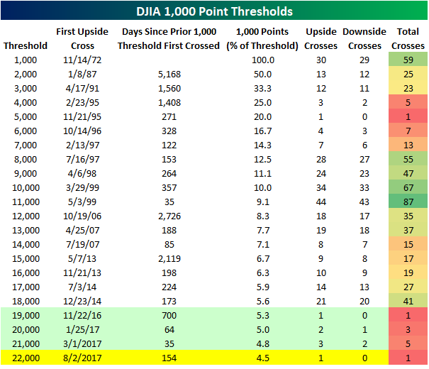
19K, 20K, 21K, 22K…
The thousand point thresholds are dropping like flies these days. With the caveat that a thousand points becomes an increasingly small percentage of the overall index as prices rise, the DJIA just crossed its fourth 1,000 point threshold since Trump’s election last November. The table below shows the date that the DJIA has first crossed each 1,000 point threshold on a closing basis since it first closed above 1,000 back on 11/14/72. For each threshold, we show the date the DJIA first closed above that threshold, how many days transpired between that cross and the prior 1,000 point threshold, the percentage that each thousand point threshold represents of the index’s price, and then how many upside and downside crosses the DJIA has had with each level.
Since the election, the DJIA has now crossed four thousand point thresholds, and with each one, there has been very little in the way of looking back. For instance, once the DJIA crossed 19,000 it never closed back below that level. For 20,000, once it crossed that level, it only closed below it again once, while 21,000 only saw two subsequent closes. In looking for comparable periods, the current period is somewhat similar to the late 1990s, when the DJIA also crossed several 1,000 point thresholds in very short order. In the current period, these levels have been coming and going a lot faster, but again, it’s also important to remember that they represent a much smaller percentage of the overall index’s value than the levels that were crossed in the 1990s. Finally, while it may seem as though the move from 21K to 22K was quick, at 154 calendar days (if that level holds between now and the closing bell), it was nearly five times longer than the time that elapsed between 20K and 21K (35 days) and two and a half times longer than the time it took to go from 19K to 20K.