The Closer — Confidence, New Home Price Highs, And Mo-EUR — 8/29/17
Log-in here if you’re a member with access to the Closer.
Looking for deeper insight on global markets and economics? In tonight’s Closer sent to Bespoke Institutional clients, we take a look at consumer confidence and US home prices before reviewing the correlation between EUR and trans-Atlantic yield curves.

The Closer is one of our most popular reports, and you can sign up for a free trial below to see it!
See today’s post-market Closer and everything else Bespoke publishes by starting a no-obligation 14-day free trial to our research platform!
Bespoke Stock Scores: 8/29/17
ETF Trends: Fixed Income, Currencies, and Commodities – 8/29/17
Gold Ratios
Summer may be ending, but that means you can take advantage of our Labor Day Special and receive a month of full access to any one of our research services for just $1 and then 20% off for the life of the subscription!
The GLD ETF that tracks the yellow metal is now up 13% year-to-date after breaking out of a sideways range yesterday. Check out the chart for GLD below. (Remember, you can use Bespoke’s new Interactive Chart Tool for free at any time.)

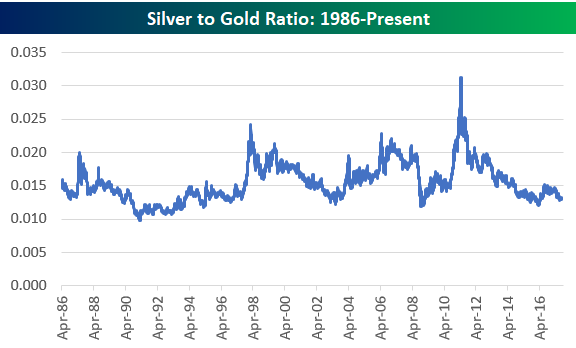
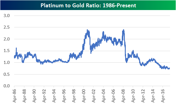
We like to look at gold price ratios compared to other metals, and below we’ve charted the historical silver-to-gold ratio and platinum-to-gold ratio. When the line is rising in the charts below, it means gold is underperforming the other metal. When the line is falling, it means gold is outperforming.
As you can see, both silver and platinum have been underperforming gold for years now. The silver-to-gold ratio is right at the bottom of its 30-year range, while the platinum-to-gold ratio has been making new multi-decade lows for the last two years. Remember when platinum was considered more precious than gold? Even though platinum is 30x as rare as gold, it currently trades at just 75% of the price of gold. At multiple points in the mid-2000s, platinum traded close to 2.5x the price of gold. Given that platinum has more uses than gold in the industrial economy, you definitely wouldn’t expect the ratio to be at record lows multiple years into the current economic expansion. At least based on its historical average ratio of 1.34x the price of gold, platinum looks cheap to us on a relative basis. Unfortunately, it has looked cheap for quite some time now!
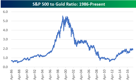
For those interested, below is a chart of the S&P 500 to gold ratio. Throughout the entire equity bull market that we’ve been in since 2009, this ratio hasn’t been able to break solidly above 2x. At the end of the Dot Com bubble back in early 2000, this ratio was over 5.5x!
Consumer Confidence Climbs
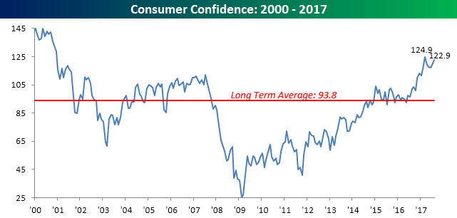
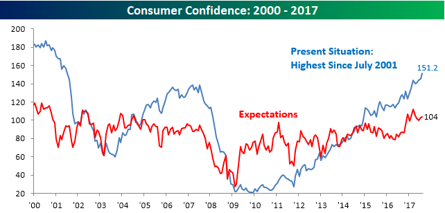
Even as headlines have been chaotic this month, Consumer Confidence rebounded and remains right near its highs for the cycle. While economists were forecasting the August reading to come in at a level of 120.7, the actual reading came in at 122.9, which is the second highest reading of the cycle, behind only the 124.9 reading from March.
Summer may be ending, but that means you can take advantage of our Labor Day Special and receive a month of full access to any one of our research services for just $1 and then 20% off for the life of the subscription!
Breaking out this month’s report by Present Conditions and Expectations, consumers are more optimistic about the present than they are of the future, but that’s actually been a pretty common trend in the last few years. While the index for Expectations is also right near its highs for the cycle, the Present Situation index ticked up to 151.2, which is the highest monthly reading since July 2001.
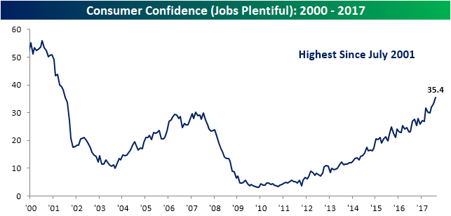
The reason for this optimism on the part of consumers is primarily due to jobs. In August, 35.4% of consumers considered jobs to be plentiful, and that is also the highest reading since July 2001. Additionally, if you look closely at the chart, you can see how much it has surged in recent months. In fact, there have only been five other periods since the late 1960s where the percentage of consumers considering jobs to be ‘plentiful’ saw a similar or greater increase during a six-month span.
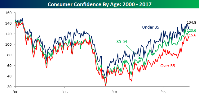
Broken out by age, the recent Consumer Confidence readings have been quite interesting. Generally speaking, younger consumers who have their whole careers ahead of them are usually more optimistic than older consumers near the end of their working years. In the last several months, though, sentiment among older consumers has been improving at a much faster rate than younger consumers. In this month’s report, the confidence index for consumers over the age of 55 increased to a new cycle high and the best level in over 17 years.
Our last chart shows how the trend in confidence by age has really shifted in the last several months. In it, we show the six-month spread between confidence for those under the age of 35 and those over 55. While this spread bottomed at just over 10 percentage points in the early months of Obama’s Presidency, it steadily climbed throughout his two terms in office and actually peaked right around election day. Since then it has cratered by more than half in an incredibly short span of time. While Obama may have lifted the spirits of younger Americans, Trump has clearly had a positive impact on older Americans.
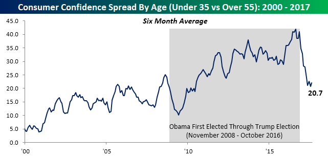
Chart of the Day: Jobs, Jobs Jobs
Moving Averages On the Downturn
A key trait of the S&P 500’s strong performance this year has been that the major moving averages of the index and its industry groups have all been trending higher. In fact, there hasn’t been a single day all year where the S&P 500’s 50 or 200-day moving average (DMA) was lower than it was the week before. That’s indicative of a solid overall trend, but lately, there have been some cracks in the armor that we have been highlighting to clients over the last couple of weeks.
From a longer-term perspective, practically every industry group has a rising 200-day moving average. As shown in the chart below, just last week the percentage of industry groups with rising 200-day moving averages increased to over 95%. The last time we saw a stronger reading was back in November 2014. Now if only we could get Energy’s 200-DMA to turn. Then we’d be up to 100%!
Summer may be ending, but that means you can take advantage of our Labor Day Special and receive a month of full access to any one of our research services for just $1 and then 20% off for the life of the subscription!

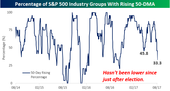
While the long-term trends are still to the upside, we have seen the trend in short-term moving averages really start to shift. The chart below is the same as the one above, except that instead of looking at the percentage of industry groups with rising 200-DMAs, we used a shorter term 50-DMA instead. Here the picture has really deteriorated in the last few weeks. After getting as high as 95.8% earlier this year, at the June and August peaks, the percentage only reached as high as 88%. But after that second peak in early August, the percentage of industry groups with rising 50-DMAs has come crashing down to just 33.3% as of this morning. That’s the weakest reading we have seen since the days just after the election.
The Closer — Harvey’s Impact — 8/28/17
Log-in here if you’re a member with access to the Closer.
Looking for deeper insight on global markets and economics? In tonight’s Closer sent to Bespoke Institutional clients, we review the inflation implications of the price cut Amazon announced for Whole Foods today (negligible), the miss in existing home sales today (significant), mortgage delinquencies (up) and the impact of Harvey on energy markets (big).
The Closer is one of our most popular reports, and you can sign up for a free trial below to see it!
See today’s post-market Closer and everything else Bespoke publishes by starting a no-obligation 14-day free trial to our research platform!