S&P 500 Back Above 50-DMA; Breadth Not Quite Caught Up
Summer may be ending, but that means you can take advantage of our Labor Day Special and receive a month of full access to any one of our research services for just $1 and then 20% off for the life of the subscription!
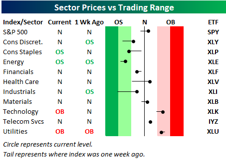
As shown in our sector trading range screen below, the S&P 500 has re-taken its 50-day moving average as we get set to begin the last trading day of August. (For reference, the black, vertical “N” line represents each sector’s 50-day moving average. The dot represents where each sector is currently trading, while the tail end represents where it was trading one week ago.)
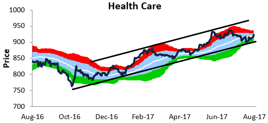
While the S&P is back above its 50-day, some key cyclical sectors remain below their 50-days. These include Consumer Discretionary, Energy, Financials, and Industrials. Fortunately, both Health Care and Technology — the two largest sectors — are solidly back above their 50-days
Below is an updated snapshot of a key breadth measure we track — the percentage of stocks trading above their 50-day moving averages. While the S&P 500 is back above its 50-day moving average on a price basis, as shown below, less than 50% of the stocks in the index are trading above their 50-days. This is a slightly negative breadth divergence.
The most defensive sector of the market — Utilities — currently has the strongest breadth, while Technology ranks second at 66%. If it weren’t for Tech’s massive outperformance this year, the market would be in a much different — darker — place.
On the downside, Energy has the weakest breadth with just 25% of stocks above their 50-days. The Financial sector remains weak as well at 36%.

As mentioned above, both Tech and Health Care are trading back above their 50-day moving averages. These two sectors currently have the most attractive chart patterns in our view. Tech is in the midst of another breakout, while Health Care is swinging higher within a long-term uptrend channel.

On another note, Tech’s weighting in the S&P 500 is now all the way up to 23.5%, while Health Care has just moved into second place with a weighting of 14.5%. The Financial sector has slipped into third with a weighting of 14.3%.

Don’t forget to take advantage of our Labor Day Special!
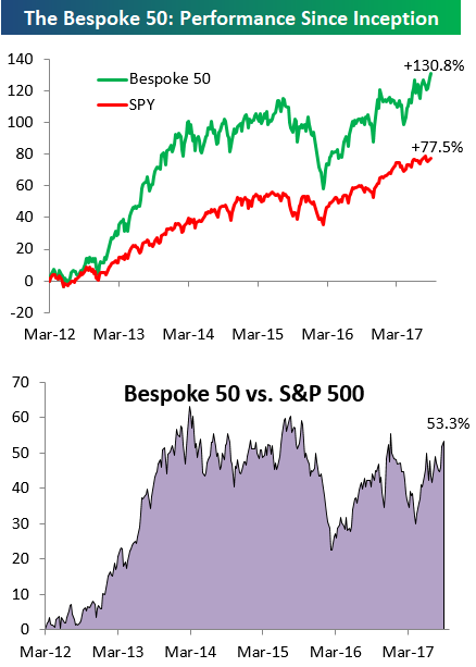
the Bespoke 50 — 8/31/17
Every Thursday, Bespoke publishes its “Bespoke 50” list of top growth stocks in the Russell 3,000. Our “Bespoke 50” portfolio is made up of the 50 stocks that fit a proprietary growth screen that we created a number of years ago. Since inception in early 2012, the “Bespoke 50” has beaten the S&P 500 by 53.3 percentage points. Through today, the “Bespoke 50” is up 130.8% since inception versus the S&P 500’s gain of 77.5%. Always remember, though, that past performance is no guarantee of future returns.
To view our “Bespoke 50” list of top growth stocks, sign up for Bespoke Premium ($99/month) at this checkout page and get your first month free. This is a great deal!
B.I.G. Tips – September 2017 Seasonality
The Closer — US Growth & More Harvey Fallout — 8/30/17
Log-in here if you’re a member with access to the Closer.
Looking for deeper insight on global markets and economics? In tonight’s Closer sent to Bespoke Institutional clients, we review energy markets including EIA petroleum market information updated today and market prices. We also discuss today’s GDP report and the economic implications of Hurricane Harvey.

The Closer is one of our most popular reports, and you can sign up for a free trial below to see it!
See today’s post-market Closer and everything else Bespoke publishes by starting a no-obligation 14-day free trial to our research platform!
Chart of the Day — Tech Sector Valuation
Bespoke Consumer Pulse Report — August 2017
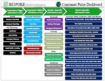
Bespoke’s Consumer Pulse Report is an analysis of a huge consumer survey that we run each month. Our goal with this survey is to track trends across the economic and financial landscape in the US. Using the results from our proprietary monthly survey, we dissect and analyze all of the data and publish the Consumer Pulse Report, which we sell access to on a subscription basis. Sign up for a 30-day free trial to our Bespoke Consumer Pulse subscription service here. With a trial, you’ll get coverage of consumer electronics, social media, streaming media, retail, autos, and much more. The report also has numerous proprietary US economic data points that are extremely timely and useful for investors.
ETF Trends: US Indices & Styles – 8/30/17
Gas Price Impact From Harvey
Summer may be ending, but that means you can take advantage of our Labor Day Special and receive a month of full access to any one of our research services for just $1 and then 20% off for the life of the subscription!
While it’s nothing compared to what people in Texas and the Gulf Coast are going through, if you plan on traveling this coming Labor Day weekend, you can expect to pay up given Harvey’s impact on the nation’s energy infrastructure. As shown in the chart, the national price of a gallon of gas has increased by 3% in the last week to $2.40 per gallon and near its highest levels of the year.
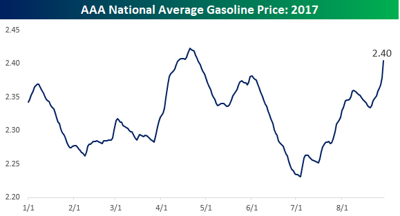
While the increase in the chart above looks dramatic, prices this year have been subdued relative to other years. The table to the lower left shows the YTD change of the national average price of gasoline by year going back to 2005. Even after the recent increase, prices at the pump are up just 2.9% this year compared to an average increase of 20.2%. For each individual year since 2005, the only one that saw a smaller YTD increase at this point in the year was 2010. The lower right chart compares the daily change in gasoline prices this year (same chart as above) to a composite of the average YTD price change by day going back to 2005. While prices have recently rallied due to the hurricane, we are just about to enter the time of year where prices begin their seasonal descent. If that pattern holds this year, don’t be surprised to see average gas prices decline in 2017. If that were to happen, it would be the third annual decline in the last four years!

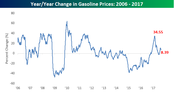
Even with the recent uptick in gasoline prices, consumers won’t be paying much more at the pump this Labor Day weekend than they did last year. As shown in the chart, prices this year are up 8.4% year/year, which is a relatively big increase compared to recent history, but from a longer term perspective, isn’t that far from the norm.
Fixed Income Weekly – 8/30/17
Searching for ways to better understand the fixed income space or looking for actionable ideals in this asset class? Bespoke’s Fixed Income Weekly provides an update on rates and credit every Wednesday. We start off with a fresh piece of analysis driven by what’s in the headlines or driving the market in a given week. We then provide charts of how US Treasury futures and rates are trading, before moving on to a summary of recent fixed income ETF performance, short-term interest rates including money market funds, and a trade idea. We summarize changes and recent developments for a variety of yield curves (UST, bund, Eurodollar, US breakeven inflation and Bespoke’s Global Yield Curve) before finishing with a review of recent UST yield curve changes, spread changes for major credit products and international bonds, and 1 year return profiles for a cross section of the fixed income world.
In this week’s note, we introduce a new measure of global central bank activity, establishing an index of policy rates for 22 central banks around the world.
Our Fixed Income Weekly helps investors stay on top of fixed income markets and gain new perspective on the developments in interest rates. You can sign up for a Bespoke research trial below to see this week’s report and everything else Bespoke publishes free for the next two weeks!
Click here to start your no-obligation free Bespoke research trial now!
Bespoke’s Global Macro Dashboard — 8/30/17
Bespoke’s Global Macro Dashboard is a high-level summary of 22 major economies from around the world. For each country, we provide charts of local equity market prices, relative performance versus global equities, price to earnings ratios, dividend yields, economic growth, unemployment, retail sales and industrial production growth, inflation, money supply, spot FX performance versus the dollar, policy rate, and ten year local government bond yield interest rates. The report is intended as a tool for both reference and idea generation. It’s clients’ first stop for basic background info on how a given economy is performing, and what issues are driving the narrative for that economy. The dashboard helps you get up to speed on and keep track of the basics for the most important economies around the world, informing starting points for further research and risk management. It’s published weekly every Wednesday at the Bespoke Institutional membership level.
Click here to start a no-obligation two-week free trial to Bespoke Institutional!
