ETF Trends: US Indices & Styles – 9/29/17
S&P 500 Quick-View Chart Book — 9/29/17
Each weekend as part of our Bespoke Premium and Institutional research service, clients receive our S&P 500 Quick-View Chart Book, which includes one-year price charts of every stock in the S&P 500. You can literally scan through this report in a matter of minutes or hours, but either way, you will come out ahead knowing which stocks, or groups of stocks, are leading and lagging the market. The report is a great resource for both traders and investors alike. Below, we show the front page of this week’s report which contains price charts of the major averages and ten major sectors.
To see this week’s entire S&P 500 Chart Book, sign up for a 14-day free trial to our Bespoke Premium research service.

September, Q3, YTD 2017 Asset Class Performance
With the third quarter coming to an end today, below is a look at our asset class performance matrix using key ETFs traded on US exchanges. This is a great way to quickly see how various asset classes are performing on a total return basis. For each ETF shown, we provide its total return for the month of September, the third quarter of 2017, and year-to-date 2017.
Notably, the areas of the market that were performing best on a year-to-date basis mostly underperformed in September, while the worst performing areas of the market this year saw the biggest bounces in September. The Nasdaq 100 (QQQ) is ending September on a strong note, but it’s still slightly down on the month. Even still, QQQ is the top performing US equity index ETF on the year with a gain of 23.56%.
Small caps had been weak compared to large caps heading into September, but they’ve soared this month. The S&P Smalllcap 600 ETF (IJR) is up 7.89% on the month, while the S&P 500 (SPY) is up 1.96%.
On a sector basis, Energy (XLE) saw by far the biggest gains at +10.08% in September. Even with the 10% gain, though, XLE is still down 6.79% year-to-date. Financials (XLF), Industrials (XLI), and Materials (XLB) were the next best performing sectors during the month. On the weak side, Telecom (IYZ) and Utilities (XLU) both fell 2%+, while the two consumer sectors, Technology, and Health Care were flat.
Outside of the US, we actually saw weakness in China (ASHR), Hong Kong (EWH), India (PIN), and Mexico (EWW) in September. But areas like Brazil (EWZ), Canada (EWC), France (EWQ), Germany (EWG), and Russia (RSX) saw big gains. Italy (EWI) is now the best performing country in our screen on a year-to-date basis with a gain of 31.64%.
While the emerging markets ETF (EEM) is up 28.46% YTD and 8.15% in the third quarter, it’s actually slightly down in September.
Finally, while oil (USO) gained 8% on the month, other commodities like natural gas (UNG), gold (GLD), and silver (SLV) were in the red. Fixed income ETFs also fell slightly, but they’re still up year-to-date across the board.
Gain access to 1 month of any of Bespoke’s premium membership levels for $1!

2017 Least Volatile Year Since 1964
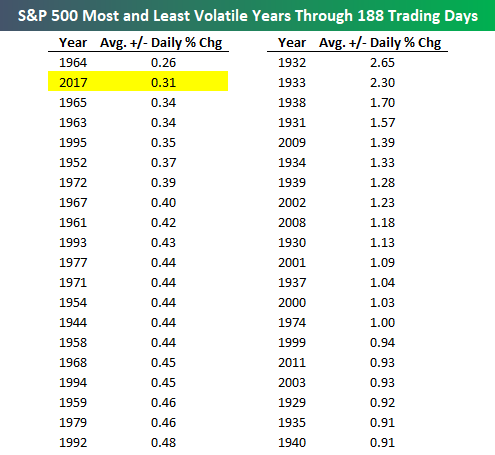
Today marks the end of the third quarter of 2017. There have been 188 trading days so far this year, and the S&P 500 has experienced an average absolute move of +/-0.31% on these days.
As shown in the chart below, historically, the S&P 500 has averaged a daily change of +/-0.73% over the first 188 trading days of any given year.
Gain access to 1 month of any of Bespoke’s premium membership levels for $1!
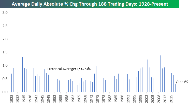
The only year where the S&P 500 experienced a smaller daily change through 188 trading days is 1964. In that year, the index averaged a daily move of just +/-0.26%! As shown in the table below, though, the S&P 500 went through a three-year period of extremely low volatility in 1963, 1964, and 1965. 2017 now ranks as the second least volatile year through 188 trading days, but 1964 ranks 1st, 1965 ranks 3rd, and 1963 ranks 4th. The 1963-1965 period shows that 2017 doesn’t have to be a one-year outlier — this type of low volatility environment can go on for even longer.
That’s not to say vol WILL remain low, however. It can pick up again at any given moment. On the right hand side of the table below, we show the most volatile years through 188 trading days as well. The four most volatile years and six of the top seven all came in the 1930s. 1932 was the most volatile with an average daily move of +/-2.65%.
Three of the ten most volatile years have come since the year 2000, so only the youngest investors haven’t experienced a period of massive volatility. 2009 ranks 5th with an average daily move of +/-1.39% through 188 trading days. Memory is fleeting, though, and at this point it’s difficult for most investors to remember exactly how they felt during the darkest days of the Financial Crisis. The further we distance ourselves from the Crisis and the lower volatility gets, the more complacent investors will become.
Gain access to 1 month of any of Bespoke’s premium membership levels for $1!
The Closer — What’s The Economy? — 9/28/17
Log-in here if you’re a member with access to the Closer.
Looking for deeper insight on global markets and economics? In tonight’s Closer sent to Bespoke Institutional clients, we review the final release of Q2 US GDP. We also comment on the Banxico decision for today.

The Closer is one of our most popular reports, and you can sign up for a free trial below to see it!
See today’s post-market Closer and everything else Bespoke publishes by starting a no-obligation 14-day free trial to our research platform!
Bespokecast Episode 16 — Michelle Leder — Now Available on iTunes, GooglePlay, Stitcher and More
 We’re happy to announce that the newest episode of Bespokecast is now available to the general public both here and via the various podcast platforms. Be sure to subscribe to Bespokecast on your preferred podcast app to gain access to our full collection of episodes. We’d also love for you to provide a review as well!
In our newest conversation on Bespokecast, we talk to Michelle Leder of Footnoted*, who specializes in digging deep into SEC filings for nuggets of information companies bury inside. Michelle’s career started in journalism but has evolved into independent research, giving her a unique qualitative perspective on financial markets. We talk about her process, the process of company filings, and the keys to identifying language that raises red-flags. We also got a chance to discuss how she feels about running a small business and working from home from sunny Los Angeles. We hope you enjoy the conversation! You can also follow Michelle on Twitter here.
To listen to our newest episode or subscribe to the podcast via iTunes, GooglePlay, OvercastFM, or Stitcher, please click the button or links below. Please note that third-part podcast feeds may update at a lag of a few hours to this blog post.

Bespoke’s Sector Snapshot — 9/28/17
We’ve just released our weekly Sector Snapshot report (see a sample here) for Bespoke Premium and Bespoke Institutional members. Please log-in here to view the report if you’re already a member. If you’re not yet a subscriber and would like to see the report, please start a 30-day trial to Bespoke Premium now.
Below is one of the many charts included in this week’s Sector Snapshot, which shows our trading range screen for the S&P 500 and ten major sectors. The dot represents where each sector is currently trading, while the tail end represents where it was trading one week ago. The black vertical “N” line represents each sector’s 50-day moving average. Moves into the red zone are considered “overbought,” while moves into the green zone are considered “oversold.”
As shown, the S&P 500 and six sectors are in overbought territory, while two sectors — Consumer Discretionary and Utilities — are oversold.

To see our full Sector Snapshot with additional commentary plus six pages of charts that include analysis of valuations, breadth, technicals, and relative strength, start a 30-day free trial to our Bespoke Premium package now. Here’s a breakdown of the products you’ll receive.