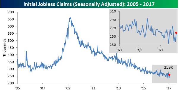
Jobless Claims Rise
It was a mixed jobless claims report this week as first-time claims rose from extremely low levels and came in higher than expected. While economists were expecting first time claims to come in at a level of 247K, the actual reading came in at 259K. That 22K increase in weekly claims was enough to rank as the largest one-week increase since April 2014. That said, even at 259K, current levels are extremely low by historical standards with the most recent print representing the 99th straight week where claims were below 300K.
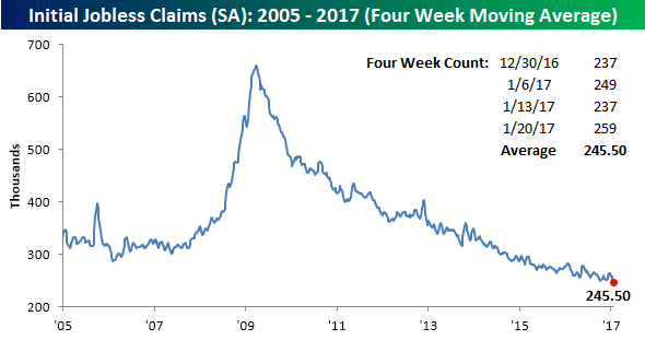
While this week saw a large increase in claims, because the number from four weeks ago was even higher, the four-week moving average actually declined to 245.5K from last week’s level of 247.5K. That puts the four-week moving average at its lowest level since November 1973.
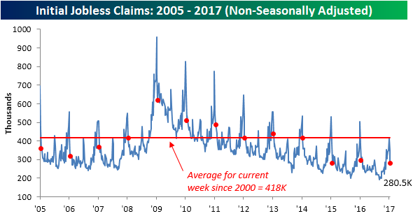
On a non-seasonally adjusted (NSA) basis, the report was also positive as claims declined another 69.8K down to 280.5K. For the current week of the year, that’s the lowest reading since 1969, and is more than 137K below the average of 418K for the current week of the year dating back to 2000.
The Closer 1/25/17 – More On State Labor Markets, Gasoline Demand Falters
Log-in here if you’re a member with access to the Closer.
Looking for deeper insight on global markets and economics? In tonight’s Closer sent to Bespoke Institutional clients, we take a further look at state level employment data we discussed last night. We also break down this week’s EIA report on the petroleum markets.

The Closer is one of our most popular reports, and you can see it and everything else Bespoke publishes by starting a no-obligation 14-day free trial to our research!
VIX at Two and a Half Year Lows
Remember back in the early days of the bull market when a VIX reading below 20 was considered low? Well, for the first time in over two and a half years, the VIX volatility index closed below 11 today. In the history of the VIX going back to 1990, there have only been 70 prior days where the VIX closed below 11. In addition to today’s low reading, we also found it noteworthy that since Donald Trump won the election, the VIX hasn’t closed above 15, which is a streak that’s now at 52 trading days and counting. Who would have ever thought that would be the case?
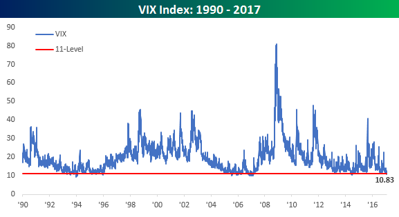
Since 1990, there have been ten prior periods where the VIX closed below 15 for 50 or more consecutive trading days, and in today’s Chart of the Day sent to Bespoke subscribers, we looked at each prior period where the VIX went 50 or more trading days without closing above 15, and then calculated the S&P 500’s forward returns over the following one, three, six, and twelve months. See today’s Chart of the Day by starting a 14-day free trial to Bespoke’s premium research below.
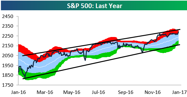
S&P 500 Sector Trading Range Charts
With US equity markets seeing a jump to start the week, below is an updated look at our S&P 500 sector trading range charts. The first chart below looks at the broad S&P 500. We’ve drawn lines to represent the top and bottom of the index’s long-term uptrend channel. As you can see, the S&P is currently slightly overbought but not overly extended at current levels. Another 1% gain or so and it will be at the top of its channel, though. At some point investors can expect to see some consolidation within this uptrend. Only if we get a break below the bottom of the uptrend channel would it be a bearish signal.
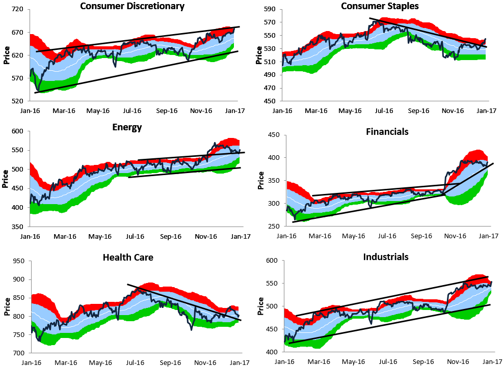
We’ll quickly go through our thoughts on each sector. Consumer Discretionary is similar to the S&P 500 in that it’s trading within a long-term uptrend channel and currently right near the top of it. Consumer Staples looks much different. After trending downward from mid-2016 through year-end, the sector has recently broken above the top of its downtrend.
The Energy sector broke out of a tight range after the election, but recently it has pulled back to key support as we highlight in the chart. The Financial sector made a big leg higher following the election and is now forming a new near-term uptrend channel. At current levels the Financial sector isn’t even overbought due to its trading range shifting upward.
Health Care has the worst looking chart of the cyclical sectors. It managed to break above its downtrend recently, but over the last couple of weeks it has trended lower once again. Industrials looks similar to Consumer Discretionary and the broad S&P 500 — it’s trading within a well-defined uptrend channel and is now slightly overbought.
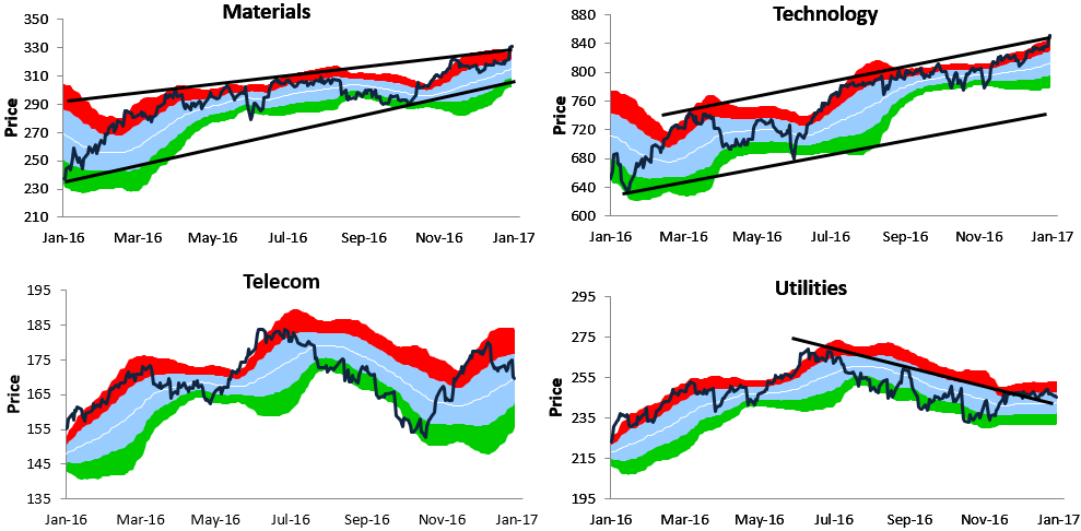
The Materials sector has surged over the last week, which has actually pushed it above the top of its uptrend channel. This could be the start of a new leg higher similar to the one the Financial sector experienced a couple of months ago. Technology is breaking out to a new 52-week high as well.
The Telecom sector is basically trendless and has been for quite some time, while the Utilities sector is struggling due to higher interest rates. Don’t expect gains for Utilities stocks unless the 10-year yield begins to drop again.
Want to see more research like this? Click here to start a no-obligation two-week free trial.
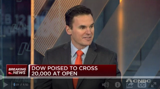
Bespoke CNBC Appearance (1/25/17)
Bespoke co-founder Paul Hickey appeared on CNBC this morning to discuss markets and the Dow’s recent leg higher. To view the segment, please click on the image below.
Fixed Income Weekly – 1/25/17
Searching for ways to better understand the fixed income space or looking for actionable ideals in this asset class? Bespoke’s Fixed Income Weekly provides an update on rates and credit every Wednesday. We start off with a fresh piece of analysis driven by what’s in the headlines or driving the market in a given week. We then provide charts of how US Treasury futures and rates are trading, before moving on to a summary of recent fixed income ETF performance, short-term interest rates including money market funds, and a trade idea. We summarize changes and recent developments for a variety of yield curves (UST, bund, Eurodollar, US breakeven inflation and Bespoke’s Global Yield Curve) before finishing with a review of recent UST yield curve changes, spread changes for major credit products and international bonds, and 1 year return profiles for a cross section of the fixed income world.
In this week’s note, we examine the diversity of the EM bond market.
Our Fixed Income Weekly helps investors stay on top of fixed income markets and gain new perspective on the developments in interest rates. You can sign up for a Bespoke research trial below to see this week’s report and everything else Bespoke publishes free for the next two weeks!
Click here to start your no-obligation free Bespoke research trial now!
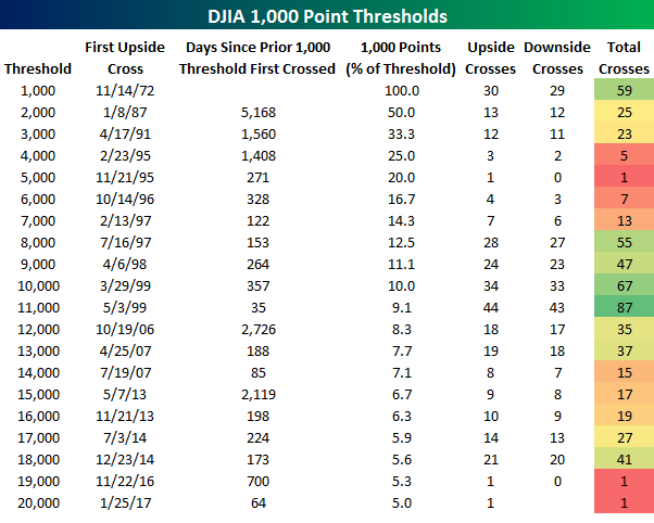
Dow 20,000 – Finally
After at least a month of flirting with 20,000, the Dow Jones Industrial Average finally broke through the level that everyone…OK, just some people…has been watching for the last several weeks. In honor of crossing the 20,000 threshold, the table below lists the date that the DJIA first crossed each thousand point threshold (on a closing basis) going back to 1,000 back in 1972. We also show how many days elapsed between the first time the index crossed each level, the number of times it crossed that threshold to the upside and downside, and what percentage each successive 1,000 points represents as a percentage of the index’s level.
Looking at the table, a couple of things stand out. First, the 64 days that elapsed between the first cross of 19,000 and 20,000 would represent the second shortest amount of time that transpired between two thousand point levels. The only one that was shorter was the 35 days that elapsed between 10,000 and 11,000. The 64-day sprint between 19,000 and 20,000 may sound impressive, but when you consider the fact that 1,000 points only represents 5% at 20,000 compared to 10% at 10,000, it loses a bit of its luster. Another aspect of the current rally worth citing is that after first crossing 19K back in November, the DJIA has yet to look back and trade below that level. The only other 1,000 point level that the DJIA crossed to the upside and never looked back from was 5,000 back in November 1995. While 5K and 19K are levels the DJIA has yet to ever revisit, DJIA 10,000 and 11,000 were levels that the index just couldn’t shake off. The DJIA first crossed 10K in 1999, but over the years following that first cross, it moved above and below that level 66 times. 11K was even harder to shake off. Since first crossing that threshold in May 1999, the index has moved above and below that level on a closing basis 86 other times.
Want to see more research like this? Click here to start a no-obligation two-week free trial.
ETF Trends: US Sectors & Groups – 1/25/17
Who would have thought that in the week surrounding an executive order pulling out of NAFTA, Mexican equities would dramatically outperform in USD terms? Brazil and Poland have also done well while the homebuilders have been the strongest stocks in the US following very solid existing home sales data yesterday (which we discussed in The Closer last night). On the losing side over the last 5 days, biotech, Pharma, and long-term Treasuries continue to decline. Precious metals and the USD have also declined; interestingly GLD and UUP have identical performance over the last five sessions, an unusual correlation.

Bespoke provides Bespoke Premium and Bespoke Institutional members with a daily ETF Trends report that highlights proprietary trend and timing scores for more than 200 widely followed ETFs across all asset classes. If you’re an ETF investor, this daily report is perfect. Sign up below to access today’s ETF Trends report.
See Bespoke’s full daily ETF Trends report by starting a no-obligation free trial to our premium research. Click here to sign up with just your name and email address.
The Closer 1/24/17 – Hot Housing, State Level Labor, Richmond Confidence
Log-in here if you’re a member with access to the Closer.
Looking for deeper insight on global markets and economics? In tonight’s Closer sent to Bespoke Institutional clients, we chart state-level employment change across the US, including the impact of oil price declines, a diffusion index, and a heatmap of all 50 states. We also discuss strong existing home sales data today and a mixed Richmond Fed activity report on the Manufacturing and Services sectors.
The Closer is one of our most popular reports, and you can see it and everything else Bespoke publishes by starting a no-obligation 14-day free trial to our research!