Jobless Claims Stuck at 245K
Jobless claims came in higher than expected for the second straight week by staying unchanged from last week’s reading at 245K. Economists had been expecting a drop to 240K. Even if the print was higher than expected, claims notched their 147th straight week below 300K, which is impressive to say the least. If claims stay below 300K for another 15 weeks, this current streak will go down as the longest ever.
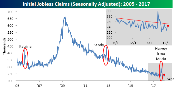
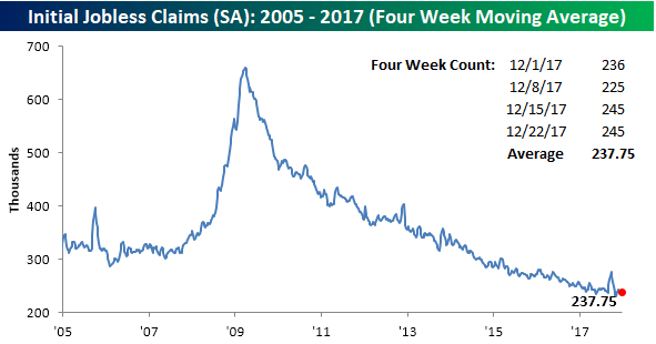
While the four-week moving average got close to making a new low two weeks ago, the last two weekly prints have put that low out of reach for now. As shown below, the average weekly reading over the last four weeks has been 237.75K, which is 6.5K above the cycle low of 231.25K from eight weeks ago.
On a non-seasonally adjusted (NSA) basis, jobless claims remained incredibly low. This week’s reading of 321.9K was the lowest for the current week of the year since 1969 and more than 125K below the average of 450.2K for the current week of the year dating back to 2000.

The Closer — Flattening Curves, Consumer Confidence — 12/27/17
Log-in here if you’re a member with access to the Closer.
Looking for deeper insight on markets? In tonight’s Closer sent to Bespoke Institutional clients, we take a look at declining term premiums and Conference Board consumer confidence.

See today’s post-market Closer and everything else Bespoke publishes by starting a 14-day free trial to Bespoke Institutional today!
Fixed Income Weekly – 12/27/17
Searching for ways to better understand the fixed income space or looking for actionable ideals in this asset class? Bespoke’s Fixed Income Weekly provides an update on rates and credit every Wednesday. We start off with a fresh piece of analysis driven by what’s in the headlines or driving the market in a given week. We then provide charts of how US Treasury futures and rates are trading, before moving on to a summary of recent fixed income ETF performance, short-term interest rates including money market funds, and a trade idea. We summarize changes and recent developments for a variety of yield curves (UST, bund, Eurodollar, US breakeven inflation and Bespoke’s Global Yield Curve) before finishing with a review of recent UST yield curve changes, spread changes for major credit products and international bonds, and 1 year return profiles for a cross section of the fixed income world.
In this week’s shortened note, we review fixed income returns by asset class.

Our Fixed Income Weekly helps investors stay on top of fixed income markets and gain new perspective on the developments in interest rates. You can sign up for a Bespoke research trial below to see this week’s report and everything else Bespoke publishes free for the next two weeks!
Click here and start a 14-day free trial to Bespoke Institutional to see our newest Fixed Income Weekly now!
Chart of the Day – Margin Debt Hits Another Record
The Closer — Home Prices, Richmond, & Capex — 12/26/17
Log-in here if you’re a member with access to the Closer.
Looking for deeper insight on markets? In tonight’s Closer sent to Bespoke Institutional clients, we review US home prices and regional manufacturing activity indices with an eye towards the outlook for capex.
See today’s post-market Closer and everything else Bespoke publishes by starting a 14-day free trial to Bespoke Institutional today!
Chart of the Day: Breadth of Large Caps vs Small Caps
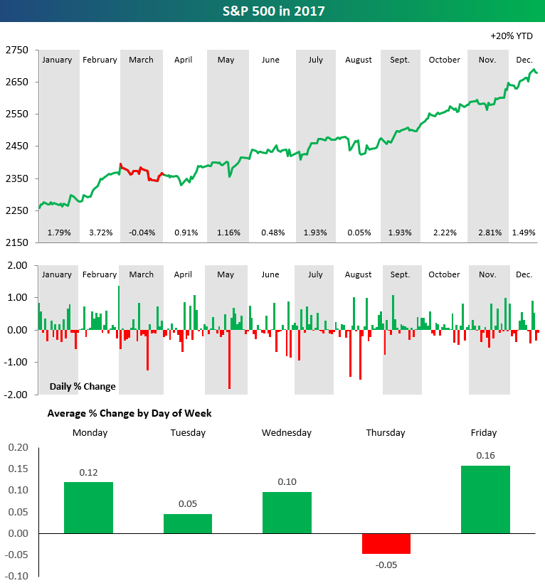
2017 S&P 500 Stock Market Performance in Three Charts
The chart below is from our 2018 annual outlook report. The full report is available now with any membership level using our Annual Outlook Sign-Up Special.
The set of charts below highlights the performance of the S&P 500 throughout 2017. In the top chart, we break down performance by month. The price line is green if the S&P posted gains during the month, and the line is red if the S&P posted a decline. As you can see, the index was up in price in 2017 in every month except March, and in March it only fell 0.04%. Talk about a consistently positive year!
The second chart in the set shows the daily change of the S&P 500 throughout the year. While there were certainly more up days than down days, the thing that stands out most is that the index didn’t see a gain or decline of more than 2% on any trading day in 2017.
The final chart in our set highlights the S&P 500’s average percentage change by weekday through 2017. As shown, every trading day of the week averaged a gain except for Thursday, which saw an average decline of 0.05% throughout the year.
S&P 500 Stock Seasonality – 12/26/17
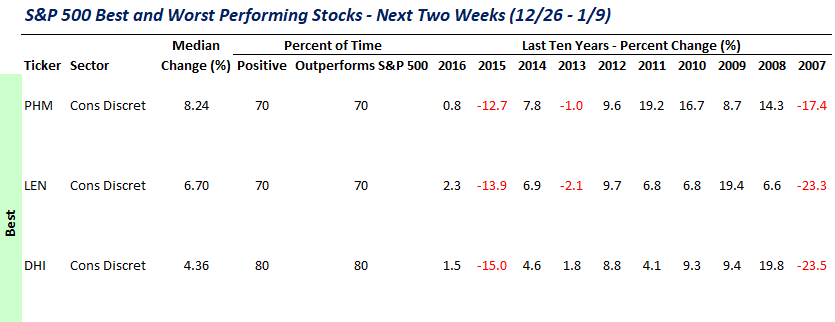
While we don’t ever suggest that investors should base their trading solely on the calendar, there is evidence that the market and many stocks do indeed follow seasonal patterns. This makes our S&P 500 Stock Seasonality report a useful addition to every investor’s toolbox. Using the last ten years worth of price data, our Stock Seasonality report looks at the average returns for the S&P 500, its ten sectors, and its 500 individual stocks. In the report, we highlight the five stocks in each sector that have historically been the best and worst performers over the next two weeks. For each stock, we also include information such as average returns, the percent of time each stock or sector is positive/outperforms the S&P 500, and its historical performance over the next two weeks for each of the last ten years. The Stock Seasonality report is published on a weekly basis on Mondays, and it is available to all Bespoke Premium and Bespoke Institutional subscribers.
One section of the Stock Seasonality report that we wanted to highlight this week is the one where we highlight the fifteen stocks in the S&P 500 that have historically performed the best during the upcoming two-week period. The table below shows this week’s section with three of the names that made the list showing. As shown, homebuilders Pulte (PHM), Lennar (LEN), and DR Horton (DHI) have all seen median gains during the upcoming two-week period ranging from 4.36% up to 8.24%. So, even though the late December/early January period is probably one of the worst times of year to be outside building a house, for the stocks of homebuilders, it has been a great time of year!
For active traders, our Stock Seasonality report is an excellent tool keep track of the best and worst times of year for the overall market, sectors, and individual stocks. To see the report, sign up for a monthly Bespoke Premium membership now!
Bespoke Stock Scores — 12/26/17
[Used to Be] The Most Wonderful Time of the Year
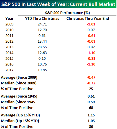
When it comes to the stock market, the period before and after Christmas has historically been a great time of year to be long equities. After all, the term Santa Claus Rally didn’t just come up out of nowhere. Recently, though, not so much. Despite being in one of the longest and strongest bull markets on record, the last week of the year between Christmas and New Years has been more Scrooge than Santa. The table below lists the performance of the S&P 500 for each year during the current bull market from the start of the year through Christmas and then from Christmas through year-end.
Since the bull market began in 2009, there has not been a single year where the S&P 500 was down YTD as of Christmas, but there have only been two years where the index traded in the black from Christmas through year-end. Overall, the index’s average return in the last week of the year has been a decline of 0.47% (median: -0.72%). That’s not the way it has always been, though. In the interest of space, we didn’t list every year, but we have included the results in the table, and since 1945, the S&P 500 has seen an average gain of 0.61% (median: 0.59%) in the last week of the year with gains over two-thirds of the time. Finally, with the S&P 500 up close to 20% in 2017, we also looked at the index’s performance in the last week of the year when it was already up at least 15% YTD. In those 25 years, the S&P 500 saw an average last week gain of 1.15% (median: 1.05%) with gains 80% of the time. Those are some pretty consistent results, but here again, we would note that in the current bull market, the results haven’t been as positive. Since 2009, there have been two years where the S&P 500 was up over 15% YTD (2009 and 2013) as of Christmas. In 2009, the S&P 500 traded down 1.01% in the last week of the year, while in 2013 it finished the year with a gain of 0.82% in the final week.