Treasury Yields Creep Higher as Dividend Yields Tick Lower
Below are charts that were included in last Friday’s Bespoke Report newsletter, which is published weekly for Newsletter, Premium, and Institutional clients.
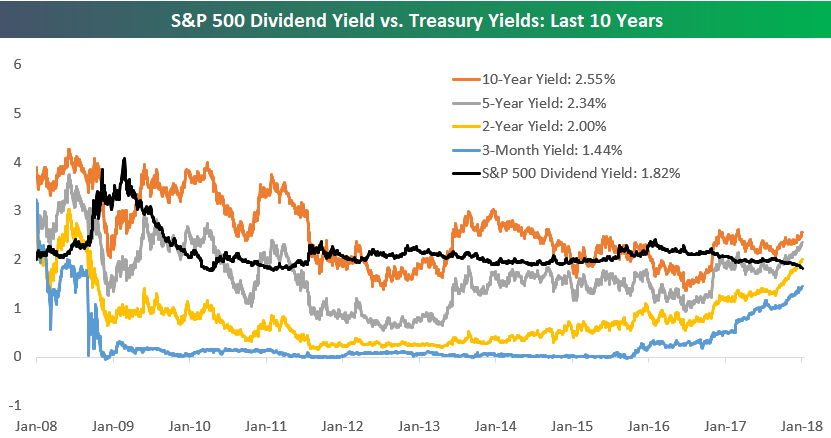
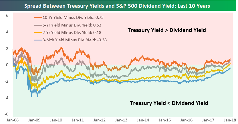
For the better part of the decade, extremely low yields on “risk-free” Treasuries made “riskier” asset classes like equities more attractive. That attractiveness is finally beginning to fade as Treasury yields across the curve tick higher. As shown in the two charts below, at this point the yields on the 10-Year, 5-Year, AND 2-Year Treasury Notes are above the dividend yield of the S&P 500. Only the 3-Month T-Bill yields less than the S&P 500’s dividend yield at this point. The last time the 10, 5, and 2-Year Treasury yields were all higher than the dividend yield of the S&P 500 was ten years ago back in mid-2008.
To read more about this topic, start a 2-week free trial to any membership level and pull up last Friday’s Bespoke Report newsletter. The start to the trading week is an excellent time to start a two-week free trial!
Bespoke Brunch Reads: 1/14/18
Welcome to Bespoke Brunch Reads — a linkfest of the favorite things we read over the past week. The links are mostly market related, but there are some other interesting subjects covered as well. We hope you enjoy the food for thought as a supplement to the research we provide you during the week.
Investors
Personal genius and peer pressure: Britt Harris on institutional investing by Grant Birdwell and Bryce Klempner (McKinsey)
A profile on the CEO and CIO of UTIMCO, who manages the endowment of the University of Texas system endowment (one of the largest in the country) among other assets. [Link]
Valuations
Valuation Ratios for Households and Businesses by Thomas Mertens, Patrick Schultz, and Michael Tubbs (FRBSF Economic Letter)
Cyclically-adjusted P/Es are high, and it’s no secret that the market is relatively expensive compared to history. But broader measures of household assets relative to income also look expensive. [Link]
Hacks
Website Glitch Let Me Overstock My Coinbase by Brian Krebs (Krebs On Security)
A flaw in the system blockchain enthusiasts at Overstock used for refunding transactions led to free bitcoins for a number of customers. [Link]
A Clever Radio Trick Can Tell If A Drone Is Watching You by Andy Greenberg (Wired)
Researchers at Ben Gurion University have developed a technique that uses pre-recognized patterns to search drone uplink data to determine if the drone is being used to watch a given spot. [Link]
Retail
The Strange Brands in Your Instagram Feed by Alexis Madrigal (The Atlantic)
Combining “drop shipping” direct from manufacturers, Shopify templates, and a few stock photos of goods, “stores” can be created overnight and go from zero to thousands in revenues in days thanks to social media. [Link]
Regulation
When Picking Apples on a Farm With 5,000 Rules, Watch Out for the Ladders by Steve Eder (NYT)
An anecdote on the breadth and scope of regulations that small businesses have to contend with. [Link]
Banter
Merc Stories by Hooper Quant (The Contrarian Corner)
A funny tale about the consequences of trying to slide right back into the futures pit after going completely AWOL for weeks on a bender. [Link]
Travel
Why Did New York’s JFK Airport Struggle to Cope With Its Flight Backlog After the Bomb Cyclone? by Jason Rabinowitz (The Points Guy)
A basic explainer of the epic mess created by JFK when snows rolled in a couple weeks ago; in addition to other weirdness, we had no idea that each terminal had entirely separate landing rights! [Link]
Have a great Sunday!
S&P 500 Quick-View Chart Book: 1/12/18
The Closer: End of Week Charts — 1/12/18
Looking for deeper insight on global markets and economics? In tonight’s Closer sent to Bespoke clients, we recap weekly price action in major asset classes, update economic surprise index data for major economies, chart the weekly Commitment of Traders report from the CFTC, and provide our normal nightly update on ETF performance, volume and price movers, and the Bespoke Market Timing Model. This week, we’ve added a section that helps break down momentum in developed market foreign exchange crosses.

The Closer is one of our most popular reports, and you can sign up for a free trial below to see it!
See tonight’s Closer by starting a two-week free trial to Bespoke Institutional now!
The Bespoke Report — Cyclicals Roar — 1/12/18
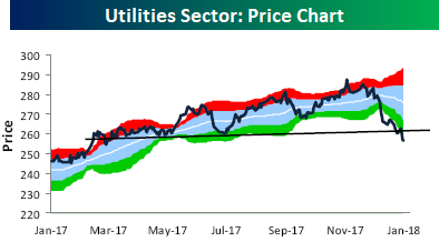
Blackout For Utilities
It’s really hard to imagine how a sector could be doing as bad as the Utilities sector in a tape that has been as strong as this one, but the reality is that when everyone expects rates to increase, they want nothing to do with interest rate sensitive sectors like Utilities. The following charts are from this week’s Sector Snapshots report which looks at the technical and fundamental backdrop for the S&P 500’s major sectors. The report is published every Thursday for Bespoke Premium Clients, so if you don’t already receive it, sign up for a trial today.
Let’s start with the Utilities sector’s price chart. After trading into extreme overbought territory late last year, investors have headed for the exits and taken the sector to its most oversold levels in well over a year. In fact, to find a time when the sector was more oversold than it has gotten in the current leg lower, you have to go back to June 2015.
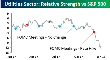
With the Utilities sector being so weak in an otherwise strong tape, the relative strength versus the S&P 500 has fallen off a cliff. Utilities is not normally a volatile sector, so that makes the recent moves stand out even more. Note in the chart too, how the recent leg lower in relative strength really picked up steam right after the FOMC’s most recent rate hike.
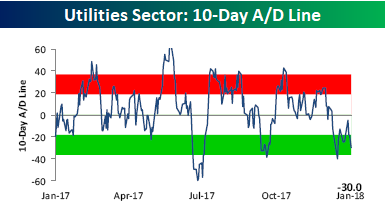
Not surprisingly, breadth for the sector has been weak. Two charts that highlight this are the sector’s 10-Day A/D line which takes a rolling tally of the net number of stocks in the sector rising on a daily basis. As of yesterday, the sector was firmly into oversold territory.
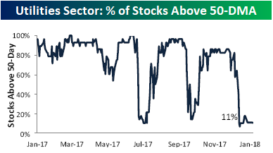
The other illustration of the Utility sector’s pitiful breadth is the percentage of stocks in the sector trading above their 50-day moving average. Currently, that stands at just 11%. Again, this is an extreme reading.
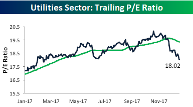
Given the declines, one would think that the sector’s valuation would be starting to look attractive, and while the sector’s P/E ratio has come in pretty significantly from over 19.5 times trailing earnings, it still trades at just over 18 times trailing earnings, which for a little to no growth sector, doesn’t exactly scream buy. That said, from a short-term perspective, the sector should be due for at least a bounce.
The Closer — Mexico Data Day, PPI, Largest Deficit Since 2012 — 1/11/18
Log-in here if you’re a member with access to the Closer.
Looking for deeper insight on markets? In tonight’s Closer sent to Bespoke Institutional clients, we review Mexican data, US PPI, and the widening US budget deficit.

See today’s post-market Closer and everything else Bespoke publishes by starting a 14-day free trial to Bespoke Institutional today!
Bespoke’s Sector Snapshot — 1/11/18
We’ve just released our weekly Sector Snapshot report (see a sample here) for Bespoke Premium and Bespoke Institutional members. Please log-in here to view the report if you’re already a member. If you’re not yet a subscriber and would like to see the report, please start a two-week free trial to Bespoke Premium now.
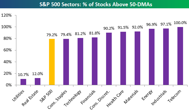
Below is one of the many charts included in this week’s Sector Snapshot, which highlights the percentage of stocks trading above their 50-day moving averages by sector in the S&P 500. As shown, six of eleven sectors have more than 90% of their stocks above their 50-days at the moment, which is an extremely high reading.
To see our full Sector Snapshot with additional commentary plus six pages of charts that include analysis of valuations, breadth, technicals, and relative strength, start a two-week free trial to our Bespoke Premium package now. Here’s a breakdown of the products you’ll receive.
the Bespoke 50 — 1/11/18
Every Thursday, Bespoke publishes its “Bespoke 50” list of top growth stocks in the Russell 3,000. Our “Bespoke 50” portfolio is made up of the 50 stocks that fit a proprietary growth screen that we created a number of years ago. Since inception in early 2012, the “Bespoke 50” has beaten the S&P 500 by 66.8 percentage points. Through today, the “Bespoke 50” is up 166.4% since inception versus the S&P 500’s gain of 99.6%. Always remember, though, that past performance is no guarantee of future returns.
To view our “Bespoke 50” list of top growth stocks, click the button below and start a trial to either Bespoke Premium or Bespoke Institutional.
