Bespoke Bloomberg Appearance (12/28/17)
Bespoke Macro Strategist George Pearkes appeared on Bloomberg’s What Did You Miss on Tuesday evening to discuss where the global economy stands to start 2018. To view the segment, click on the image below.

The Lightning Comes Before the Boom
Bitcoin has seen some impressive growth in the latter half of 2017, but all that growth hasn’t been without growing pains. Due to the nature of blockchain tech, the network that underlies bitcoin will never handle transactions with the rapidity of a centralized authority like Visa. Currently the bitcoin network can only handle about 4 transactions per second at maximum capacity, which is unacceptably slow if it’s ever to be used as a global payment system.
Bitcoin Cash, a fork of bitcoin, attempted to solve this issue by increasing the maximum block size, but doing so is akin to putting out a fire by throwing larger logs on it. The competition to get transactions processed has led to the creation of an artificial “fee market”, where those who can pay higher premiums on their transactions are able to get them processed faster. The average bitcoin transaction fee is now over $40, painfully high for anyone who actually wants to use bitcoin to buy things. For a permanent solution, second layer “off-chain” solutions are required. Enter the Lightning Network.

If the Lightning Network launches successfully, it could transform bitcoin from digital gold into useful currency, enabling cross-border payments to happen in record time. The Lightning Network works by enabling the creation of bi-directional payment “channels” between two parties. The channel functions as an off-chain agreement between the parties on the state of their respective balances. To update the state of the balance, both parties must sign and time-stamp a new transaction. At any time, the state of the channel can be broadcast to the network by either party, which cements the balances permanently in the blockchain.
However, broadcasting to the blockchain only needs to be done in the case of a disagreement, where the blockchain effectively functions as a courtroom. Each party may submit their “evidence” (signed transactions), and the evidence with the most recent timestamp wins. With this setup, a network of channels can be created that allow any two people connected by the network to transact, and only take their transactions to the blockchain in case of a disagreement. For those interested in the nitty-gritty, the lightning network whitepaper can be found here.
Get more crypto/blockchain analysis by following our @bespokecrypto Twitter feed.
Bullish Sentiment: Start of a New Streak?
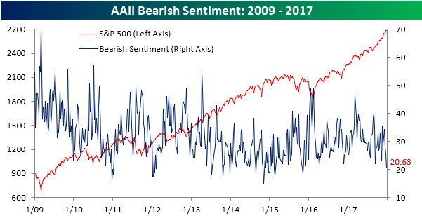
After a record run of weeks where bullish sentiment was below 50%, we have now seen two straight weeks where bullish sentiment has come in above 50%. According to the weekly sentiment survey from AAII, bullish sentiment came in at 52.65% this week, and although it only represented a slight increase from last week, it is the highest weekly reading we have seen since November 2014!

As bullish sentiment has surged, bearish sentiment plummeted to 20.63% from 25.62%, which is the lowest weekly reading since November 2015. The tide in sentiment has really started to turn!
Jobless Claims Stuck at 245K
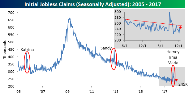
Jobless claims came in higher than expected for the second straight week by staying unchanged from last week’s reading at 245K. Economists had been expecting a drop to 240K. Even if the print was higher than expected, claims notched their 147th straight week below 300K, which is impressive to say the least. If claims stay below 300K for another 15 weeks, this current streak will go down as the longest ever.
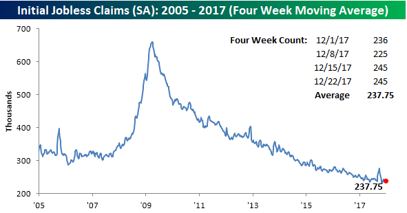
While the four-week moving average got close to making a new low two weeks ago, the last two weekly prints have put that low out of reach for now. As shown below, the average weekly reading over the last four weeks has been 237.75K, which is 6.5K above the cycle low of 231.25K from eight weeks ago.
On a non-seasonally adjusted (NSA) basis, jobless claims remained incredibly low. This week’s reading of 321.9K was the lowest for the current week of the year since 1969 and more than 125K below the average of 450.2K for the current week of the year dating back to 2000.

The Closer — Flattening Curves, Consumer Confidence — 12/27/17
Log-in here if you’re a member with access to the Closer.
Looking for deeper insight on markets? In tonight’s Closer sent to Bespoke Institutional clients, we take a look at declining term premiums and Conference Board consumer confidence.

See today’s post-market Closer and everything else Bespoke publishes by starting a 14-day free trial to Bespoke Institutional today!
Fixed Income Weekly – 12/27/17
Searching for ways to better understand the fixed income space or looking for actionable ideals in this asset class? Bespoke’s Fixed Income Weekly provides an update on rates and credit every Wednesday. We start off with a fresh piece of analysis driven by what’s in the headlines or driving the market in a given week. We then provide charts of how US Treasury futures and rates are trading, before moving on to a summary of recent fixed income ETF performance, short-term interest rates including money market funds, and a trade idea. We summarize changes and recent developments for a variety of yield curves (UST, bund, Eurodollar, US breakeven inflation and Bespoke’s Global Yield Curve) before finishing with a review of recent UST yield curve changes, spread changes for major credit products and international bonds, and 1 year return profiles for a cross section of the fixed income world.
In this week’s shortened note, we review fixed income returns by asset class.

Our Fixed Income Weekly helps investors stay on top of fixed income markets and gain new perspective on the developments in interest rates. You can sign up for a Bespoke research trial below to see this week’s report and everything else Bespoke publishes free for the next two weeks!
Click here and start a 14-day free trial to Bespoke Institutional to see our newest Fixed Income Weekly now!
Chart of the Day – Margin Debt Hits Another Record
The Closer — Home Prices, Richmond, & Capex — 12/26/17
Log-in here if you’re a member with access to the Closer.
Looking for deeper insight on markets? In tonight’s Closer sent to Bespoke Institutional clients, we review US home prices and regional manufacturing activity indices with an eye towards the outlook for capex.
See today’s post-market Closer and everything else Bespoke publishes by starting a 14-day free trial to Bespoke Institutional today!
Chart of the Day: Breadth of Large Caps vs Small Caps
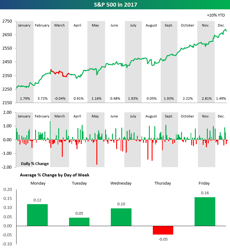
2017 S&P 500 Stock Market Performance in Three Charts
The chart below is from our 2018 annual outlook report. The full report is available now with any membership level using our Annual Outlook Sign-Up Special.
The set of charts below highlights the performance of the S&P 500 throughout 2017. In the top chart, we break down performance by month. The price line is green if the S&P posted gains during the month, and the line is red if the S&P posted a decline. As you can see, the index was up in price in 2017 in every month except March, and in March it only fell 0.04%. Talk about a consistently positive year!
The second chart in the set shows the daily change of the S&P 500 throughout the year. While there were certainly more up days than down days, the thing that stands out most is that the index didn’t see a gain or decline of more than 2% on any trading day in 2017.
The final chart in our set highlights the S&P 500’s average percentage change by weekday through 2017. As shown, every trading day of the week averaged a gain except for Thursday, which saw an average decline of 0.05% throughout the year.