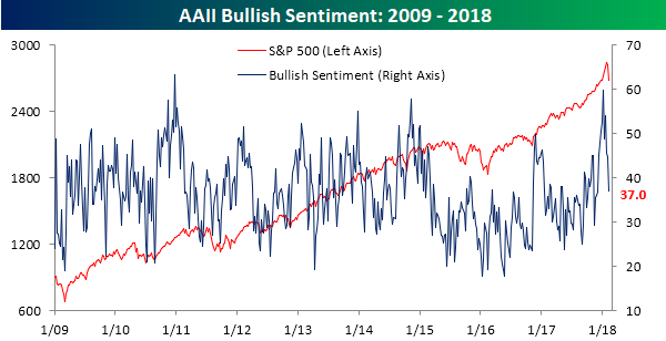
Bulls Retreat
It’s easy to have positive sentiment towards the stock market when things are going well, but the real test is always when the going gets tough. The last two weeks have provided that test for the bulls, and their response has been an all-out retreat. Based on the weekly survey from AAII, bullish sentiment declined from 44.8% down to 37.0% for the fourth weekly decline in the last five. At the start of the year, bullish sentiment spiked up to just under 60%, but in the span of just five weeks, close to 40% of those newly minted bulls have already abandoned ship and shifted over to the bearish or neutral camp.
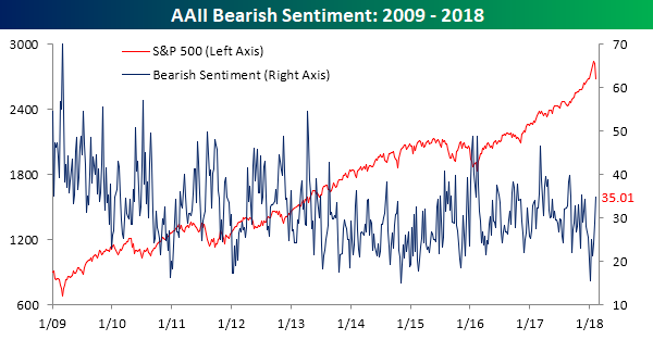
As bullish sentiment drops back into the doldrums, bears have been on the prowl. In this week’s survey, bearish sentiment swelled to 35% from last week’s level of just under 29%. Since the first week of January, the size of the bearish camp has more than doubled from a low of 15.6%.
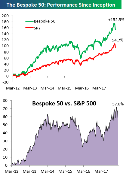
the Bespoke 50 — 2/8/18
Every Thursday, Bespoke publishes its “Bespoke 50” list of top growth stocks in the Russell 3,000. Our “Bespoke 50” portfolio is made up of the 50 stocks that fit a proprietary growth screen that we created a number of years ago. Since inception in early 2012, the “Bespoke 50” has beaten the S&P 500 by 57.8 percentage points. Through today, the “Bespoke 50” is up 152.5% since inception versus the S&P 500’s gain of 94.7%. Always remember, though, that past performance is no guarantee of future returns.
To view our “Bespoke 50” list of top growth stocks, click the button below and start a trial to either Bespoke Premium or Bespoke Institutional.
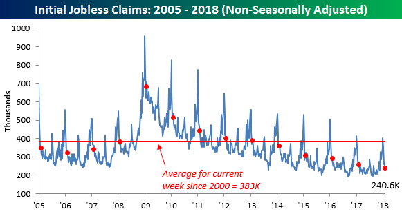
Jobless Claims at Generational Lows
Jobless claims declined for the third time in four weeks, falling from 230K down to 221K compared to expectations for an increase to 232K. This week’s print was the second lowest reading of the current economic expansion and the 153rd straight week below 300K.
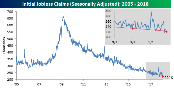
Even more impressive is the fact that the four-week moving average for claims dropped to its lowest level in 45 years. Not since 1973, when the size of the labor force was considerably smaller, were claims as low as they are now.

On a non-seasonally adjusted (NSA) basis, jobless claims fell to 240.6K, which is more than 40K below the average of 383K for the current week of the year dating back to 2000. In fact, going back to the late 1960s, for the current week of the year there has never been a lower NSA print! How’s that for impressive?
The Closer — Energy And Consumer Credit — 2/7/18
Log-in here if you’re a member with access to the Closer.
Looking for deeper insight on markets? In tonight’s Closer sent to Bespoke Institutional clients, we review EIA data, recent Energy price action, and discuss December consumer credit numbers from the Fed.

See today’s post-market Closer and everything else Bespoke publishes by starting a 14-day free trial to Bespoke Institutional today!
Chart of the Day: Big Washout in Group Breadth
Fixed Income Weekly – 2/7/18
Searching for ways to better understand the fixed income space or looking for actionable ideals in this asset class? Bespoke’s Fixed Income Weekly provides an update on rates and credit every Wednesday. We start off with a fresh piece of analysis driven by what’s in the headlines or driving the market in a given week. We then provide charts of how US Treasury futures and rates are trading, before moving on to a summary of recent fixed income ETF performance, short-term interest rates including money market funds, and a trade idea. We summarize changes and recent developments for a variety of yield curves (UST, bund, Eurodollar, US breakeven inflation and Bespoke’s Global Yield Curve) before finishing with a review of recent UST yield curve changes, spread changes for major credit products and international bonds, and 1 year return profiles for a cross section of the fixed income world.
In this week’s note, we take a look at what the recent price action means for the relative valuation of credit and equities.

Our Fixed Income Weekly helps investors stay on top of fixed income markets and gain new perspective on the developments in interest rates. You can sign up for a Bespoke research trial below to see this week’s report and everything else Bespoke publishes free for the next two weeks!
Click here and start a 14-day free trial to Bespoke Institutional to see our newest Fixed Income Weekly now!
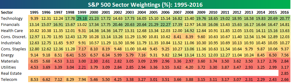
S&P 500 Sector Weightings Report — February 2018
S&P 500 sector weightings are important to monitor. Over the years when weightings have gotten extremely lopsided for one or two sectors, it hasn’t ended well. Below is a table showing S&P 500 sector weightings from the mid-1990s through 2016. In the early 1990s before the Dot Com bubble, the US economy was much more evenly weighted between manufacturing sectors and service sectors. Sector weightings were bunched together between 6% and 14% across the board. In 1990, Tech was tied for the smallest sector of the market at 6.3%, while Industrials was the largest at 14.7%. The spread between the largest and smallest sectors back then was just over 8 percentage points.
The Dot Com bubble completely blew up the balanced economy, and looking back you can clearly see how lopsided things had become. Once the Tech bubble burst, it was the Financial sector that began its charge towards dominance. The Financial sector’s sole purpose is to service the economy, so in our view you never want to see the Financial sector make up the largest portion of the economy. That was the case from 2002 to 2007, though, and we all know how that ended.
Unfortunately we’ve begun to see sector weightings get extremely out of whack once again.
If you would like to see the most up-to-date numbers for S&P 500 sector weightings, simply start a two-week free trial to our Bespoke Premium or Bespoke Institutional service. Click back to this post once you’re signed up to see the numbers.
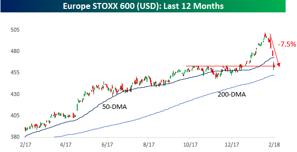
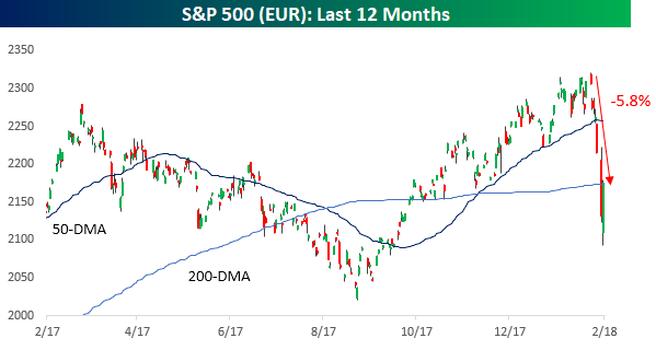
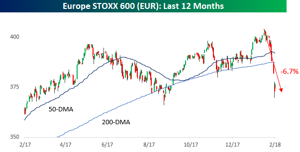
Similar Declines on Both Sides of Atlantic, But From Different Levels
In looking at equity market returns in the US and Europe since the January highs, both the S&P 500 and Europe’s benchmark STOXX 600 have seen declines of similar magnitudes. Depending on which side of the Atlantic you reside on, however, the level from which equities sold off is entirely different. Let’s start with a look at recent performance from the eyes of a US investor.
As shown in the top chart below, the S&P 500 headed into Wednesday down 6.2% from its January high. The index ended its 100+ trading day streak of consecutive closes above its 50-DMA on Monday, and even after an enormous intraday rebound on Tuesday, it remains below that level.

The chart of the STOXX 600 looks similar to the S&P 500. Up until late January, US investors saw steady gains in the index on a dollar-adjusted basis. Since the late January peak, though, the index has seen a decline of 7.5% and like the S&P 500 broke down below its 50-DMA earlier this week. As shown in the chart, though, at current levels the index is sitting right at a pretty significant support level.
While the recent declines in the S&P 500 and STOXX 600 look like nothing more than a blip relative to a longer-term uptrend, from the perspective of a European investor, the charts look a lot less encouraging. While the S&P 500 is off just 5.8% relative to its January highs in Euro terms, that January high was only modestly above where it was trading a year ago. In other words, while US investors have seen the S&P 500 rally 17.5% in the last year, European investors who bought the S&P 500 are up less than 2% after accounting for the dollar’s weakness!
Similarly, the chart of the STOXX 600 looks much weaker in local currency terms than the dollar-adjusted version above. January’s high represented just a modest breakout from prior resistance that quickly failed miserably as the index is now comfortably below both its 50 and 200-day moving averages. Over in Europe, they’re saying, “Bull? What bull?”
Bespoke’s Global Macro Dashboard — 2/7/18
Bespoke’s Global Macro Dashboard is a high-level summary of 22 major economies from around the world. For each country, we provide charts of local equity market prices, relative performance versus global equities, price to earnings ratios, dividend yields, economic growth, unemployment, retail sales and industrial production growth, inflation, money supply, spot FX performance versus the dollar, policy rate, and ten year local government bond yield interest rates. The report is intended as a tool for both reference and idea generation. It’s clients’ first stop for basic background info on how a given economy is performing, and what issues are driving the narrative for that economy. The dashboard helps you get up to speed on and keep track of the basics for the most important economies around the world, informing starting points for further research and risk management. It’s published weekly every Wednesday at the Bespoke Institutional membership level.
You can access our Global Macro Dashboard by starting a 14-day free trial to Bespoke Institutional now!

The Closer — The Making of A Shopping List — 2/6/18
Log-in here if you’re a member with access to the Closer.
Looking for deeper insight on markets? In tonight’s Closer sent to Bespoke Institutional clients, we look at some stocks that have recently gotten a lot cheaper. We also review JOLTS data and the tempo of recent Fed statements.
See today’s post-market Closer and everything else Bespoke publishes by starting a 14-day free trial to Bespoke Institutional today!