S&P 500 Corrections
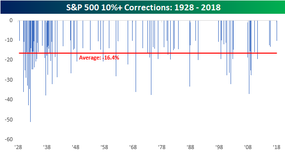
After nearly two years without one, the S&P 500 officially entered correction territory yesterday, falling 10.2% from its 1/26/18 all-time closing high. The current correction represents the 96th decline of 10%+ from a closing high that followed a gain of at least 10%. The chart below shows the magnitude of every prior correction for the S&P 500 since 1928. Not including the current period, the median decline for the S&P 500 in the 95 prior corrections was a decline of 16.4% over the course of 64 days. Keep in mind, though, that these are median levels. There have been a number of corrections (13) that saw declines of less than 11%, while several saw deeper declines of more than 20%. In terms of length, prior corrections have also been all over the map. Some have lasted as little as three days, while others have stretched on for well over a year.
Unfortunately, there is no hard and fast rule when it comes to corrections, and that’s what can make them so terrifying when you go through one. You never know when it will end. Throughout history, market corrections have ‘typically’ occurred a little more than once per year. As mentioned above, there have been 96 corrections since 1928, but if you look at their distribution over time, a good deal of them were clustered around the Great Depression. If we look just at the post-WWII period, there have been 55 corrections in the span of 73 years, reducing their frequency to once about every 16-17 months. In any event, the market was still overdue for a correction heading into the current one, but maybe not by as much as it seemed on the surface.
The Closer — A Correction Comes — 2/8/18
Log-in here if you’re a member with access to the Closer.
Looking for deeper insight on markets? In tonight’s Closer sent to Bespoke Institutional clients, we make the case that downside for equities is limited from current levels, based on technicals, the economic back drop, and historical precedent, with each reviewed in turn.

See today’s post-market Closer and everything else Bespoke publishes by starting a 14-day free trial to Bespoke Institutional today!
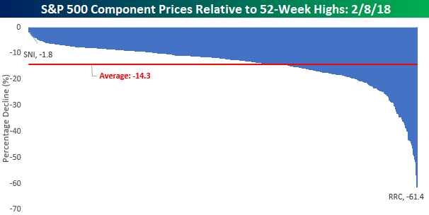
How Much Are Individual Stocks Down From Their 52-Week Highs?
The S&P 500 is currently down about 8.5% from its 52-week high less than two weeks ago, but the average stock in the S&P 500 is now down 14.3% from its respective 52-week high. That may seem like a pretty wide discrepancy, but it’s actually pretty common for the individual stock reading to be much lower than the index itself due to the fact that not all stocks hit 52-week highs at the same time as the index. In fact, you rarely even see a third of stocks hit an all-time high on the same day.
While the ‘average’ stock is down 14.3%, the vast majority of stocks are down less than the average – 328 to be exact. Of those 328 names, 170 are still down less than 10% from their respective highs. So who is currently the biggest loser in the S&P 500? That title belongs to Range Resources (RRC). At a current price of $13.16, RRC is down over 60% from its 52-week high. Behind RRC, there are three other stocks down over 50%. They are Chesapeake (CHK), General Electric (GE), and Envision Healthcare (EVHC). The demise of GE has certainly been a major fall from grace. While the stock didn’t perform well under the leadership of Jeff Immelt, it hasn’t been any better since he left. In fact, since Immelt officially retired on October 2nd, 2017, GE shares are down more than 40%!
On the upside, shares of Scripps Networks (SNI) have been holding up better than any S&P 500 stock as they are down less than 2% from their 52-week highs.
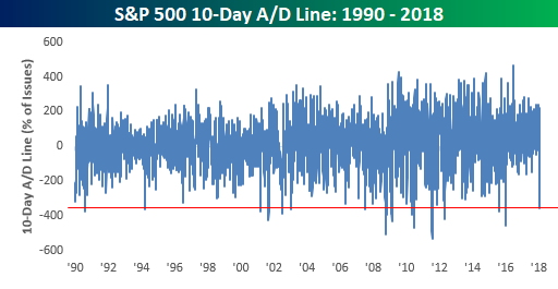
El Capitan!
In our latest update to the 10-day advance/decline (A/D) lines in our Sector Snapshot report for clients, we couldn’t help but think of the rock formation El Capitan in Yosemite National Park. The chart below shows the S&P 500’s 10-day A/D line over the last year. If you are unfamiliar with the term 10-day A/D line, it is simply a rolling 10-day total of the net number of stocks in the S&P 500 rising and falling on a daily basis. When the line is positive it means more stocks are rising than falling, while a falling line means the opposite. Over the course of the last two weeks since the S&P 500’s closing high on 1/26, the 10-Day A/D line has seen an outright collapse, falling to levels not seen at any point in the last year.
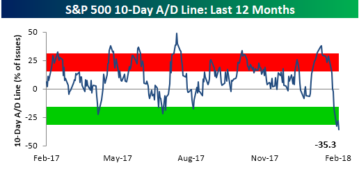
While the big drop in the 10-day A/D line is a big outlier relative to levels from the last year, from a longer-term vantage point, there have been several other periods where the 10-day A/D line was as low or lower. The most recent occurrences came back in early 2016 when the S&P 500 was getting off to its worst start to a year on record. Before that, we saw another extreme reading back in August 2015. Besides these two instances, other periods during the current bull market where the 10-Day A/D line was more negative than it now came in May 2010 (Europe Debt Crisis), August 2011 (US Debt Downgrade), and May 2012 (Greek Debt Crisis).
Bespoke’s Sector Snapshot — 2/8/18
We’ve just released our weekly Sector Snapshot report (see a sample here) for Bespoke Premium and Bespoke Institutional members. Please log-in here to view the report if you’re already a member. If you’re not yet a subscriber and would like to see the report, please start a two-week free trial to Bespoke Premium now.
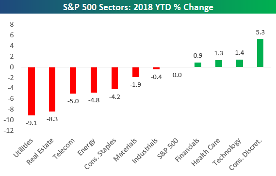
Below is one of the many charts included in this week’s Sector Snapshot, which highlights the year-to-date change of the S&P 500 and its eleven sectors. Just last week nearly every sector was up significantly in 2018. Now there are just four sectors that remain in positive territory, while seven are in the red. Ouch.
To see our full Sector Snapshot with additional commentary plus six pages of charts that include analysis of valuations, breadth, technicals, and relative strength, start a two-week free trial to our Bespoke Premium package now. Here’s a breakdown of the products you’ll receive.
One Benefit of the Selloff — Lower Valuations
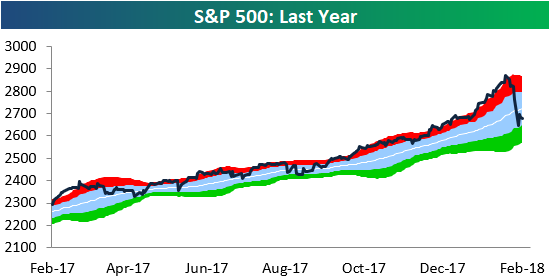
Below is a quick snapshot of the S&P 500 run through our trading range chart. After trading overbought for four consecutive months and then going parabolic in January, the S&P has been re-introduced to the concept of “mean reversion.”
One benefit of the mean reversion is that valuations have fallen quite dramatically in the span of less than two weeks. As shown below, the S&P 500’s trailing 12-month P/E ratio had stretched above 23 at the end of January, but it now sits below 22 at 21.74. As long as earnings (the “E” in P/E) remain strong, any price decline in the S&P will cause further declines in the P/E.
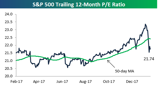
Chart of the Day: Real Yields
Bulls Retreat
It’s easy to have positive sentiment towards the stock market when things are going well, but the real test is always when the going gets tough. The last two weeks have provided that test for the bulls, and their response has been an all-out retreat. Based on the weekly survey from AAII, bullish sentiment declined from 44.8% down to 37.0% for the fourth weekly decline in the last five. At the start of the year, bullish sentiment spiked up to just under 60%, but in the span of just five weeks, close to 40% of those newly minted bulls have already abandoned ship and shifted over to the bearish or neutral camp.
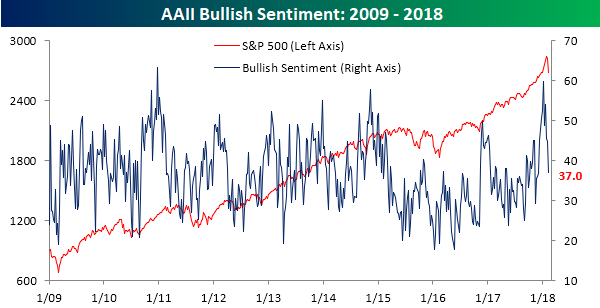
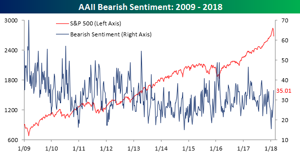
As bullish sentiment drops back into the doldrums, bears have been on the prowl. In this week’s survey, bearish sentiment swelled to 35% from last week’s level of just under 29%. Since the first week of January, the size of the bearish camp has more than doubled from a low of 15.6%.
the Bespoke 50 — 2/8/18
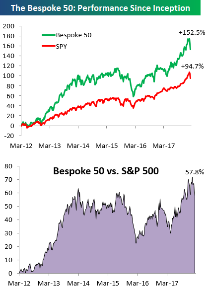
Every Thursday, Bespoke publishes its “Bespoke 50” list of top growth stocks in the Russell 3,000. Our “Bespoke 50” portfolio is made up of the 50 stocks that fit a proprietary growth screen that we created a number of years ago. Since inception in early 2012, the “Bespoke 50” has beaten the S&P 500 by 57.8 percentage points. Through today, the “Bespoke 50” is up 152.5% since inception versus the S&P 500’s gain of 94.7%. Always remember, though, that past performance is no guarantee of future returns.
To view our “Bespoke 50” list of top growth stocks, click the button below and start a trial to either Bespoke Premium or Bespoke Institutional.
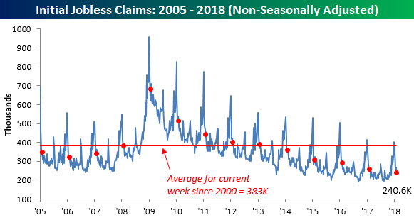
Jobless Claims at Generational Lows
Jobless claims declined for the third time in four weeks, falling from 230K down to 221K compared to expectations for an increase to 232K. This week’s print was the second lowest reading of the current economic expansion and the 153rd straight week below 300K.
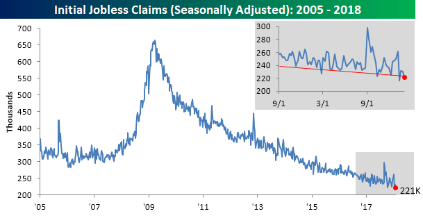
Even more impressive is the fact that the four-week moving average for claims dropped to its lowest level in 45 years. Not since 1973, when the size of the labor force was considerably smaller, were claims as low as they are now.

On a non-seasonally adjusted (NSA) basis, jobless claims fell to 240.6K, which is more than 40K below the average of 383K for the current week of the year dating back to 2000. In fact, going back to the late 1960s, for the current week of the year there has never been a lower NSA print! How’s that for impressive?