Strong ISM Manufacturing With an Inflation Aroma
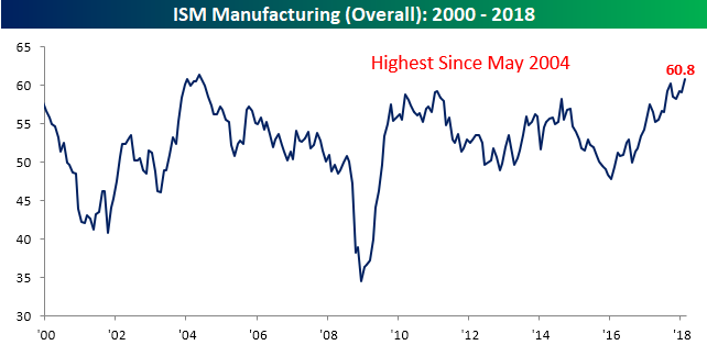
The February ISM Manufacturing report for the Manufacturing sector came in much stronger than expected and rose to a level of 60.8 compared to last month’s reading of 59.1 and consensus expectations that were calling for a decline to 58.7. As shown in the chart below, February’s reading was the strongest for the headline index since May 2004. It’s hard not to like that!
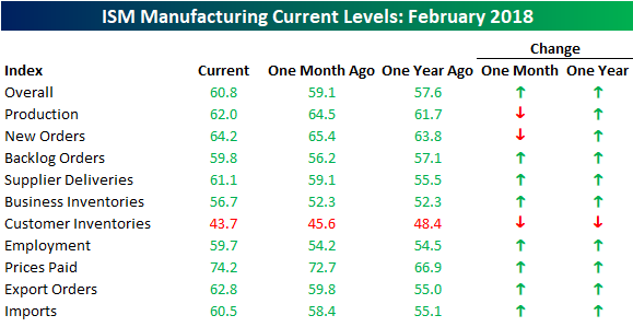
While the headline reading was positive, not all the news was good. The table below shows the breakdown of this month’s sub-indices on both a m/m and a y/y basis. One thing that stands out is that breadth in the report was strong. On a m/m basis, all but three components increased, and on a y/y basis Customer Inventories was the only category that showed a decline. That’s the good news. The bad news is that two of the three categories that declined on a m/m basis in February were Production and New Orders. These are two categories that we typically like to see increasing, and February’s drops represent the second straight month of declines for each sub-index. More important than those declines, however, is the fact that Price Paid rose to its highest level since May 2011 (chart below). With the markets already on edge about potential inflation pressures, this was not welcome news.

A look at the commentary in this month’s report stinks even more of inflation and potential price pressures. Of the ten quotes highlighted in the report, seven of them discuss issues like lead times, contraints, tight labor markets, suppliers out of inventory, supplier price increases, etc. The usual way to alleviate these issues is simple- higher prices. Whether and how much they actually translate to higher prices, remains to be seen, but for a market already worried about the potential for upside price pressures, these aren’t welcome comments.
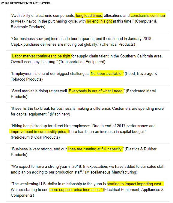
Chart of the Day: Autos To Miss In February
the Bespoke 50 — 3/1/18
Every Thursday, Bespoke publishes its “Bespoke 50” list of top growth stocks in the Russell 3,000. Our “Bespoke 50” portfolio is made up of the 50 stocks that fit a proprietary growth screen that we created a number of years ago. Since inception in early 2012, the “Bespoke 50” has beaten the S&P 500 by 57.3 percentage points. Through today, the “Bespoke 50” is up 154.5% since inception versus the S&P 500’s gain of 97.2%. Always remember, though, that past performance is no guarantee of future returns.
To view our “Bespoke 50” list of top growth stocks, click the button below and start a trial to either Bespoke Premium or Bespoke Institutional.

Strong Month For Ford Truck Sales
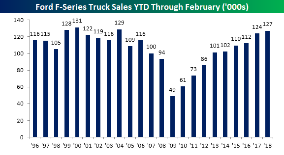
Overall February sales from Ford came in slightly weaker than expected, but it was a pretty strong month for sales of Ford F-series trucks. Trucks are not only higher margin, but they are often purchased by small businesses and contractors so they provide a good read on the health of the small business sector. Based on these sales totals, small businesses are expanding. As shown in the first chart, February sales came in at 68,243, which is a 3.5% increase from last February (which had the same number of selling days) and the second highest sales total for February going all the way back to 1996. The only February that was stronger was in 2000 when sales of F-Series trucks totaled 71.82K.

With this month’s relatively strong sales total, YTD sales for F-Series trucks are now running at 127.18K. This now represents the 9th straight year that YTD sales through the first two months of the year have been better than the prior year, and going back to 1996, there have only been three years where the first two months of the year saw stronger sales totals (2000, 2004, and 1999).
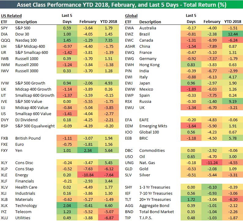
February 2018 and YTD Asset Class Performance
Below is a look at our asset class performance matrix showing the total return of a number of key ETFs across equities, fixed income, commodities, and currencies. For each ETF, we show its total return over the last week, in February, and year-to-date.
Major US index ETFs all fell in February, with the Dow (DIA) falling the most (-4.05%) and the Nasdaq 100 (QQQ) falling the least (-1.29%). Growth outperformed value by a wide margin. In fact, with a drop of 5.55%, the S&P 500 Value ETF (IVE) fell the most in February out of all the US index ETFs in our matrix.
Looking at the major S&P 500 sectors, Energy (XLE) got whacked by more than 10% in February, while Consumer Staples (XLP) fell 7.63%. Technology was the best performing sector on a relative basis with a drop of just 0.41% in February.
Outside of the US, every country ETF fell more than 1% in February. China (ASHR), Germany (EWG), and Spain (EWP) fell the most with drops of more than 7%, while Russia (RSX) and Brazil (EWZ) were down the least. Year-to-date, Brazil (EWZ) is the best performing ETF in the entire matrix with a gain of 12.44%.
Commodity ETFs in our matrix all fell in February too, with natural gas (UNG) down the most at -11.24%. And even though the drop in Treasuries (rise in interest rates) dominated the headlines during the month, Treasury ETFs were still some of the best performers compared to other asset classes.
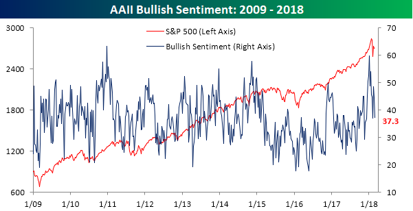
Bulls Retreat
With continued volatility in the market, individual investors are increasingly becoming leery of equities without turning outright bearish. In the latest weekly survey of investor sentiment from AAII, bullish sentiment dropped from 44.65% down to 37.28%. That’s the second lowest weekly reading of the year behind only the 37.03% level we saw right at the lows in early February.
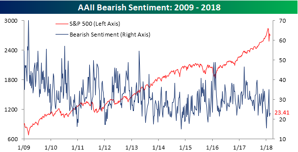
While bullish sentiment saw a pretty sizable decline in just the last week and is off its highs in early January, bearish sentiment hasn’t seen much of an uptick. In this week’s survey, bearish sentiment came in at just 23.41%.
Neutral sentiment, on the other hand, has surged in recent weeks. This week’s level of 39.3% is the highest since last July, indicating that while investors have become more skittish of the market, they haven’t been completely shaken out.

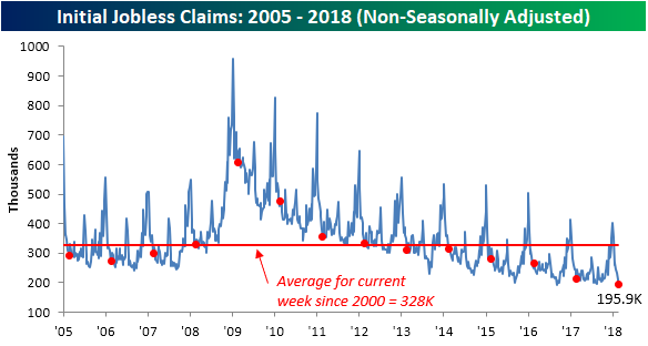
Jobless Claims: Ludicrous Mode
At the risk of sounding like a broken record, weekly jobless claims continue to amaze us. In this week’s report, first-time claims came in at 210K, which was 15K below the consensus estimate of 225K. The last time a weekly print came in that low was in 1969! It has now been seven straight weeks that jobless claims have come in below 250K and 156 straight weeks that they have been below 300K. Barring a 90K increase in the next few weeks, the current streak of sub-300K readings will go down as the longest ever.

With another extraordinarily low reading this week, the four-week moving average dropped by nearly 5K down to 220.5K. That’s also the lowest level for this indicator since 1969!
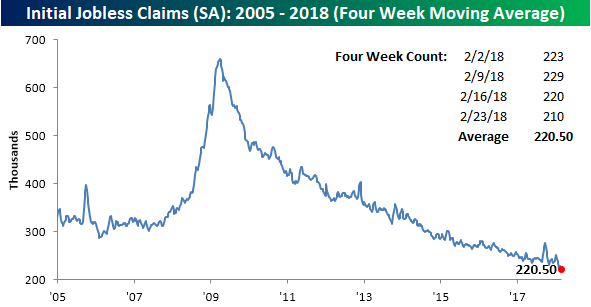
On a non-seasonally adjusted (NSA) basis, jobless claims dropped down to 195.9K. For the current week of the year, that was the lowest weekly reading since at least 1967. More recently, since 2000 this week’s print was more than 132K below average.
The Streak
Back in 1995, on a crisp fall September night, Cal Ripken Jr. did the previously unthinkable and broke one of the most enduring streaks in baseball history when his 2,131st straight game became official in the top of the fifth. That game surpassed the previous record of 2,130 straight games that was held by “The Iron Horse” Lou Gehrig and stood for over a half-century. Ripken’s streak continued another 501 games until 9/19/98 when he voluntarily sat out of what would have been his 2,633rd straight game. Because of the way the game is now played and how players are rested on a somewhat regular basis, there is widespread agreement that Ripken’s streak could stand forever.
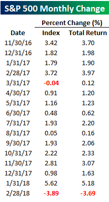
For the US equity market, there is another almost as impressive streak of consistency that could have set a record had we just managed to post a gain in February. February marked the first down month for the S&P 500 since March 2017 (ten straight months of gains). On a total return basis, though, the streak of gains was even more impressive at 15 straight months heading into February (right side column in the table below). The last time the index had a down month on a total return basis before February, Hillary Clinton was a shoe-in to be the next President. Just like President Clinton was on hand to watch as Ripken broke Gehrig’s streak, President Trump was likely watching this streak just as closely!
As mentioned above, the 15-month streak of consecutive monthly gains for the S&P 500 is quite an impressive one. Throughout history, there have only been a handful of prior streaks that even reached the double-digit range. In a B.I.G. Tips report we just published this morning, we looked at prior periods when similarly long streaks came to an end to see how the market tended to react. What we found was a clear trend in how equities performed going forward, and depending on your perspective, you’ll either love it or hate it.
If you’re interested in the report, you can read it by signing up for a Bespoke Premium membership now!
The Closer — US Data Recap, Dollar Coiling, Energy Update — 2/28/18
Log-in here if you’re a member with access to the Closer.
Looking for deeper insight on markets? In tonight’s Closer sent to Bespoke Institutional clients, we review today’s economic data, petroleum market data from the EIA, energy asset price action, and finally a series of breakout setups for the dollar versus a wide range of foreign currencies.

See today’s post-market Closer and everything else Bespoke publishes by starting a 14-day free trial to Bespoke Institutional today!
A One-Two-(Three Percent) Punch For Treasuries
The year is only two months old, but already it has been a rough one for US Treasuries. Year to date, the Merrill Lynch index that tracks the performance of long-term US Treasuries is already down over 6% with declines of more than 3% in both January and February. Treasuries have long been considered one of the safest assets along the invest-able risk curve, so investors typically don’t expect to see significant losses on their holdings in the space. To illustrate, over the last forty years, monthly declines of 3% have only occurred a little more than 10% of the time. In the last 17 months, however, we’ve now seen four occurrences!
Back to back declines of 3% in long-term US Treasuries are even more uncommon. The chart below shows the monthly total return in the Merrill Lynch 10+ Year Treasury Index going back to 1978. Each of the periods that are shaded in red indicate back to back monthly declines of 3%. In the last forty years, there have only been five prior events. The most recent was in October and November of 2016, but before that, you have to go back to February and March 1994. Needless to say, these types of back to back declines are something that most investors are not used to.
