Chart of the Day: Q1 Earnings Winners & Losers
Fixed Income Weekly – 4/11/18
Searching for ways to better understand the fixed income space or looking for actionable ideals in this asset class? Bespoke’s Fixed Income Weekly provides an update on rates and credit every Wednesday. We start off with a fresh piece of analysis driven by what’s in the headlines or driving the market in a given week. We then provide charts of how US Treasury futures and rates are trading, before moving on to a summary of recent fixed income ETF performance, short-term interest rates including money market funds, and a trade idea. We summarize changes and recent developments for a variety of yield curves (UST, bund, Eurodollar, US breakeven inflation and Bespoke’s Global Yield Curve) before finishing with a review of recent UST yield curve changes, spread changes for major credit products and international bonds, and 1 year return profiles for a cross section of the fixed income world.
In this week’s note, we review the significant seasonality present in breakeven yields.

Our Fixed Income Weekly helps investors stay on top of fixed income markets and gain new perspective on the developments in interest rates. You can sign up for a Bespoke research trial below to see this week’s report and everything else Bespoke publishes free for the next two weeks!
Click here and start a 14-day free trial to Bespoke Institutional to see our newest Fixed Income Weekly now!
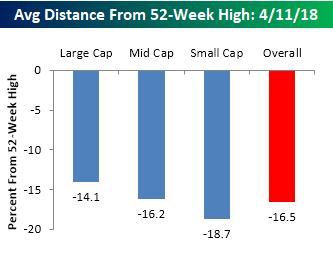
Average Stock Declines From 52-Week Highs
While the S&P 500 as a whole is down nearly 8% from its recent 52-week high in late January, as you might expect, the average decline of individual stocks in the index is quite a bit larger. The first chart below shows the average distance between the current price of stocks in the S&P 1500 relative to their 52-week highs by market cap. Overall, the average stock in the S&P 1500 is down just over 16.5% from its 52-week high. From a market cap perspective, the trend is pretty typical of what you would expect to see. Small caps are currently trading the furthest from their 52-week highs (-18.7%), mid caps are right in the middle (-16.2%), while large cap stocks are down an average of 14.1%.
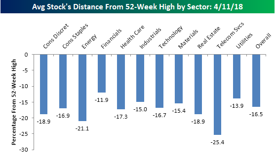
The chart below shows the average distance that stocks in the S&P 1500 are trading relative to their 52-week highs by sector. Currently, there are just two sectors where the average percentage decline is greater than 20% (Energy and Telecom Services). In the case of Energy, the current 21.1% reading is actually pretty good compared to prior readings we have seen for the sector over the last couple of years. Meanwhile, the Telecom Services sector only has a handful of stocks in it, so we don’t really place much focus on that. Financials are one sector that has held up really well in the recent market turbulence as stocks in that sector are only down an average of 11.9%. Since it’s the largest sector, no discussion would be complete without mentioning Technology, and while it had been a market leader, stocks in the sector are actually now down slightly more relative to their 52-week highs (-16.7%) than the overall market (-16.5%).
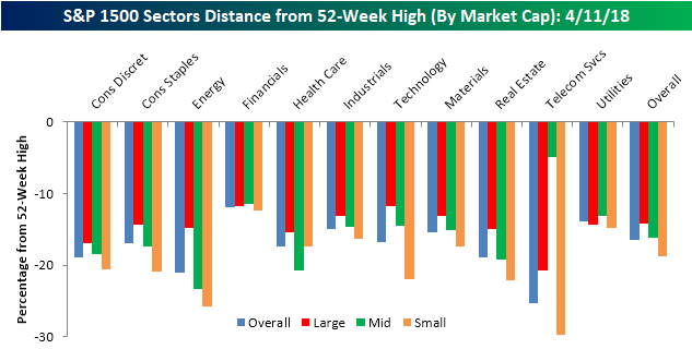
The last breakdown we wanted to look at is the average decline of stocks based on market cap and sector. The category that is down the most is small cap stocks in the Telecom Services sector (-29.66%). Keep in mind, though, that there are only seven stocks in the group. As mentioned above, stocks in the Technology sector are down slightly more than the overall average, but there is a wide disparity across different market caps. In the small cap Technology sector, the average stock is down nearly 22% compared to an average decline of less than 12% for large cap tech stocks. While there is a wide disparity between Technology sector stocks based on market cap, in the Financial sector, the spread couldn’t be narrower as less than 100 bps separates the best performing market cap range from the worst. How’s that for uniformity?
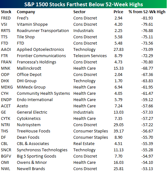
Finally, in the table below we provide a list of the 25 stocks in the S&P 1500 that are down the furthest from their respective 52-week highs. The two stocks down the most from their highs are both from the Consumer Discretionary sector and are also both brick and mortar retailers (Fred’s and Vitamin Shoppe). Outside of the brick and mortar retailers that are spread throughout the list, there are also seven stocks from the Health Care sector and three Tech stocks. The only sectors not represented on this list are Energy, Financials, Materials, and Utilities.
B.I.G. Tips – US Economic Indicator Diffusion Index Remains Positive
The Closer — Oil & EURCHF Break Out, PPI Surge, BoC Business Outlook — 4/10/18
Log-in here if you’re a member with access to the Closer.
Looking for deeper insight on markets? In tonight’s Closer sent to Bespoke Institutional clients, we review recent price action in crude and a currency cross that’s breaking out and indicative of solid risk sentiment. We also discuss a strong PPI report today and yesterday’s Business Outlook and Senior Loan Officer Surveys from the Bank of Canada.

See today’s post-market Closer and everything else Bespoke publishes by starting a 14-day free trial to Bespoke Institutional today!
Gas Prices Near Two Year Highs
With all of the concern over inflation recently, nowhere do rising prices hit closer to home than at the gas pump (unless you’re driving a Tesla of course). As you might expect given that crude oil prices are in the mid-60s, prices at the pump have been on the rise. According to AAA, the national average price currently stands at $2.66 per gallon, which is just off the $2.67 post-crash high that we saw late last summer in the aftermath of the hurricanes.
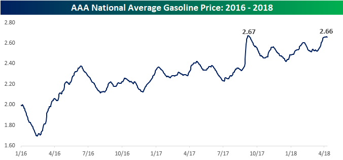
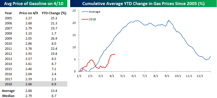
While prices have been on the rise this year, the magnitude of the move has hardly been out of the ordinary for this time of year. The table to the lower left shows the YTD change (through 4/9) for the national average price of a gallon of gas going back to 2005. While prices are up 6.9% this year, that’s actually only slightly more than half the average YTD change of 13.4% as of early April and nearly two percentage points below the median change of 8.7%. In the lower right chart, we have created a composite chart of the average price of gasoline throughout the year. As shown, it’s very common for gas prices to rise in the first three months of the year. In fact, there hasn’t been a single year since 2005 that the national average price was down YTD through 4/9, and this year’s 6.9% gain is the fourth smallest YTD gain of the last fourteen years.
Based on historical trends, we’re also only about two months from the point in the year where gas prices typically peak (mid-June). From that point through the Summer, prices typically level off before plummetting to close out the year.
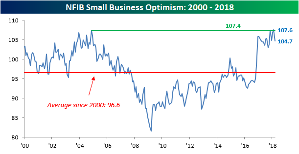
Biggest Drop in Small Business Sentiment Since 2015
After hitting multi-decade highs in February, optimism on the part of small businesses pulled back a fair amount in March. While economists were expecting the headline index to see a slight pullback to 107.0 from last month’s reading of 107.6, the actual decline was much larger as the index dropped to 104.7. With a m/m decline of 2.9 points, this month’s drop was the largest drop since 2015. In terms of the report’s reading relative to expectations, however, we actually saw a bigger miss back in January with the release of the December 2017 report.
Even with this month’s decline, however, we would note that sentiment on the part of small businesses remains positive and is well above the historical average reading of 96.6. Also, as noted in the report, of the 432 historical monthly readings, only 20 have been higher than this month’s level.
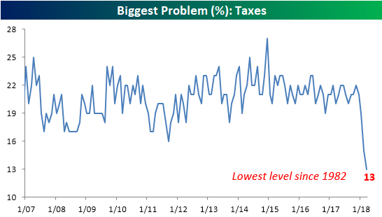
In terms of the biggest problems facing small businesses, the table below summarizes this month’s breakdown. Topping the list once again this month is Quality of Labor which received 21% of the votes. That’s a high reading, but it’s actually down from February’s reading of 22%. Falling further and further down the “problems list” is Govt Red Tape and Taxes. While markets have grown increasingly concerned about price pressures in the last couple of months, small business owners aren’t seeing it yet as only 1% cited inflation as their number one problem, and that’s down from 2% last month.

In the case of Taxes, the percentage of businesses citing that issue as their biggest problem has plummetted ever since the Tax Reform bill was signed into law. According to the NFIB, it hasn’t been cited by this few a percentage of businesses since 1982!
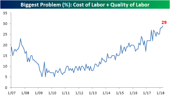
Inflation may not be a big concern at this point for small businesses, but with issues arising regarding labor quality and costs, that could very well lead to higher wages and ultimately higher prices. As shown in the chart below, 29% of small businesses cited either labor quality (21%) or labor costs (8%) as their number one problem this month. That’s the highest level in at least a decade.
Bespoke Stock Scores — 4/10/18
Chart of the Day: The Day After The Big Reversal
The Closer — CBO Charted — 4/9/18
Log-in here if you’re a member with access to the Closer.
Looking for deeper insight on markets? In tonight’s Closer sent to Bespoke Institutional clients, we chart changes to the long-term economic growth and budget outlook today as forecast by the Congressional Budget Office.
See today’s post-market Closer and everything else Bespoke publishes by starting a 14-day free trial to Bespoke Institutional today!