Chart of the Day: Some Former Laggards Starting to Lead
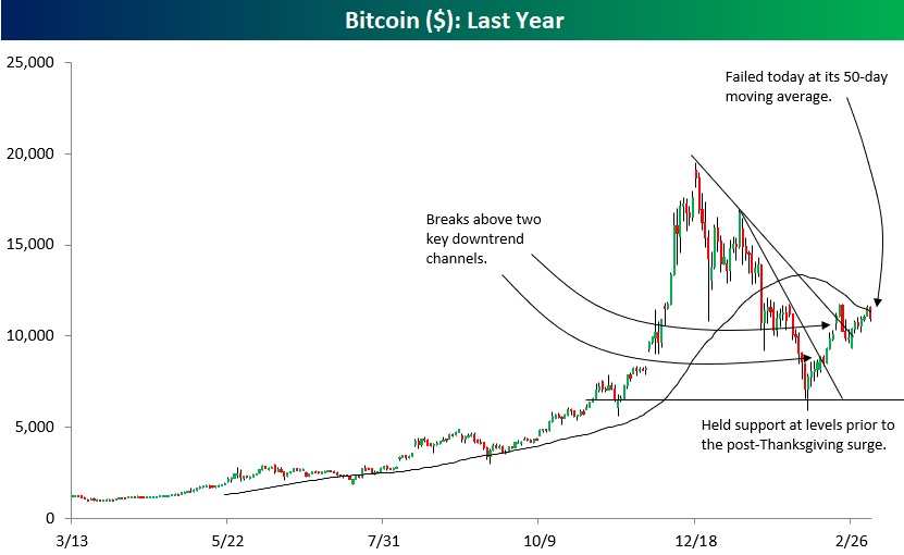
Bitcoin Stalls At Its 50-DMA
We’ve been highlighting the chart of Bitcoin below over the past month or so because of how much the crypto seems to be trading on technicals. After finding support around the $7,000 level in early February, Bitcoin bounced significantly and broke two key downtrend lines in the process. The reason we’re pointing out the chart today is because the rally has been stopped in its tracks right at the 50-day moving average. Bitcoin bulls were hoping that price could take out both the 50-day and the high from February 20th, which was just under the $12,000 mark. Instead, the 50-day (which sits right below $12,000) acted as stiff resistance and we’ve seen price pull back to the $11,000 mark.
How Can This Be the Best Performing Industry Group in the S&P 500?
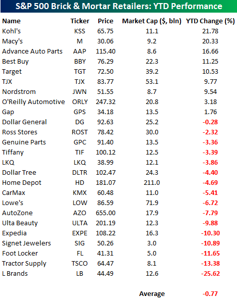
In an earlier post looking at breadth among the different industry groups in the S&P 500, we noted that Retailing was the top performing group in the S&P 500 YTD with a gain of over 15%. Looking at the table below, however, you would have hardly guessed by looking at the performance of brick and mortar retailers in the S&P 500 on a YTD basis. Of the 25 individual brick and mortar companies listed, just nine are up YTD, and the average YTD performance of these stocks has been a decline of 0.77%. To be sure, there have been some winners with stocks like Kohl’s (KSS) and Macy’s (M) up over 20% and a total of five stocks up more than 10%. At the other end of the list, though, there are also five stocks down by double-digit percentages.
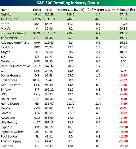
The table below shows the YTD returns of all the stocks in the S&P 500 Retailing Industry Group. That includes all the names highlighted above plus the four non-traditional brick and mortar retailers in the group (highlighted in green). As shown, all four of the stocks not listed in the table above have seen stellar returns so far in 2018, with Netflix’s (NFLX) 67% gain leading the way higher. Right behind NFLX, Amazon (AMZN) has rallied over 30%, while Booking (BKNG) and Trip Advisor (TRIP) round out the top five. In this table, we have also included a column showing what each company’s market cap equals as a percentage of the industry group’s total market cap. By itself, AMZN accounts for almost 45% of the industry group, while NFLX accounts for another 8.4%. BKNG is no slouch either at 6.1% of the industry group’s total market cap. What’s really amazing about these four stocks is that together they account for just under 60% of the industry group’s total market cap, yet when you think retail, for most people they aren’t the first companies that typically come to mind.
S&P 500 Industry Groups vs 50-DMA
As the S&P 500 continues to churn around below its all-time highs from January, we are beginning to see short-term breadth readings start to weaken. While strong breadth is always preferable to weak breadth, given the declines we have seen in price, it should come as no surprise that the number of industry groups with rising 50-day moving averages (DMA) and the number trading above their 50-DMAs has also declined.
Starting with the percentage of industry groups above their 50-DMA, after falling down close to zero in early February, it has rebounded some but still remains below a third at 29.4%. You may recall that prior to Monday’s rally, this reading was considerably lower at just 16.7%.

The longer industry groups trade below their 50-days, the more likely it is that the direction of their 50-DMAs will start to turn lower as well. As shown in the chart below, just 37.5% of S&P 500 industry groups have rising 50-DMAs. The last time the reading was this low was late last summer, and before that, you would need to go back to right before the 2016 election. Investors have certainly become a bit antsier over the last few weeks, and given that it has been pretty uncommon over the last two years to see so many industry groups with falling 50-DMAs, that sense of unease is understandable.

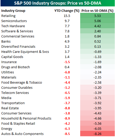
The table below lists the YTD performance of all 24 S&P 500 industry groups along with where they are trading relative to their 50-DMAs. Given the year is still young, the fact that the best performers YTD are the furthest above their 50-DMA (and vice versa) shouldn’t come as much of a surprise. Leading the way higher this year, the Retailing Industry Group has been the best performer with a YTD gain of over 15%! The performance of this group, however, is completely misleading. While a number of traditional brick and mortar retailers are up on the year, the bulk of the group’s gains have come from Amazon (AMZN), Netflix (NFLX), and Booking (formerly Priceline), which are up 32%, 67%, and 20% YTD, respectively. The average return of the traditional brick and mortar retailers in the group is actually a decline of 0.4% YTD.
Behind retailing, the other Industry Groups that are furthest above their 50-DMAs are all tech related with Semis, Tech Hardware, and Software & Services all at least 2.4% above their 50-DMAs.
On the downside, it’s already been a rough year for Autos & Auto Parts, Energy, and Food & Staples Retail, which are all more than 5% below their 50-DMAs. So while tech stocks have been driving the market’s gains (what else is new), there really hasn’t been a dominant theme behind the groups that are furthest below their 50-DMAs.
Bespoke Stock Scores — 3/6/18
The Closer — Equity Duration — 3/5/18
Log-in here if you’re a member with access to the Closer.
Looking for deeper insight on markets? In tonight’s Closer sent to Bespoke Institutional clients, we discuss the duration of the US equity market. We also make the case that the Canadian dollar has further to fall versus greenbacks.

See today’s post-market Closer and everything else Bespoke publishes by starting a 14-day free trial to Bespoke Institutional today!
Chart of the Day: Commodity Prices on the Rise
S&P 500 Stock Seasonality: 3/5/18
While we don’t ever suggest that investors should base their trading solely on the calendar, there is evidence that the market and many stocks do indeed follow seasonal patterns. This makes our S&P 500 Stock Seasonality report a useful addition to every investor’s toolbox. Using the last ten years worth of price data, our Stock Seasonality report looks at the average returns for the S&P 500, its eleven sectors, and its 500 individual stocks. In the report, we highlight the five stocks in each sector that have historically been the best and worst performers over the next two weeks. For each stock, we also include information such as average returns, the percent of time each stock or sector is positive/outperforms the S&P 500, and its historical performance over the next two weeks for each of the last ten years. The Stock Seasonality report is published on a weekly basis on Mondays, and it is available to all Bespoke Premium and Bespoke Institutional subscribers.
This week’s stock that we have chosen to highlight is Altria Group (MO). When it comes to defensive stocks, they don’t get much more defensive than MO, but in the upcoming two-week period at least, the stock has been a dud. As shown in the chart below, the stock has traded lower from the close on 3/5 through 3/19 in nine of the last ten years for a median decline of 1.9%. The last year that the stock was up during this period was in 2009, right when the rest of the market was going up in smoke.

For active traders, our Stock Seasonality report is an excellent tool to help keep track of the best and worst times of year for the overall market, sectors and individual stocks. To see the report, sign up for a monthly Bespoke Premium membership now!
Industry Group Breadth Readings
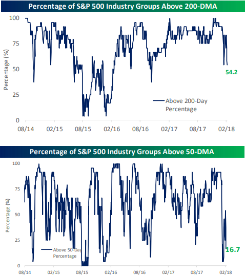
One of the breadth measures we follow closely is the percentage of S&P 500 industry groups trading above their 50-day and 200-day moving averages. (These are two indicators we feature often for Bespoke subscribers.) As shown below, the percentage of industry groups now trading above their 200-day moving averages has dipped down to 54.2%, so it’s getting very close to the 50% reading that is often viewed as a line of demarcation of sorts for a market that’s trending higher or trending lower.
The percentage of industry groups trading above their 50-day moving averages has dipped all the way down to 16.7%, and it was actually much lower at the recent lows in early February. This speaks to the extreme near-term weakness that the market has experienced over the last month and a half.
Start a two-week free trial to one of our premium membership levels if you’d like to receive more breadth analysis going forward. You can sign up here or click the button below.
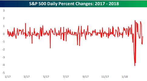
Market EKG goes haywire
We were reminded of an EKG when we made the chart below. The chart shows the S&P 500’s daily percentage change going back to 2017.
Aside from a few skips here and there, the market’s “EKG” looked pretty stable throughout 2017. Since early 2018, however, things have gone haywire, with violent daily moves in both directions.
If the market is the patient, who/what is the cause of the stress, and who/what is the doctor that can resolve the problem? Your average investor watching from the sidelines is like the nervous family member watching closely in the waiting room.
There are any number of ways you can answer the questions above. Rising interest rates, valuations, the short-vol trade, over-heating, inflation, and now tariffs are all possible answers as to the cause. Or maybe it’s just old age. As to how the stress gets resolved, if the main doctor is the Fed, they’ve got quite the predicament on their hands since they’re also a potential cause of the stress.
We’ll stop here before going even further down this metaphorical rabbit hole. The bottom line is that daily volatility has picked up quite significantly from where it stood throughout 2017, and at this point the only remedy might be time.