Jobless Claims Jump
Jobless claims for the latest week increased by 21K, which is the largest one-week increase since late last Summer when Hurricane Harvey struck Texas. What’s still pretty amazing is that even after the increase, claims only amounted to 231K, which in any other period over the last several years would have been considered an extraordinarily low reading. Jobless claims have now been below 250K for eight straight weeks and below 300K for 157 weeks in a row.
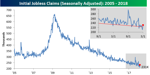
After hitting a multi-decade low last week, the four-week moving average increased slightly to 222.5K from 220.5K last week.

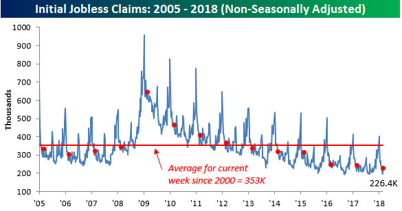
On a non-seasonally adjusted (NSA) basis, jobless claims increased by 30.5K. Even with the increase, though, this week’s reading was well below the average of 353K for the current week of the year dating back to 2000. To find a week at this time of year where NSA claims were lower, you have to go back to 1969.
Running of the Bulls (From Stocks)
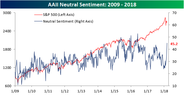
It really didn’t take much for the individual investor to sour on equities. After nearly three years where bulls failed to gain a majority in the weekly sentiment survey from AAII, in late December of last year, bullish sentiment finally topped 50% and reached as high 59.75% in early January. Then the correction came. After the swoon in equities in late January/early February, sentiment remained surprisingly resilient at just under 50% in mid-February. As the initial bounce off the February lows lost momentum and volatility continued, individual investors have had enough and are quickly jumping off the bullish bandwagon.
In this week’s sentiment survey from AAII, bullish sentiment plummetted nearly 11 percentage points, falling from 37.28% down to 26.4%. That’s the lowest weekly reading since the end of August and the largest two-week decline since June 2013.

While investors have been exiting the bullish camp, bearish sentiment hasn’t seen much of a bounce. At 28.38%, it is slightly higher than bullish sentiment, but it has been higher as recently as early February.

Neutral is where it’s at these days. In this week’s survey, the non-committal camp increased from 39.3% up to 45.2%. That’s the highest weekly reading since May 2016 and the largest two-week increase since December 2015.
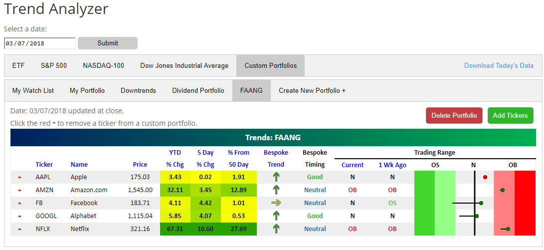
FAANG Stocks Back Above 50-DMAs
Using our Trend Analyzer tool, available to Premium and Institutional members, we built a custom portfolio of the five FAANG stocks in order to easily track their price trends. As shown in the snapshot of our custom FAANG portfolio below, gains over the last week have pushed all of the FAANG names back above their 50-day moving averages (the black vertical “N” line in the trading range section).
Netflix (NFLX) has been by far the strongest of the FAANG names in 2018 with a gain of 67%. A near parabolic move recently has pushed NFLX 27% above its 50-day moving average and well into overbought territory. Amazon (AMZN) is nearly just as overbought at NFLX as well, but it’s up about half the amount of NFLX on a year-to-date basis.
Outside of AMZN and NFLX, the gains have been much more muted, but they’re still gains nonetheless. GOOGL is up 5.85%, FB is up 4.11%, and AAPL is up 3.4%. While Apple (AAPL) has been as flat as a pancake over the past week (up 0.02%), Alphabet (GOOGL) and Facebook (FB) are up more than 4%. Today we saw both GOOGL and FB break back above their 50-DMAs, which is a healthy sign.
The Closer — Beige Book, NAFTA Impact — 3/7/18
Log-in here if you’re a member with access to the Closer.
Looking for deeper insight on markets? In tonight’s Closer sent to Bespoke Institutional clients, we quantify the exposure of the US economy at the national and state level to NAFTA trading partners in the US and Mexico.

See today’s post-market Closer and everything else Bespoke publishes by starting a 14-day free trial to Bespoke Institutional today!
Chart of the Day: Sell in May and Go Away Test for Global Equity Markets
Fixed Income Weekly – 3/7/18
Searching for ways to better understand the fixed income space or looking for actionable ideals in this asset class? Bespoke’s Fixed Income Weekly provides an update on rates and credit every Wednesday. We start off with a fresh piece of analysis driven by what’s in the headlines or driving the market in a given week. We then provide charts of how US Treasury futures and rates are trading, before moving on to a summary of recent fixed income ETF performance, short-term interest rates including money market funds, and a trade idea. We summarize changes and recent developments for a variety of yield curves (UST, bund, Eurodollar, US breakeven inflation and Bespoke’s Global Yield Curve) before finishing with a review of recent UST yield curve changes, spread changes for major credit products and international bonds, and 1 year return profiles for a cross section of the fixed income world.
In this week’s note, we quantify the dollar value of interest rate volatility that the Fed’s MBS portfolio has taken out of the markets.

Our Fixed Income Weekly helps investors stay on top of fixed income markets and gain new perspective on the developments in interest rates. You can sign up for a Bespoke research trial below to see this week’s report and everything else Bespoke publishes free for the next two weeks!
Click here and start a 14-day free trial to Bespoke Institutional to see our newest Fixed Income Weekly now!
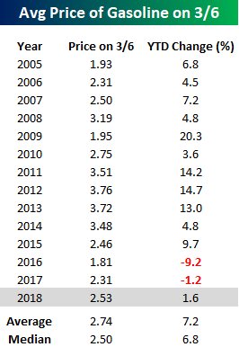
At Least Gas Prices Aren’t Taking off
Over the last several weeks, we’ve been highlighting a number of inflationary statistics in various economic indicators. One place, though, where consumers tend to quickly notice price increases where we haven’t seen a major uptick yet is in gas prices. The national average price of a gallon of gasoline in the United States currently stands at $2.53 per gallon, which is actually lower than the average price for this time of year going back to 2005. Additionally, so far this year the national average price has increased by just 1.2%. While that reverses a two-year trend where prices declined to kick off the year since 2005, gas prices have historically risen early in the year with the average YTD change through 3/6 being right around 7%. At least consumers have that going for them! That said, we aren’t completely out of the woods yet. On a historical basis, gas prices typically rise through the end of May before leveling off and falling from Labor Day through year-end.

Sector Internals + Best Performing Russell 3,000 and S&P 500 Stocks YTD (2018)
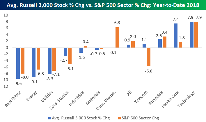
So far this year, the S&P 500 is up 2%, while the average stock in the Russell 3,000 (an index that contains large-cap, mid-cap, and small-cap stocks) is up 0.9%. These performance numbers highlight how the largest stocks in the market have boosted the performance of major indices.
There are some big discrepancies when you look at cap-weighted S&P 500 sector performance versus the performance of the average stock in each Russell 3,000 sector. One of the biggest standouts is the Consumer Discretionary sector. As shown in the chart below, the S&P 500 Consumer Discretionary sector is up 6.3% year-to-date. That’s the second-best performing sector in the market. In the Russell 3,000 Consumer Discretionary sector, though, the average stock is actually down 0.1% year-to-date. The significant underperformance on an equal-weight basis suggests that Consumer Discretionary is much weaker than it appears underneath the surface. The two main stocks causing this discrepancy are Netflix (NFLX) and Amazon (AMZN). Given their massive market caps, their movements have a huge impact on the S&P 500 Consumer Discretionary sector. With NFLX up 69% YTD and AMZN up 31%, these two stocks account for nearly all of the cap-weighted sector’s YTD gains.
The opposite trend is in place for the Health Care sector. Here we’ve seen the largest Health Care stocks lag the smaller ones year-to-date. The S&P 500 Health Care sector is up 1.8% in 2018, while the average Health Care stock in the Russell 3,000 is up 7.4%. This suggests that the Health Care sector has actually been performing better than it appears. The same is true for Consumer Staples based on the data points in the chart.
For Technology, we’ve seen strength across all market cap levels. The S&P 500 Technology sector (cap-weighted) is up 7.9% year-to-date — the best of any sector. The average Technology stock in the Russell 3,000 is also up 7.9% — the best of any sector. You won’t find any weakness underneath the surface for Tech at this point.
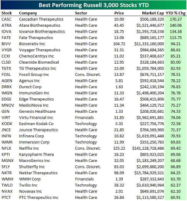
Below is a list of the best performing Russell 3,000 stocks year-to-date. As mentioned above, Health Care looks stronger underneath the surface due to big gains on an equal-weight basis. You can see what we mean by looking at the list of best performers. They’re nearly all biotech names! Of the 30 best performing Russell 3,000 stocks year-to-date, 21 are Health Care sector stocks.
Four Russell 3,000 stocks are up more than 100% in 2018 already, and they’re all biotech names — CASC, ATRA, IOVA, and FATE. The top performing non-Health Care stocks are Fossil Group (FOSL), Virtu Financial (VIRT), and Eastmak Kodak (KODK). We doubt many investors would have guessed FOSL and KODK to be top performers at the start of the year.
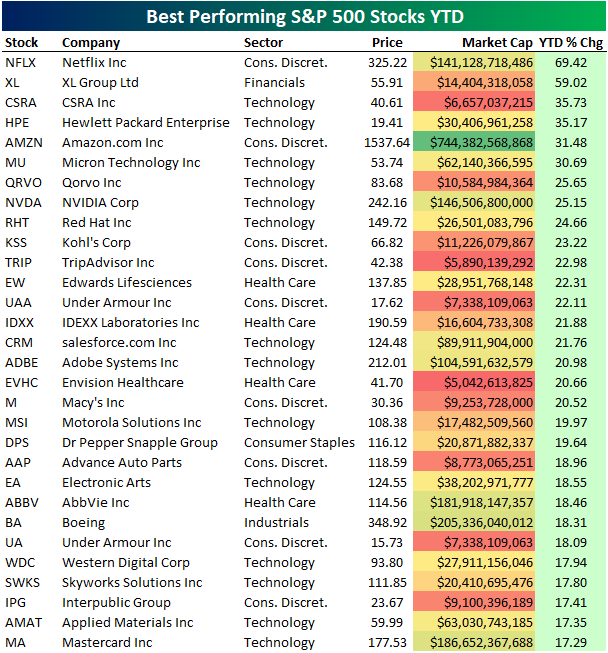
Below is a list of the top performing S&P 500 stocks year-to-date. Netflix (NFLX) is up the most at +69%, followed by XL Group (XL), CSRA, Hewlett Packard Enterprise (HPE), and Amazon.com (AMZN). Other notable winners include NVIDIA (NVDA), Kohl’s (KSS), Under Armour (UAA), salesforce.com (CRM), Adobe (ADBE), and Macy’s (M).
Bespoke’s Global Macro Dashboard — 3/7/18
Bespoke’s Global Macro Dashboard is a high-level summary of 22 major economies from around the world. For each country, we provide charts of local equity market prices, relative performance versus global equities, price to earnings ratios, dividend yields, economic growth, unemployment, retail sales and industrial production growth, inflation, money supply, spot FX performance versus the dollar, policy rate, and ten year local government bond yield interest rates. The report is intended as a tool for both reference and idea generation. It’s clients’ first stop for basic background info on how a given economy is performing, and what issues are driving the narrative for that economy. The dashboard helps you get up to speed on and keep track of the basics for the most important economies around the world, informing starting points for further research and risk management. It’s published weekly every Wednesday at the Bespoke Institutional membership level.
You can access our Global Macro Dashboard by starting a 14-day free trial to Bespoke Institutional now!

The Closer — High Yield, Low Unions — 3/6/18
Log-in here if you’re a member with access to the Closer.
Looking for deeper insight on markets? In tonight’s Closer sent to Bespoke Institutional clients, we review recent high yield market price action. We also take a look at the declining frequency of strikes, lower unionization, and shift in labor bargaining power.
See today’s post-market Closer and everything else Bespoke publishes by starting a 14-day free trial to Bespoke Institutional today!