The Bespoke Report — A Little Something For Everyone — 3/16/18
S&P 500 Quick-View Chart Book — 3/16/18
The Closer: End of Week Charts — 3/16/18
Looking for deeper insight on global markets and economics? In tonight’s Closer sent to Bespoke clients, we recap weekly price action in major asset classes, update economic surprise index data for major economies, chart the weekly Commitment of Traders report from the CFTC, and provide our normal nightly update on ETF performance, volume and price movers, and the Bespoke Market Timing Model. This week, we’ve added a section that helps break down momentum in developed market foreign exchange crosses.

The Closer is one of our most popular reports, and you can sign up for a free trial below to see it!
See tonight’s Closer by starting a two-week free trial to Bespoke Institutional now!
Weakening Internals
The S&P 500 is starting the trading day just barely above its 50-day moving average, but the percentage of stocks in the index trading above their 50-DMAs is only at 43%. Also, as shown in the second chart below, there are now more stocks oversold (22.6%) than overbought (21%). Both of these readings on breadth are a sign of weakening internals. This is a key trend to keep an eye on.

The Closer — Import Prices, Political Thermometer, Capital Flows — 3/15/18
Log-in here if you’re a member with access to the Closer.
Looking for deeper insight on markets? In tonight’s Closer sent to Bespoke Institutional clients, we review import price indices, the current political backdrop for consumers, and international capital flows into the US.

See today’s post-market Closer and everything else Bespoke publishes by starting a 14-day free trial to Bespoke Institutional today!
Bespoke’s Sector Snapshot — 3/15/18
We’ve just released our weekly Sector Snapshot report (see a sample here) for Bespoke Premium and Bespoke Institutional members. Please log-in here to view the report if you’re already a member. If you’re not yet a subscriber and would like to see the report, please start a two-week free trial to Bespoke Premium now.
Below is one of the many charts included in this week’s Sector Snapshot, which highlights the percentage of stocks in S&P 500 sectors currently trading above their 50-day moving averages. As shown, seven sectors have readings that are weaker than the S&P 500, while just four have readings that are stronger.
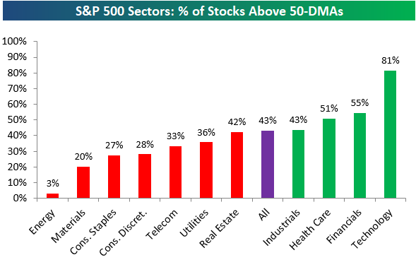
To find out what this means and see our full Sector Snapshot with additional commentary plus six pages of charts that include analysis of valuations, breadth, technicals, and relative strength, start a two-week free trial to our Bespoke Premium package now. Here’s a breakdown of the products you’ll receive.
the Bespoke 50 — 3/15/18
Every Thursday, Bespoke publishes its “Bespoke 50” list of top growth stocks in the Russell 3,000. Our “Bespoke 50” portfolio is made up of the 50 stocks that fit a proprietary growth screen that we created a number of years ago. Since inception in early 2012, the “Bespoke 50” has beaten the S&P 500 by 65.7 percentage points. Through today, the “Bespoke 50” is up 166.3% since inception versus the S&P 500’s gain of 100.6%. Always remember, though, that past performance is no guarantee of future returns.
To view our “Bespoke 50” list of top growth stocks, click the button below and start a trial to either Bespoke Premium or Bespoke Institutional.

Staying On Top Of FX Trends
It can be a challenge staying on top of what’s happening in the FX market; which currencies are strong, which are weak, and positioning. If you don’t watch the space closely, it can be helpful to have a go-to source for the big picture on foreign currencies. That’s where our Friday edition of The Closer comes in. Click here to learn more about the Closer and how to access it daily.
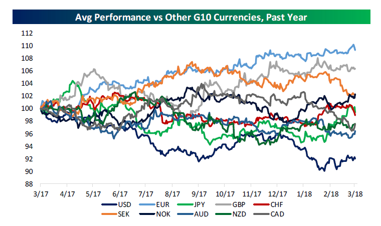
In addition to recapping price action in equities and interest rates, thematic trades in US markets, and recent economic surprise data for major economies, we also recap developments in the FX markets in our Friday Closer report. One way to do that is to compare the performance of each major developed market currency versus the others. In the first chart below, we do that. When a currency is strengthening broadly, the indices are rising. When they’re weakening, they fall. As shown, EUR has been strong broadly over the past year while the USD has been weak. CAD and SEK have seen a decline in broad strength in recent months while JPY and NOK have picked up. (All of the charts and tables in this post appear in our Friday Closer each week.)
To gain access to these charts each week in our Friday Closer, start a Bespoke Institutional trial now.
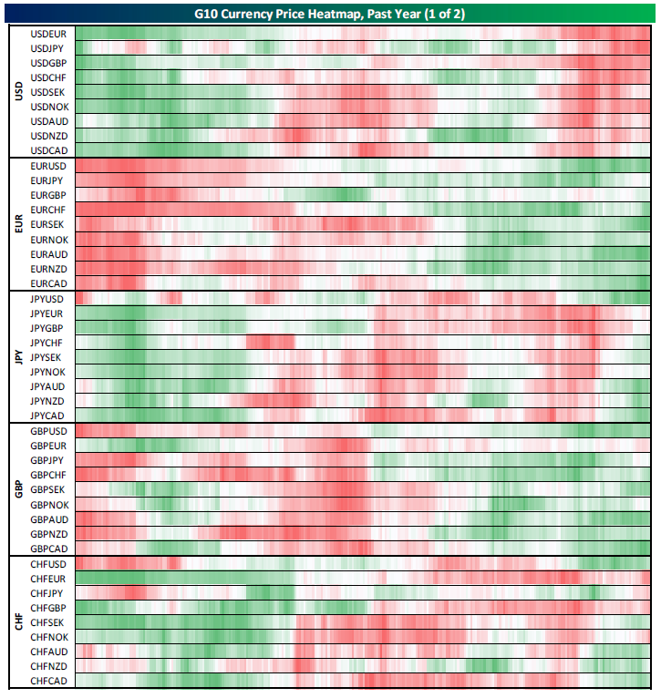
Another way to show strength versus other currencies is to use heatmaps. Each Friday, our recap shows the relative strength of each G10 cross versus all the others, heatmapped to show changes in relative momentum. When a currency is broadly swinging from underperformance (red) to outperformance (green), new uptrends may be starting for its crosses.
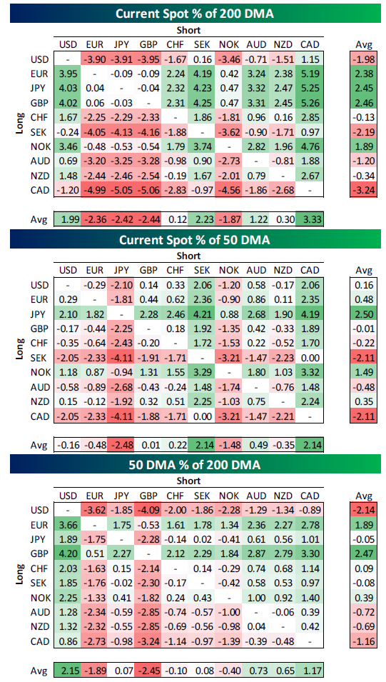
We also show how extended trends are by comparing them to moving averages, across all combinations of G10 currencies. In the tables below, we can see EUR, JPY, and GBP are broadly elevated versus their 50-DMAs, and that those 50-DMAs are elevated relative to the 200-DMA. Conversely, SEK and CAD are very weak relative to their trends. This can provide an opportunity to fade or hop on to existing trends in the market.
Finally, we use the Commitment of Traders report to show how speculators in the US FX futures market are positioned. Each chart shows the speculators’ position relative to total open interest; negative readings indicate short positioning, positive represent longs. These series can provide contrarian signals for positioning in foreign exchange markets. As shown in the charts, as of last week large short positioning in JPY were in the process of being closed, while the opposite (large longs being moved back towards neutral) was true in CAD.
To gain access to these charts each week in our Friday Closer, start a Bespoke Institutional trial now.

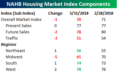
Homebuilder Sentiment Continues Retreat From Extreme Highs
After a hitting the highest level since 1999 back in December, Homebuilder sentiment dropped for the third straight month in March, falling from a downwardly revised level of 71 down to 70. A decline is a decline, but any reading in homebuilder sentiment that still has a 7-handle is quite impressive.
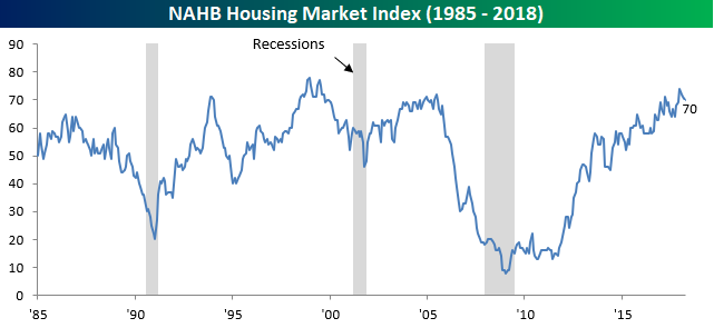
The table below shows the breakdown of present and future sales, traffic, and sentiment by region. Traffic saw quite a large downtick and is currently just barely above 50, which could be due to higher interest rates shrinking the pool of prospective buyers. On a regional basis, the only region of the country where sentiment declined, however, was in the Midwest. In the South region, homebuilder sentiment is actually just below the highest levels of the economic expansion.