The Last Hour Finally Hangs On…By a Thread
We’ve been talking quite a lot recently about the equity market’s inability to hang on to gains in the last hour of trading. Heading into today, the index had traded down in the last hour of trading for six straight sessions. Today, equities were strong throughout the trading day and even started to leg higher just as we entered the final hour of trading. It looked like the streak of selling was easily coming to an end, but the bears didn’t go down without a fight. In the final half hour, equities started to give up some of their gains, and by the time the bell rang, the S&P 500 was up just barely in the last hour for a total gain of just 0.21 points!
While today’s last hour gain ended the six-day streak of selling, the trend of last hour selling remains in place. For example, over the last 25 trading days, the S&P 500 has declined in the last hour of trading 18 times (72%), which is well above the historical average of 44% for all 25 trading day periods since 1983. In case your curious, the record for most last hour declines over a 25-trading day period was in the Summer of 2015, when the 25-day total hit 21 a handful of times between late June and early July. If you remember that period, the rest of the Summer wasn’t particularly enjoyable for bulls.

B.I.G. Tips – Death by Amazon – 4/17/18
Chart of the Day: Healthy Housing
Bespoke Stock Scores — 4/17/18
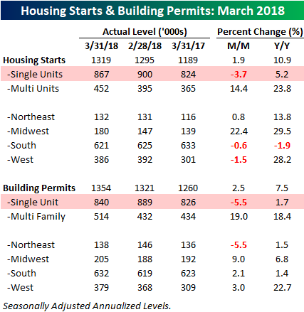
Housing Starts and Building Permits Boosted by Multi-Family
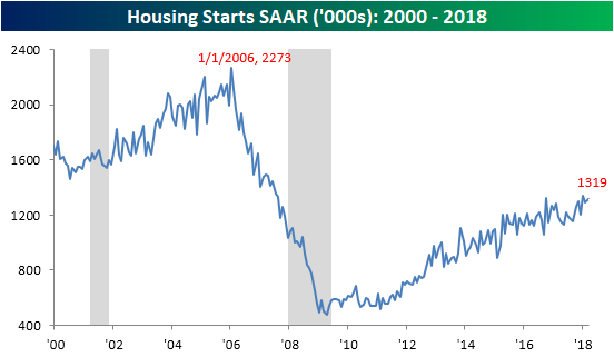
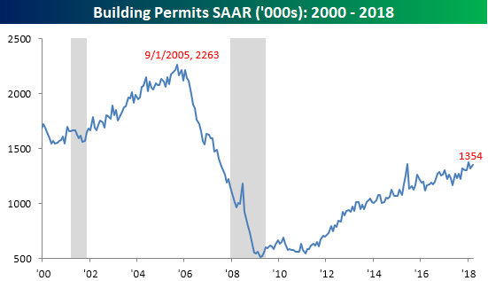
Data related to Housing Starts and Building Permits for the month of March came in stronger than expected earlier today. Housing Starts for March came in at a seasonally-adjusted annualized rate of 1.319 mln compared to expectations for a rate of 1.267 mln, while Building Permits hit a rate of 1.354 mln, which was 33K greater than forecasts. In the case of both data series, March’s readings were just shy of the current cycle’s highs, but still well in the hole compared to the peak run rate of over 2.2 mln during the last expansion.
While the headline data was strong in both reports, underneath the surface the trend wasn’t quite as positive. The table below breaks down both reports by size of unit and region. The key thing that sticks out in both reports is that single-family units actually declined on a m/m basis with a drop of 3.7% in Housing Starts and a decline of over 5% in Building Permits. Multi-family unit starts and permits, however, were up by double-digit percentages. On a regional basis, the Midwest was the strongest m/m in both starts and permits, while the Northeast was the only region to see a m/m drop in permits. All in all, it would have been preferable to see a stronger showing from single-family units, but the longer term trend for housing remains solid.
Bespokecast Episode 24 — Ernie Tedeschi — Now Available on iTunes, GooglePlay, Stitcher and More
 Our newest episode of Bespokecast is now available! Be sure to subscribe to Bespokecast on your preferred podcast app to gain access to our full collection of episodes. We’d also love for you to provide a review as well!
In this episode of Bespokecast, we talk to Ernie Tedeschi of Evercore ISI. Ernie is a policy economist and Head of Fiscal Analysis, and has been immersed in analysis of public policy his entire career. He’s had broad experience in the private sector, as well as working at the US Treasury for several years in a policy evaluation role. In our discussion, we focus on the current policy backdrop for the US, primarily through the lens of the newly released long-term budget and economic growth forecasts updated by the CBO in early April. We also review Fed policy, and get Ernie’s thoughts on Amazon’s HQ2, the outlook for the Bay Area, and more. You can follow Ernie on Twitter here and see what he’s writing on Medium here.
To listen to our newest episode or subscribe to the podcast via iTunes, GooglePlay, OvercastFM, or Stitcher, please click the button or links below. Please note that third-party podcast feeds may update at a lag of a few hours to this blog post.

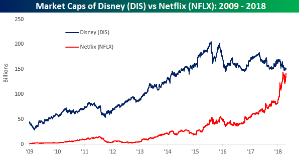
It Happened Right Under Mickey’s Nose
Sometimes big changes happen right under our eyes and we barely notice, until one day we look at the same thing we’ve been looking at every day and suddenly realize how different it has become. The example of Netflix and Disney is a perfect example. For more than a few years now, there has been constant speculation that Disney would buy Netflix. Five years ago, that would have been an easily digestible acquisition for Disney when its market cap was 10x the market cap of Netflix. Even two years ago, when Disney was four times the size of Netflix, they could have gotten it done. Nowadays, it looks like that opportunity has passed. With Netflix set to open higher by about 7% this morning, the stock will have a market cap of over $142 billion compared to Disney’s market cap of $152 billion. As shown in the chart below, the market caps of the two stocks have never been closer than they are now.
The Closer — Empire Nosedive, Bill Issuance, Freight Prices, TICS Flows — 4/16/18
Log-in here if you’re a member with access to the Closer.
Looking for deeper insight on markets? In tonight’s Closer sent to Bespoke Institutional clients, we take a look at the huge decline in expectations in today’s release of March Empire Manufacturing data. We also review recent securities flows in and out of the US, bill issuance trends, and the release of Cass Freight expenditure and volume data.

See today’s post-market Closer and everything else Bespoke publishes by starting a 14-day free trial to Bespoke Institutional today!
Chart of the Day: Netflix (NFLX) Q1 Earnings
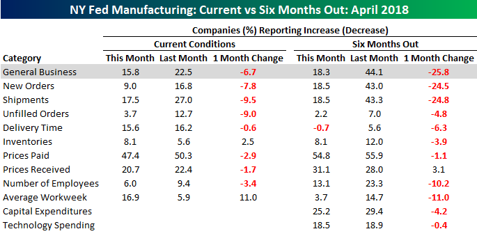
Empire Manufacturing Report Weakens
It looks as though manufacturing activity in the NY Fed region is slowing in April as the Empire Manufacturing report came in weaker than expected, showing a larger than expected decline. While economists were expecting the headline number to show just a modest decline from 22.5 down to 18.4, the actual decline was a bit larger to 15.8. Not a major decline by any stretch, but it does represent the fifth m/m decline in the last six months. The real weakness, however, was in the expectations component. As shown in the chart below, that reading saw its second largest m/m decline on record, falling from 44.1 down to 18.3. The only decline that was larger was following the 9/11 attacks, although we would note that back in September 2001 the m/m decline was over 60 points compared to 25.8 now. More recently, the last time the expectations index dropped by a similar amount was in January 2016.
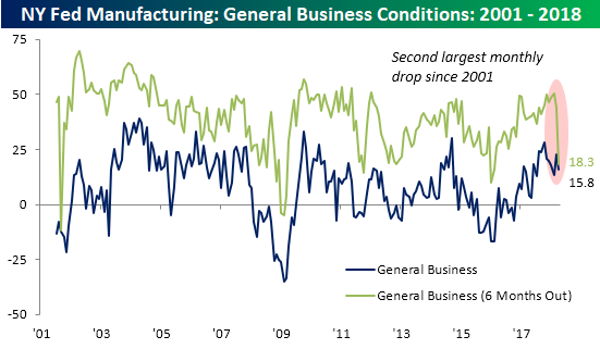
The table below breaks down this month’s report by each of its components. Here again, you can see the disparity between current conditions and expectations. While current conditions and expectations both declined m/m, for categories like New Orders and Shipments, expectations saw enormous declines. One bright side? On the inflation front, the Prices Paid and Prices Received components didn’t see any large moves higher.