The Closer — PPI Pause, Oil Draws — 5/9/18
Log-in here if you’re a member with access to the Closer.
Looking for deeper insight on markets? In tonight’s Closer sent to Bespoke Institutional clients, we recap today’s PPI report (the first inflation data for April) and give our weekly update on petroleum inventories as well as energy asset price action.

See today’s post-market Closer and everything else Bespoke publishes by starting a 14-day free trial to Bespoke Institutional today!
Number of Analyst Ratings Per Stock; Buy Ratings Up
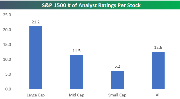
We’re in the process of updating a report we publish for clients a few times a year looking at the most loved and hated stocks by Wall Street analysts. In the report, we also provide an analysis of analyst ratings at the sector and market cap level. Taking a view from the top, below is a look at how many analyst ratings there are per stock for large caps, mid caps, and small caps.
The S&P 1500 index is made up of the S&P 500 (large caps), the Mid Cap 400 (mid-caps), and the Small Cap 600 (small caps). For the entire S&P 1500, there are 18,945 analyst recommendations, which equates to 12.6 analyst ratings per stock. But analyst coverage varies widely by market cap. Predictably, the largest stocks in the market have the most analyst coverage, while the smallest stocks have the least amount of coverage. In the S&P 500, there are 21.2 analyst ratings per stock. For mid caps, there are 11.5 analyst ratings per stock, and for small caps, there are just 6.2 analyst ratings per stock.
In terms of finding stocks that are going to outperform, there’s a reason why investors gravitate towards the small-cap space. With fewer analysts covering small caps, there’s a better chance at finding stocks that are either undervalued or overvalued. The more eyes there are watching a stock (or group, sector, index, or country), the higher the likelihood that the “efficient market hypothesis” is at work.
On another note, we also wanted to quickly touch on analyst sentiment without diving too deep. (We’re saving that for our premium report.) Right now, 49.8% of all analyst ratings are “Buy” ratings. As shown below, at the start of the year, 47.2% of all ratings were “Buy” ratings, so analysts have gotten more bullish as the year has progressed.

S&P 500 Sector Weightings; Tech Nears 26%
Yesterday we published our monthly S&P 500 Sector Weightings report for clients. The report provides a detailed historical look at S&P 500 sector weightings, and it’s something clients find very useful. Below we show current S&P 500 sector weightings. Anything stand out?
Yes, at 25.78%, the Technology sector now makes up more than a quarter of the S&P 500. That’s a bigger slice of the pie than the smallest six sectors combined.
The Financial sector is the second largest at 14.65%, followed by Health Care at 13.71%, and then Consumer Discretionary at 12.86%. There was a time relatively recently when Energy, Consumer Staples, and Industrials all had weightings above 10%, but at this point they’re all in the single digits.

Getting back to the Technology sector, below is a look at its historical weight in the S&P 500. At 25.78%, Tech’s weighting was only higher during a 10-month window from December 1999 to September 2000.
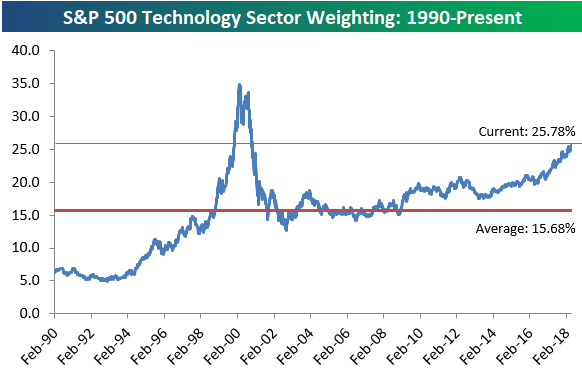
Chart of the Day: Stoneridge Inc (SRI)
Not Quite Mission Accomplished
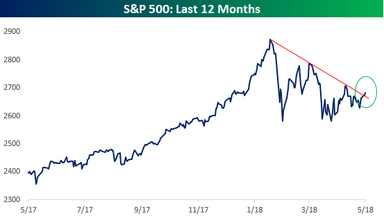
Anyone that follows the market has likely been watching the downtrend that the S&P 500 has been in since the January highs. While the index has repeatedly bounced off of support at the 200-day moving average (DMA), the 50-DMA has been a tough hurdle. In recent weeks we’ve seen rallies fail just as prices have approached or even briefly traded above the 50-DMA. The result has been a series of lower highs and higher lows.
Following the bounce that equities have seen since last Thursday, the top of the S&P 500’s short-term (and increasingly becoming an intermediate-term) downtrend has once again come into play. In early trading today, the S&P 500 has traded above its 50-DMA but hasn’t quite been able to break out above its downtrend. The next few days should go a long way in helping to determine which way the market will ultimately break from this pattern.
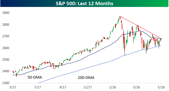
Looking just at closing prices for the S&P 500 provides a much more optimistic picture. As shown in the chart below, after two lower highs since the January peak, the S&P 500 has not quite made a higher high, but it has broken the downtrend. While it may be tempting to take this upside break and run with it, a more prudent path would be to wait at least for confirmation in the chart above as well as an upside break above the mid-April highs.
Bespoke’s Global Macro Dashboard — 5/9/18
Bespoke’s Global Macro Dashboard is a high-level summary of 22 major economies from around the world. For each country, we provide charts of local equity market prices, relative performance versus global equities, price to earnings ratios, dividend yields, economic growth, unemployment, retail sales and industrial production growth, inflation, money supply, spot FX performance versus the dollar, policy rate, and ten year local government bond yield interest rates. The report is intended as a tool for both reference and idea generation. It’s clients’ first stop for basic background info on how a given economy is performing, and what issues are driving the narrative for that economy. The dashboard helps you get up to speed on and keep track of the basics for the most important economies around the world, informing starting points for further research and risk management. It’s published weekly every Wednesday at the Bespoke Institutional membership level.
You can access our Global Macro Dashboard by starting a 14-day free trial to Bespoke Institutional now!

Fixed Income Weekly – 5/9/18
Searching for ways to better understand the fixed income space or looking for actionable ideals in this asset class? Bespoke’s Fixed Income Weekly provides an update on rates and credit every Wednesday. We start off with a fresh piece of analysis driven by what’s in the headlines or driving the market in a given week. We then provide charts of how US Treasury futures and rates are trading, before moving on to a summary of recent fixed income ETF performance, short-term interest rates including money market funds, and a trade idea. We summarize changes and recent developments for a variety of yield curves (UST, bund, Eurodollar, US breakeven inflation and Bespoke’s Global Yield Curve) before finishing with a review of recent UST yield curve changes, spread changes for major credit products and international bonds, and 1 year return profiles for a cross section of the fixed income world.
This week we discuss where things stand in the current credit cycle. We also discuss the net asset value discount on EDD as a sentiment gauge and as a way to gauge future returns.

Our Fixed Income Weekly helps investors stay on top of fixed income markets and gain new perspective on the developments in interest rates. You can sign up for a Bespoke research trial below to see this week’s report and everything else Bespoke publishes free for the next two weeks!
Click here and start a 14-day free trial to Bespoke Institutional to see our newest Fixed Income Weekly now!
The Closer — Iran Away, Jaunty JOLTs, Beige Not Boring — 5/8/18
Log-in here if you’re a member with access to the Closer.
Looking for deeper insight on markets? In tonight’s Closer sent to Bespoke Institutional clients, we review the decision from President Trump to cancel the Iran deal, updated March JOLTS data, and a new index of economic activity based on the Fed’s Beige Book.
See today’s post-market Closer and everything else Bespoke publishes by starting a 14-day free trial to Bespoke Institutional today!
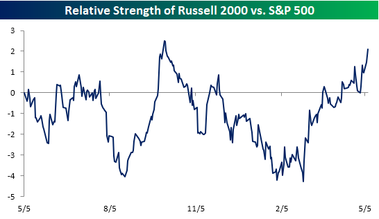
Small Caps Shine in Dollar’s Rise
As we highlighted in a prior post, when the dollar rallies, companies with domestic exposure tend to outperform their multi-national peers. Since small-cap stocks tend to have little in the way of international exposure, they tend to be a big beneficiary of dollar strength. Look no further than the relative strength chart of the Russell 2000 versus the S&P 500 over the last year. When the line is rising, it indicates that small caps are outperforming and vice versa for a falling line. While small caps were underperforming by a pretty sizable margin back in mid-February, they have completely reversed in the last three months and are now outperforming large caps by nearly their widest margin of the last twelve months. Quite a turnaround!
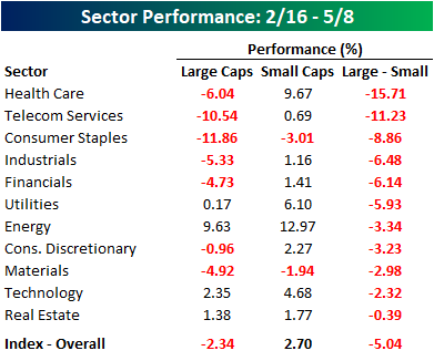
In terms of the recent outperformance in the small-cap space since the US Dollar Index’s low in February, it couldn’t possibly be more broad-based. Since 2/16, the S&P 500 is down 2.3% while the S&P 600 small-cap Index has actually rallied 2.7%. What’s really amazing, though, is that all 11 sectors in the small-cap space have outperformed their large-cap peers since 2/16. While the performance spread is widest in the Health Care sector at more than 15 percentage points, even small-cap Technology and REITs have managed to outperform their larger peers.
Bespoke’s Sector Weightings Report — May 2018
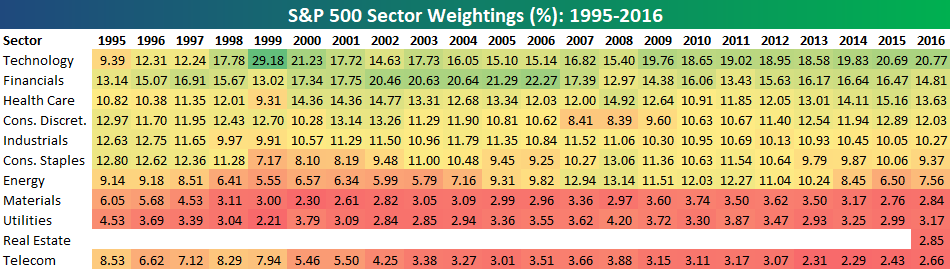
S&P 500 sector weightings are important to monitor. Over the years when weightings have gotten extremely lopsided for one or two sectors, it hasn’t ended well. Below is a table showing S&P 500 sector weightings from the mid-1990s through 2016. In the early 1990s before the Dot Com bubble, the US economy was much more evenly weighted between manufacturing sectors and service sectors. Sector weightings were bunched together between 6% and 14% across the board. In 1990, Tech was tied for the smallest sector of the market at 6.3%, while Industrials was the largest at 14.7%. The spread between the largest and smallest sectors back then was just over 8 percentage points.
The Dot Com bubble completely blew up the balanced economy, and looking back you can clearly see how lopsided things had become. Once the Tech bubble burst, it was the Financial sector that began its charge towards dominance. The Financial sector’s sole purpose is to service the economy, so in our view you never want to see the Financial sector make up the largest portion of the economy. That was the case from 2002 to 2007, though, and we all know how that ended.
Unfortunately we’ve begun to see sector weightings get extremely out of whack once again.
If you would like to see the most up-to-date numbers for S&P 500 sector weightings, simply start a two-week free trial to our Bespoke Premium or Bespoke Institutional services. Click back to this post to see the numbers once you’re signed up!