Stocks Reacting Positively to Earnings
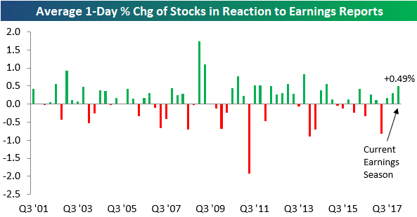
So far this earnings season, the more than 2,000 stocks that have reported have averaged a gain of 0.49% on their earnings reaction days. (For a stock that reports in the morning, its earnings reaction day is that trading day. For a stock that reports after the close, its earnings reaction day is the next trading day.)
Below is a chart showing the average 1-day price change in reaction to earnings by quarter since 2001. As shown, this quarter’s reading of +0.49% is actually set to be the strongest since the Q4 2014 reporting period when the average stock gained 0.55% on its earnings reaction day.
Even though expectations for earnings have gotten dramatically more optimistic over the last year, stocks have still managed to react positively to their earnings reports for three consecutive quarters.
Earnings and Revenue Beat Rates Hold Strong
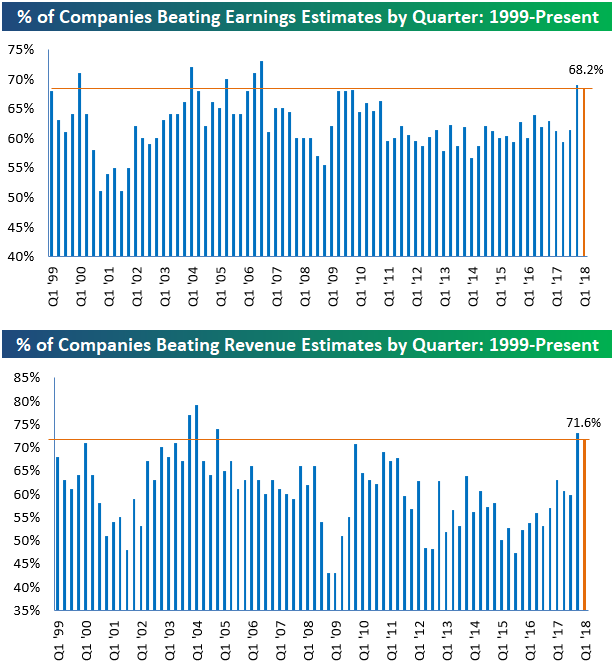
Another 500+ companies reported earnings this week, bringing the total number of companies that have reported this earnings season up to 2,000+. The “unofficial” end to earnings season comes next week when Wal Mart (WMT) reports on Thursday. With less than a week to go, the summary results for this earnings season aren’t likely to change much.
As shown below, the percentage of companies that have beaten consensus analyst EPS estimates this season now stands at 68.2%. This is down slightly from where it stood a couple of weeks ago, but it’s still a very strong reading nonetheless. There have only been a handful of other quarters (including last quarter) over the last 20 years that have seen higher bottom-line beat rates.
In terms of top-line numbers, 71.6% of companies have beaten consensus analyst revenue estimates this earnings season. Like we’ve seen with the earnings beat rate, the revenue beat rate is extremely strong this season even though it’s down just a hair from last season. There have been just four prior quarters over the last 20 years that have seen stronger top-line beat rates.
The Closer — Taking A Breather: Inflation, Deficit, EM — 5/10/18
Log-in here if you’re a member with access to the Closer.
Looking for deeper insight on markets? In tonight’s Closer sent to Bespoke Institutional clients, we discuss slower inflation readings after a miss today in the BLS report for April. We also take a look at the US monthly budget statement and the explosive rebound in EM assets today.

See today’s post-market Closer and everything else Bespoke publishes by starting a 14-day free trial to Bespoke Institutional today!
Bespoke’s Sector Trading Range Charts
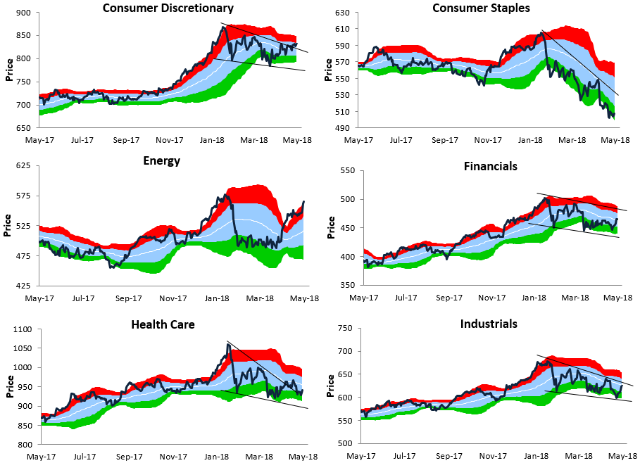
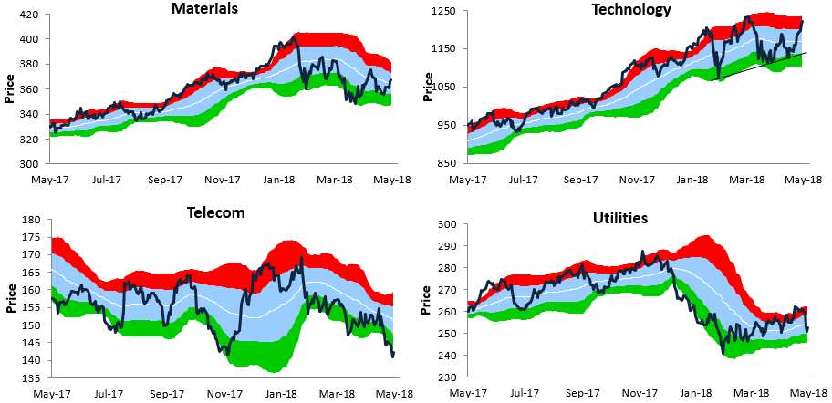
Below is a look at our one-year trading range charts for ten S&P 500 sectors (the Real Estate sector is excluded). In each chart, the white line represents the 50-day moving average, while the light blue shading represents each sector’s “normal” trading range. This range is calculated as one standard deviation above and below the 50-DMA.
Moves into or above the red zone are considered overbought, while moves into or below the green zone are considered oversold.
For some of the charts, we’ve drawn trend lines where applicable. Note that Consumer Discretionary has now broken above the top of its downtrend channel. Consumer Staples, on the other hand, remains in a steep downtrend.
The Energy sector has moved up into extreme overbought territory, while Financials is just breaking back above its 50-DMA. The Health Care sector hasn’t bounced nearly as much as some other cyclical sectors, and Industrials is still flirting with its 50-DMA and the top of its downtrend channel.
Technology is the one sector that has managed to make a series of higher lows since its first correction low back in February. At this point Tech is approaching new all-time highs again!
Bespoke’s Sector Snapshot — 5/10/18
We’ve just released our weekly Sector Snapshot report (see a sample here) for Bespoke Premium and Bespoke Institutional members. Please log-in here to view the report if you’re already a member. If you’re not yet a subscriber and would like to see the report, please start a two-week free trial to Bespoke Premium now.
Below is one of the many charts included in this week’s Sector Snapshot, which highlights the percentage of stocks by sector trading above their 50-day moving averages. As shown, in the Energy sector, 97% of stocks are now above their 50-DMAs, which is an extremely high reading.
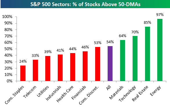
To find out what this means and to see our full Sector Snapshot with additional commentary plus six pages of charts that include analysis of valuations, breadth, technicals, and relative strength, start a two-week free trial to our Bespoke Premium package now. Here’s a breakdown of the products you’ll receive.
Introducing Bespoke’s Beige Book Sentiment Index
Twice per quarter, the Federal Reserve publishes a qualitative assessment of the economy called the Beige Book. The Beige Book makes for very interesting reading, filled with anecdotal discussion about the state of output, prices, consumer spending, confidence, and other indicators nationally and in each of the Fed’s individual districts. While useful, the Beige Book is very long, with the most recent edition running in excess of 14,000 words! In an effort to more quickly digest that huge body of text, we have developed an algorithm to quickly summarize the main thrust of the Beige Book. By analyzing the balance of positive words relative to negative words, we summarize what the Beige Book is saying about the economy. As currently constructed, Bespoke’s Beige Book Sentiment index reports the share of positive descriptors less negative descriptors divided by all descriptors. Over time, this diffusion index tends to lead GDP and is more timely, as shown in the chart below.
Readings above zero indicate more positive descriptors than negative ones, and vice-versa. The most recent reading hit a new multi-year high, but it’s still below readings seen during the early part of the current expansion. Only twice has the reading dipped below zero, and they both occurred near the depths of the last two recessions.
Our new Beige Book Sentiment economic indicator will be released in the moments after the Beige Book release twice per quarter (or eight times per year). Access to this new economic indicator and its sub-indices is only available at the Bespoke Institutional subscription level, which you can start a free trial to here. If you have any questions about the Bespoke Beige Book Sentiment index, please submit a contact form at our About page.
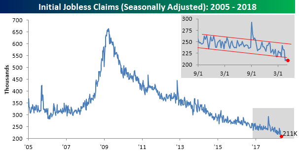
Chart of the Day: Inflation Cools
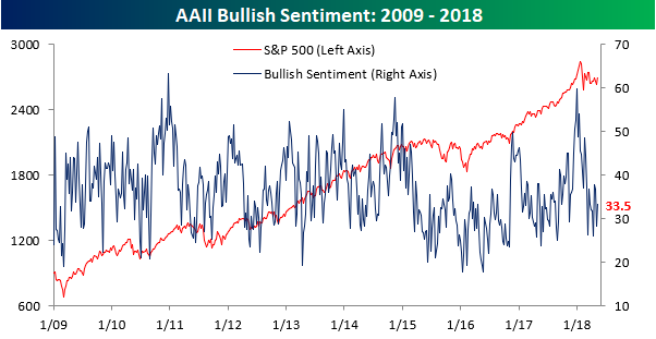
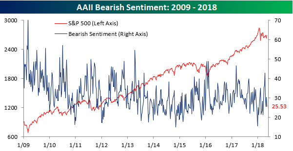
Bulls and Bears Switch Seats
The difference between the market backdrop this week versus last week is almost like night and day. Last Thursday, equities were testing the 200-DMA to the downside before staging a major turnaround over the last five days. Now, rather than breaking down, stocks appear to have broken their downtrend from the late January highs. Given the about-face, it’s not too surprising that in this week’s AAII sentiment survey, bulls and bears pretty much flipped spots.
As shown in the two charts below, bullish sentiment jumped five points this week, rising from 28.4% up to 33.5%, while bearish sentiment dipped about five points, falling from just over 30% to 25.5%.
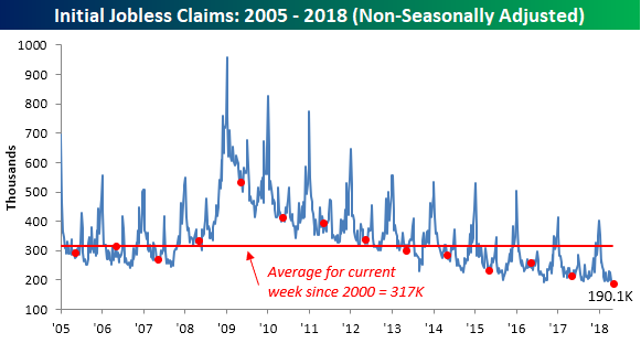
Jobless Claims Still Great
Jobless claims were unchanged in the latest week, and at a level of 211K, bulls on the economy will take it. This week’s 211K reading was also good enough to come in below economists’ expectations, which were at 219K. It is also tied for the second-lowest reading in weekly claims since 1969, behind only the 209K print from two weeks ago! The record streak of weekly claims below 300K is now in its 166th week, and the streak of sub 250K readings is up to 25!
With the third straight week of sub 225K readings, the four-week moving average of claims also set another multi-decade low this week, falling from 221.5K down to 216K. The last time the four-week moving average was this low was back in 1969.

Finally, on a non-seasonally adjusted (NSA) basis, claims once again came in below 200K. NSA claims are more than 125K below their average of 316.8K for the current week of the year since 2000, and to find the last time they were this low in the first week of May, you have to go way back to 1969.
the Bespoke 50 — 5/10/18
Every Thursday, Bespoke publishes its “Bespoke 50” list of top growth stocks in the Russell 3,000. Our “Bespoke 50” portfolio is made up of the 50 stocks that fit a proprietary growth screen that we created a number of years ago. Since inception in early 2012, the “Bespoke 50” has beaten the S&P 500 by 80.4 percentage points. Through today, the “Bespoke 50” is up 176.6% since inception versus the S&P 500’s gain of 96.2%. Always remember, though, that past performance is no guarantee of future returns.
To view our “Bespoke 50” list of top growth stocks, click the button below and start a trial to either Bespoke Premium or Bespoke Institutional.
