Philly Feeling Fine
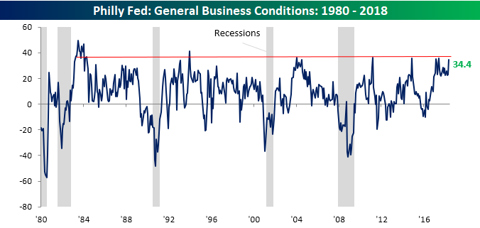
After a better than expected Empire Manufacturing report on Tuesday, today’s release of the Philly Fed Manufacturing report also came in better than expected (34.4 vs 21.0) and was up from last month’s reading of 23.2. What makes this month impressive is that it now represents the 18th straight month that the headline index has come in above 20. That hasn’t happened since – well, ever! Prior to this month’s report, there had never been a streak of more than 17 months since the indicator’s inception where the headline index was above 20.
Looking at the chart below, the current level indicates that further upside momentum may be hard to come by. Outside of the short-period in the early 1980s, the reading on General Business conditions has had a hard time staying above the 35-ish level.
The table below breaks down this month’s report by each category. As shown, breadth was relatively strong as six categories showed m/m increases, and just three saw declines. Of the gainers, New Orders saw the biggest increase, while the biggest decline came in Prices Paid, which fell from a seven-year high of 56.4 down to a still high level of 52.6.
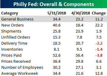
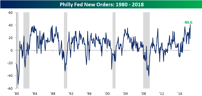
As mentioned above, the New Orders component of this month’s report saw the largest increase, rising a staggering 22.2 points to a record 40.6. The last time this component saw a larger monthly increase was in October 2005.
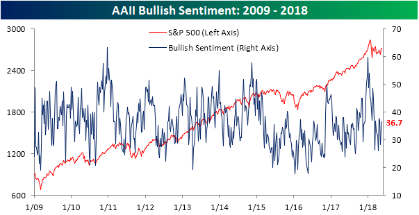
Bear Camp Getting Lonely
After breaking its downtrend heading into last weekend, individual investor sentiment surely has improved. In this week’s sentiment survey from AAII, bullish sentiment ticked up to 36.68% from last week’s level of 33.51%. Beleive it or not, that’s actually back above the average of 36.62% for the current bull market.
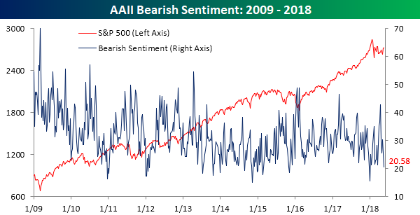
The big move this week, however, was in bearish sentiment which declined for the second straight week, falling from 25.5% down to 20.6%. Since its recent high in early April, bearish sentiment has now been more than cut in half. It’s also at the lowest level since the first week of the year, when the market was in party mode. As we all remember now, that party was broken up shortly thereafter.
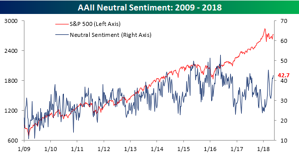
Finally, neutral sentiment has also been on the rise recently and remains above 40% for the third straight week.
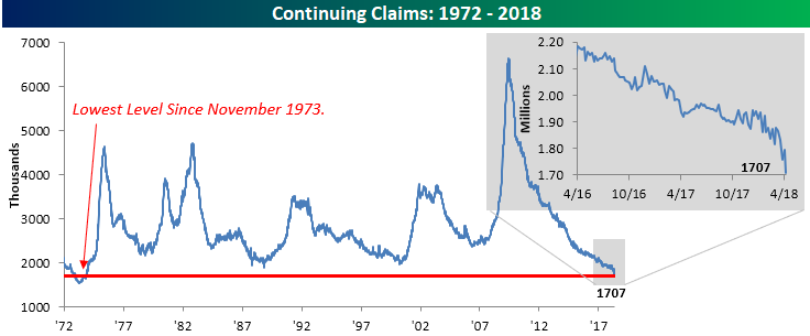
Continuing Claims Falling Out of Bed
Not to be left out of the party with initial jobless claims, continuing jobless claims have really started to pick up steam to the downside in the last few weeks. In this week’s report, continuing claims fell to 1.707 million. That’s the lowest reading in this series since November 1973. Almost as impressive as the actual levels of continuing claims has been the speed at which they have declined recently. Over the last three months, continuing claims have dropped by over 10%, which is a pace not seen since early 2011.
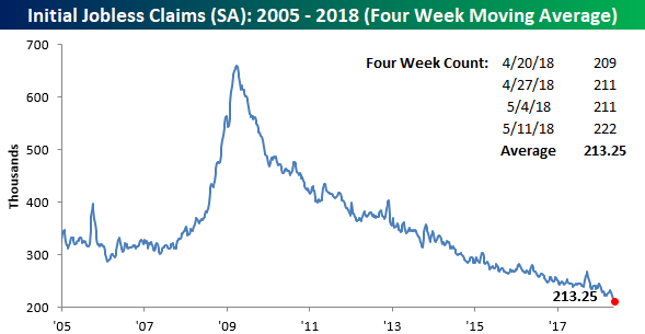
Jobless Claims: Running Out of Superlatives
Sometimes a streak or an event just keeps on going that you run out of adjectives to describe it. Back during the Financial crisis, after months where the market saw big decline after big decline and kept hitting more extreme levels, it became hard to describe things without being repetitive. These days, we’re running into a similar problem on the other end of the spectrum with regards to jobless claims. While this week’s print rose 11K and came in higher than expected, the move only brought claims up to 222K. In any other environment, 222K would be an extraordinary level. How amazing has the current run been? This week’s print is the 4th straight week that claims have been below 225K, the 32nd straight week that claims have been below 250K, and the 167th straight week that claims have been below 300K.

With this week’s reading of 222K, the four-week moving average dropped to 213.25K. That’s a new low for the cycle, the century, and all the way back to December 1969!
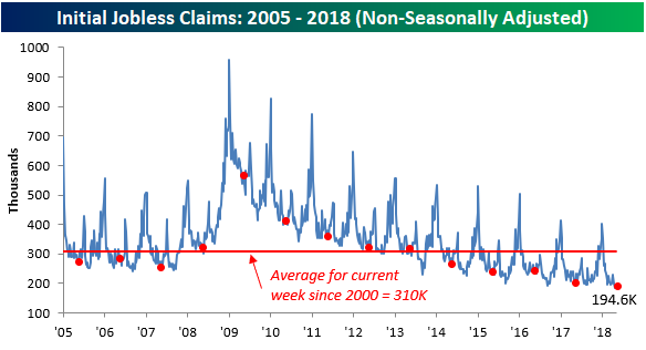
Finally, on a non-seasonally adjusted basis (NSA), claims rose slightly to 194.6K but still remained below 200K for the third straight week. The last time NSA claims were this low at this time of year was in 1969, and the last time the NSA reading was below 200K for more than three straight weeks was in 1973.
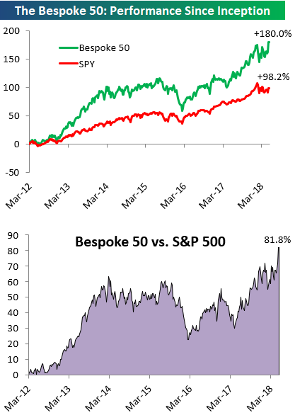
the Bespoke 50 — 5/17/18
Every Thursday, Bespoke publishes its “Bespoke 50” list of top growth stocks in the Russell 3,000. Our “Bespoke 50” portfolio is made up of the 50 stocks that fit a proprietary growth screen that we created a number of years ago. Since inception in early 2012, the “Bespoke 50” has beaten the S&P 500 by 81.8 percentage points. Through today, the “Bespoke 50” is up 180.0% since inception versus the S&P 500’s gain of 98.2%. Always remember, though, that past performance is no guarantee of future returns.
To view our “Bespoke 50” list of top growth stocks, click the button below and start a trial to either Bespoke Premium or Bespoke Institutional.
The Closer — Construction Revised, Industrial Production Rises, Crude Flows — 5/16/18
Log-in here if you’re a member with access to the Closer.
Looking for deeper insight on markets? In tonight’s Closer sent to Bespoke Institutional clients, we review monthly residential construction numbers including benchmark revisions to historical numbers. We also review industrial production and petroleum market data.

See today’s post-market Closer and everything else Bespoke publishes by starting a 14-day free trial to Bespoke Institutional today!
General Electric (GE): Selling Low?
It’s hard to imagine a stock more out of favor these days than General Electric (GE). After a 44% decline last year, investors have been running from the stock like the plague. As a perfect example, this week marked the deadline for institutional investors to file their quarterly holdings report (13F). Based on an analysis from Bloomberg, institutional investors sold more than 126 million GE shares during the first quarter. Besides the fact that no other stock in the Industrials sector saw total sales of this magnitude during Q1, this quarter’s institutional investor outflows from GE reversed a string of three straight quarters where institutions were net buyers. In other words, while the stock was falling 44% in 2017, institutions were accumulating GE only to become net sellers after the decline. Isn’t the phrase supposed to be “buy low and sell high”?
The chart below shows the relative strength of GE versus the S&P 500 going all the way back to 1975. As with all of our relative strength charts, a rising line indicates outperformance of GE relative to the S&P 500, while a falling line indicates underperformance. From the early 1980s right on through the turn of the century, GE was a major outperformer. At its peak in 2000, it had outperformed the S&P 500 over 400%. Since that peak just a few months before famous CEO Jack Welch left the company, it has been a brutal 18 years for GE. When the stock made its recent low of $12.83 at the start of the second quarter, the 400% of outperformance had been more than erased, and the stock was now underperforming the S&P 500 by a record low of -50%.
Who knows where GE will go from here, but with the stock already up over 11% in Q2, it would be pretty ironic to see GE hit a generational bottom just as the institutional investor community started to cry uncle.

Energy: Market Leader
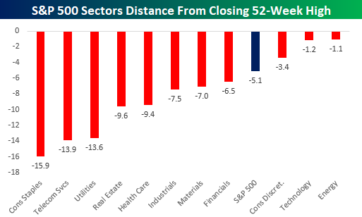
When was the last time we’ve been able to say that the Energy sector was a market leader? Well, you can say it now. While the S&P 500 is still over 5% from its 52-week closing high, the Energy sector is knocking on those levels and is currently down just 1% from its closing high. In fact, while Technology gets all the attention these days for its leadership, the sector is actually slightly further below its 52-week high than Energy. Granted, Technology has a much larger weighting and is therefore more impactful on the overall index, but strictly in terms of how far each sector is from its 52-week closing high, Energy is on top.
Behind Technology and Energy, the only other sector that is closer to its 52-week closing high than the S&P 500 is Consumer Discretionary (-3.4%). As far as the laggards are concerned, three sectors are more than 10% from their 52-week highs and they are all defensive in nature (Consumer Staples, Telecom Services, and Utilities). Given that the S&P 500 is in the middle of a correction, you would think that defensives would be holding up well. But because of rising interest rates, which make high dividend paying stocks less attractive, the defensives have struggled.
With regards to Energy specifically, the sector has had quite a run off its early April lows. At this point it’s up more than 20%.

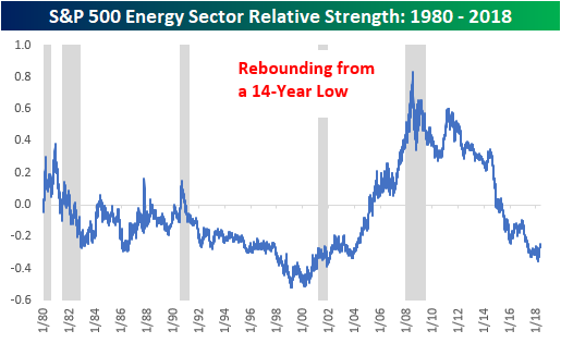
While the Energy sector is certainly overbought in the short-term, from a longer-term vantage point, you wouldn’t believe that the sector was performing well. The chart below shows the relative strength of the Energy sector versus the S&P 500 going back to 1980. When the line is rising, it indicates that the Energy sector is outperforming and vice versa. Ever since the middle of the last recession, the Energy sector has been a near constant underperformer vs the S&P 500. If you look really closely at the chart, you can see that the relative strength line for the sector has stopped going down, but it remains right near 14-year lows.
The last period of underperformance for the sector spanned a longer stretch (1980 – 2000), but the magnitude of the underperformance wasn’t nearly as deep. Given the steep underperformance, is nearly a decade of underperformance enough for the sector to finally turn things around? Rising oil prices even as the dollar has been rallying certainly doesn’t hurt the bullish argument.
Fixed Income Weekly – 5/16/18
Searching for ways to better understand the fixed income space or looking for actionable ideals in this asset class? Bespoke’s Fixed Income Weekly provides an update on rates and credit every Wednesday. We start off with a fresh piece of analysis driven by what’s in the headlines or driving the market in a given week. We then provide charts of how US Treasury futures and rates are trading, before moving on to a summary of recent fixed income ETF performance, short-term interest rates including money market funds, and a trade idea. We summarize changes and recent developments for a variety of yield curves (UST, bund, Eurodollar, US breakeven inflation and Bespoke’s Global Yield Curve) before finishing with a review of recent UST yield curve changes, spread changes for major credit products and international bonds, and 1 year return profiles for a cross section of the fixed income world.
This week we discuss the relationship between dividend coverage and yield, as well as identifying a series of stocks that look attractive given high yield relative to their coverage ratios.

Our Fixed Income Weekly helps investors stay on top of fixed income markets and gain new perspective on the developments in interest rates. You can sign up for a Bespoke research trial below to see this week’s report and everything else Bespoke publishes free for the next two weeks!
Click here and start a 14-day free trial to Bespoke Institutional to see our newest Fixed Income Weekly now!
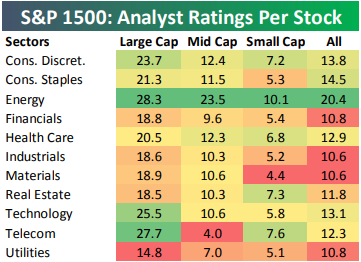
Energy Stocks Have the Most Analyst Coverage
Last week we published a post looking at the number of analyst ratings per stock by market cap. On average, a large-cap stock has 21.2 analyst ratings per stock versus just 6.2 for small-cap stocks.
Below we take a look at average analyst ratings per stock by sector. If we had to guess which sector had the most coverage, we would almost certainly guess Technology. That’s not the case, though. In reality, the Energy sector has the most coverage, and it’s not really close. Across the S&P 1500, which includes large caps, mid caps, and small caps, the average Energy stock has 20.4 analyst ratings per stock. The Consumer Staples sector is the next closest at 14.5.
At the large-cap level, Energy ranks first with 28.3 ratings per stock. Telecom ranks second at 27.7, followed by Technology in third at 25.5. Utilities has the lowest coverage at the large-cap level at just 14.8.
In the mid-cap space, the average Energy stock has 23.5 analyst ratings per stock, which is more than 10 ratings higher than the next sector (Consumer Discretionary) at 12.4. While Technology has 25.5 ratings per stock in the large-cap space, it only has 10.6 ratings per stock in the mid-cap space.
For small caps, Energy once again has the most coverage at 10.1 analyst ratings per stock. Energy is the only small-cap sector with an average of more than 10. Telecom, Real Estate, and Consumer Discretionary all have more than 7 analyst ratings per stock, while Technology is only at 5.8. The Materials sector has the least amount of coverage in the small-cap space with just 4.4 ratings per stock.