Small-Cap Breakout
While the large-cap S&P 500 remains in “correction” mode, the small-cap Russell 2,000 is in “breakout” mode. At the end of last week, the Russell 2,000 managed to break above its early 2018 highs to finish the week at new all-time highs.
Below are two trading range charts of the Russell 2,000. The first is a one-year chart, and the second is a three-year chart. While the index is now “overbought” based on its current distance above its 50-day moving average, its chart pattern still looks quite bullish from a long-term perspective.
Small caps are generally considered to be a “leading” indicator for large caps, and if that’s the case this time, the S&P 500 has new highs in store as well.

Bespoke Brunch Reads: 5/20/18
Welcome to Bespoke Brunch Reads — a linkfest of the favorite things we read over the past week. The links are mostly market related, but there are some other interesting subjects covered as well. We hope you enjoy the food for thought as a supplement to the research we provide you during the week.
Europe
March of Italy’s mini-BoTs may split the euro by John Dizard (FT)
The populist coalition that’s set to form a government in Italy has proposed a very…”interesting” mechanism for funding public spending increases, and one that has some historical precedent. [Link; paywall]
Germany’s Great European Heist by Adam Tooze and Shahin Vallée (Project Syndicate)
While Germany is perfectly happy to demand a certain two-part fiscal and monetary discipline on the part of the Eurozone, but seems to completely reject that approach when it comes to defense spending. [Link]
Europe’s Data Protection Law Is a Big, Confusing Mess by Allison Cool (NYT)
A review of GDPR, the new EU directive covering the use of personal data by companies and other institutions. While this argument probably goes a bit too far, the broader point that execution has been lacking is worthwhile. [Link; soft paywall]
American Wealth
In the second Gilded Age, the mansions get bigger, and the homeless get closer by Rick Hampson (USA Today)
A survey of one particular consequence of soaring inequality in one particular facet of one particular city’s life: the link between income and wealth disparities on how people live and live with each other in Los Angeles. [Link]
How Much Money Do You Need to Be Wealthy in America? by Suzanne Woolley (Bloomberg)
Americans consider $2.4 million as the cut-off between being “wealthy” and being less than that per a new piece of survey data from Charles Schwab. [Link; soft paywall]
Malfeasance
Drone Maker Accused of Covering Up Bomb in Bag on Flight by Anders Melin and Brandon Kochkodin (Bloomberg)
A short-seller dug up an insistence where a drone company’s employee managed to get a drone equipped with explosives onto a Delta flight from Salt Lake to LA. [Link; soft paywall, auto-playing video]
The SEC Has an Opportunity You Won’t Want to Miss: Act Now! (SEC)
In an effort to make the public more aware of scam initial coin offerings (ICOs), the SEC has set up a website that appears to be a promotion of a scam coin. [Link]
Progress
Global surge in air-conditioning set to stoke electricity demand by Ed Crooks (FT)
A new IEA report argues that income growth in large, hot countries will create massive new electricity demand fueled by increasing use of air conditioners. [Link; soft paywall]
Drug target for curing the common cold by Michelle Roberts (BBC)
Researchers in the UK think they may have found a way to boost the body’s immune response as a way to combat the common cold. [Link]
Sports
A New Atlanta, United by Soccer by Ken Belson (NYT)
With enormous crowds and similar on-pitch success, Atlanta United is the most popular soccer team in America, and has risen in a town that seems like the polar opposite of a soccer hotbed. [Link; soft paywall]
Hall of Fame pitcher Jim Palmer long wondered if he’s related to JFK. At 72, he learned the truth. by Dave Sheinin (WaPo)
A baseball legend and the story of a genealogical treasure trove that eventually peeled back the onion of genealogy for the adopted ball player. [Link; soft paywall]
Business Models
How to Lease a $50,000 BMW for Less Than a Subway Pass by Gabrielle Coppola (Bloomberg)
With automakers incentivized by both policy and the need to win the next great automotive arms race, electric vehicles are available on the very, very cheap. [Link; soft paywall]
Inside the business model for botnets (MIT Technology Review)
Botnets are a big risk, but with millions on the line for willing sellers of DDoS attacks, click fraud, or spam, they can generate significant revenues for their operators. [Link]
F-AI-l
I Tried to Get an AI to Write This Story by Paul Ford (Bloomberg)
A lovely personal essay about the trials and tribulations of machine learning, both at the level of coding it and in the world at large. [Link; soft paywall]
Data Security
Digital Photocopiers Loaded With Secrets by Armen Keteyian (CBS)
Unknown to most users, photocopiers contain hard drives which log a copy of every job they process. When improperly disposed, those hard drives are a treasure trove of information like the one CBS found. [Link]
Investing
Jack Bogle’s Battle by Leslie P. Norton (Barron’s)
A long interview with the man who did more to democratize index investing than anyone else, the founder of Vanguard Group. [Link; paywall]
Emerging Markets
Franklin Templeton buys $2.25bn in Argentine bonds by Robin Wigglesworth and Benedict Mander (FT)
A survey of the outlook for Argentina, which is in the midst of its latest meltdown, this time in the form of a run on the currency, a ceiling on USDARS, and an appeal to the IMF. [Link]
Ice History
Rise and fall of Roman Empire exposed in Greenland ice samples by Katie Langin (Science)
Using samples from ice cores in Greenland, researchers have identified a series of economic booms and busts in antiquity that threw lead off into the atmosphere. [Link]
Read Bespoke’s most actionable market research by starting a two-week free trial today! Get started here.
Have a great Sunday!
The Bespoke Report — Small Caps Take the Lead
The Closer: End of Week Charts — 5/18/18
Looking for deeper insight on global markets and economics? In tonight’s Closer sent to Bespoke clients, we recap weekly price action in major asset classes, update economic surprise index data for major economies, chart the weekly Commitment of Traders report from the CFTC, and provide our normal nightly update on ETF performance, volume and price movers, and the Bespoke Market Timing Model. We also take a look at the trend in various developed market FX markets.
Below is a snapshot from today’s Closer highlighting weekly intraday price charts for major equity indices and other asset classes. If you’d like to see more, start a free trial below.

The Closer is one of our most popular reports, and you can sign up for a free trial below to see it!
See tonight’s Closer by starting a two-week free trial to Bespoke Institutional now!
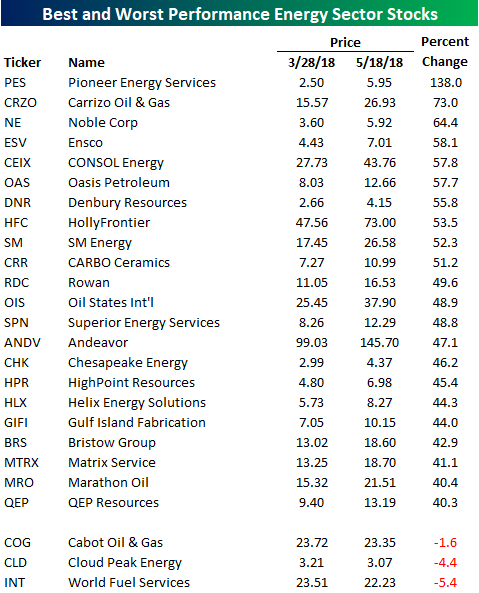
Top Performing Energy Sector Stocks Since March Low
Even when you look just at the market cap weighted performance of the Energy sector, its 18% rally off the late March closing low has been impressive. However, when you consider that over 35% of the index is made up of Exxon Mobil (XOM) and Chevron (CVX), which are each up less than 15%, the sector has been even stronger. In fact, within the S&P 1500 Energy sector (made up of large, mid, and small cap stocks), the average performance of the 88 stocks has been a gain of over 29% since 3/28!
The table below lists the best and worst performing stocks in the S&P 1500 Energy sector since 3/28. During that span, a quarter of the stocks are up over 40%. Leading the way higher, Pioneer Energy (PES) has more than doubled, while Carrizo (CRZO) is up over 70%. Along with these two names, some of the more well-known names on the list of biggest winners include HollyFrontier (+53.5%), Andeavor (+47.1%), Chesapeake (+46.2%), and Marathon Oil (+40.4%).
While a lot of energy stocks are up big since the sector’s recent closing low in late March, just three stocks are down (listed at bottom of table). Given the strength we have seen in the overall sector, things have to be pretty bad at Cabot, Cloud Peak, and World Fuel if they can’t even rally in this environment.
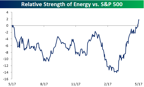
A High Energy Rally
Sentiment in the market has a way of changing on a dime. A case in point is the Energy sector. In addition to hitting a 52-week high on Thursday, a number of internal measures for the sector have been pointing higher. For starters, check out the sector’s relative strength versus the S&P 500. In the span of two months, the sector went from underperforming the S&P 500 by its widest margin in over a year to outperforming by its widest margin in a year.
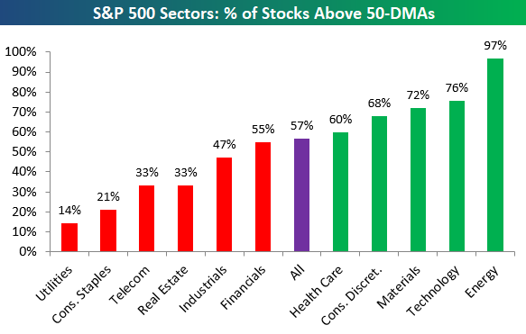
Breadth in the sector has also been strong. As highlighted in our Sector Snapshots report on Thursday, 97% of the stocks in the sector are currently above their 50-day moving averages. That compares to a level of 57% for the entire S&P 500 and 76% for the next closest sector (Technology). Not only are nearly all of the stocks in the sector above their 50-DMAs, but a good chunk of them are also hitting 52-week highs. In yesterday’s session alone, over 40% of the stocks in the sector hit 52-week highs. That was the highest one-day percentage for the sector since late 2016. Suddenly, investors can’t get their hands on enough energy stocks. Crude oil at over $70 a barrel as a way of doing that!

The Closer — Consumer Lending, Thursday Potpourri — 5/17/18
Log-in here if you’re a member with access to the Closer.
Looking for deeper insight on markets? In tonight’s Closer sent to Bespoke Institutional clients, we chart the quarterly consumer credit data from the New York Fed. We also discuss EM, long bond yields, and the leading/coincident indicator ratio.

See today’s post-market Closer and everything else Bespoke publishes by starting a 14-day free trial to Bespoke Institutional today!
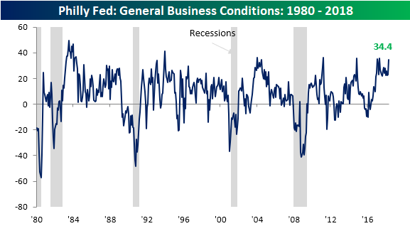
B.I.G. Tips – Philly Fed Feeling Fine
As mentioned in a post earlier today, today’s headline reading in the Philadelphia Fed Manufacturing report came in stronger than expected and registered its 18th straight reading above +20 in the history of the survey. While the current streak of +20 readings is unprecedented, there have been two other periods in the history of the survey (dating back to 1980) where it was above +10 for at least a year and a half (18 months). In a just-published B.I.G. Tips report for Bespoke Premium and Bespoke Institutional clients, we analyzed the S&P 500’s performance during each of those periods to see if there were any parallels to today.
From a more shorter-term perspective, we also looked at how a key internal breadth indicator of the S&P 500 is currently at a critical juncture which could go a long way in determining the future path of the market.
If you are already a member, please log-in here to view the report. If you’re not yet a Premium subscriber and would like to see the report, please start a two-week free trial to Bespoke Premium now. Here’s a breakdown of the products you’ll receive.
Bespoke’s Sector Snapshot — 5/17/18
We’ve just released our weekly Sector Snapshot report (see a sample here) for Bespoke Premium and Bespoke Institutional members. Please log-in here to view the report if you’re already a member. If you’re not yet a subscriber and would like to see the report, please start a two-week free trial to Bespoke Premium now.
Below is one of the many charts included in this week’s Sector Snapshot, which highlights the percentage of stocks by sector trading above their 50-day moving averages. As shown, five cyclical sectors now have stronger readings than the S&P 500 as a whole. This is a healthy sign for bulls hoping for a return to new all-time highs soon.
To find out what this means and to see our full Sector Snapshot with additional commentary plus six pages of charts that include analysis of valuations, breadth, technicals, and relative strength, start a two-week free trial to our Bespoke Premium package now. Here’s a breakdown of the products you’ll receive.