All or Nothing Days on the Comeback
For those unfamiliar with the term, we consider an “all or nothing day” to be one where the S&P 500’s net daily A/D (advance/decline) reading is greater than +/-400. Throughout the financial crisis and most of the current bull market, the frequency of all or nothing days increased substantially relative to the years before. The reason for the increase was a one-two punch of an easy Fed and ETFs. As far as the Fed is concerned, easy money and low-interest rates increased the attractiveness of equities relative to other asset classes. More importantly, though, ETFs provided an easy vehicle for investors to gain exposure to stocks while minimizing company-specific risk. The result was an environment of a rising tide lifting all boats and vice versa, and the chart below says it all. From 1990 through 2005, there were just two years where the S&P 500 saw a double-digit number of all or nothing days, but from 2006 through 2017, their frequency exploded and there wasn’t a single year where there were less than ten all or nothing days.
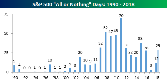
In 2017, though, all or nothing days fell by the wayside as there were just three such days in the entire year. One reason for the lack of extreme single-day breadth readings was that volatility was low, so there simply were not a lot of days where the S&P 500 was up or down 1%. In addition to that, 2017 was also a very weak year for Energy and stocks in the Consumer Discretionary sector not named Amazon (AMZN), and because these two sectors on a combined basis account for about a quarter of the names in the index, it was hard to get strong daily breadth readings.
This year, however, all or nothing days are back in a big way. Through the first five months of the year, there have already been 12 such days, which puts the index on pace for 29 on the year. If that were to occur it would be the largest number of all or nothing days in a single year since 2015 when there were 38.
Chart of the Day: US Charts Holding Up Well
Fixed Income Weekly – 5/30/18
Searching for ways to better understand the fixed income space or looking for actionable ideals in this asset class? Bespoke’s Fixed Income Weekly provides an update on rates and credit every Wednesday. We start off with a fresh piece of analysis driven by what’s in the headlines or driving the market in a given week. We then provide charts of how US Treasury futures and rates are trading, before moving on to a summary of recent fixed income ETF performance, short-term interest rates including money market funds, and a trade idea. We summarize changes and recent developments for a variety of yield curves (UST, bund, Eurodollar, US breakeven inflation and Bespoke’s Global Yield Curve) before finishing with a review of recent UST yield curve changes, spread changes for major credit products and international bonds, and 1 year return profiles for a cross section of the fixed income world.
Today we review the recent shock declines in interest rates, focusing on the 10 year yield.

Our Fixed Income Weekly helps investors stay on top of fixed income markets and gain new perspective on the developments in interest rates. You can sign up for a Bespoke research trial below to see this week’s report and everything else Bespoke publishes free for the next two weeks!
Click here and start a 14-day free trial to Bespoke Institutional to see our newest Fixed Income Weekly now!
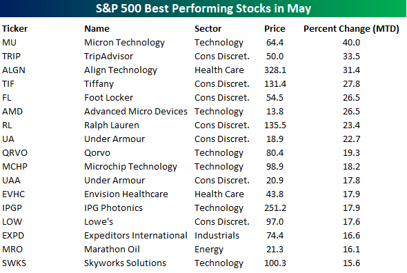
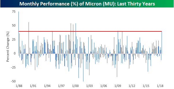
Micron’s Monster Month
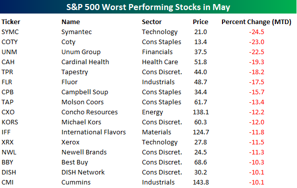
For US equities as a whole, May has been a pretty good month with the average S&P 500 stock rising nearly 1%. In terms of individual stocks, though, there have been a number of standouts. The table below lists the 17 stocks in the index that have rallied over 15% this month. Topping the list of winners is Micron (MU). Of the 21 trading days so far this month, the stock has been up on 16 of them for a total gain of 40%. Besides MU, a number of retail related stocks made the list of biggest winners including Tiffany (TIF), Foot Locker (FL), Ralph Lauren (RL), Under Armour (UA and UAA), and Lowe’s.
Below is a list of the biggest losers in the S&P 500 so far this month. Just as a tech stock tops the list of biggest winners, another one (Symantec – SYMC) tops the list of losers. Besides SYMC, other notable names include old-time brands like Campbell (CPB), Molson Coors (TAP), Xerox (XRX), and Newell (NWL).
On a final note, not only is Micron the biggest winner this month, but it is also having one of its best months in years. The chart below shows the monthly performance of the stock over the last thirty years. With a gain of 40%, MU is having its best month since December 2009 and its 8th best month over the last thirty years.
Analyzing Trends Across Asset Classes
Yesterday’s equity market declines moved large-cap US index ETFs from overbought to neutral territory. Below is a snapshot of key ETFs using our Trend Analyzer tool. You can see that heading into today’s open, the Dow Jones Industrial Average (DIA) was the only one that had broken back below its 50-day moving average. Other large-cap index ETFs like SPY, OEF, and IWB are down more than 1% over the last week, but they remain above their 50-DMAs. The Nasdaq 100 (QQQ) and the small and mid-cap space continues to hold up the best.
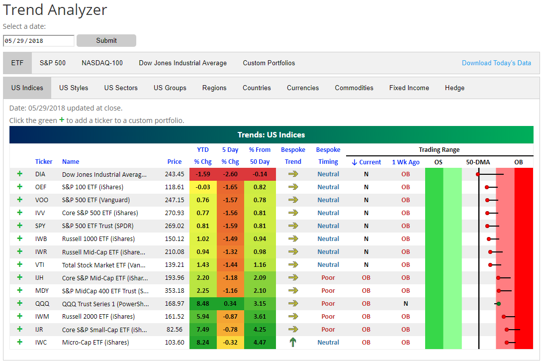
Looking at sectors, Energy (XLE) and Financials (XLF) have taken it on the chin the worst over the last week, with XLE down 5.78% and XLF down 4.37%. Even after Energy’s declines, the sector remains above its 50-day moving average, while the Financial sector has moved from above its 50-DMA down to oversold territory over the last week. Along with Financials, the other three sectors that are below their 50-DMAs are Consumer Staples, Telecom, and Materials. Tech and Consumer Discretionary are the only two sectors that remain overbought.

Oil has gotten crushed over the last week, with USO and DBO both falling sharply. USO has moved from overbought to below its 50-DMA. As energy-related commodity ETFs have seen mean reversion to the downside, we’ve seen gold ETFs start to experience mean reversion to the upside. DGL, GLD, and IAU are all up over the last week and they’re getting close to moving from oversold to neutral territory.
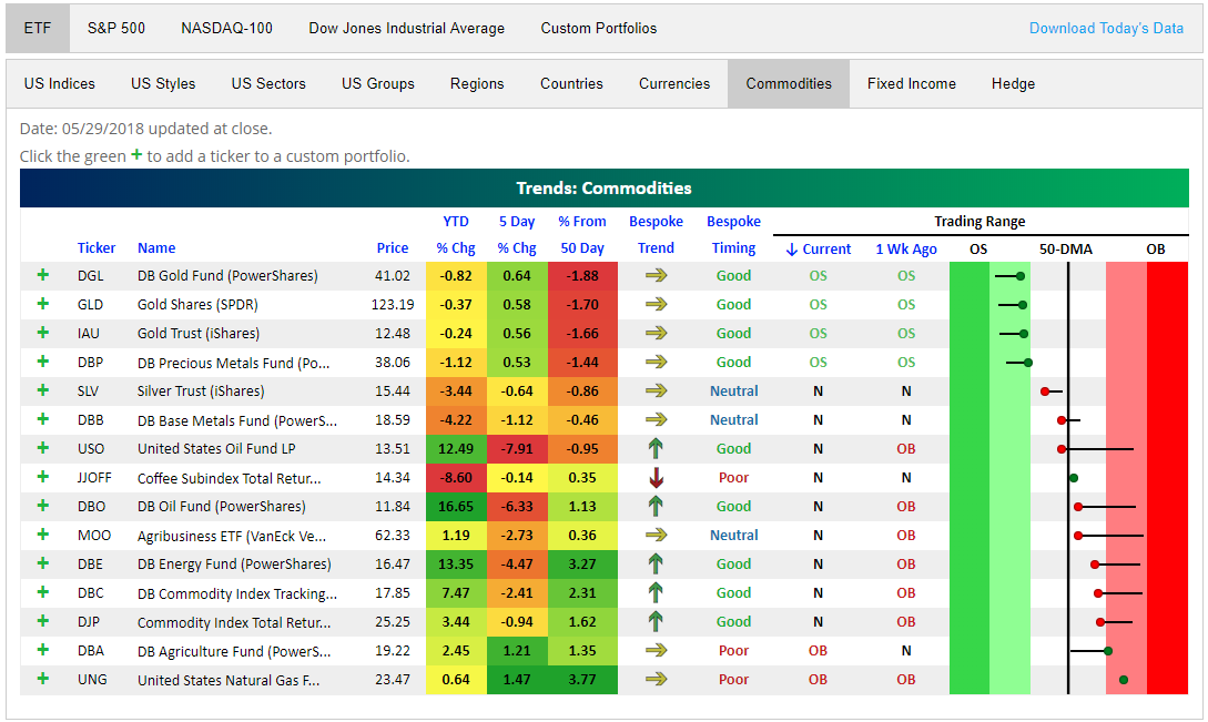
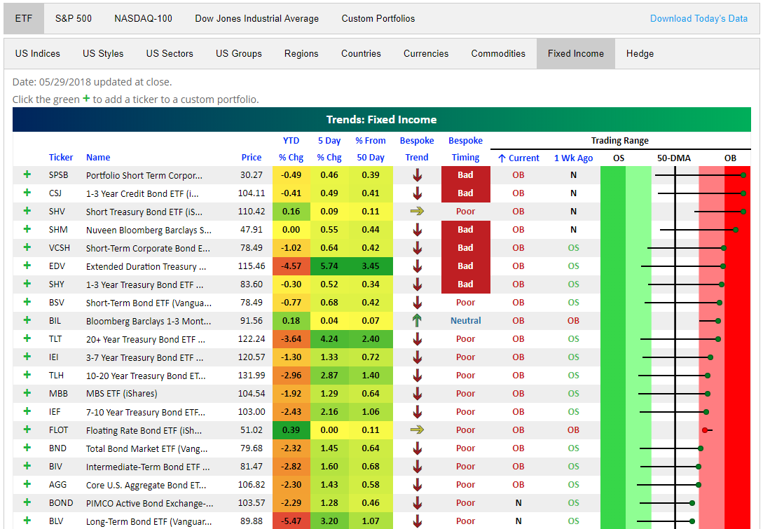
Finally, below is a snapshot of the fixed income ETFs that are currently the most extended to the upside. As you can see, ETFs across the fixed income space have caught a huge bid over the last week, with many moving from oversold to overbought levels. Given longer-term downtrends that are still in place, this gives them a “Bad” timing score based on our proprietary scoring system. You can read more about our Bespoke Trend and Bespoke Timing ratings at the bottom of our Trend Analyzer page.
Bespoke’s Global Macro Dashboard — 5/30/18
Bespoke’s Global Macro Dashboard is a high-level summary of 22 major economies from around the world. For each country, we provide charts of local equity market prices, relative performance versus global equities, price to earnings ratios, dividend yields, economic growth, unemployment, retail sales and industrial production growth, inflation, money supply, spot FX performance versus the dollar, policy rate, and ten year local government bond yield interest rates. The report is intended as a tool for both reference and idea generation. It’s clients’ first stop for basic background info on how a given economy is performing, and what issues are driving the narrative for that economy. The dashboard helps you get up to speed on and keep track of the basics for the most important economies around the world, informing starting points for further research and risk management. It’s published weekly every Wednesday at the Bespoke Institutional membership level.
You can access our Global Macro Dashboard by starting a 14-day free trial to Bespoke Institutional now!

The Closer — More On Italy, More On Manufacturing — 5/29/18
Log-in here if you’re a member with access to the Closer.
Looking for deeper insight on markets? In tonight’s Closer sent to Bespoke Institutional clients, we continue to look at Italy and the recent stress in European markets. We also review a huge UST rally and the last component of our 5 Fed Manufacturing activity index.

See today’s post-market Closer and everything else Bespoke publishes by starting a 14-day free trial to Bespoke Institutional today!
Case Shiller Home Price Numbers Strengthen Further
The most recent numbers from S&P/Case-Shiller came out this morning and showed increased home prices on a month-over-month and year-over-year basis for every city tracked.
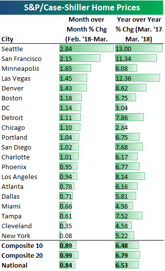
Below is a table highlighting each city’s change in home prices for March (the data is released on a two-month lag). As shown, Seattle — home to Amazon.com — continues to see the biggest gains, with a month-over-month gain of 2.84% and a year-over-year gain of 13%. San Francisco was also up 2%+ in March, while another ten cities were up more than 1%. New York was up the least month-over-month at just 0.08%, which was even weaker than Cleveland’s +0.35% gain.
Year-over-year, Seattle, San Francisco, and Las Vegas were the three cities up 10%+, while DC and Chicago were up the least at 3.04% and 2.84%, respectively.
Below we show where home prices currently stand versus their high points during the housing bubble of the mid-2000s. Ten cities are currently above their prior bubble highs — meaning they’ve recently hit new all-time highs — while ten cities are still below.

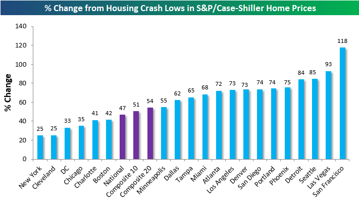
We can also see how much home prices are up off of their lows following the housing bubble burst in each city. As shown, the national and composite 10 and 20 city indices are all up roughly 50% from their lows, while San Francisco is up the most at 118%. While Vegas is still the furthest below its housing-bubble highs at -25%, it’s up the 2nd most off of its lows at +93%. This is a reminder as to how crazy things got for Vegas home prices back in the mid-2000s.
We noted earlier that New York and Cleveland showed the smallest month-over-month gains this month, and these two cities are also up the least from their lows (just 25%) following the housing crash. DC, Chicago, Charlotte, and Boston are the other cities that are up less than the national indices.
Finally, below are charts of the S&P/Case Shiller home price indices for each city tracked. Cities highlighted in green are currently at new all-time highs.

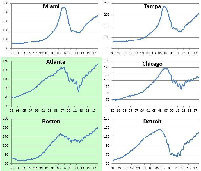
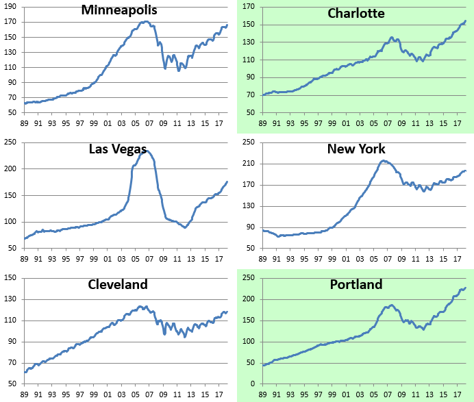
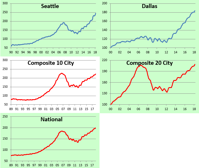
Chart of the Day: Flattest Yield Curve in Over a Decade
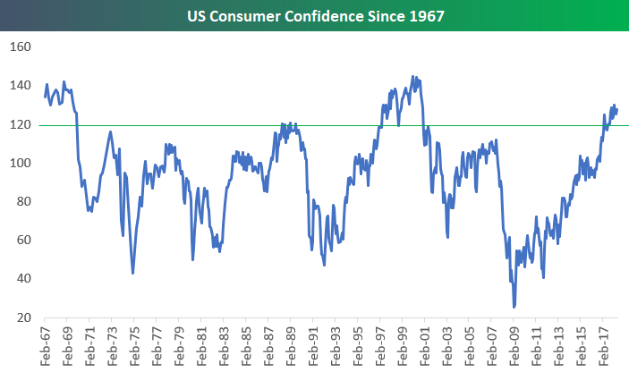
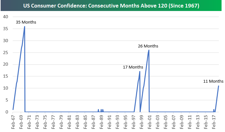
Consumer Confidence Above 120 for 11 Straight Months
As noted earlier, Consumer Confidence for the month of May came in at 128, which was right inline with consensus economist expectations. May was the 11th straight month that Consumer Confidence has been above 120. Since 1967, there have only been two other periods where US consumers have been this positive for such an extended streak.
The first chart below shows Consumer Confidence since 1967, while the second chart shows streaks of consecutive months above 120. The two other periods where confidence was this high came in the late 1960s and the late 1990s.
Confidence was above 120 for 35 months from February 1967 (the first month of data for the survey) through December 1969. It then dipped below 120 in 1970 and didn’t get back above it again for the next 18 years until May 1988.
Unsurprisingly, the next period of continued strength for Consumer Confidence came during the Dot Com boom of the late 90s. In May 1997, confidence ticked above 120 and stayed above it for 17 straight months. After one month of a sub-120 reading in October 1998, another streak of +120 readings began that lasted 26 months through December 2000.
Even during the mid-oughts bull market from 2003 through 2007, Consumer Confidence never ticked above 120. And during the current bull market, it took 8 years of stock market gains and economic growth for the reading to finally tick above 120 and stay there for an extended period. The current streak of 11 months above 120 began last July and continued this month.
While it’s a good sign that consumers are finally feeling positive again, we can’t help but worry about over-confidence and/or complacency eventually setting in. While the economy was rolling in the late 1960s and the late 1990s, the 1970s and the Dot Com crash immediately followed them. Eventually the current streak of +120 readings will come to an end, and when it does, hopefully a period like the 1970s or early 2000s doesn’t follow!