Bespoke’s Sector Snapshot — 6/7/18
We’ve just released our weekly Sector Snapshot report (see a sample here) for Bespoke Premium and Bespoke Institutional members. Please log-in here to view the report if you’re already a member. If you’re not yet a subscriber and would like to see the report, please start a two-week free trial to Bespoke Premium now.
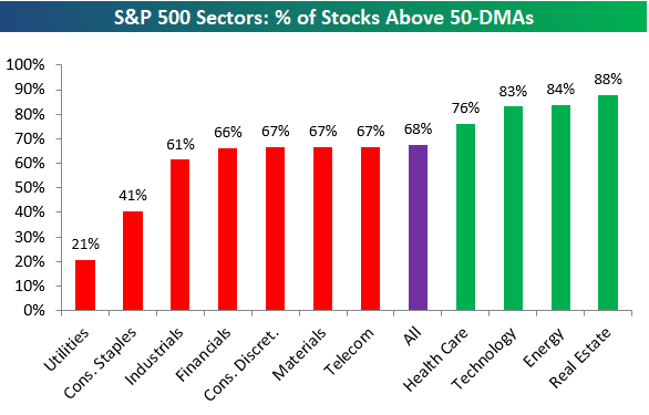
Below is one of the many charts included in this week’s Sector Snapshot, which highlights the percentage of stocks above their 50-day moving averages by sector. As shown, more than two-thirds of stocks in the S&P are back above their 50-DMAs, which is a healthy sign.
To find out what this means and to see our full Sector Snapshot with additional commentary plus six pages of charts that include analysis of valuations, breadth, technicals, and relative strength, start a two-week free trial to our Bespoke Premium package now. Here’s a breakdown of the products you’ll receive.
Chart of the Day: Equity Issuance Back From The Dead
Equity Markets Back to Overbought
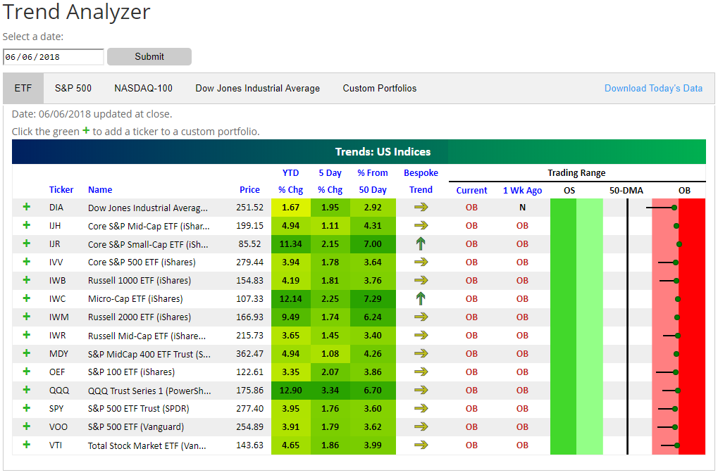
It took a few months, but equity markets have finally made it back into overbought territory. You can easily see this from the Trend Analyzer snapshot below.
Our Trend Analyzer allows users to easily see how well (or poorly) stocks or ETFs are trading relative to their 50-day moving averages. It’s a useful tool when trying to get a gauge on trends of the overall market, and it also helps investors identify potential buy and sell opportunities on an individual security basis.
In the Trading Range section of the snapshot below, the dot represents where the ETF is currently trading relative to its 50-day moving average. The tail end of the dot represents where it was trading one week ago. The red shading in the Trading Range section represents overbought territory, so when the dot moves up into the red zone, it means the ETF has moved well above its 50-day up to levels that are considered extended. The theory is that over time prices eventually revert to the mean as they trend in either sideways, upwards, or downward patterns. When price gets extremely overbought, it may be best to wait for downside mean reversion to occur before entering into a long position.
As you can see, every single US Index ETF (across market cap levels) in our Trend Analyzer began the day trading well into overbought territory. In 2017, overbought trading was extremely common, but we haven’t seen this kind of across-the-board “overboughtness” in a few months now since the correction began at the end of January.
You can learn more about how and why you should be using our Trend Analyzer tool here. If there are specific stocks or ETFs that you’d like to monitor, you can even set up custom Trend Analyzer portfolios!
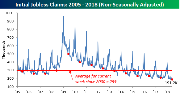
Another Week of Sub-250K Claims
Jobless claims came in slightly higher than expected this week with first-time claims coming in at 222K compared to expectations for 220K. Make no mistake, though, 222K is still extraordinarily low. It also marks the 170th straight week that claims have been below 300K (longest on record) and the 35th straight week that claims have been 250K or lower (longest streak since 1970).
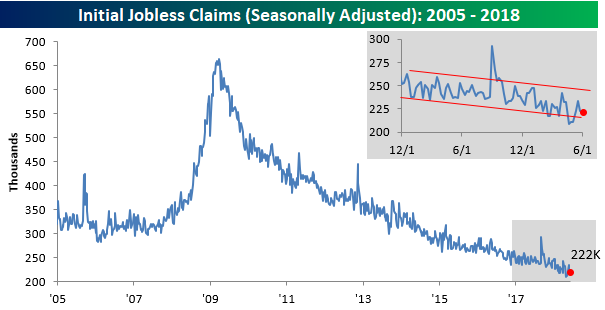
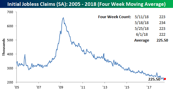
While claims declined for the second straight week, the four-week moving actually increased slightly, rising from 222.75K up to 225.5K. That puts the current reading 12K above the multi-decade low of 213.5K that we saw back on 5/11/18.
On a non-seasonally adjusted basis (NSA), claims dropped from 202.8K down to 191.2K. For the current week of the year, this is the lowest level since 1973 and more than 100K below the average for the current week of the year dating back to 2000.
the Bespoke 50 — 6/7/18
Every Thursday, Bespoke publishes its “Bespoke 50” list of top growth stocks in the Russell 3,000. Our “Bespoke 50” portfolio is made up of the 50 stocks that fit a proprietary growth screen that we created a number of years ago. Since inception in early 2012, the “Bespoke 50” has beaten the S&P 500 by 98.6 percentage points. Through today, the “Bespoke 50” is up 200.6% since inception versus the S&P 500’s gain of 102.0%. Always remember, though, that past performance is no guarantee of future returns.
To view our “Bespoke 50” list of top growth stocks, click the button below and start a trial to either Bespoke Premium or Bespoke Institutional.

The Closer — Trade Twice, EIA Not Nice — 6/6/18
Log-in here if you’re a member with access to the Closer.
Looking for deeper insight on markets? In tonight’s Closer sent to Bespoke Institutional clients, we review trade data releases in Canada and the US as well as weekly petroleum market data from the EIA.

See today’s post-market Closer and everything else Bespoke publishes by starting a 14-day free trial to Bespoke Institutional today!
B.I.G. Tips – The Doctor Is In
Markets Eyeing More Hikes Around The World
Each week, we publish a Fixed Income Weekly, a recap of interest rate and credit markets in the US and around the world. In addition to charts and tables keeping track of performance and levels for fixed income assets in the US and around the world, we also present a weekly trade idea and unique analyses.
This week, we introduced a global central bank index using overnight index swap forwards which indicate market pricing for short-term central bank rates and current central bank rates. We can then convert those variables into 25 basis point increments, each representing 1 hike, and weight them by purchasing power parity (PPP) GDP levels. We include data for the US, Canada, Mexico, Brazil, the Eurozone, the UK, Switzerland, Norway, Sweden, Czech Republic, Poland, Australia, New Zealand, Japan, India, and South Korea, capturing a wide swath of developed and emerging markets.
As shown in the chart below, despite a small pullback over the last few weeks thanks to Italian stresses, interest rate markets are still pricing an output-weighted average of 1.6 hikes across the global economy between now and mid-2019. That’s near the most in over 5 years, and represents a significant shift from the neutral to cutting bias of the 2016-2017 period.
Fixed Income Weekly – 6/6/18
Searching for ways to better understand the fixed income space or looking for actionable ideals in this asset class? Bespoke’s Fixed Income Weekly provides an update on rates and credit every Wednesday. We start off with a fresh piece of analysis driven by what’s in the headlines or driving the market in a given week. We then provide charts of how US Treasury futures and rates are trading, before moving on to a summary of recent fixed income ETF performance, short-term interest rates including money market funds, and a trade idea. We summarize changes and recent developments for a variety of yield curves (UST, bund, Eurodollar, US breakeven inflation and Bespoke’s Global Yield Curve) before finishing with a review of recent UST yield curve changes, spread changes for major credit products and international bonds, and 1 year return profiles for a cross section of the fixed income world.
Today we review the global outlook for interest rates in the form of central bank hike pricing.

Our Fixed Income Weekly helps investors stay on top of fixed income markets and gain new perspective on the developments in interest rates. You can sign up for a Bespoke research trial below to see this week’s report and everything else Bespoke publishes free for the next two weeks!
Click here and start a 14-day free trial to Bespoke Institutional to see our newest Fixed Income Weekly now!