Bespoke’s Global Macro Dashboard — 7/25/18
Bespoke’s Global Macro Dashboard is a high-level summary of 22 major economies from around the world. For each country, we provide charts of local equity market prices, relative performance versus global equities, price to earnings ratios, dividend yields, economic growth, unemployment, retail sales and industrial production growth, inflation, money supply, spot FX performance versus the dollar, policy rate, and ten year local government bond yield interest rates. The report is intended as a tool for both reference and idea generation. It’s clients’ first stop for basic background info on how a given economy is performing, and what issues are driving the narrative for that economy. The dashboard helps you get up to speed on and keep track of the basics for the most important economies around the world, informing starting points for further research and risk management. It’s published weekly every Wednesday at the Bespoke Institutional membership level.
You can access our Global Macro Dashboard by starting a 14-day free trial to Bespoke Institutional now!

The Closer — Nasdaq Reversals, 3 of 5 Fed, Canada GDP, Mexico CPI, Delinquencies — 7/24/18
Log-in here if you’re a member with access to the Closer.
Looking for deeper insight on markets? In tonight’s Closer sent to Bespoke Institutional clients, we review the implications for forward returns of very large reversals in the Nasdaq Composite like the one we saw today. We also discuss manufacturing activity data, Canadian GDP, Mexican inflation, and the extinction of foreclosures in the US real estate market.

See today’s post-market Closer and everything else Bespoke publishes by starting a 14-day free trial to Bespoke Institutional today!
High Valuation = High Returns?
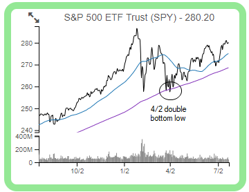
The average stock in the S&P 500 is up just under 7% since the index made its double bottom closing low on April 2nd. As shown in the chart for SPY (the S&P 500 tracking ETF) below, price has been steadily trending higher since 4/2 — making a series of higher highs and higher lows. Until the index is able to break above its late January all-time closing high, however, the market’s long-term uptrend cannot be re-confirmed.
So what has been driving performance since April 2nd? We regularly run a report called our “Decile Analysis” where we look at a number of different stock characteristics to see which ones are driving outperformance or underperformance. Examples of some of the stock characteristics we look at include market cap, dividend yield, valuations, institutional ownership, analyst ratings, etc.
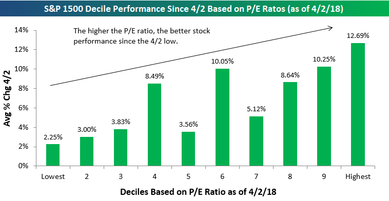
Since April 2nd, one of the performance metrics from our Decile Analysis that stands out the most is valuation.
Below is a chart showing the average performance of S&P 500 stocks by decile based on trailing 12-month P/E ratios. Decile 1 contains the 50 S&P 500 stocks with the lowest (cheapest) valuations, while decile 10 contains the 50 stocks with the highest (or most expensive) valuations.
As shown in the chart, the lower the P/E ratio, the weaker performance has been as the market has rallied since the April 2nd low. The 50 stocks with the lowest P/E ratios as of 4/2 are up an average of 2.25% since then (the weakest of any decile), while the 50 stocks with the highest P/E ratios are up 12.69% (the highest of any decile).
Seeing “growth” outperform “value” during a significant market rally is to be expected, but the degree of outperformance this time around has been especially stark.
To read our full Decile Analysis report where we identify additional performance trends, start a two-week free trial to Bespoke Premium!
Thin Rally? Thin Argument
It continues to amaze us at how often we hear arguments that the market’s rally this year has been thin. A rally that is thin is one where just a handful of stocks are participating in the market’s gains, while the rest of the market languishes. An extreme example of this was in the late 1990s and early 2000 when tech stocks surged, while most other areas of the market declined. Today’s market is nothing even close to resembling that. Take, for example, the S&P 500’s cumulative A/D line. Since the S&P 500 last made a closing high in late January, the cumulative A/D line has seen close to 20 new all-time highs. That’s the opposite of a thin rally!
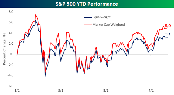
Another way to look at this is to compare the performance of the S&P 500 on both a market cap and equal-weighted basis. Looking at performance on an equal-weighted basis tells you how the ‘average’ stock is doing, while the normal market cap weighted approach puts a larger emphasis on the bigger names. So far this year, the market cap weighted S&P 500 is up 5% YTD, while the equal-weighted index is up 3.1%. These performance numbers definitely imply that larger mega-cap stocks in the index are doing the best so far YTD, but all 500 stocks in the index are also up an average of 3.1%, so they’re not exactly slumping.
Performing the same analysis on a sector by sector basis, proponents of the thin rally argument may be surprised to learn that in six of the S&P 500’s eleven sectors, the YTD performance of the weighted index is actually underperforming the performance of the equal-weighted index. Looking at the chart, the only sector where the market cap weighted sector performance is materially greater than the equal-weighted performance is in the Consumer Discretionary sector where Amazon’s 56% return and Netflix’s 87% gain have really skewed things. Outside of Consumer Discretionary, though, there is not a single sector where the market cap weighted sector performance exceeds the equal-weighted performance by more than two percentage points. Given the fact that there is plenty of strength in the market outside of the large mega-caps, a good place to look for new ideas is in our Bespoke 50 list of attractive growth stocks. For full access, start a two-week free trial to Bespoke Premium.

B.I.G. Tips – Decile Analysis Off the Lows
Chart of the Day: Four Months of Gains Heading into August
Bespoke Stock Scores — 7/24/18
The Closer — CDS, Real Nasdaq, Curve Steepening, Chicago National Activity — 7/23/18
Log-in here if you’re a member with access to the Closer.
Looking for deeper insight on markets? In tonight’s Closer sent to Bespoke Institutional clients, we take a look at economic data and market trends: CDS index spreads, the real performance of the NASDAQ composite, the sudden and dramatic bear steepening of the yield curve, and the Chicago Fed National Activity Index.
See today’s post-market Closer and everything else Bespoke publishes by starting a 14-day free trial to Bespoke Institutional today!
Chart of the Day: A Less Hawkish Fed
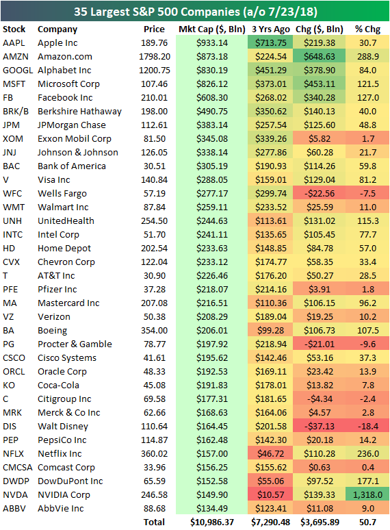
Four Members of the $800+ Billion Market Cap Club
Below is an updated look at the 35 largest S&P 500 companies. It’s worth noting that recent gains have put four companies into the $800+ billion market cap club. Apple (AAPL) is still on top with a market cap of $933 billion, followed by Amazon (AMZN) at $873 billion, Alphabet (GOOGL) at $830 billion, and Microsoft (MSFT) at $826 billion. It’s easy to forget that Microsoft (MSFT) was a company left for dead in the early part of this bull market. Its turnaround over the last few years driven by its shift to the Microsoft 365 “software as a subscription” model has been impressive to watch in real time.
You’ll notice that the five largest companies are all Tech-related, while the 6th through 14th largest companies are non-Tech. You have to move down to the #15 spot — Intel (INTC) — to find the next Tech company, and after that the next Tech company is Cisco (CSCO) at #24.
For each stock on the list, we also show where its market cap stood 3 years ago on July 23rd, 2015. The seven largest companies right now have all seen their market caps rise by at least 30% over the last 3 years. Even JP Morgan (JPM) — which ranks 7th — has seen its market cap jump nearly 50% from $257.5 billion up to $383 billion. Three years ago, a market cap of $383 billion would have ranked as the 3rd largest company in the US.
Netflix (NFLX) and NVIDIA (NVDA) are the two other stocks worth pointing out. Netflix has seen its market cap jump from $46.7 billion up to $157 billion over the last 3 years, which makes it the 31st largest company in the S&P. The rise for NVDA has been even more impressive, as it has seen a jump from just $10 billion up to $147 billion — a gain of 1,318%.
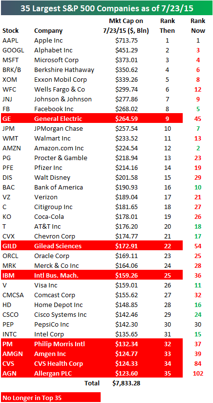
Below we show a snapshot of the 35 largest companies as of three years ago on July 23rd, 2015. For each stock on the list, we include where it ranked then in terms of market cap and where it ranks now. Apple (AAPL) ranked #1 then and it ranks #1 now, but the next six largest companies as of three years ago have all dropped in the rankings.
Amazon.com (AMZN) has seen the biggest jump from 12th place up to 2nd — increasing its market cap by $648 billion over the last 3 years!
On the downside, the biggest drop has been General Electric (GE) — which has fallen from 9th place down to 45th place (it used to be in first place too!). Along with GE, six other stocks have fallen out of the top 35 over the last 3 years — GILD, IBM, PM, AMGN, CVS, and AGN.
Start a two-week free trial to Bespoke Premium for a look at the changing landscape of S&P 500 sector weightings over the years.