Chart of the Day: Hatching an Idea in the Consumer Staples Sector
B.I.G. Tips — Fed Days June 2018
Small Business Going Gangbusters
Small business optimism saw a big jump in May, with the NFIB’s index of small business optimism rising to the second highest level in the history of the survey going back nearly 50 years. And if you think the NFIB isn’t excited about the recent uptick in its sentiment index, check out the size of the font on the home page. It’s huge!
The commentary of this month’s report was also quite positive and deservedly so given the strength. As NFIB President Juanita Duggan noted in the report, “Main Street optimism is on a stratospheric trajectory thanks to recent tax cuts and regulatory changes.” There were also a number of additional record readings in this morning’s report, including increases in compensation, positive earnings trends, positive sales trends, and expansion plans. The biggest challenges faced by small business owners these days is no longer tied to government regulations, red tape, or taxes, but instead to finding qualified workers.
The chart below shows historical readings of the NFIB Small Business Optimism Index dating back to 2000. After first breaking through its 2004 high back in November, the index has now made two new marginal new highs and is way above its historical average of 96.7. While the initial surge following President Trump’s election was originally seen by some as being just a temporary move, it has had plenty of staying power at this point.

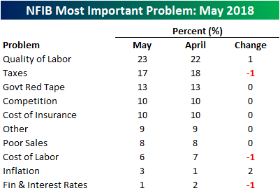
One section of the NFIB report that we like to follow closely is the issues that small businesses consider to be their number one problem. The table below lists the percentage of small businesses that cited each issue as their most important problem. Topping the list once again this month is the issue of Labor Quality, which was specifically called out in the commentary of the report. At 23%, this reading tied for its highest level on record and at a level not seen since late 2000. Behind Labor Quality, Taxes are still a decent sized problem cited by 17% of small business owners, but it it down considerably from where it was in recent history.
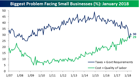
As shown above, when it comes to monthly changes in the issues small business owners see as their most important problems, there tends to be little in the way of change, but over time these issues see big shifts. A case in point is labor issues and government red tape and taxes. The chart below compares the combined percentage of small business owners who cited Taxes and Government Requirements as their most important problem to the combined percentage who cited Cost and Quality of Labor as their biggest problem. As shown, the roles of the various problems have really shifted over time. As recently as early 2015, nearly half of all small business owners complained about taxes and red tape while very few business owners had any issues with labor issues. Now, though, we are in an environment where Labor is increasingly becoming the most important problem for business owners.
Earnings Report Stock Price Volatility Surprisingly Stable Over Time
The screening features available with our popular Earnings Screener are pretty much limitless. Last week when Warren Buffett and Jamie Dimon together called for companies to end the practice of issuing quarterly guidance, we immediately thought about the impacts that it might have on stock prices.
The end to quarterly guidance would have its pluses and minuses, but one theory is that it would cause a spike in individual stock price volatility when earnings reports are released. Less info provided by companies heading into their quarterly reports would cause greater surprises when the actual numbers are released (on both the positive and negative side).
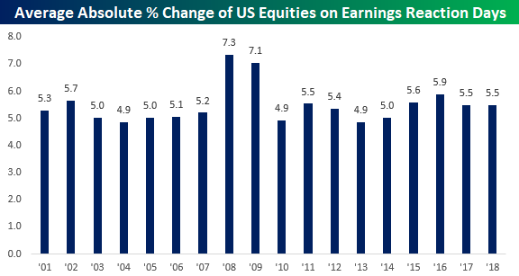
From our Earnings Screener, users are able to see how much stocks typically move (on an absolute basis) on the first trading day following their earnings report each quarter. Below is a chart showing the average absolute percentage change for US stocks on their earnings reaction days by year going back to 2001.
As you can see, the average stock typically experiences a one-day move of +/-5% on its earnings reaction day each quarter. The two outlier years came during the Financial Crisis in 2008 and 2009 when stocks moved more than +/-7% on their earnings reaction days.
Should companies collectively decide to end the practice of issuing forward guidance, we think you’d at least initially see a jump in the average move up towards and maybe even above +/-6%.
Bespoke Stock Scores — 6/12/18
Cyclical to Non-Cyclical Stock Weighting Ratio at 40 Year High
Below is an updated look at S&P 500 sector weightings. As shown, Technology now makes up more than a quarter of the pie, while Financials, Health Care, and Consumer Discretionary are the next largest sectors (in that order).
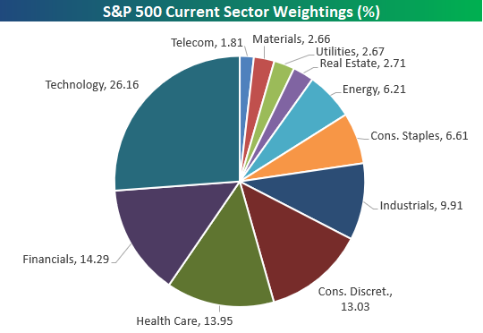
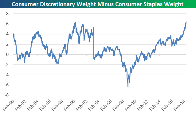
Notably, the Consumer Discretionary sector’s weighting of 13.03% is nearly twice as large as the weighting of 6.61% for Consumer Staples. Below is a chart showing the spread between the weighting of the Discretionary sector vs. the Staples sector. At +6.42 percentage points, the spread is at a record high going back to 1990.
The record spread between Discretionary and Staples certainly tells us that the economy has been rolling, but it should also start to offer a bit of a warning sign for investors. The prior record for this spread came at the very end of the Dot Com boom of the late 90s, when Tech was on fire (as it is now) and the economy was also rolling. The low for the spread came at the depths of the Financial Crisis in early 2009. It’s not rocket science — you know which of these two points in time was the better buying opportunity for investors!
The Closer — Relative Valuation, Farm Income — 6/11/18
Log-in here if you’re a member with access to the Closer.
Looking for deeper insight on markets? In tonight’s Closer sent to Bespoke Institutional clients, we review relative valuations across sectors and the performance of agricultural commodities.

See today’s post-market Closer and everything else Bespoke publishes by starting a 14-day free trial to Bespoke Institutional today!
S&P 500 Sector Weightings Report — June 2018
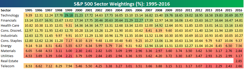
S&P 500 sector weightings are important to monitor. Over the years when weightings have gotten extremely lopsided for one or two sectors, it hasn’t ended well. Below is a table showing S&P 500 sector weightings from the mid-1990s through 2016. In the early 1990s before the Dot Com bubble, the US economy was much more evenly weighted between manufacturing sectors and service sectors. Sector weightings were bunched together between 6% and 14% across the board. In 1990, Tech was tied for the smallest sector of the market at 6.3%, while Industrials was the largest at 14.7%. The spread between the largest and smallest sectors back then was just over 8 percentage points.
The Dot Com bubble completely blew up the balanced economy, and looking back you can clearly see how lopsided things had become. Once the Tech bubble burst, it was the Financial sector that began its charge towards dominance. The Financial sector’s sole purpose is to service the economy, so in our view you never want to see the Financial sector make up the largest portion of the economy. That was the case from 2002 to 2007, though, and we all know how that ended.
Unfortunately we’ve begun to see sector weightings get extremely out of whack once again.
If you would like to see the most up-to-date numbers for S&P 500 sector weightings, simply start a two-week free trial to our Bespoke Premium or Bespoke Institutional services. Click back to this post to see the numbers once you’re signed up!
Adobe (ADBE) Heads Up Small List of Earnings Reports This Week
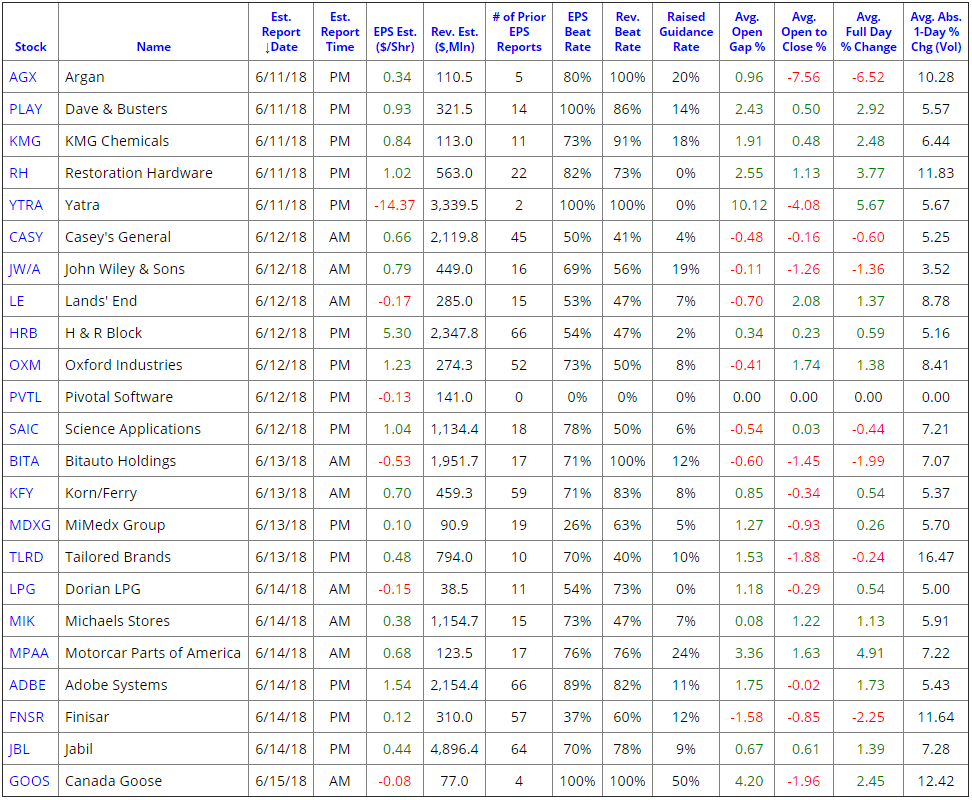
It’s currently a very quiet period for corporate earnings, but there are still a handful of companies releasing their quarterly numbers each day. Below is a snapshot pulled from the Bespoke Earnings Calendar showing the stocks set to report earnings this week.
Some of the names we’ll be watching include high-end furniture company Restoration Hardware (RH), convenience store operator Casey’s General (CASY), luxury outerwear maker Canada Goose (GOOS), and the widely-used publishing software maker Adobe Systems (ADBE).
You can always check to see how companies performed on their most recent quarterly report with our Earnings Screener, which also has historical earnings information for every US stock as well.