That Was Quick
In last Friday’s Bespoke Report newsletter, we noted that while overall industry group breadth was very positive with 70% trading above their 50-day moving averages, half of the 24 industry groups were within +/- 2% of their 50-DMAs. Therefore, a moderate move for the market in either direction had the potential to really shift the reading. Less than one trading session later, we have now seen that play out. With today’s 1.5% decline in the S&P 500, the percentage of industry groups trading above their 50-DMAs has now dropped to 50%. When you consider the fact that this reading was at 96% just two weeks ago, it’s quite a shift! The last time we saw a larger shift was back in late March.

The table below lists each industry group’s YTD change and the percentage it is currently trading above or below its 50-DMA. Here again, you can see that there are a lot of industry groups still trading right around their 50-DMAs as nine are still within +/- 2%. Industries that are the furthest above their 50-DMAs are Media, Food & Staples Retail, and Real Estate, while Consumer Services, Capital Goods, Banks, and Semiconductors are now trading the furthest below.

Chart of the Day: Dow 200-DMA Streak At Risk
US vs The World: Two Different Ends of the Spectrum
No matter where in the world you’re invested, if you’re an equity investor, odds are that last week wasn’t a particularly good one. We’ll start with the US. The graphic below is from our Trend Analyzer tool and shows the performance and trading range levels for all of the major US index ETFs. As shown in the “5-Day % Chg” column, just about every major US index saw modest declines last week. The only exceptions were small caps (IJR & IWM) and micro-caps (IWC). If you are long equities, declines are never fun, but when you consider the fact that every single one of the US index ETFs listed was overbought heading into last week, it is only natural for them to take a pause at some point to work off the overbought conditions. Even after last week’s declines, more than half of the ETFs are still overbought and every one of them with the exception of the Dow (DIA) is still well above its 50-day moving average.

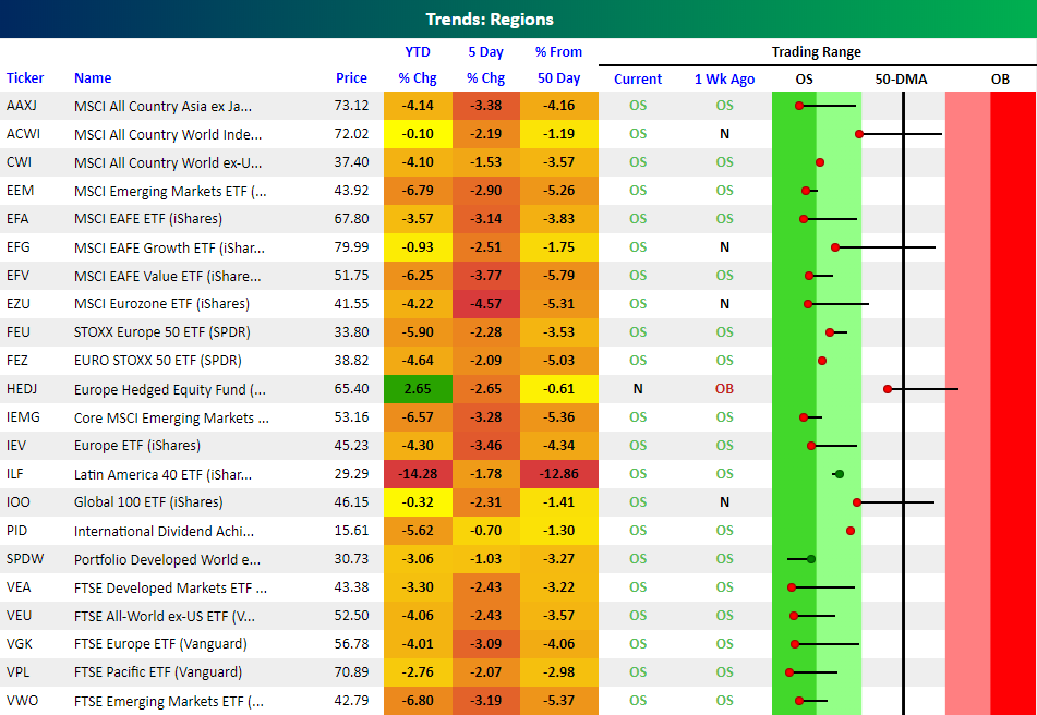
While the US is at one end of the trading range spectrum, the rest of the world is at the other. The graphic below shows the current levels of major international regional ETFs around the world. Every single one of these ETFs was down last week, and only one (International Dividend Achievers – PID) was down less than 1%. While US index ETFs generally saw moderate declines last week, most regional ETFs saw sharp declines of more than 2%. As a result, all but one of the international regional ETFs listed below are oversold heading into this week.
Right now there’s quite a different picture in the US versus abroad.
Bespoke Brunch Reads: 6/24/18
Welcome to Bespoke Brunch Reads — a linkfest of the favorite things we read over the past week. The links are mostly market related, but there are some other interesting subjects covered as well. We hope you enjoy the food for thought as a supplement to the research we provide you during the week.
Nailing The Number
Satellite Data vs. Mobile Data — A Complementary Approach by RS Metrics (Medium)
A look at how combining very different but equally innovative approaches to measuring customer traffic and activity at businesses can yield superior results. [Link]
Wall Street Looks to Superforecasting to Predict the Financial Future by Mike Bird (WSJ)
A snapshot of how “superforecasting” (a complex approach that rewards prior success in addition to other factors) is being used in finance to help derive more precise predictions about the future of asset markets and businesses. [Link; paywall]
Tech
Google Engineers Refused to Build Security Tool to Win Military Contracts by Mark Bergen (Bloomberg)
Amidst growing skepticism about the role AI or machine learning techniques are playing in the global national security apparatus (see for instance how China deploys the technology in areas with high Muslim minority populations, link), engineers at Google have refused to work on tools used to win military contracts. [Link; soft paywall, auto-playing video]
SoftBank: inside the ‘Wild West’ $100bn fund shaking up the tech world by Arash Massoudi, Kana Inagaki, and Leo Lewis (FT)
With $100bn raised to invest in potentially transformative (but totally unproven and aggressively valued) technologies around the world, SoftBank is testing the boundaries of what is viable in early stage and venture investing. [Link; paywall]
Financial Regulation
ECB seeks compromise solution to banks’ bad loans problem by Francesco Canepa and Balazs Koranyi (Reuters)
The ECB is trying to forge a consensus set of rules that balances an approach based on delinquency time and specific circumstances which impact the . [Link]
The SEC Will Leave Good ICOs Alone by Matt Levine (Bloomberg)
The Securities and Exchange Commission is in the process of thinking about how to handle the evolving cyprtocurrency and token markets, and is not sparing the nuance. [Link; soft paywall]
Midterms
Lawmakers scramble to find solution to family separation policy with eye on midterms by Peter Doocy (Fox News)
Separating families at the border is the latest political firestorm for the Trump White House (for instance, “tender age shelters”, link), and lawmakers on both sides are measuring their responses with an eye on the November midterm elections. [Link]
Research
How The Opioid Crisis Is Depressing America’s Labor Force by Samantha Raphelson (NPR)
A recent study (direct link; 59 page PDF) suggests that as much as one-quarter of the decline in the prime-age labor force participation rate is due to the increasing use of opioids. [Link]
An Idea For Decreasing Income Segregation And Increasing Economic Mobility by Adam Ozimek (Forbes)
This proposal suggests adjusting college applicants by the income of the area where they live, creating an incentive for high income families to live in lower-income areas. The economic segregation between high and low income Americans has been widely blamed for increasing income and wealth inequality, exacerbating other factors if not serving as a source of the problem. [Link; auto-playing video]
Millennials moving out of Mom and Dad’s place, study shows by Sarah O’Brien (CNBC)
A stronger economy appears to be helping younger Americans into their own households and out from the protective custody of their parents after years of soft labor markets. [Link]
Economic History
Business Booms and Depressions since 1775 (Tension Envelope Corp./St. Louis Fed FRASER)
A truly remarkable infographic detailing the economic history of the United States from 1775 to 1945, including business activity, national income, federal debt, and asset prices. [Link; 3 page PDF]
World Cup
There Be Ice Dragons Here by Aron Gunnarsson (The Players Tribune)
An explanation of the remarkable success of the tiny North Atlantic island’s success on the world stage from one of their midfielders. [Link]
What’s That Magic Spray? by Daniel Engber (Slate)
While dated, this is a helpful explanation of the spray used by training staffs when soccer players go down with a variety of different injuries during the World Cup. [Link]
I’ve Got Some Things to Say by Romelu Lukaku (The Players Tribune)
A remarkable essay about struggles against poverty, racism, and the transformative value of sport for the young man that is leading Belgium through the group stage of the World Cup. [Link]
Brexit
Brexit – Risk Assessment (Airbus)
Amidst uncertainty surrounding the departure of the UK from the EU, the firm which conducts the most aerospace activity in the country is limiting investment and supplier involvement within the UK. [Link; 2 page PDF]
Trading
Day trader sues broker over ‘demo’ trading platform mix-up by Martin Arnold (FT)
A day trader was accidentally able to place billions in futures orders in what he thought was a demo version of an online brokerage platform. He’s now suing to recover profits that were seized by the firm. [Link; paywall]
Fashion
Luxury sneakers: high style and a booming market (AFP)
High-price shoes are nothing new and even extremely pricy sneakers aren’t exactly a first, but the current market for the most exclusive shoes is soaring to new heights. [Link]
Cultural Shifts
Southern Baptists Call Off the Culture War by Jonathan Merritt (The Atlantic)
While Baptists and Evangelicals more broadly are still extremely reliable Republican voters, younger adherents are starting to pressure leadership to move towards more neutral political ground. [Link]
The Positive Death Movement Comes to Life by John Leland (NYT)
A small but growing group of the elderly (with women especially prominent) are working to claim ownership over the process of death. [Link; soft paywall]
Climate Change
Global warming, now brought to you by your local TV weathercaster by James Rainey (NBC)
The leading edge of educating the public about changes in the climate is your local weather forecast, whose opinions have slowly edged away from climate skepticism and towards a more universal acceptance of scientific research on the subject. [Link]
Apple
A hacker figured out how to brute force iPhone passcodes by Zack Whittaker (ZDNet)
Using an outside input for the iPhone keyboard instead of manual input can allow a hacker (or government agency) to break an iPhone’s password despite elaborate security protocols and hardware. [Link]
Read Bespoke’s most actionable market research by starting a two-week free trial today! Get started here.
Have a great Sunday!
The Bespoke Report — Mid Year Market Checkup
The Closer: End of Week Charts — 6/22/18
Looking for deeper insight on global markets and economics? In tonight’s Closer sent to Bespoke clients, we recap weekly price action in major asset classes, update economic surprise index data for major economies, chart the weekly Commitment of Traders report from the CFTC, and provide our normal nightly update on ETF performance, volume and price movers, and the Bespoke Market Timing Model. We also take a look at the trend in various developed market FX markets.
Below is a snapshot from today’s Closer highlighting weekly intraday price charts for major equity indices and other asset classes. If you’d like to see more, start a free trial below.

The Closer is one of our most popular reports, and you can sign up for a free trial below to see it!
See tonight’s Closer by starting a two-week free trial to Bespoke Institutional now!
Bespokecast Episode 26 — Horacio Coutino — Now Available on iTunes, GooglePlay, Stitcher and More
 Our newest episode of Bespokecast is now available! Be sure to subscribe to Bespokecast on your preferred podcast app to gain access to our full collection of episodes. We’d also love for you to provide a review as well!
In this episode of Bespokecast, we have a long conversation with Horacio Coutino of ETM Analytics. Horacio joined us from Mexico City to help explain the world of Mexican politics ahead of a hugely consequential election on July 1st. In addition to some very helpful background about the history of Mexican politics, we meet some of the major players and discuss the likely victory for left-wing candidate Andrés Manuel López Obrador (“AMLO”). Also important are ongoing NAFTA renegotiations. They will be impacted by the election in some very specific ways, which Horacio elaborates on. We also discuss the broader world of EM investing, what it takes to build a business in Mexico, and a number of other topics. You can follow Horacio on Twitter here.
To listen to our newest episode or subscribe to the podcast via iTunes, GooglePlay, OvercastFM, or Stitcher, please click the button or links below. Please note that third-party podcast feeds may update at a lag of a few hours to this blog post.

Streak Broken?
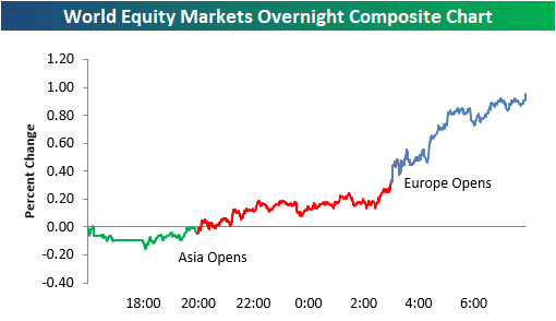
It’s about time! After eight straight days of declines, the DJIA is looking to open higher this morning and end its eight-day losing streak. As shown in our overnight equity performance chart from the Morning Lineup, prices have been trending higher all night. Let’s hope it stays that way for the next 7.5 hours!
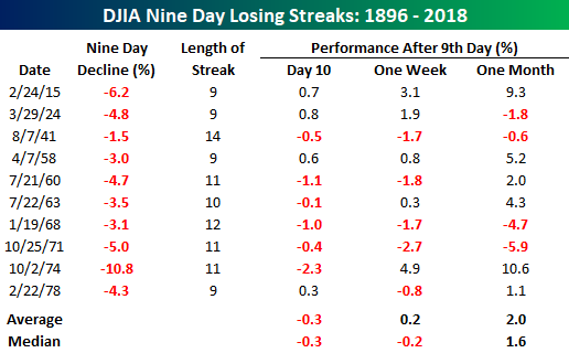
With the DJIA set to trade higher today, it has a real possibility of ending its current eight-day losing streak, which was the longest since March of last year. While an eight-day losing streak for the DJIA may not be too uncommon, nine-day losing streaks have been rare. If the DJIA does finish today in the red, it would mark the first nine-day losing streak for the index since 1978. That’s longer than most traders on Wall Street have been alive! As shown in the table below, when DJIA losing streaks reach the nine-day point, they usually move into double-digits as well. Of the ten prior streaks shown, the DJIA was also down on day ten six times for an average and median decline of 0.3%. Over the next week and month, though, performance starts to improve. Nothing goes down forever.
The Closer — Leading Indicators, Banxico, 2 of 5 Fed — 6/21/18
Log-in here if you’re a member with access to the Closer.
Looking for deeper insight on markets? In tonight’s Closer sent to Bespoke Institutional clients, we review the Banxico rate hike today, the low recession risk as evidenced by the Leading/Coincident ratio, and the first 2 of 5 regional Fed manufacturing indices.

See today’s post-market Closer and everything else Bespoke publishes by starting a 14-day free trial to Bespoke Institutional today!
Bespoke’s Sector Snapshot — 6/21/18
We’ve just released our weekly Sector Snapshot report (see a sample here) for Bespoke Premium and Bespoke Institutional members. Please log-in here to view the report if you’re already a member. If you’re not yet a subscriber and would like to see the report, please start a two-week free trial to Bespoke Premium now.
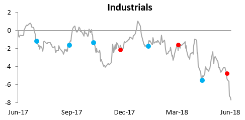
Below is one of the many charts included in this week’s Sector Snapshot, which shows the relative strength of the Industrials sector versus the S&P 500. When the line is falling, the sector is underperforming the S&P, and as you can see, there has been massive underperformance for Industrials lately.
To find out what this means and to see our full Sector Snapshot with additional commentary plus six pages of charts that include analysis of valuations, breadth, technicals, and relative strength, start a two-week free trial to our Bespoke Premium package now. Here’s a breakdown of the products you’ll receive.