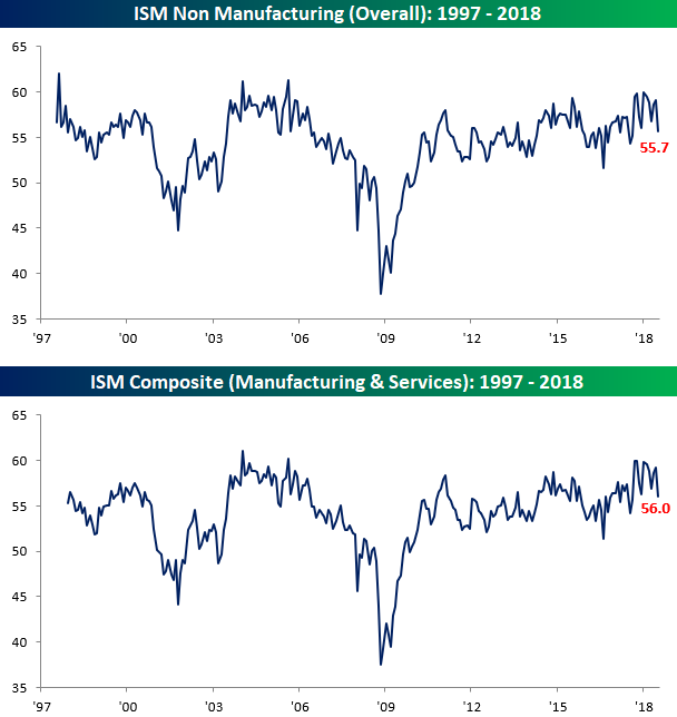
ISM Services Report Lays an Egg
The ISM Services report for July came in lower than expected on Friday and missed expectations by a pretty decent amount, falling from 59.1 down to 55.7 compared to expectations for a reading of 58.6. With the actual reported number missing expectations by 2.9 points, it was the largest miss relative to expectations in exactly one year (8/3/17). On a combined basis and accounting for each sector’s share of the overall economy, the July ISM report came in at 56.0 compared to last month’s reading of 59.2. In the cases of both the ISM Services report and the combined ISM, July’s readings were the worst headline levels since last August.
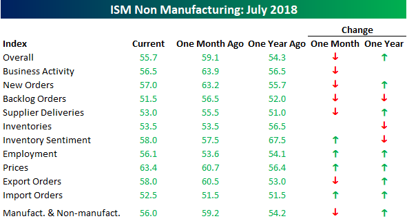
The table below breaks down the breadth of this month’s ISM report by showing each component’s m/m and y/y change. On a m/m basis, breadth in the July report was skewed just slightly negative, but we saw large declines in Business Activity, New Orders, and Backlog Orders. Conversely, both Prices Paid and Employment saw the largest increases. On a y/y basis, however, breadth remains positive and despite the large drops in Business Activity and New Orders, both indices are either flat to slightly higher relative to a year ago.
One interesting fact regarding the components of the ISM Services report is that this month was only the second time since 1997 (when data begins) that Business Activity, New Orders, and Backlog Orders all fell 5 points or more on a m/m basis. The only other time they fell that much or more was in October 2001, right after 9/11. One key difference between now and then, though, is that even after July’s declines, all three of these components are still well above 50 (dividing line between growth and contraction). Back in October 2001, these three components were only slightly above 40. In our newest Bespoke Report, we will have a full discussion of this week’s economic data slate as well as the latest earnings and market news. To read it, start a two-week free trial to Bespoke Premium!
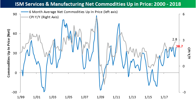
Combined ISM Commodities Survey Near Multi-Year Highs
Earlier this week we noted that our Commodities Survey index for the ISM Manufacturing report reached the highest level since 2011. With this morning’s release of the ISM Services report, we just updated our combined Commodities Survey index to include data from both the Manufacturing and Services sector. The chart below shows the three-month moving average of the net number of commodities rising in price on a monthly basis since 1999. In the month of July, ISM reported that a total of 38 commodities were up in price and just one was down. July’s net reading of +37 brought the three-month moving average for this index to 38.7, which is up from 33 last month but still below the recent high of 40.0 from February. So while inflation signals in the manufacturing sector ticked up to their highest levels in seven years, the combined reading is close, but not quite at a new high.
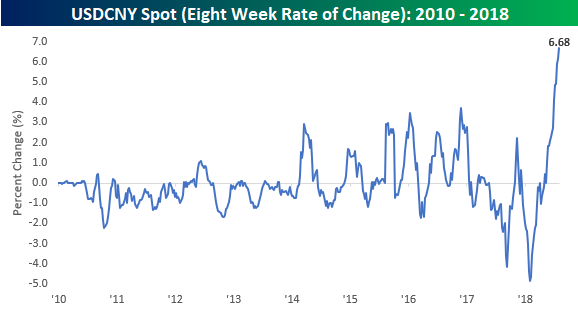
Eight Week Losing Streak for the Chinese Yuan
It has been a summer to forget for the Chinese yuan. Although the currency reversed earlier losses against the dollar today after the PBOC raised the reserve requirement on FX forwards from 0% to 20%, it is still on pace to finish lower against the dollar for the eighth straight week. Looking at a long-term chart of spot USDCNY shows how even after the dollar’s big rally this summer, it still remains below the levels it traded at relative to the yuan back in late 2016 when it peaked at just under 7.0. As of this writing, USDCNY is trading at 6.8348 but is down from earlier highs at 6.8972.

While the dollar has not quite reached new highs against the yuan in this most recent leg higher, the speed of the move is noteworthy. Over the last eight weeks of gains for the dollar relative to the yuan, it has rallied 6.68%, which is by far the largest eight week gain in USDCNY since at least 2010. What’s also worth pointing out is that this extreme eight-week rally in USDCNY immediately followed what was an extreme eight-week decline! If nothing else, the currency pair has become a lot more volatile in 2018. We’ve been discussing the recent moves in China’s currency and how it relates to trade in detail on a daily basis in our various reports. In our newest Bespoke Report, we will be dedicating an entire section to it. To read the analysis, start a two-week free trial to Bespoke Premium!
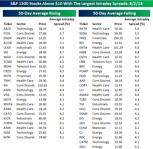
Looking for Action? S&P 1500 Most Volatile Stocks
For traders with a short-term time horizon looking for big moves, we have updated our list of the S&P 1500 stocks trading above $10 that have the largest intraday high-low ranges (based on the average percent spread between the intraday high and low over the last 50 days). The stocks are grouped based on whether they have a rising or falling 50-day moving average (DMA). With the broader market trading sideways for the better part of the last six months, the fact that the list is pretty much evenly divided between stocks in uptrends and stocks in downtrends makes sense.
While we have seen some increased volatility in certain names over the last several trading days, it hasn’t been enough to cause much of an uptick in the average daily move of individual stocks. Through Thursday’s close, just seven stocks in the S&P 1500 trading above $10 per share have seen average intraday moves of over 5%. The most volatile of these six stocks is Applied Optoelectronics (AAOI), which averages an intraday range of 6%. Unlike many prior months, you may also find that many of the names near the top of both lists are stocks that you may have actually heard of as well.
With a share price of under $40, AAOI’s average daily range works out to a little bit more than $2 per share, so it isn’t particularly large in dollar terms. Two stocks listed below have share prices in the triple-digits, so their average daily dollar moves are considerably larger than AAOI. RH trades at just over $130 per share, and with an average daily range of 4.4%, its average daily move is close to $6. Likewise, Enanta Pharma (ENTA) trades at just over $100 and has an average daily range of nearly 5%.
Finally, of the 50 stocks listed, the only sectors not represented are Consumer Staples, Real Estate, and Utilities. Sectors that are the most heavily represented are Health Care (13), Consumer Discretionary (12) and Energy (10). Somewhat surprisingly, only seven stocks on the list are from the Technology sector. Not much of a showing for the largest sector of the market.
The Closer — Valuation Drawdown, Banxico Indecisive — 8/2/18
Log-in here if you’re a member with access to the Closer.
Looking for deeper insight on markets? In tonight’s Closer sent to Bespoke Institutional clients, we see what significant drawdowns in S&P 500 trailing P/E means for forward total returns. We also review today’s policy decision from the Banxico and a few data points released today.

See today’s post-market Closer and everything else Bespoke publishes by starting a 14-day free trial to Bespoke Institutional today!
Chart Scanner Screens
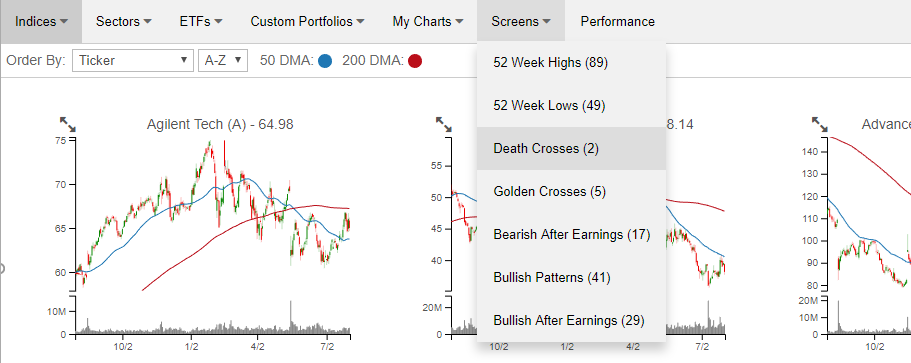
Our recently launched Chart Scanner has become an incredibly popular and useful tool for clients as it gives a user the ability to quickly scan through hundreds of charts in order to find the most attractive (or unattractive) patterns. Included with the tool are a number of pre-defined screens that allow users to see stocks that hit 52-week highs or lows in the previous session, experienced “death” or “golden” crosses, as well as charts which we view as having bullish or bearish patterns. Each of these screens can be found using the drop-down box at the top of the page (as illustrated in the image below).
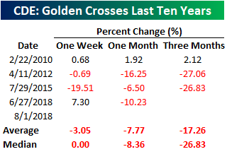
Today we wanted to provide a look at one of the two stocks that showed up on our screen of Death Crosses. That stock is Coeur Mining (CDE). If you aren’t familiar with the terms, a Golden Cross occurs when a stock’s 50-day moving average crosses above its 200-day moving average as both are rising. Conversely, a Death Cross occurs when a stock’s 50-day moving average crosses down below its 200-day moving average as both are falling. While we often note that the technical formations known as Golden and Death Crosses have a spotty record of accuracy, prior Death Crosses for CDE have been pretty bearish. The chart below shows each of the prior four Death Crosses for CDE over the last ten years (2010, 2012, 2015, and last month in June).
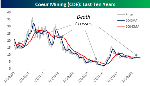
Looking at the stock’s returns following each of the prior Death Crosses for CDE, the stock has seen negative returns on both an average and median basis. One week later, the stock was down 3.1% (median: 0.0%) with gains half of the time. One month later, though, the average (-7.77%) and median (-8.36%) returns were a lot worse with only one period of gains. Finally, the average three-month change was a decline of over 17% with losses two out of three times. In the past, we have been quick to point out how bad of a timing indicator Golden and Death Crosses have often been, but in the case of CDE, Death Crosses have usually been followed with losses. As mentioned above, our Chart Scanner tool has become an incredibly popular feature of our Bespoke Premium service. To start using it now, take a two-week free trial to Bespoke Premium today!
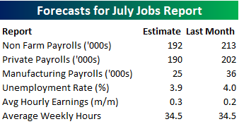
July Employment Report Preview
Heading into Friday’s Non-Farm Payrolls (NFP) report for July, economists are expecting an increase in payrolls of 192K, which would be a decline from June’s solid reading of 213K. In the private sector, economists are expecting an increase of 190K. The unemployment rate is expected to tick down to 3.9% after unexpectedly ticking up to 4.0% last month. Last month’s jump to 4% was taken as a signal to economists that workers were entering the workforce, so this will be an added area of focus again. Any increase in the unemployment rate without a surprisingly weak headline number will indicate a continuation of that trend and should help to keep wages from rising too fast.
Ahead of the report, we just published our eleven-page preview of the July jobs report. This report contains a ton of analysis related to how the equity market has historically reacted to the monthly jobs report, as well as how secondary employment-related indicators we track looked in July. We also include a breakdown of how the initial reading for July typically comes in relative to expectations and how that ranks versus other months.
One topic we cover in each month’s report is the S&P 500 stocks that do best and worst from the open to close on the day of the employment report based on whether or not the report comes in stronger or weaker than expected. In other words, which stocks should you buy, and which should you avoid? The table below highlights the best-performing stocks in the S&P 500 from the open to close on days when the Non-Farm Payrolls report has been better than expected over the last two years.
Of the 25 top performing stocks on days when the NFP beats expectations, seven sectors are represented, and Consumer Discretionary leads the way with nine. Vornado (VNO) has been the best performing stock with an average open to close gain of 2.54%. VNO is followed by nine other stocks that have been up 1%+. In terms of consistency, Urban Outfitters (URBN), CH Robinson (CHRW), and Michael Kors (KORS) have all been positive 90% of the time.
For anyone with more than a passing interest in how equities are impacted by economic data, this report is a must-read. To see the report, sign up for a monthly Bespoke Premium membership now!

Bespoke’s Sector Snapshot — 8/2/18
Chart of the Day: Good News, Bad News For Manufacturing Employment
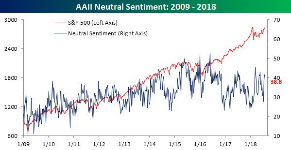
Sentiment Down, But Holding Up Relatively Well
Between Facebook’s (FB) record plunge last week and some other high profile weakness in former leading stocks, we would have thought that individual investor sentiment would have taken a big turn for the worse this week. While bullish sentiment did decline, the drop was smaller than we were expecting. According to the weekly sentiment survey from the American Association of Individual Investors (AAII), bullish sentiment dropped from 31.52% down to 29.11%, which is actually smaller than the declines we saw in each of the prior two weeks when equities were doing better!
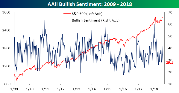
Although bullish sentiment saw just a small decline, bearish sentiment saw its largest one-week increase since the end of June, rising from 26.9% up to 32.1%. Still, that’s hardly a level that indicates much in the way of worry.
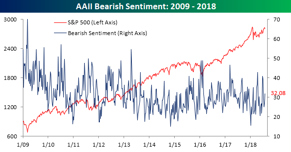
Most of this week’s new bears came from off the fence, as neutral sentiment declined from 41.58% down to 38.81%.