Chart of the Day: Correction Impact on Historical Returns
ISM Manufacturing Index Surges Past Expectations
Manufacturing activity in the US really saw a bounce in June as the ISM Manufacturing report surged back above 60 from last month’s reading of 58.7. This month’s reading of 60.2 was well ahead of consensus expectations and was tied for the second highest reading of the current expansion. What’s really impressive about this month’s report is that as the ISM noted in its release, “The past relationship between the PMI® and the overall economy indicates that the PMI® for June (60.2 percent) corresponds to a 5.2 percent increase in real gross domestic product (GDP) on an annualized basis.”
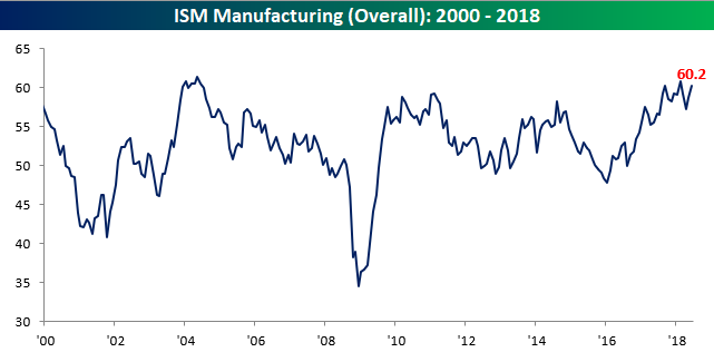
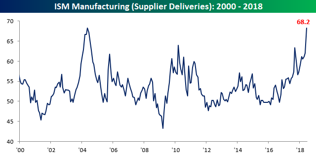
The table below summarizes the internals of this month’s report and shows relatively strong breadth. On a m/m basis, just four out of ten components showed a m/m decline and just three saw a y/y drop. The biggest increases in June relative to May were Supplier Deliveries and Imports, while Backlog Orders saw the largest decline. The big increase in Supplier Deliveries took that index to its highest level in just over 14 years (chart below) and suggests supplies are constrained which is hurting overall economic growth.
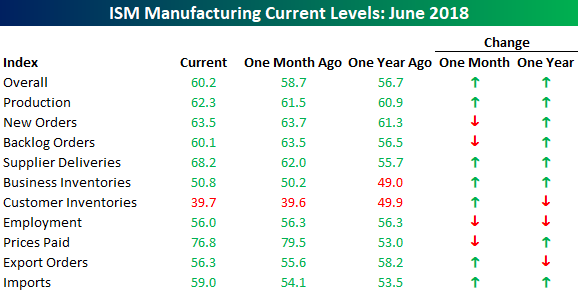
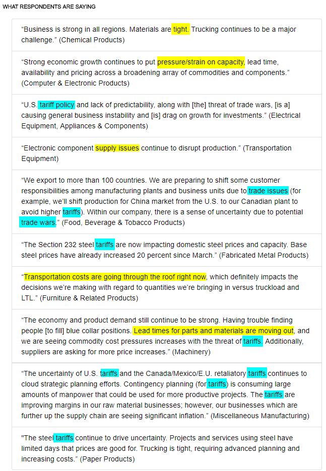
Tight supply chains were also evident in the commentary of this month’s report. As shown in the image below, there were numerous references made to this subject (yellow highlights), but just as big, if not a bigger issue for manufacturers is the increased uncertainty over trade and tariffs (blue highlights). Both of these factors are ultimately likely to lead to price increases, which is a trend we are already seeing as 31 commodities were reported as being up in price (most since May 2011), and 8 commodities were in short supply.
June 2018 Headlines
An Atypical Start to July
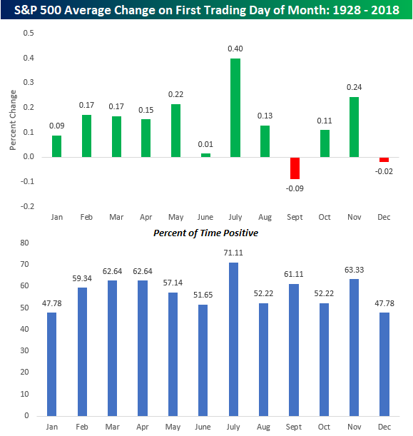
US equities are kicking off July on a decidedly weak note this morning, which is something investors have not been used to seeing over the years. The chart below shows the S&P 500’s historical performance on the first trading day of each month dating back to 1928. The only two months that have historically kicked off the month on a negative note are September (-0.09%) and December (-0.02%). Every other month has tended to see gains on an average basis, and the most positive of those months has been July with an average gain of 0.40%. That’s 0.16% more than the next closest month (November). In terms of consistency, July has also been, hands down, the leader with positive returns over 70% of the time.
In recent history, July has also tended to follow the historical script. Over the last ten years, the first trading day of July has seen an average gain of 0.45% with positive returns in nine of the last ten years, including each of the last seven. There’s still time for the S&P to conform this year, but it’s not looking good this morning.
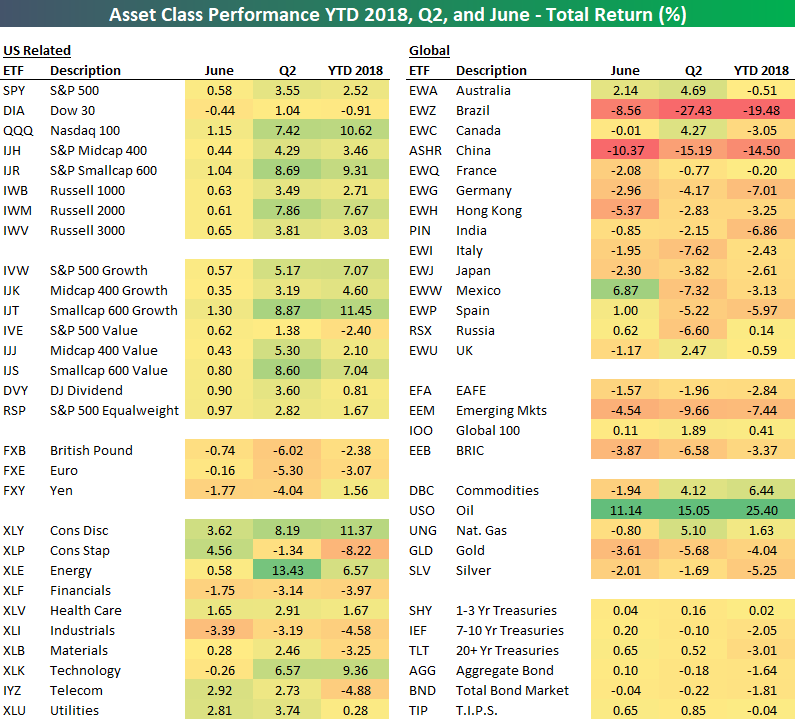
First Half 2018 Asset Class Performance Matrix
Below is our total return matrix highlighting the performance of various asset classes during the first half of 2018 from the perspective of a US investor focused on ETFs.
At the halfway point of 2018, small-caps have trumped large-caps, while growth has crushed value. Looking at sectors, Consumer Discretionary (XLY), Technology (XLK), and Energy (XLE) have been the best performers so far this year, while Consumer Staples (XLP), Financials (XLF), Materials (XLB), and Industrials (XLI) are solidly in the red.
Outside of the US, equity markets have struggled this year. Of the 14 country ETFs in our matrix, Russia (RSX) is the only one that finished the first half in the green, and it was in the green by just 14 basis points at that. Brazil (EWZ) and China (ASHR) enter the second half down on the year by 19.48% and 14.50%, respectively.
Looking at commodities, oil (USO) is up more than any asset class in our matrix at +25.40%. Gold (GLD) and silver (SLV) are both down 4%+. Treasury ETFs are down on the year as interest rates have risen.
Bespoke Brunch Reads: 7/1/18
Welcome to Bespoke Brunch Reads — a linkfest of the favorite things we read over the past week. The links are mostly market related, but there are some other interesting subjects covered as well. We hope you enjoy the food for thought as a supplement to the research we provide you during the week.
Europe
Why Have Negative Nominal Interest Rates Had Such a Small Effect on Bank Performance? Cross Country Evidence (FRBSF Working Papers)
Using a comprehensive dataset of more than 5000 banks in Japan and Europe, the authors find little evidence that negative nominal interest rates have a significant negative impact on bank profitability in aggregate (though that may be less true for specific subgroups of banks). [Link; 32 page PDF]
Brussels steps up emergency planning for no-deal Brexit by Alex Barker, Arthur Beesley, and Anne-Sylvaine Chassany (FT)
While a hard Brexit isn’t necessarily likely, EU officials are starting comprehensive planning for that outcome should the UK leave the EU on its Article 50 trigger date next year without a deal on the post-Brexit relationship with the EU. [Link; paywall]
Volatility
Traders Are Still Haunted by the VIX Five Months Later by Lu Wang and Elena Popina (Bloomberg)
The February collapse of short-vol products created a very specific fear of downside skew that investors appear to be taking to heart. [Link; paywall]
Taxes
The New Tax Form Is Postcard-Size, but More Complicated Than Ever by Jim Tankersley (NYT)
While the new basic tax filing form is certainly more simple and its main details are roughly postcard sized, more than 6 other worksheets supplement the smaller basic form. [Link; soft paywall]
Innovation
The FDA Approved Its First Cannabis Drug. What Next? by Alyssa Foote (Wired)
With the approval of Epidiolex (a drug designed to reduce seizures in epileptics), marijuana is now part of an FDA-approved medical treatment. It’s also legal in 8 states and DC, while even Oklahoma fully legalized medical marijuana by a comfortable margin this week (link; auto-playing video) in a bid to juice state revenues. [Link]
Tesla Energy Made Its Owner $2.5 Million in a Single Quarter by Jonas Elmerraji (The Street)
While most media attention focuses on building cars, Tesla also runs the largest battery installation on the planet (in Australia). The project makes money by arbitraging electricity prices intraday, buying when grid power is cheap and selling back when prices rise. [Link]
Trade Wars
Chip-Equipment Makers in Crosshairs of Trade War by Dan Gallagher (WSJ)
The extremely complex and trade-dependent semiconductor industry is set to become ground zero for the negative impacts of the escalating trade dispute between the US and China. [Link; paywall]
San Fran Stories
A six-figure salary is considered ‘low income’ in San Francisco, and the threshold is rising by Michelle Robertson (SF Gate)
Residents of San Francisco, San Mateo, and Marin counties are considered “low income” on a relative basis if they earn $117,000 per year. [Link]
Education
The Gates Effective Teaching Initiative Fails to Improve Student Outcomes by Jay P. Greene (Education Next)
Bill and Melinda Gates’ foundation deployed more than $1bn (80% of which ultimately came from governments) in an effort to improve educational outcomes. The results showed teacher effectiveness and retention made little improvement as a result. [Link]
Memes
That ‘distracted boyfriend’ meme? Twitter users uncover the backstory of the woman by his side (Scroll)
You wouldn’t think a simple stock photo could at once contain so much intrigue, but you’d be wrong. Here’s the untold story of the girl from the distracted boyfriend meme. [Link]
Gentrification
They Played Dominoes Outside Their Apartment For Decades. Then The White People Moved In And Police Started Showing Up. by Lam They Vo (Buzzfeed)
As neighborhoods gentrify, previously commonplace and always innocuous activities like dominoes on the sidewalk are resulting in calls to the police as new arrivals seek to enforce rules that have never existed on the ground for long-time residents. [Link]
Gaming
The International Olympic Committee Will Host a Forum on E-sports by Lisa Marie Segarra (Fortune)
The IOC has announced a forum to discuss e-sports and possible future collaboration between “old fashioned” and computer-based sports, a possible prelude to an inclusion in competition. [Link]
A team of AI algorithms just crushed humans in a complex computer game by Will Knight (MIT Technology Review)
While current basic AI doesn’t typically get much credit for collaborative and dynamic problem solving, one implementation was able to beat a human team at popular online strategy game Dota 2. [Link]
Read Bespoke’s most actionable market research by starting a two-week free trial today! Get started here.
Have a great Sunday, and happy Canada Day to our friends up north!
The Bespoke Report — Winning and Losing Trends Entering the 2nd Half
The Closer: End of Week Charts — 6/29/18
Looking for deeper insight on global markets and economics? In tonight’s Closer sent to Bespoke clients, we recap weekly price action in major asset classes, update economic surprise index data for major economies, chart the weekly Commitment of Traders report from the CFTC, and provide our normal nightly update on ETF performance, volume and price movers, and the Bespoke Market Timing Model. We also take a look at the trend in various developed market FX markets.
Below is a snapshot from today’s Closer highlighting weekly intraday price charts for major equity indices and other asset classes. If you’d like to see more, start a free trial below.

The Closer is one of our most popular reports, and you can sign up for a free trial below to see it!
See tonight’s Closer by starting a two-week free trial to Bespoke Institutional now!
Bespoke Summary of Economic Indicators: 6/29/18
July 4th Week: Not As Bullish As it Used to Be
Next Wednesday is July 4th, and because the holiday falls right smack in the middle of the week, it is also likely to be a week where many people look to take extended weekends on either end of the holiday. That doesn’t mean it will be a quiet week in terms of economic data, though. Not only is next Friday the Non-Farm Payrolls report, but we’ll also be getting both the ISM Manufacturing (Monday) and the ISM Services (Thursday) reports, as well as FOMC Minutes (also Thursday). With fewer people at their desks and plenty of data, don’t be surprised if there is a pickup in volatility.
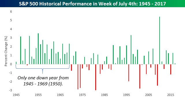
In terms of the US equity market’s historical performance during the week of July 4th, it has historically been positive. Since 1945, the S&P 500 has seen an average gain of 0.71% during the week of July 4th with positive returns 70% of the time. In years where the market was already up YTD heading into the holiday week, returns were even a little better at 0.78% with positive returns 75% of the time. For these calculations, we have used the S&P 500’s returns from the Friday before July 4th to the Friday after. In those cases where July 4th fell on a Friday or Saturday (in which case the markets were closed on the 3rd), performance was measured in the week before.
The chart below shows the S&P 500’s July 4th week returns since 1945. Looking at the chart, what really stands out is how consistently positive the S&P 500 was in the 25 years that followed WWII. From 1945 – 1969, the S&P 500 was up during the July 4th week in every year but one (1950), and in that one down year it only fell 0.11%. Since then, though, the bullish trend for the week has waned. While the S&P 500’s return is still positive, it has not been nearly as consistent to the upside with gains just 58% of the time.