B.I.G. Tips – Analysts Cautiously Pessimistic
Earnings season kicks off this week as the first of the major companies start to report Q2 numbers. Most of the big names reporting are Financials like Citigroup (C), JPMorgan Chase (JPM), PNC, and Wells Fargo (WFC), which all report on Friday morning. Besides these names, the only non-Financials of note are Pepsi (PEP) on Tuesday morning and Delta (DAL) before the open on Thursday.
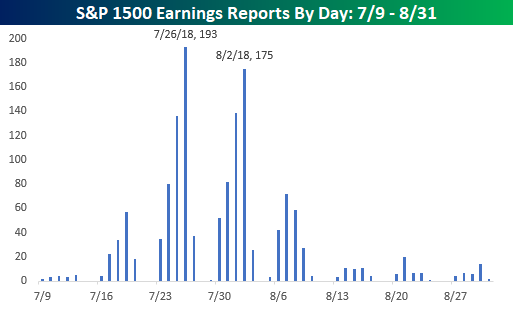
The pace of reports picks up next week when 135 companies in the S&P 1500 are expected to report, but the peak period of earnings season will be in the two weeks that follow as more than 950 companies are scheduled to report. That’s nearly two-thirds of the entire index in just two weeks! The busiest day during that period will be on 7/26 when 193 companies in the S&P 1500 are expected to report in a single day, while the second busiest day of earnings season is one week later on 8/2 when another 175 companies will report. For a more detailed rundown of the earnings schedule for the upcoming season, please see our Interactive Earnings Calendar, and to prepare for how individual companies tend to react to earnings, check out our Earnings Screener (available to all Institutional clients).
We just published our quarterly look at analyst EPS revisions heading into this earnings season. In this report, we look to see if analysts are bullish or bearish on earnings for the upcoming quarter. Analyst sentiment at the start of earnings season has historically had a big impact on the stock market’s performance.
This report is a must-read. To see it, sign up for a Bespoke Premium membership now!
Bespoke Brunch Reads: 7/8/18
Welcome to Bespoke Brunch Reads — a linkfest of the favorite things we read over the past week. The links are mostly market related, but there are some other interesting subjects covered as well. We hope you enjoy the food for thought as a supplement to the research we provide you during the week.
Research
How Much Americans Could Save by Ridesharing Driverless Cars Over Owning (Insurance Journal)
While self-driving cars are still far from deployment and uptake is likely to be a very, very long and slow process (please see our Industry Insight on the subject, link), they do have the potential to save drivers a huge amount of money over traditional ownership. [Link]
The World Cup, Nationalism, and International Trade by Andrew Bertoli and George Yin (SSRN)
Using data from the group stage of the World Cup from 1930 to 2014 (486 matches), the authors identify a measurable decline in trade between soccer match contestants in time periods close to the games. [Link]
Investing
Vanguard Will Let Investors Trade Its Rivals’ Funds Online for Free by Lisa Beilfuss (WSJ)
In order to drive more customer traffic, Vanguard’s rival products will now be commission free for Vanguard investors. [Link; paywall]
China
PBOC Says China’s Fiscal System Reason Behind Its Leverage Woes (China Banking News)
The head of the PBoC’s research department argued recently that distortions in China’s tax and fiscal systems have created excessive credit problems for the country. [Link]
Family
Americans Are Having Fewer Babies. They Told Us Why. by Claire Cain Miller (NYT)
Using a poll of 20-45 year olds, the Upshot team identifies economic issues as the biggest factors holding back fertility rates among the current cohort in prime parenthood ages. [Link]
The Secret Price of Pets by Peter Haldeman (NYT)
Fake testicles, insurance, plastic surgery, gender reassignment, and obscure hair-dos: these are just some of the obscure services pet owners are purchasing these days. [Link; soft paywall]
Online Dystopia
The nightmare videos of children’s YouTube — and what’s wrong with the internet today by James Bridle (TED)
In our Brunch Reads dated November 17th (link), we included a story about the nightmarish content that finds its way into the YouTube feeds of children via the algorithmic recommendations provided by the service (link). That original piece is now a TED talk. [Link]
“I Was Devastated”: Tim Berners-Lee, the Man Who Created the World Wide Web, Has Some Regrets by Katrina Brooker (Vanity Fair)
The man most plausibly credited with inventing the internet is deeply troubled with where his work has taken the world, but he has ideas about how to improve things. [Link; soft paywall]
Juggalos Figured Out How To Beat Facial Recognition by Caroline Haskins (The Outline)
Insane Clown Posse fans are an odd bunch, and their trademark clown makeup has inadvertently demonstrated a weapon against facial recognition technology. Can we get a whoop-whoop? [Link]
Real Estate
Tax h(e)aven by Ina Cordle and Katherine Kallergis (The Real Deal)
Responding to new incentives created (intentionally, in an effort to reduce blue state fiscal capacity) by the tax cuts introduced last year, ultra-wealthy buyers are bidding up South Florida real estate. [Link]
Manhattan real estate has worst second quarter since financial crisis by Robert Frank (CNBC)
Not-so-surprisingly based on the prior link, Manhattan high-end real estate has gotten hit hard, with sales down 17% and prices off 5% on average. [Link]
The Death of a Once Great City by Kevin Baker (Harpers)
Development, especially with towering new buildings in central cores, is in this author’s view wrecking the diverse, dynamic tumble that was once the hallmark of American cities. [Link]
Slow Adoption
Even Great Ideas Can Fail At First. Just Look At The Zipper. by Marc Bain (Quartzy)
Americans alone consume 4.5 billion zippers per year, but the story of its development is a very long one with a range of patents running from 1853 to 1917 before a zipper we would recognize today was created. [Link]
Sports
Inside Decision 3.0: LeBron James Follows in the Footsteps of Legends by Lee Jenkins (SI)
The story of how Lebron James landed in Los Angeles in a surprise move that capped off weeks of speculation from the sports world about where the best basketball player of his generation (and, probably, ever) would wind up. [Link; auto-playing video]
Nathan’s might go digital after awful hot dog judging flub by Noah Bressner and Chris Perez (NYP)
Judges at the iconic American eating contest on the 4th of July badly flubbed the count as eleven time winner Joey Chestnut set a world record. [Link]
SCOTUS
Inside the White House’s Quiet Campaign to Create a Supreme Court Opening by Adam Liptak and Maggie Haberman (NYT)
How the Trump White House worked to convince Justice Kennedy to retire, creating a second vacancy on the Supreme Court for the administration to fill. [Link]
Read Bespoke’s most actionable market research by starting a two-week free trial today! Get started here.
Have a great Sunday!
The Closer: End of Week Charts — 7/6/18
Looking for deeper insight on global markets and economics? In tonight’s Closer sent to Bespoke clients, we recap weekly price action in major asset classes, update economic surprise index data for major economies, chart the weekly Commitment of Traders report from the CFTC, and provide our normal nightly update on ETF performance, volume and price movers, and the Bespoke Market Timing Model. We also take a look at the trend in various developed market FX markets.
Below is a snapshot from today’s Closer highlighting weekly intraday price charts for major equity indices and other asset classes. If you’d like to see more, start a free trial below.

The Closer is one of our most popular reports, and you can sign up for a free trial below to see it!
See tonight’s Closer by starting a two-week free trial to Bespoke Institutional now!
Bespoke’s Sector Snapshot — 7/6/18
We’ve just released our weekly Sector Snapshot report (see a sample here) for Bespoke Premium and Bespoke Institutional members. Please log-in here to view the report if you’re already a member. If you’re not yet a subscriber and would like to see the report, please start a two-week free trial to Bespoke Premium now.
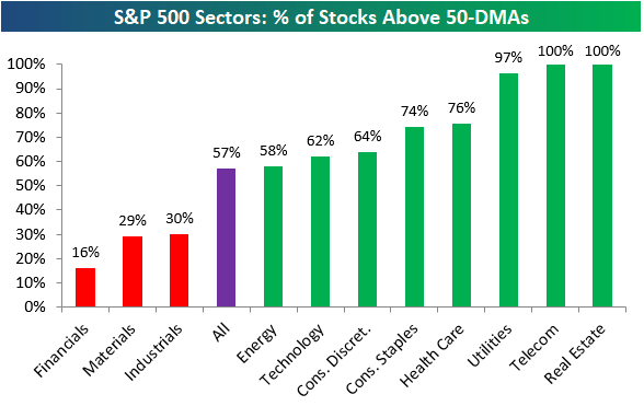
Below is one of the many charts included in this week’s Sector Snapshot, which shows the percentage of stocks in each sector that are trading above their 50-day moving averages. This is a popular measure of breadth. As shown, eight sectors currently have stronger readings than the S&P 500, while just three have weaker readings.
To find out what this means and to see our full Sector Snapshot with additional commentary plus six pages of charts that include analysis of valuations, breadth, technicals, and relative strength, start a two-week free trial to our Bespoke Premium package now. Here’s a breakdown of the products you’ll receive.
Oversold Bounce for Global Equity Markets
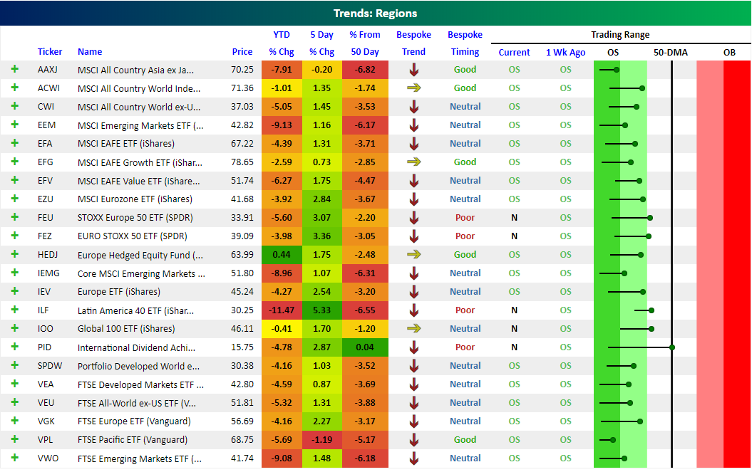
Our Trend Analyzer (available to Bespoke Premium and Bespoke Institutional members) highlights how stocks and ETFs are trending and how overbought or oversold they are from a timing perspective. It’s a very useful way to quickly analyze the health of a specific portfolio or any basket of stocks and ETFs.
Below is a snapshot of our Trend Analyzer showing regional ETFs that cover equity markets around the world. You can see that most of these ETFs are down YTD and below their 50-day moving averages, but they have bounced over the last 5 trading days. On the right side of the snapshot, the dot for each ETF represents where it’s currently trading relative to its 50-day moving average (the black, vertical “N” line). The tail end of the dot represents where it was trading a week ago. When the dot is in the green zone, the ETF is “oversold” relative to its normal trading range, while a dot in the red zone means the ETF is “overbought.”
Last week at this time, every single regional ETF shown was in oversold territory, with many at extreme levels (the dark green section). Over the last week, though, we’ve seen a big bounce off of oversold levels, as evidenced by the long tails with the dots to the right of the tails. Stocks globally remain in longer-term downtrends, but at least they’ve caught a bid over the last week. Bulls are hopeful this is the start of a meaningful rally.
Poor Pulse
Each month, Bespoke Market Intelligence publishes a comprehensive review of the US consumer called Bespoke Consumer Pulse. In the June report, we saw a number of negative indicators after a very strong run for the consumer over the past 18 months or so. You can access the whole report by signing up for a free 30-day trial. Pulse surveys ~1500 US consumers on a monthly basis, providing tracking for consumer activity, confidence, and their relationship with businesses.
One indicator we like to keep track of is consumers’ assessment of their financial condition relative to what they perceive as the “average” person. As shown in the chart below, after surging from mid-2015 to mid-2017, the indicator has persistently softened over the past year or so. That’s a sign that consumers may be feeling less confident in their financial situations and falling behind their peers.

Another negative signal from our data is the assessment that consumers make of their income growth. The chart below shows our composite indicator for how respondents feel about their personal income growth. As shown, it took a significant tumble MoM in June from very strong levels. One-off declines of that kind have precedents, but it’s still a very significant drop and a trend to keep an eye on.

While not a direct economic variable, we also keep track of the share of consumers reporting they have health insurance. That number drifted slowly higher from 2014 through 2017 but has since started to slide, hitting the lowest level in years in our June data. This could be a factor in how confident about their personal finances our respondents are feeling.

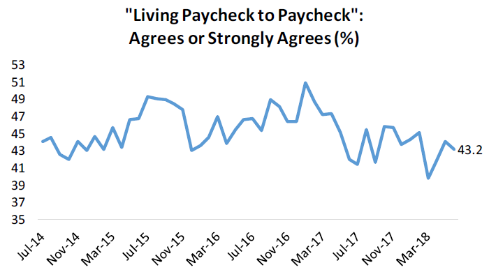
Finally, some less negative news. As shown in the chart below, the share of respondents who report they are living paycheck to paycheck (a measure of economic insecurity, or perceived economic insecurity) has steadily fallen since late 2016. While this series is a bit elevated from recent levels, it’s still trending lower which is one positive take-away from our survey.
Finally, we’ll take a look at stock-specific insight from our survey. Since late 2015, “core” Facebook has been seeing steady declines in the share of consumers reporting it as one of their two most frequent social media sites. Fortunately for the stock, Instagram has seen steadily rising popularity that has offset much of the usage decline from the core product. Remember, if you aren’t already a subscriber to our Pulse add-onn service, you can access the whole report by signing up for a free 30-day trial.
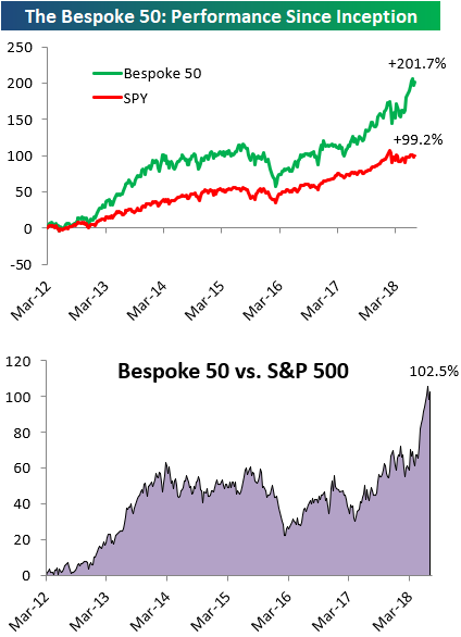
the Bespoke 50 — 7/6/18
Every Thursday, Bespoke publishes its “Bespoke 50” list of top growth stocks in the Russell 3,000. Our “Bespoke 50” portfolio is made up of the 50 stocks that fit a proprietary growth screen that we created a number of years ago. Since inception in early 2012, the “Bespoke 50” has beaten the S&P 500 by 102.5 percentage points. Through today, the “Bespoke 50” is up 201.7% since inception versus the S&P 500’s gain of 99.2%. Always remember, though, that past performance is no guarantee of future returns.
To view our “Bespoke 50” list of top growth stocks, click the button below and start a trial to either Bespoke Premium or Bespoke Institutional.
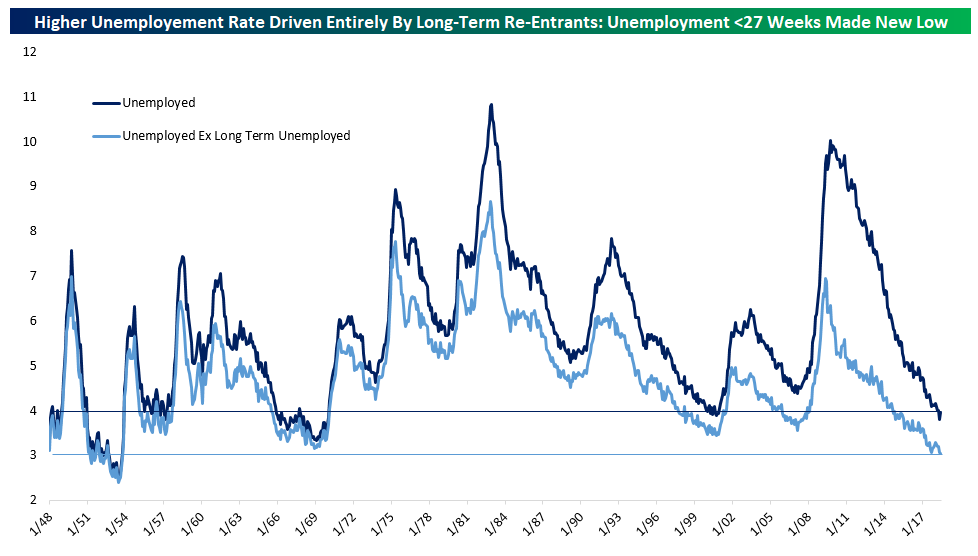
A Rare Result: The Good Kind of Higher Unemployment
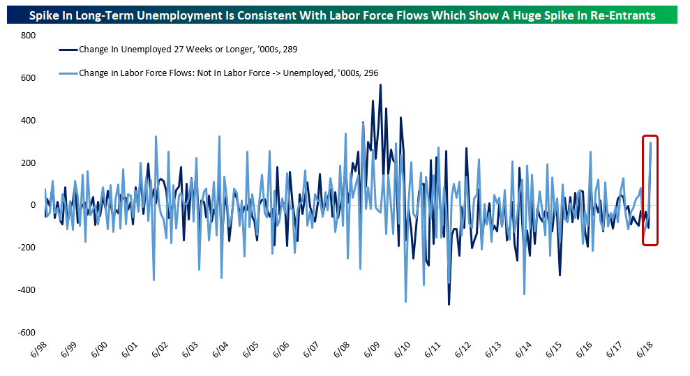
This month’s Employment Situation Report from the Bureau of Labor Statistics showed strong job creation, but the unemployment rate rose 0.2% to 4.0%, in an unexpected result. So is the labor market slowing? Quite the opposite. Sometimes higher unemployment is actually a good sign. In the chart below, we show two versions of the unemployment rate. The first, in dark blue, is the total number of unemployed workers, or the “headline” U3 unemployment rate. The light blue line only includes workers that have been unemployed for less than 27 weeks. That unemployment rate for only short-term workers made a new low for the cycle in June at 3.05%. In other words, only longer-term unemployed workers drove the higher unemployment rate.
The increase in long-term unemployed workers really was dramatic. It was the largest one month percent change in that category since the 1970s, much larger than spikes seen during or right after recessions. So where did all of these long-term unemployed come from if the numbers of shorter-term unemployed did not rise?
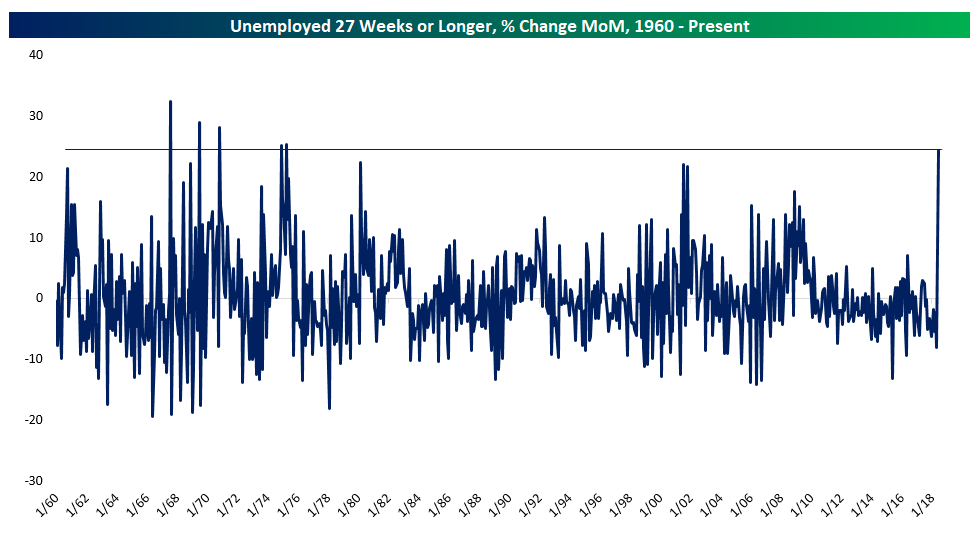
All those unemployed workers came from outside the labor force. When a worker enters the labor force after spending a long period of time outside the labor force (that is, extreme long-term unemployment or being outside the labor force for other reasons), they are counted as long-term unemployed (that is, unemployed for 27 weeks or longer, but currently looking for work). As shown in the chart below, the increase in long-term unemployed and the MoM change in the number of workers moving from outside the labor force to unemployment match almost perfectly in June. What this tells us is that hundreds of thousands of people started looking for work. Because they started job searches, they’re now counted as unemployed, while they weren’t previously.
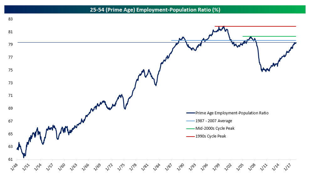
Looking at the bigger picture, the best measure of how robust the labor market is (the ratio of those aged 25-54 who have jobs to the overall 25-54 population) returned to cycle highs in June at 79.3% (matching February’s level). This measure is now 1.0% below the mid-2000s cycle peak, 1.6% below the 1990s cycle peak, and 0.6% below the 1987-2007 average. There’s lots of room for this measure of labor market slack to improve, but it’s no longer dramatically depressed like it was in the earlier part of the expansion.
Finally, our last chart below looks at wage growth. The BLS publishes two measures: one for all private workers, and one for only production and nonsupervisory workers. The latter has a much longer history. In recent quarters the total private level has been growing faster than production and nonsupervisory wages only, but those wages have begun to catch up over the last few months and they’re now close to equal, with production and nonsupervisory wages growing at roughly the fastest pace of the expansion while total private wages sit at a slightly less strong growth rate.
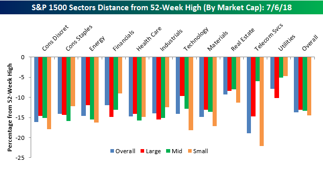
S&P 1500 Misfit Stocks
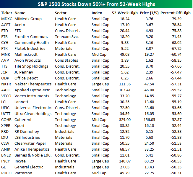
Earlier today, we summarized how far individual stocks in the S&P 1500 were trading from their 52-week highs based on sectors and market cap. In the table below, we wanted to highlight which stocks have been the biggest drags on their peer groups. The 27 stocks listed below are all down 50% or more from their respective 52-week highs. Leading the way to the downside, shares of MiMedx (MDXG) have plummetted close to 80% as that company deals with financial restatements (to put it mildly) and what some consider a potential bankruptcy filing. Behind MDXG, another five small-cap stocks lead the list of biggest losers, and all of them have lost at least two-thirds of their value.
The first non-small cap stock on the list is generic drug maker Mallinkrodt (MNK), which at just under $20 per share is down over 60%. From MNK’s position at number seven, we have to go down another five to find the first large-cap stock on the list (Nektar Therapeutics: NKTR). The story of NKTR is one of tough timing for the S&P 500. The stock was added to the index back in March when it was trading at $105. From there, though, it’s been all downhill as the stock has lost more than half of its value after releasing disappointing trial data at this year’s ASCO conference. Going further down the line, the most notable stock listed is General Electric (GE). Things haven’t exactly been going well lately for “the house that Jack (Welch) built.” As if losing more than half of its value wasn’t bad enough, the stock was also just booted from the DJIA.
In terms of sector and market cap breakdown, the majority of the stocks listed are from the S&P 600 Small Cap Index. While small caps are often an area of the market where investors look to find winners that will turn into large caps, it’s also often the last stop for former large and mid-cap companies that have fallen on hard times. In terms of sector breakdowns, seven of the eleven S&P 500 sectors are represented. Health Care has the most misfits and accounts for a full one-third of the names on the list. Behind Health Care, Consumer Discretionary accounts for six stocks, while another five are from the Technology sector.
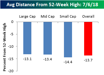
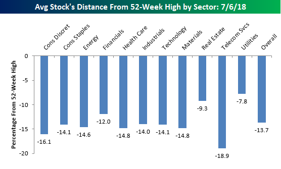
Average Stock Declines From Their 52-Week Highs
In a tweet yesterday, we noted that the S&P 500 was trading right at the exact mid-point of its 2018 closing high and closing low, putting the index about 5% below its 52-week high. While that’s a relatively modest decline, stocks in the S&P 1500, which includes large, mid, and small caps, are down an average of 13.7% from their respective 52-week highs. Before we all go and start talking about how these numbers suggest much weaker internals than the overall market averages suggest, keep in mind that not all stocks hit their own highs simultaneously with the market. Therefore, this reading is always weaker than the overall reading for the S&P 500. In fact, even when the S&P 500 was hitting highs earlier this year, the average stock in the index was down in the mid to high single-digits.
What is interesting to note about current levels is how uniform they are across each market cap range. Between the average large cap, which is down 13.1% from its high, and the average small cap, which is down 14.4%, only 1.3 percentage points separates the two. Normally the gap is much wider (with small caps usually down much more), but with small cap domestically focused stocks outperforming recently, the gap has narrowed.
In terms of average stock declines by sector, the handful of stocks in the Telecom Services sector are down the most with an average decline of 18.9% from their respective highs. Behind that sector, you may be surprised to see that the next weakest sector based on this measure is Consumer Discretionary, where the average stock is down over 16%. Consumer Discretionary has been one of the better performing sectors this year with a gain of 11%. A lot of that strength, however, is the result of big gains in Amazon.com (AMZN) and Netflix (NFLX), which have large weightings in the market cap weighted sector performance. Among smaller cap names in the sector, the picture isn’t quite as strong.
Sectors holding up the best relative to their highs are Utilities (-7.8%) and Real Estate (-9.3%). These are the only two sectors where the average stock is down less than 10%, and that’s largely due to the fact that both sectors are defensive and not very volatile by nature. Stocks in these two sectors may well be holding up the best, but both sectors are actually underperforming the S&P 500 YTD.
Finally, our last chart breaks down the average decline from a 52-week high by sector and market cap. Here there are some interesting divergences. We already mentioned the Consumer Discretionary sector above, but a similar dynamic is playing out in Energy, and even more so in Technology. Within the Technology sector, the average decline from a 52-week high among large caps is less than 10%, while the average decline for a small cap is more than twice that at 18.2%. Besides small cap tech, the only group weaker has been small cap Telecom Services, which is made up of just eight stocks compared to 95 for the small cap Technology sector.
While large caps are holding up a lot better than small caps in many sectors, we have seen the opposite pattern play out in the Financials sector. All we seem to hear this year is how Financials have been so weak, and while that may be true among large cap Financials which are down an average 14%+ from their highs, small cap Financials are down less than 10%.