Chart of the Day: New 9 Year Lows For Turkey
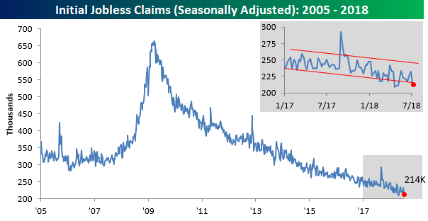
Jobless Claims Back Near Historic Lows
After two weeks of increases, jobless claims saw their largest one-week decline since April this week, falling from 232K down to 214K. At 214K, initial claims are just 5K above their cycle low of 209K back on 4/20, but more importantly, claims have now been below 300K for a record 175 straight weeks and at or below 250K for 40 weeks. If that’s not impressive, what is?
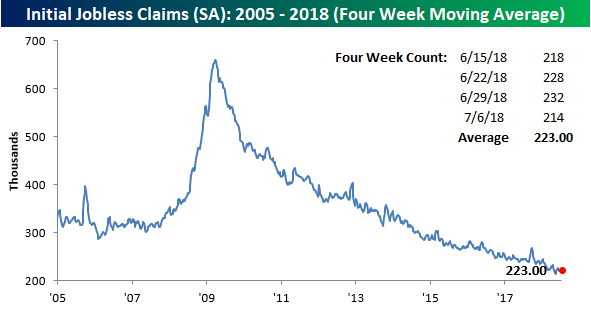
Even with this week’s decline, though, the four-week moving average barely budged lower, falling from 224.75K down to 223K. That’s 9.5K above the cycle low of 213.5K on 5/11. With a print of 218K falling off the count next week, it’s going to be hard to make much downside headway in this reading.
The most impressive aspect of the report this week was the non-seasonally adjusted numbers. At a level of 264.5K, NSA claims were more than 130K below the average for the current week of the year dating back to 2000, and going all the way back to the late 1960s when the series starts, there has never been a lower reading for the current week of the year.

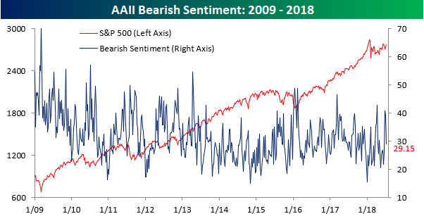
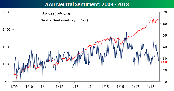
Biggest Increase In Bullish Sentiment Since 2016 Election
Bulls are not only running on the streets of Pamplona this week, but they’re on Wall St. as well. Even with yesterday’s trade-induced decline, individual investors seized on the S&P 500’s four-day win streak and turned considerably more optimistic on equities. According to the weekly sentiment survey from AAII, bullish sentiment surged from 27.9% up to 43.1%. That 15.2 percentage point increase represents the largest one week increase in optimism since the week after the November 2016 election of President Trump.
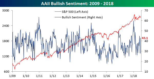
Not surprisingly, most of the increase in bullish sentiment came from the bearish camp, where the percentage dropped from 39.3% down to 29.2%.
Neutral sentiment also saw a sizable decline this week as investors became a little bit more decisive in their views. This week’s reading of 27.8% is the lowest level of neutral sentiment since the start of February.
The Closer — Quits Surge, Curves Flatten — 7/11/18
Log-in here if you’re a member with access to the Closer.
Looking for deeper insight on markets? In tonight’s Closer sent to Bespoke Institutional clients, we take a look at the very strong PPI numbers today from the BLS. Despite the huge decline in crude today, EIA data showed strong demand with large inventory draws continuing. We also take a look at a few different market indicators in fixed income and FX.

See today’s post-market Closer and everything else Bespoke publishes by starting a 14-day free trial to Bespoke Institutional today!
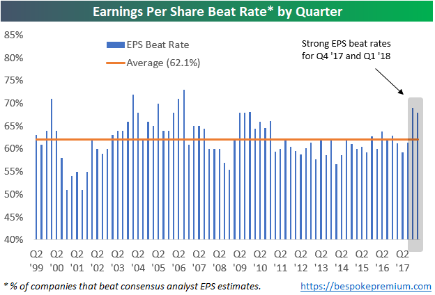
Can Companies Keep Up Strong Beat Rates in Q2 Earnings Season?
One thing we’ll be watching closely this earnings season is whether companies can keep up the extraordinarily high beat rates seen over the past two quarters.
Over the past two earnings seasons, even though analysts had to up their estimates quite a bit due to the Trump corporate tax cuts, companies were easily able to beat expectations. Since 1999, 62.1% of earnings reports have reported EPS that were greater than consensus expectations. As shown below, though, the last two quarters saw much higher than average beat rates.
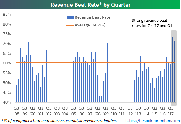
Not only have bottom line EPS beat rates been strong, but top-line revenue beat rates have been strong as well. Revenue beat rates over the last two earnings seasons were higher than any quarter since Q4 2004.
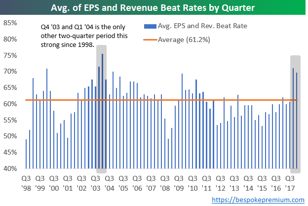
The chart below takes the average of each quarter’s earnings and revenue beat rate. When looking at the strength of both the top and bottom line beat rate each earnings season, the only other two-quarter period that showed stronger beat rates than the last two quarters was back in Q4 2003 and Q1 2004.
Needless to say, investors have gotten used to stronger than expected earnings reports over the last six months. If companies aren’t able to keep up the pace this season, we think the market will struggle.
Years Like 2018 – Not Many!
Calling a specific period of time “unique” is often used as a cop-out by commentators and investors, so we usually try not use the term lightly. But if a certain period of time is so unique that it has no historical precedent, you can’t fault someone for saying it. In comparing the S&P 500’s performance in 2018 to prior years, we found that there really are very few years where the market has seen a similar pattern. In other words, 2018 really is unique!
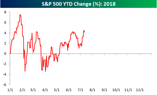
To illustrate this, we ran the correlation of the closing prices of the S&P 500 so far this year to the closing prices for every other year through 7/11. We have done this type of analysis many times over the years, and usually, when we run it, the years that have the most similarity to the year in question have correlation coefficients of +0.85 or even greater than 0.90. In the analysis we ran for 2018, however, there were only two years with a correlation coefficient of more than +0.50, and five of the top ten years have correlation coefficients of less than +0.40!
In a just-published report for Premium and Institutional clients, we ran an analysis of the years that were the most positively and negatively correlated to 2018 to see what trends the market showed for the remainder of these years. To unlock this report, sign up for a Bespoke Premium trial membership now!
Exxon Mobil (XOM) Golden Cross
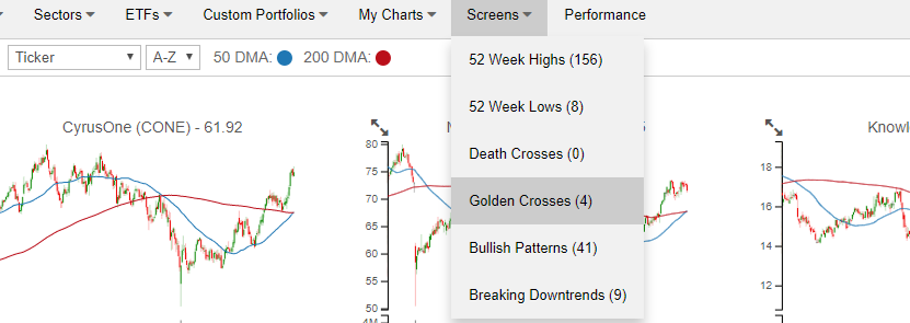
Our recently launched Chart Scanner has become an incredibly popular and useful tool for clients as it gives a user the ability to quickly scan through hundreds of charts in order to find the most attractive (or unattractive) patterns. Included with the tool are a number of pre-defined screens that allow users to see stocks that hit 52-week highs or lows in the previous session, experienced “death” or “golden” crosses, as well as charts which we view as having bullish or bearish patterns. Each of these screens can be found using the drop-down box at the top of the page (as illustrated in the image below). To unlock our Chart Scanner tool, simply sign up for a two-week free trial to Bespoke Premium. You won’t be disappointed!
One stock that showed up on our Golden Cross screen today was Exxon Mobil (XOM). After a rough first quarter for the stock, shares of XOM came roaring back in the second quarter and just yesterday completed the formation. For anyone who is unfamiliar with the term, a Golden Cross occurs when a stock’s upwardly sloping 50-day moving average (DMA) crosses above its 200-DMA, which also has to be rising. Conversely, a Death Cross occurs when a downwardly sloping 50-DMA crosses below the 200-DMA, which also has to be moving lower. Technicians consider Golden Cross formations to be a positive signal, while a Death Cross is considered to be negative. In practice, however, that is not always the case.
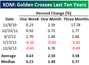
The chart below shows the performance of XOM over the last ten years, and we have included arrows to show occurrences of each Golden Cross for the stock. Prior to yesterday’s formation, XOM had seen five other Golden Crosses over the last ten years with the most recent occurring back in December 2013.

We mentioned above that Golden Crosses haven’t always been bullish for future stock returns in practice, but in the case of XOM, prior occurrences have, for the most part, been positive for the stock. Even in this case, though, it hasn’t been overwhelmingly bullish. The table below lists the one week, one month, and three month returns for the stock following each prior Golden Cross. In the week that followed the five prior occurrences, XOM averaged a gain of 0.63% (median: 0.23%) with positive returns just three out of five times. One month later the stock saw an average gain of 2.10% (median: 2.10%) with gains four out of five times, while the average three-month return was a gain of 3.18% (median: 1.77%) with gains three out of five times.
Fixed Income Weekly – 7/11/18
Searching for ways to better understand the fixed income space or looking for actionable ideals in this asset class? Bespoke’s Fixed Income Weekly provides an update on rates and credit every Wednesday. We start off with a fresh piece of analysis driven by what’s in the headlines or driving the market in a given week. We then provide charts of how US Treasury futures and rates are trading, before moving on to a summary of recent fixed income ETF performance, short-term interest rates including money market funds, and a trade idea. We summarize changes and recent developments for a variety of yield curves (UST, bund, Eurodollar, US breakeven inflation and Bespoke’s Global Yield Curve) before finishing with a review of recent UST yield curve changes, spread changes for major credit products and international bonds, and 1 year return profiles for a cross section of the fixed income world.
In our analysis today we take a look at which developed market bond markets are richest or cheapest versus overnight index swaps (OIS).

Our Fixed Income Weekly helps investors stay on top of fixed income markets and gain new perspective on the developments in interest rates. You can sign up for a Bespoke research trial below to see this week’s report and everything else Bespoke publishes free for the next two weeks!
Click here and start a 14-day free trial to Bespoke Institutional to see our newest Fixed Income Weekly now!
Chart of the Day: Huge Forecasts Ahead Of Earnings
Bespoke’s Global Macro Dashboard — 7/11/18
Bespoke’s Global Macro Dashboard is a high-level summary of 22 major economies from around the world. For each country, we provide charts of local equity market prices, relative performance versus global equities, price to earnings ratios, dividend yields, economic growth, unemployment, retail sales and industrial production growth, inflation, money supply, spot FX performance versus the dollar, policy rate, and ten year local government bond yield interest rates. The report is intended as a tool for both reference and idea generation. It’s clients’ first stop for basic background info on how a given economy is performing, and what issues are driving the narrative for that economy. The dashboard helps you get up to speed on and keep track of the basics for the most important economies around the world, informing starting points for further research and risk management. It’s published weekly every Wednesday at the Bespoke Institutional membership level.
You can access our Global Macro Dashboard by starting a 14-day free trial to Bespoke Institutional now!
