B.I.G,. Tips – US Economic Indicator Diffusion Index Bounces
Market Fireworks Still Blazing
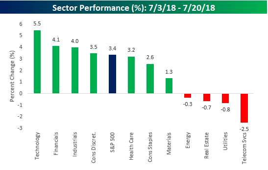
Heading into the July 4th holiday, US equities were in a bit of a funk with the S&P 500 down nearly 3% from its recent high in June. The July 4th holiday must have been just the rest the bulls needed, though, because since then the S&P 500 has gone on to make a higher high with eight daily gains in the eleven trading days since July 4th. So, which sectors have been behind the market’s recent strength? Leading the way higher has been Technology (what else is new?), which is up over 5%. Behind tech, though, Financials and Industrials have been noticeable outperformers while Consumer Discretionary is just barely outpacing the S&P 500. On the downside, four sectors are actually down during the S&P 500’s recent rally, with Telecom Services acting as the largest drag with a decline of 2.5%.
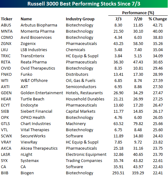
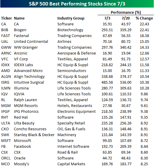
In terms of individual stock performance, gains have been pretty broad-based. For the Russell 3000, 64% of stocks in the index are positive since July 4th and the average stock is up 1.68%. In the S&P 500, however, performance has been even more positive with the average stock up 2.44% and three out of four stocks in the index posting gains. So, large caps have definitely been leading of late. In the tables below, we just wanted to quickly run through what have been some of the best and worst performing stocks since July 4th.
We’ll start with the Russell 3000. The table below lists the index’s 25 best performing components since the close on July 3rd. Looking at this list, there are three things worth highlighting. First, all of these stocks have had big gains in a short period of time. Second, most of them, you have probably never even heard of. Third, it’s been a good month for Drugs and Biotech. Of the 25 names listed below, eleven of them are either biotechs or pharma stocks. Another stock we wanted to point out was Turtle Beach (HEAR). Back on July 3rd, we highlighted this stock as the best performing stock in the Russell 3000 YTD as it had already returned 1,050%. Since that post, the stock has rallied another 27% taking its total YTD return to 1,400%. How’s that for compounding? Even more surprising is that even after a 14-bagger, the company’s market cap is less than $400 million.
Since you’ve probably never heard of most of the names above, in the table below we list the 25 best performing large-cap S&P 500 stocks since 7/3. These stocks haven’t seen quite as impressive gains as the stocks in the table above, but all of them are up over 8%, which isn’t bad for a little over two weeks. Topping this list with gains of more than 20% are CA and Biogen (BIIB), which were also both on the list above. behind these two, another ten stocks are up over 10%. With all the talk about how FANG is carrying the market lately, it is worth noting that the only one to make the list was Facebook (FB).
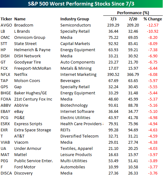
Finally, not to end on a bad note, but the stocks listed below are the 25 worst performing S&P 500 stocks since the July 4th holiday. As mentioned above, breadth for the stocks in the S&P 500 has been strong, so there haven’t been a whole lot of big losers. Of the 25 biggest dogs in the index, just two are down more than 10% (Broadcom-AVGO and L Brands-LB). The most notable stock listed, however, is Netflix (NFLX). After a run in 2018 where the stock more than doubled, NFLX’s weak earnings report on Monday, hit the stock hard. While NFLX did recover a bit of its initial weakness on Tuesday, it hasn’t been able to really catch its footing since.
The Closer — Politics & Leading Indicators — 7/19/18
Log-in here if you’re a member with access to the Closer.
Looking for deeper insight on markets? In tonight’s Closer sent to Bespoke Institutional clients, we review market performance (equity sector and benchmark interest rate) since the election, the extreme political polarization reflected in Bloomberg’s Consumer Comfort numbers, this month’s Leading / Coincident Indicator ratios (no recession on the horizon), and finally Cass Transportation indices.

See today’s post-market Closer and everything else Bespoke publishes by starting a 14-day free trial to Bespoke Institutional today!
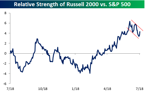
What Happened to the Transports and Small Caps?
When looking to get a handle on the overall health of the market, many technicians like to pay attention to Transports and Small Caps, but judging by the relative strength charts of the Dow Jones Transports and Russell 2000 versus the S&P 500, the broader market hasn’t been quite as strong. First, in the case of the Dow Transports, the index hasn’t been much of an outperformer at any point in the last year. Over the last month, though, the Transports have been extremely weak and are currently near their lowest level on a relative basis at any point in the last year.
![]()
The performance of small caps versus the S&P 500 has been a lot stronger than the Transports, but even here, we’ve recently seen a bit of weakness in the group. From when the China tariffs were first announced earlier this year right up until mid to late June, the Russell 2000 was a steady outperformer. Over the last month, though, the Russell 2000 has been a laggard. Granted, the index got a bit ahead of itself in the run-up, but notwithstanding today’s bounce, for the last couple of weeks as the S&P 500 has been in rally mode, Transports and Small Caps have been left behind.
Bespoke’s Sector Snapshot — 7/19/18
We’ve just released our weekly Sector Snapshot report (see a sample here) for Bespoke Premium and Bespoke Institutional members. Please log-in here to view the report if you’re already a member. If you’re not yet a subscriber and would like to see the report, please start a two-week free trial to Bespoke Premium now.
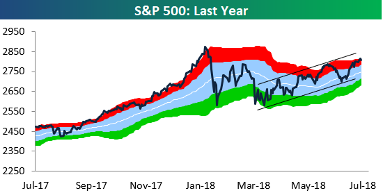
Below is one of the many charts included in this week’s Sector Snapshot, which is a trading range chart of the S&P 500. While the index is currently overbought (in the red zone in the chart), it has been trending in a smooth uptrend of higher highs and higher lows ever since making its correction low at the start of April.
To find out what this means and to see our full Sector Snapshot with additional commentary plus six pages of charts that include analysis of valuations, breadth, technicals, and relative strength, start a two-week free trial to our Bespoke Premium package now. Here’s a breakdown of the products you’ll receive.
Chart of the Day: Capex Wanes
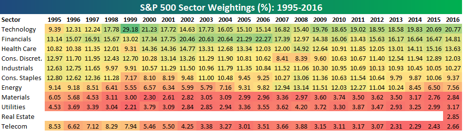
Bespoke’s Sector Weightings Report — July 2018
S&P 500 sector weightings are important to monitor. Over the years when weightings have gotten extremely lopsided for one or two sectors, it hasn’t ended well. Below is a table showing S&P 500 sector weightings from the mid-1990s through 2016. In the early 1990s before the Dot Com bubble, the US economy was much more evenly weighted between manufacturing sectors and service sectors. Sector weightings were bunched together between 6% and 14% across the board. In 1990, Tech was tied for the smallest sector of the market at 6.3%, while Industrials was the largest at 14.7%. The spread between the largest and smallest sectors back then was just over 8 percentage points.
The Dot Com bubble completely blew up the balanced economy, and looking back you can clearly see how lopsided things had become. Once the Tech bubble burst, it was the Financial sector that began its charge towards dominance. The Financial sector’s sole purpose is to service the economy, so in our view you never want to see the Financial sector make up the largest portion of the economy. That was the case from 2002 to 2007, though, and we all know how that ended.
Unfortunately we’ve begun to see sector weightings get extremely out of whack once again.
If you would like to see the most up-to-date numbers for S&P 500 sector weightings, simply start a two-week free trial to our Bespoke Premium or Bespoke Institutional services. Click back to this post to see the numbers once you’re signed up!
Bulls and Bears Both Retreat
After a week where individual investor bullish sentiment saw its largest increase since the 2016 election, the bulls retreated this week. According to the weekly survey from AAII, bullish sentiment declined from 43.05% down to 34.66%, erasing just over half of the prior week’s increase. No matter how much individual investors want to like the market, they just can’t bring themselves to stay positive.

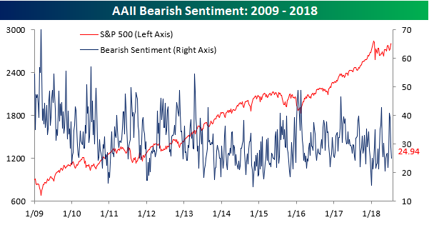
What’s really interesting about this week’s survey was that bearish sentiment also declined, falling from 29.15% down to 24.94%. With these declines, it was only the third time since 2009 that both bullish and bearish sentiment in the AAII survey fell four percentage points or more in the same week. The other two occurrences were in December 2011 and April 2015.
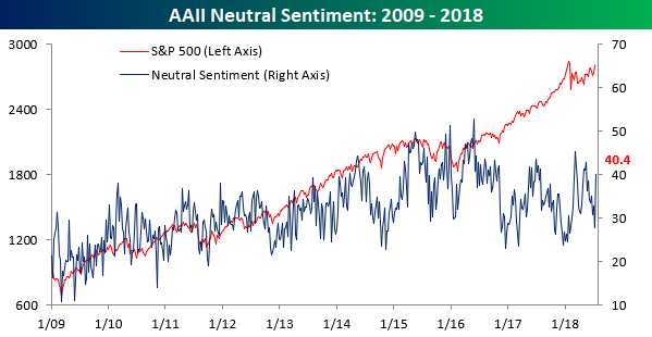
With both positive and negative sentiment dropping, all those bulls and bears got back on the fence. As shown in the chart below, neutral sentiment moved back up above 40%.
Philly Rebounds
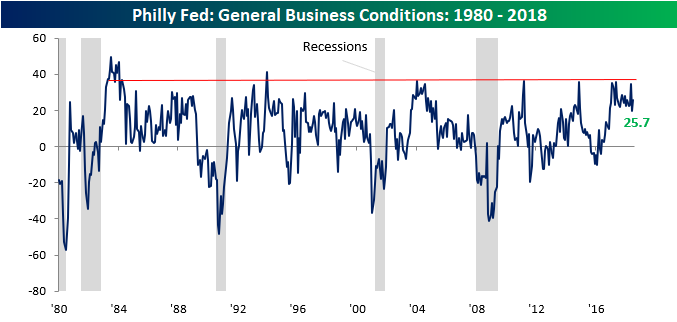
After just barely breaking an 18-month streak of readings above +20 last month, the Philadelphia Fed Manufacturing report rebounded more than expected in July, rising from 19.9 up to 25.7 compared to consensus forecasts for a reading of 21.5. With this month’s reading, the Philly Fed reading of General Business Conditions has now been above +10 for 20 months as well as in every month since the 2016 election. The only other period since 1980 where the index was above +10 for a longer period of time was in the 21-month stretch ending in April 2005.
In terms of the breadth of this month’s report, things were generally positive. Most components saw m/m gains with the biggest increases coming in Unfilled Orders, New Orders, and Prices Paid. The only three categories that saw declines were Number of Employees, Average Workweek, and Shipments.
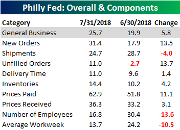
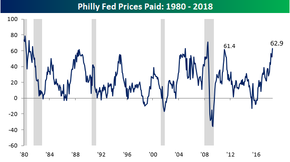
In the case of Prices Paid, that index has been soaring of late. Its current level of 62.9 is the highest monthly reading we have seen in a decade, eclipsing the prior peak from February 2011. Going all the way back to 1980, there have only been nine months where the index was higher.
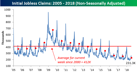
Lowest Jobless Claims in Almost Half a Century
Earlier today when Disney CEO Bob Iger was told that Comcast was dropping out of the bidding war for 21st Century Fox assets, he reportedly responded with the phrase, “Holy Crap.” That’s also the reaction a lot of people watching this morning’s Initial Jobless Claims report responded with when seeing the print come across their screens. While economists were forecasting first time claims to come in at an already low level of 220K, the actual reading was 207K, which was the lowest level since December 1969! With this week’s report, jobless claims have been below 300K for a record 176 straight weeks, and they’ve been at or below 250K for 41 weeks.
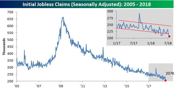
Following this week’s decline, the four-week moving average picked up the pace to the downside falling from 223.25K down to 220.5K. That’s just 7K above the cycle low of 213.5K from early May, and if claims stay around current levels for the next two weeks, this reading could test those May lows.

On a non-seasonally adjusted basis, jobless claims were more than 180K below their average for the current week of the year dating back to 2000, and at a level of 231.3K, going back to 1967, they have never been lower for the current week of the year than they are now.