Chart of the Day: Facebook Miss To De-FAANG The Market?
The Closer — EEM > IWM, New Sales Splutter (Sort Of), Homebuilder Valuation — 7/25/18
Log-in here if you’re a member with access to the Closer.
Looking for deeper insight on markets? In tonight’s Closer sent to Bespoke Institutional clients, we note a few interesting patterns in relative index and cross-asset performance. We also review June housing market data in the form of new home sales, homebuilder valuations, and weekly data from the EIA on the status of petroleum markets.

See today’s post-market Closer and everything else Bespoke publishes by starting a 14-day free trial to Bespoke Institutional today!
Bespoke Consumer Pulse Ahead of the Curve Again
Facebook (FB) is currently on pace to have one of its worst trading days as a public company on Thursday after releasing a disappointing earnings report after the close Wednesday. The culprit for the weakness was disappointing revenue and user growth, and based on the fact that the stock hit an all-time high right before the release, investors were more than caught off guard. The fact that as recently as Wednesday morning there were reports that the quarter would be strong based on strong partner checks shows just how surprised many investors were by the Q2 report.
Subscribers to the Bespoke Consumer Pulse report from Bespoke Market Intelligence were aware of the underlying weakness in usage trends, though. The chart below was taken from our most recent report for the month of June and was derived from a question where we asked consumers which two of the major social media websites they use most. While Facebook (FB) is still far and away the leader at 64.7%, usage has been steadily trending lower for a couple of years now. The big saving grace for Facebook (FB), though, has been strength in Instagram where usage had been steadily trending higher. The problem here is that growth in usage for Instagram has also shown signs of leveling off in the mid 30% range. Even usage of WhatsApp has been stuck at or below 10% for a number of months now.

Housing Data of Horrors
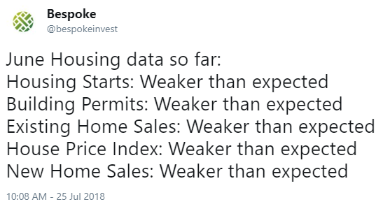
Housing data that has been released this month has been absolutely brutal. Below is a tweet from our @bespokeinvest Twitter feed earlier this morning that sums up the data well:
Stock price movements are forward looking, which explains the drop we’ve been seeing in the homebuilder ETF for the last six months. As the rest of the market rebounded off of the first quarter correction lows, the homebuilder stocks continued to trend lower. A combination of rising interest rates and the Trump tax plan (which reduced deductions for many homeowners) have been a double whammy, and it’s now showing up not only in homebuilder stock prices but also in housing-related economic data.
As shown in the one-year chart for the homebuilder ETF (ITB) below, investors are looking at a pretty significant breakdown yet again if the ETF closes below $37.
While it has yet to negatively impact the rest of the stock market, continued weakness in housing will eventually get the market’s attention.
We cover housing and the rest of the economy in our daily Closer report, which you can start receiving in your inbox with two-week free trial to Bespoke Institutional. You can also monitor charts for ETFs like ITB with our popular Chart Scanner tool that’s available to Bespoke Premium and Bespoke Institutional members.
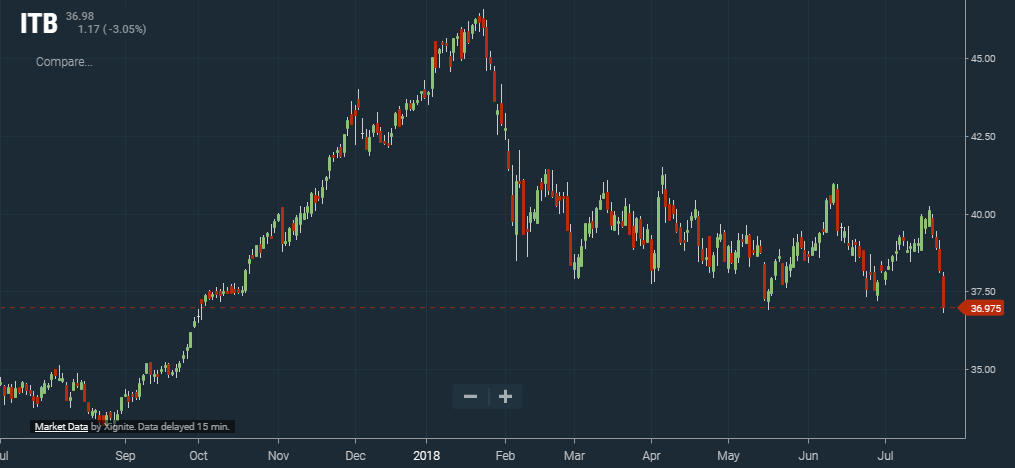
Chart of the Day: Investors Continue to Sell Domestic Equity Mutual Funds and ETFs
Fixed Income Weekly – 7/25/18
Searching for ways to better understand the fixed income space or looking for actionable ideals in this asset class? Bespoke’s Fixed Income Weekly provides an update on rates and credit every Wednesday. We start off with a fresh piece of analysis driven by what’s in the headlines or driving the market in a given week. We then provide charts of how US Treasury futures and rates are trading, before moving on to a summary of recent fixed income ETF performance, short-term interest rates including money market funds, and a trade idea. We summarize changes and recent developments for a variety of yield curves (UST, bund, Eurodollar, US breakeven inflation and Bespoke’s Global Yield Curve) before finishing with a review of recent UST yield curve changes, spread changes for major credit products and international bonds, and 1 year return profiles for a cross section of the fixed income world.
The USD is broadly over-valued per The Economist‘s Big Mac Indices, but are those helpful as a return signal for FX? We discuss.

Our Fixed Income Weekly helps investors stay on top of fixed income markets and gain new perspective on the developments in interest rates. You can sign up for a Bespoke research trial below to see this week’s report and everything else Bespoke publishes free for the next two weeks!
Click here and start a 14-day free trial to Bespoke Institutional to see our newest Fixed Income Weekly now!
Bespoke’s Global Macro Dashboard — 7/25/18
Bespoke’s Global Macro Dashboard is a high-level summary of 22 major economies from around the world. For each country, we provide charts of local equity market prices, relative performance versus global equities, price to earnings ratios, dividend yields, economic growth, unemployment, retail sales and industrial production growth, inflation, money supply, spot FX performance versus the dollar, policy rate, and ten year local government bond yield interest rates. The report is intended as a tool for both reference and idea generation. It’s clients’ first stop for basic background info on how a given economy is performing, and what issues are driving the narrative for that economy. The dashboard helps you get up to speed on and keep track of the basics for the most important economies around the world, informing starting points for further research and risk management. It’s published weekly every Wednesday at the Bespoke Institutional membership level.
You can access our Global Macro Dashboard by starting a 14-day free trial to Bespoke Institutional now!

The Closer — Nasdaq Reversals, 3 of 5 Fed, Canada GDP, Mexico CPI, Delinquencies — 7/24/18
Log-in here if you’re a member with access to the Closer.
Looking for deeper insight on markets? In tonight’s Closer sent to Bespoke Institutional clients, we review the implications for forward returns of very large reversals in the Nasdaq Composite like the one we saw today. We also discuss manufacturing activity data, Canadian GDP, Mexican inflation, and the extinction of foreclosures in the US real estate market.
See today’s post-market Closer and everything else Bespoke publishes by starting a 14-day free trial to Bespoke Institutional today!
High Valuation = High Returns?
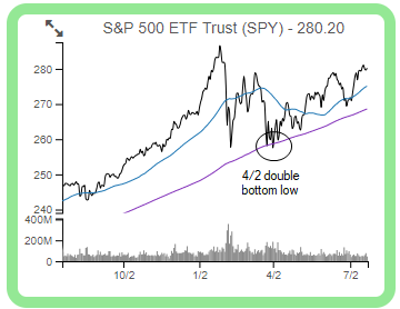
The average stock in the S&P 500 is up just under 7% since the index made its double bottom closing low on April 2nd. As shown in the chart for SPY (the S&P 500 tracking ETF) below, price has been steadily trending higher since 4/2 — making a series of higher highs and higher lows. Until the index is able to break above its late January all-time closing high, however, the market’s long-term uptrend cannot be re-confirmed.
So what has been driving performance since April 2nd? We regularly run a report called our “Decile Analysis” where we look at a number of different stock characteristics to see which ones are driving outperformance or underperformance. Examples of some of the stock characteristics we look at include market cap, dividend yield, valuations, institutional ownership, analyst ratings, etc.
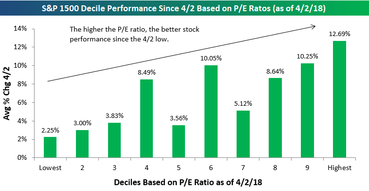
Since April 2nd, one of the performance metrics from our Decile Analysis that stands out the most is valuation.
Below is a chart showing the average performance of S&P 500 stocks by decile based on trailing 12-month P/E ratios. Decile 1 contains the 50 S&P 500 stocks with the lowest (cheapest) valuations, while decile 10 contains the 50 stocks with the highest (or most expensive) valuations.
As shown in the chart, the lower the P/E ratio, the weaker performance has been as the market has rallied since the April 2nd low. The 50 stocks with the lowest P/E ratios as of 4/2 are up an average of 2.25% since then (the weakest of any decile), while the 50 stocks with the highest P/E ratios are up 12.69% (the highest of any decile).
Seeing “growth” outperform “value” during a significant market rally is to be expected, but the degree of outperformance this time around has been especially stark.
To read our full Decile Analysis report where we identify additional performance trends, start a two-week free trial to Bespoke Premium!
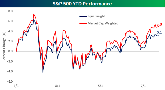
Thin Rally? Thin Argument
It continues to amaze us at how often we hear arguments that the market’s rally this year has been thin. A rally that is thin is one where just a handful of stocks are participating in the market’s gains, while the rest of the market languishes. An extreme example of this was in the late 1990s and early 2000 when tech stocks surged, while most other areas of the market declined. Today’s market is nothing even close to resembling that. Take, for example, the S&P 500’s cumulative A/D line. Since the S&P 500 last made a closing high in late January, the cumulative A/D line has seen close to 20 new all-time highs. That’s the opposite of a thin rally!
Another way to look at this is to compare the performance of the S&P 500 on both a market cap and equal-weighted basis. Looking at performance on an equal-weighted basis tells you how the ‘average’ stock is doing, while the normal market cap weighted approach puts a larger emphasis on the bigger names. So far this year, the market cap weighted S&P 500 is up 5% YTD, while the equal-weighted index is up 3.1%. These performance numbers definitely imply that larger mega-cap stocks in the index are doing the best so far YTD, but all 500 stocks in the index are also up an average of 3.1%, so they’re not exactly slumping.
Performing the same analysis on a sector by sector basis, proponents of the thin rally argument may be surprised to learn that in six of the S&P 500’s eleven sectors, the YTD performance of the weighted index is actually underperforming the performance of the equal-weighted index. Looking at the chart, the only sector where the market cap weighted sector performance is materially greater than the equal-weighted performance is in the Consumer Discretionary sector where Amazon’s 56% return and Netflix’s 87% gain have really skewed things. Outside of Consumer Discretionary, though, there is not a single sector where the market cap weighted sector performance exceeds the equal-weighted performance by more than two percentage points. Given the fact that there is plenty of strength in the market outside of the large mega-caps, a good place to look for new ideas is in our Bespoke 50 list of attractive growth stocks. For full access, start a two-week free trial to Bespoke Premium.
