Bespoke Brunch Reads Linkfest — 8/19/18
Welcome to Bespoke Brunch Reads — a linkfest of the favorite things we read over the past week. The links are mostly market related, but there are some other interesting subjects covered as well. We hope you enjoy the food for thought as a supplement to the research we provide you during the week.
Drinking
Uh-Oh, Germany Is Rapidly Running Out Of Beer Bottles by Esme Nicholson (NPR)
A European heatwave is driving a surge in beer consumption, meaning the normal circulation of beer bottles from consumer to recycler to bottler and around again is badly disrupted. [Link]
Bribes, Backdoor Deals, and Pay to Play: How Bad Rosé Took Over by Victoria James (Bon Appétit)
The story of low quality rosé’s own payola scandal: marketers paying restaurateurs to put their swill (typically industrial, by product laden product from low-quality inputs) on wine lists. [Link]
Cities
It’s no laughing matter — SF forming Poop Patrol to keep sidewalks clean by Heather Knight (SF Chronicle)
With a large homeless population to deal with, San Francisco faces a serious issue with people relieving themselves in parts of the city’s streets, a concern that has gotten lots of attention in the media. The poop patrol aims to cut down on the smell. [Link]
Economics
Swelling clout of US corporate giants is depressing pay, analysts say by Sam Fleming and Brooke Fox (FT)
New research suggests that increasing market power among large US firms is leading to reduced wage growth; monopsony purchasers of labor. [Link; paywall]
Turkey’s Crisis Exposes the Perils of Strongman Rule by Max Fisher (NYT)
An overview of why autocratic regimes struggle with the trade-off between policies they want to execute and the collateral damage (very frequently, higher inflation). [Link]
How Subscription Business Models are Changing Business and Investing (the Microeconomics of Subscriptions) by Tren Griffin (25iq)
A very comprehensive analysis of how subscription economics work and when they are or are not appropriate for a business to deploy. [Link]
Finance
CLOs Are the New Hedge Funds. Plan Accordingly. by Stephen Gandel (Bloomberg)
An overview of the rise in collateralized loan obligations, securitized pools of bank loans. While the article does not mention this, CLOs performed very well during the last credit crisis; while recent structures are somewhat weaker and concerns are valid, their history is impressive. [Link]
NYSE is putting its own interest ahead of investors’ by David Swensen (FT)
Why the advent of a profit-seeking Big Board may be not so good for the individual investor, or indeed investors of all kinds. [Link; paywall]
Social Media
“He loves me unconditionally, I count my blessings every day. (Channel 4 News/Twitter)
While not a “read”, we had to include this short video about a former drug user and his dog. It’s guaranteed to bring a very big smile to your face. [Link; auto-playing video]
Zuckerberg Doesn’t Care About Publishers? Facebook Denies It. by Glenn Fleishmann (Fortune)
In a meeting with Australian media executives, an employee of the social network claimed CEO Zuckerberg doesn’t care about third-party news organizations and publishers. [Link; soft paywall]
Have a great Sunday!
The Bespoke Report – Need Mo-mentum
The Closer: End of Week Charts — 8/17/18
Looking for deeper insight on global markets and economics? In tonight’s Closer sent to Bespoke clients, we recap weekly price action in major asset classes, update economic surprise index data for major economies, chart the weekly Commitment of Traders report from the CFTC, and provide our normal nightly update on ETF performance, volume and price movers, and the Bespoke Market Timing Model. We also take a look at the trend in various developed market FX markets.
Below is a snapshot from today’s Closer highlighting weekly intraday price charts for major equity indices and other asset classes. If you’d like to see more, start a free trial below.

The Closer is one of our most popular reports, and you can sign up for a free trial below to see it!
See tonight’s Closer by starting a two-week free trial to Bespoke Institutional now!
B.I.G. Tips – Earnings Summary and Top Triple Plays
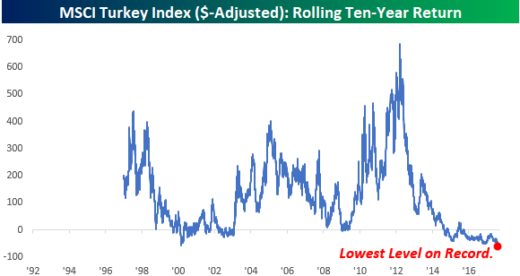
Turkish Stocks Still Declining
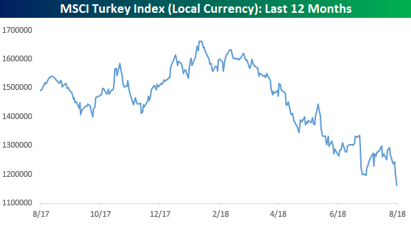
One factor behind Thursday’s rally in US equities was an apparent stabilization of the situation in Turkey. Not only had the lira rebounded off of its lows from earlier in the week, but the ETF that tracks Turkish stocks (TUR) also bounced more than 10% off of its lows. It doesn’t look like much, but the fact that it stopped going down was good enough.
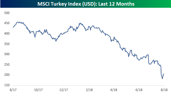
While the lira and TUR bounced, today the lira is back to its losing ways with a decline of 5% versus the dollar. In addition to that, in local currency terms, Turkish stocks haven’t stopped declining and traded to new lows yesterday. While the decline isn’t as bad in percentage terms as the dollar adjusted chart above, in order to be confident that Turkey is in fact stabilizing, we would expect to see its stock market stop declining in both dollar-adjusted as well as local currency terms. Both the chart above and below are updated through Thursday, but in early trading today, Turkish stocks are down in both local and dollar adjusted terms.
Mortgage Delinquencies At Multi-Decade Lows
Earlier this week, we noted that the New York Fed’s quarterly household debt data showed a collapse in the share of consumers facing collections for bad debts. On Thursday, quarterly data from the Mortgage Bankers’ Association relating to mortgage bankruptcy and delinquency showed similar results. In the charts below we show the share of all loans facing foreclosure, share of loans with new foreclosure proceedings started, delinquent loans, and seriously delinquent loans all as a share of total mortgage loans.
As shown, these indicators of mortgage credit performance are in free-fall and making new lows on a consistent basis. The foreclosure stats are the most impressive. New foreclosures as a share of all loans are the lowest since 1986 per the MBA data, while foreclosures as a share of all loans are the lowest since 2006. Delinquency data isn’t quite as positive but also shows impressive levels of timely payment. By all indications, consumers are in very good financial shape, buoyed by the job market, strong home prices, and higher post-crisis borrower standards.
The Closer — Big Breadth Uptick, Housing — 8/16/18
Log-in here if you’re a member with access to the Closer.
Looking for deeper insight on markets? In tonight’s Closer sent to Bespoke Institutional clients, we review the sudden uptick in breadth posted by the S&P 500 today. We also review two pieces of housing market data updated today.

See today’s post-market Closer and everything else Bespoke publishes by starting a 14-day free trial to Bespoke Institutional today!
Bespoke’s Sector Snapshot — 8/16/18
B.I.G. Tips – Death by Amazon – 8/16/18
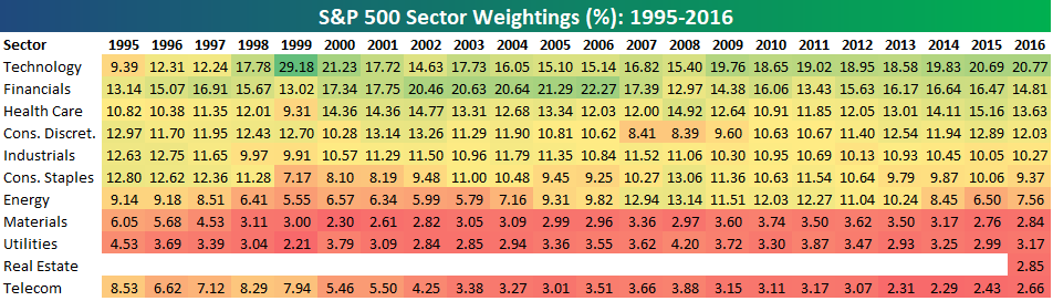
Bespoke’s S&P 500 Sector Weightings Report — August 2018
S&P 500 sector weightings are important to monitor. Over the years when weightings have gotten extremely lopsided for one or two sectors, it hasn’t ended well. Below is a table showing S&P 500 sector weightings from the mid-1990s through 2016. In the early 1990s before the Dot Com bubble, the US economy was much more evenly weighted between manufacturing sectors and service sectors. Sector weightings were bunched together between 6% and 14% across the board. In 1990, Tech was tied for the smallest sector of the market at 6.3%, while Industrials was the largest at 14.7%. The spread between the largest and smallest sectors back then was just over 8 percentage points.
The Dot Com bubble completely blew up the balanced economy, and looking back you can clearly see how lopsided things had become. Once the Tech bubble burst, it was the Financial sector that began its charge towards dominance. The Financial sector’s sole purpose is to service the economy, so in our view you never want to see the Financial sector make up the largest portion of the economy. That was the case from 2002 to 2007, though, and we all know how that ended.
Unfortunately we’ve begun to see sector weightings get extremely out of whack once again.
If you would like to see the most up-to-date numbers for S&P 500 sector weightings, simply start a two-week free trial to our Bespoke Premium or Bespoke Institutional services. Click back to this post to see the numbers once you’re signed up!