the Bespoke 50 — 8/23/18
Every Thursday, Bespoke publishes its “Bespoke 50” list of top growth stocks in the Russell 3,000. Our “Bespoke 50” portfolio is made up of the 50 stocks that fit a proprietary growth screen that we created a number of years ago. Since inception in early 2012, the “Bespoke 50” has beaten the S&P 500 by 100.6 percentage points. Through today, the “Bespoke 50” is up 208.7% since inception versus the S&P 500’s gain of 108.1%. Always remember, though, that past performance is no guarantee of future returns.
To view our “Bespoke 50” list of top growth stocks, click the button below and start a trial to either Bespoke Premium or Bespoke Institutional.

Chart of the Day: Ascending Ascena (ASDA)
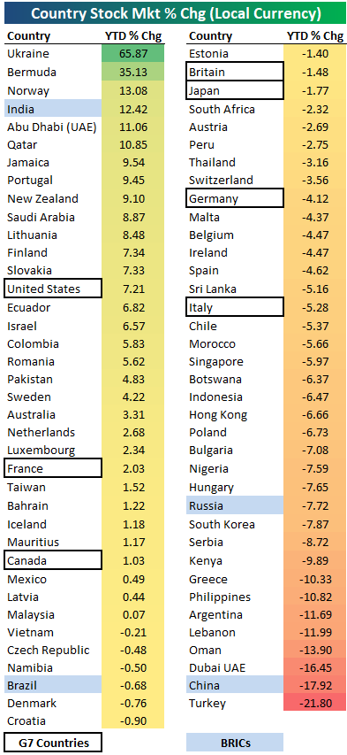
2018 Year-to-Date Country Stock Market Performance
Below is a look at the 2018 year-to-date performance of various country stock markets around the world. Returns are calculated in local currency, as if you were a domestic investor within each country.
The average year-to-date change of the 75 countries in the table is about as flat as it gets — down just 0.04%. More countries are in the red than in the green, though, with 32 up and 43 down.
Ukraine ranks at the top of the list with a gain of 65.87%. Bermuda ranks 2nd at +35.13%, while Norway, India, Abu Dhabi, and Qatar round out the top six. These six are also the only countries up double-digit percentages in 2018.
While there are six countries up 10%+ YTD, there are eight that are down 10%+. Turkey is down the most at -21.8%, followed by China at -17.9% and Dubai at -16.45%.
Looking specifically at the G7 countries, the US ranks first with a YTD gain of 7.21%. Along with the US, the only other two G7 countries in the green this year are France and Canada. Italy, Germany, Japan, and Britain are all in the red.
If it weren’t for India’s gain of 12.42%, the BRIC ETF (EEB) would be down a lot more this year. That’s because the other three BRIC countries are all in the red, with China down the most (-17.9%), followed by Russia at -7.7%.
Start a two-week free trial to Bespoke Institutional for in-depth global macro coverage.
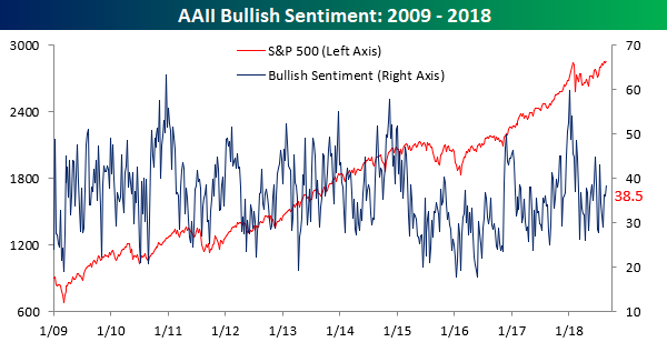
Bullish Sentiment Slightly Above Average
The media has been all over the place (wrongly) proclaiming that the current bull market is the longest ever while the S&P 500 touched an intraday all-time high earlier this week, so surely investor sentiment must be up to the rafters. Right? Not exactly. In this week’s sentiment survey from AAII, bullish sentiment increased from 36.2% up to 38.5%. That’s slightly above average, but with the market right near all-time highs in what is supposedly the longest bull market ever, one would think that investors would be a lot more confident. Or maybe they just know fake news when they see it!
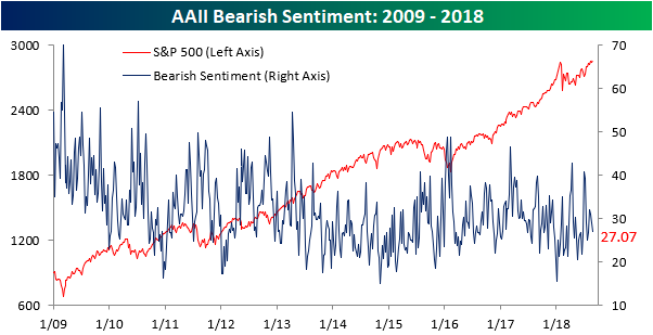
With the increase in bullish sentiment, bearish sentiment ticked lower, falling from 29.1% down to 27.1%. That represents the third straight weekly decline but is only the lowest reading since late July. Hardly a sign of complacency.
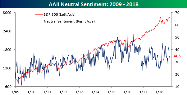
Finally, more than a third of individual investors surveyed consider themselves neutral. Again, when one out of every three investors can’t decide if they are bullish or bearish, it is not the picture you would envision years into a bull market where the S&P 500 is flirting with record highs.
Jobless Claims Continue to Sink
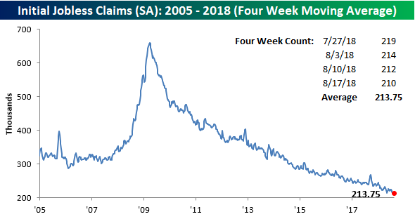
Jobless claims dropped 2K this week, falling from 212K down to 210K, but that was 7K lower than the consensus forecasts from economists. This week’s reading is also within 2K of the multi-decade low of 208K we saw in mid-July. If you look at the inset chart below, it’s almost as though the downtrend in claims is picking up steam! With this week’s reading, claims have been at or below 300K for a record 181 straight weeks, at or below 250K for 46 straight weeks (longest streak since January 1970), and at or below 225K for 7 straight weeks (longest streak since 1969). Those are pretty impressive stats to say the least!

With this week’s drop in claims, we came oh-so-close to a new multi-decade low in the four-week moving average. As shown in the chart below, the four-week moving average dropped to 213.75K. That now puts this indicator within a whisker of its cycle low of 213.5K from May. Also, as long as there are no upward revisions and claims don’t rise by more than 8K next week, we should see this reading drop to a new low!
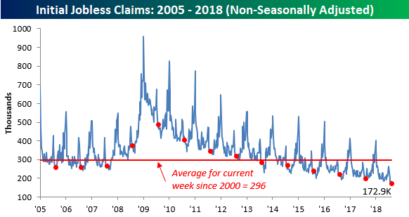
Finally, on a non-seasonally adjusted basis, jobless claims fell to 172.9K, which was the lowest reading for the current week of the year since 1969. More recently, this week’s print was more than 120K below the average for the current week of the year dating back to 2000.
The Closer — Minutes Review, Chinese Credit & PBoC, Existing Home Sales — 8/22/18
Log-in here if you’re a member with access to the Closer.
Looking for deeper insight on markets? In tonight’s Closer sent to Bespoke Institutional clients, we review Fed Minutes, existing home sales, and EIA data from the US today. We also dive into the growth of Chinese credit, including both the total lending figures for the broad economy and the recent evolution of the central bank’s balance sheet.

See today’s post-market Closer and everything else Bespoke publishes by starting a 14-day free trial to Bespoke Institutional today!
Will US Equities Continue to Outperform?
Bullish Bank Charts
Last night in The Closer we showed that S&P 500 Banks have been underperforming the market relative to the level of short-term yields and the shape of the UST curve. In addition to that analysis for the group as a whole, we also identified 4 charts with constructive patterns which look likely to outperform. First, JP Morgan (JPM) is in the process of forming a multi-month cup-and-handle. While the stock has not yet broken out, the set-up has potential. SunTrust (STI) has already broken out from a similar formation and is leading the group higher. PNC Financial (PNC) and M&T Bank (MTB) have already broken out of downtrends, but are much further below recent highs. While these patterns are all somewhat different, they all suggest good things ahead for banks, in addition to the positive signal from interest rates.
Get access to our post-market macro report — The Closer — with a two-week free trial to Bespoke Institutional.
Fixed Income Weekly – 8/22/18
Searching for ways to better understand the fixed income space or looking for actionable ideals in this asset class? Bespoke’s Fixed Income Weekly provides an update on rates and credit every Wednesday. We start off with a fresh piece of analysis driven by what’s in the headlines or driving the market in a given week. We then provide charts of how US Treasury futures and rates are trading, before moving on to a summary of recent fixed income ETF performance, short-term interest rates including money market funds, and a trade idea. We summarize changes and recent developments for a variety of yield curves (UST, bund, Eurodollar, US breakeven inflation and Bespoke’s Global Yield Curve) before finishing with a review of recent UST yield curve changes, spread changes for major credit products and international bonds, and 1 year return profiles for a cross section of the fixed income world.
We assess which emerging market economies have the most risky profiles based on external debt growth and reserve adequacy.

Our Fixed Income Weekly helps investors stay on top of fixed income markets and gain new perspective on the developments in interest rates. You can sign up for a Bespoke research trial below to see this week’s report and everything else Bespoke publishes free for the next two weeks!
Click here and start a 14-day free trial to Bespoke Institutional to see our newest Fixed Income Weekly now!
Bespoke’s Global Macro Dashboard — 8/22/18
Bespoke’s Global Macro Dashboard is a high-level summary of 22 major economies from around the world. For each country, we provide charts of local equity market prices, relative performance versus global equities, price to earnings ratios, dividend yields, economic growth, unemployment, retail sales and industrial production growth, inflation, money supply, spot FX performance versus the dollar, policy rate, and ten year local government bond yield interest rates. The report is intended as a tool for both reference and idea generation. It’s clients’ first stop for basic background info on how a given economy is performing, and what issues are driving the narrative for that economy. The dashboard helps you get up to speed on and keep track of the basics for the most important economies around the world, informing starting points for further research and risk management. It’s published weekly every Wednesday at the Bespoke Institutional membership level.
You can access our Global Macro Dashboard by starting a 14-day free trial to Bespoke Institutional now!
