Chart of the Day: Dollars Over-Owned
Bespoke Brunch Reads Linkfest — 8/26/18
Welcome to Bespoke Brunch Reads — a linkfest of the favorite things we read over the past week. The links are mostly market related, but there are some other interesting subjects covered as well. We hope you enjoy the food for thought as a supplement to the research we provide you during the week.
Labor In The Valley
What is this weird Twitter army of Amazon drones cheerfully defending warehouse work? by Devin Coldewey (TechCrunch)
Amazon appears to be astroturfing a public display of worker satisfaction via either bots or the Twitter accounts of actual workers; the larger story isn’t exactly clear. [Link]
Microsoft Bug Testers Unionized. Then They Were Dismissed by Josh Eidelson and Hassan Kanu (Bloomberg)
While tech companies, especially those based on the West Coast, have a reputation for being liberal or left-wing bastions, their relationship with labor isn’t consistent with that image; this story about Microsoft is a good example. [Link; soft paywall]
Turkey
Framing Turkey’s Financial Vulnerabilites: Some Rhymes with the Asian Crisis, but Not a Repeat by Brad Setser (Council on Foreign Relations)
Setser makes the case that Turkey’s banks are so exposed to foreign exchange denominated debt that the decline in lira has dramatically raised the odds of a funding crisis similar to the Asian Tigers in 1997. On the other hand, the complexity of the Turkish banking and credit system is very different, and Setser discusses in great detail. [Link]
Framing Crashed (5): The Turkish Crisis – the Missing Chapter (Adam Tooze)
Due to its very unique geographic, religious, cultural, financial, and political position as a bridge between the Middle East and Europe, Turkey is a nexus for all sorts of narratives related to near-history. [Link]
Real Estate
Traditional mortgage denial metrics may misrepresent racial and ethnic discrimination by Laurie Goodman and Bing Bai (Urban Institute)
While minorities tend to face higher mortgage applications denial rates than whites, they also typically have lower credit scores and incomes. After adjusting for these credit profiles, an interesting trend emerges: while Hispanic and white borrowers face an elevated denial rate relative to whites when adjusting for credit quality, it’s actually Asian buyers who face the highest “real” denial rates. [Link]
Climate Change Has Already Hit Home Prices, Led by Jersey Shore by Christopher Flavelle (Bloomberg)
A comprehensive study of property values on the New Jersey coast which are exposed to sea level rise shows that climate change’s impacts are already starting to have adverse impacts on home values. [Link; soft paywall, auto-playing video]
Luxury Apartment Sales Plummet in New York City by Josh Barbanel (WSJ)
Sales of apartments priced at $5mm or more fell 31% YoY in the first six months of the year, digesting extremely high prices and the impact of tax reform. [Link; paywall]
Unreal Animals
Company is offering ‘fur-ternity leave’ for new pet owners by Matthew Haag (CNBC/NYT)
A Minneapolis firm is offering its employees the ability to work from home for a week when they get a new dog or cat. [Link]
Animal crackers break out of their cages (CNBC/AP)
For more than a century, Barnum’s Animal Crackers (a Nabisco brand owned by Mondelez) were shown in cages, as animals were kept for circuses were historically. A 2016 request from PETA led to the change. [Link]
Weird History
Before the Civil War, Congress Was a Hotbed of Violence by Anna Diamond (Smithsonian)
Imagine if your Senator was beaten nearly to death with a stick at his desk during discussion of legislation? That was the environment of Congress prior to the Civil War, when outbursts like the Caning of Sumter were frequent and part of the process of making (or, in the case of the South, more frequently preventing) laws. [Link]
History of Rat Control In Alberta (Alberta Agriculture and Forestry)
As rates crept westward across the Prairies in the 1940s and 1950s, Alberta prepared by instituting an intense public awareness campaign and immediately eliminating even the smallest infestations. As a result, it’s just about the only human-populated place on earth without rats. [Link]
Economics
Elizabeth Warren Has Got It All Wrong by Matthew C. Klein (Barron’s)
Senator Warren of Massachusetts wants companies to distribute less cashflow to shareholders via buybacks. She’s misinformed about when and how companies buy back shares, and how that effects their ability to invest. [Link; paywall]
Demographics, Unemployment Rate and Inflation by Bill McBride (Calculated Risk)
Teasing out the relationship between demographics and macroeconomic variables is a significant challenge, but the general consensus is that population growth and inflation are positively correlated. [Link]
Network Defects
Apple and Google Face Growing Revolt Over App Store ‘Tax’ by Mark Bergen and Christopher Palmeri (Bloomberg Quint)
Apple and Google take a big cut from developers who make games or apps that get discovered and installed via the centralized app stores. But now, publishers are pushing back. [Link]
Facebook Fueled Anti-Refugee Attacks in Germany, New Research Suggests by Amanda Taub and Max Fisher (NYT)
A study by University of Warwick researchers suggest that a one standard deviation rise in Facebook use was correlated to a 50% increase in attacks on refugees. [Link; soft paywall]
Social Norms
Sorry, Pal, I Don’t Want to Talk: The Other Reason People Wear AirPods by Rebecca Dolan (WSJ)
Apple AirPods are being worn all day by users who want to avoid conversation or interruption. We’re wondering why it has to be AirPods as opposed to other forms of wireless headphones which generally have the same effect. [Link; paywall]
Venture
Benchmark Capital Stays Lean, Even After $14 Billion Bonanza by Rolfe Winkler (WJS)
Despite a trend that has seen billions of new capital flow into VC firms, one of the original early stage shops is not expanding its annual fund size, keeping things the same size as it has since 2004 despite a 25x performance from its 2011 vintage fund. [Link; paywall]
Sports
Won and done? Sportsbooks banning the smart money by David Purdum (ESPN)
Bookmakers in the UK are increasingly banning successful bettors, a practice that is totally legal and spreading to the US. [Link]
‘Listen To The Kids’: How Atlanta Became The Black Soccer Capital Of America (Bleacher Report)
A walk through the grass roots soccer scene in Atlanta, where immigrant families, hip hop, and an electric MLS squad have combined to create a passionate fan base for the beautiful game in Georgia. [Link]
Have a great Sunday!
The Bespoke Report: “I am the Stock Market King!”
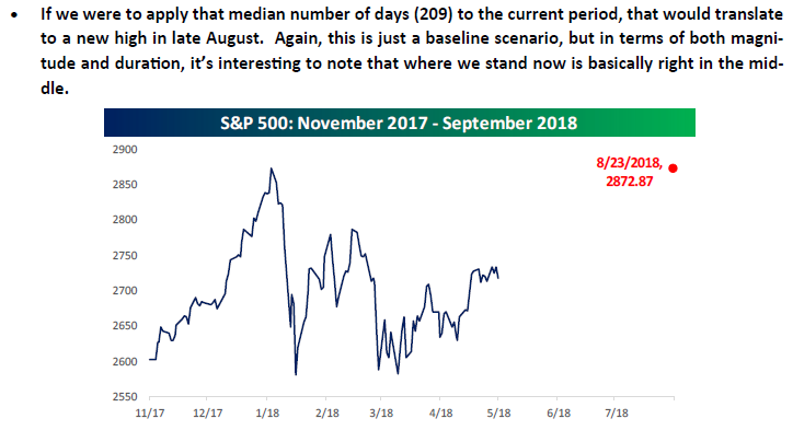
In our Bespoke Report dated 5/25/18, we provided the following chart and comments in our discussion of market corrections modeling that the S&P 500 would close at an all-time high again on 8/23/18. With the S&P 500 finally closing at an all-time high on Friday, we ended up being off by a day, but we’ll take it!
We’ve just published our latest weekly Bespoke Report newsletter, which is available to subscribers across all three of our membership levels. Sign up here to read the report.
To get up to speed on our thoughts regarding the market’s direction going forward, choose any membership option and access this week’s full Bespoke Report newsletter after signing up! You won’t be disappointed. Some of the topics discussed in this week’s report include:
- Comparison between now and 2000
- Housing starts to roll over
- The US economy and the global slowdown
- Decade-low readings in the yield curve
- Some attractive Financial sector stocks
- Market performance leading up to the mid-terms
- High yield breaks through a key level
- Sector breadth
- An exceptionally consistent Spring and Summer
- US vs ROW for the rest of year
- New highs- what now?
- Dividend Model Portfolio Update
The Closer: End of Week Charts — 8/24/18
Looking for deeper insight on global markets and economics? In tonight’s Closer sent to Bespoke clients, we recap weekly price action in major asset classes, update economic surprise index data for major economies, chart the weekly Commitment of Traders report from the CFTC, and provide our normal nightly update on ETF performance, volume and price movers, and the Bespoke Market Timing Model. We also take a look at the trend in various developed market FX markets.
Below is a snapshot from today’s Closer highlighting weekly intraday price charts for major equity indices and other asset classes. If you’d like to see more, start a free trial below.

The Closer is one of our most popular reports, and you can sign up for a free trial below to see it!
See tonight’s Closer by starting a two-week free trial to Bespoke Institutional now!
Historical Earnings Report Statistics Using Bespoke’s Earnings Screener Tool
Our famous Earnings Screener is unmatched when it comes to historical earnings report data for publicly-listed US companies. The Earnings Screener allows users to easily search through historical quarterly earnings reports for every US stock going back to 2001. The bottom line is if you want to analyze “big data” related to earnings reports, our Earnings Screener is the tool to use.
Below we highlight a number of insightful statistics using the 143,000+ individual quarterly earnings reports that make up our Earnings Screener.
Our first chart simply shows the number of quarterly earnings reports in our database by sector. As shown, there are 30,742 individual quarterly reports for Technology sector stocks in the database, which is nearly 7,000 more than the next closest sector (Consumer Discretionary). Real Estate and Telecom have the fewest quarterly reports, mostly because Real Estate just became a sector last year while there are only a handful of publicly-traded Telecom companies left.

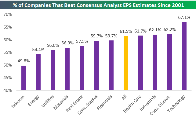
The second chart below shows the historical “beat rate” for earnings per share by sector going back to 2001. As shown, 61.5% of the 143,000+ quarterly reports since 2001 have seen EPS come in higher than consensus analyst expectations. Looking at individual sectors, Technology stands out once again. Since 2001, tech’s historical earnings beat rate has been 67.1%, which is nearly 5 percentage points higher than the next closest sectors. Consumer Discretionary, Industrials, and Health Care are the only other sectors with EPS beat rates that are higher than the overall beat rate of 61.5% for all stocks.
On the weaker end of the spectrum, Telecom has the lowest EPS beat rate at 49.8%, followed by Energy (54.4%), Utilities (56.0%), and Materials (56.9%).
Start a two-week free trial to Bespoke Institutional to start using our Earnings Screener now.
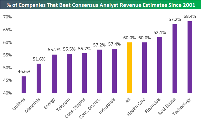
The chart above showed historical bottom-line EPS beat rates by sector, and the chart below shows historical top-line revenue beat rates. As shown, the revenue beat rate (% of companies that report actual revenues that are stronger than consensus analyst estimates) for all stocks reporting earnings since 2001 has been 60.0%, which is 1.5 percentage points lower than the historical EPS beat rate.
Technology ranks at the top of the list again with a revenue beat rate of 68.4%. Real Estate, Financials, and Health Care are the other three sectors with revenue beat rates higher than 60%.
Utilities has the weakest revenue beat rate at just 46.6%, while Materials, Energy, Telecom, and Consumer Staples are all below 56%. While Consumer Discretionary and Industrials have stronger-than-average EPS beat rates, they have weaker-than-average revenue beat rates.
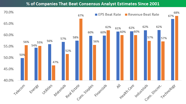
Below we offer a side-by-side comparison of EPS and revenue beat rates by sector since 2001:
In addition to looking at historical earnings and revenue beat rates by sector, we can also look at how stock prices have historically reacted to their earnings releases. Below we show the average one-day stock price reaction to earnings releases by sector. (For stocks that report in the morning before the open, we use that day’s price change. For stocks that report after the close, we use the next day’s price change.)
As shown, the average one-day stock price reaction for all 143,000 quarterly earnings reports since 2001 has been +0.08%. An average gain of 0.08% doesn’t seem like much but compounded over 143,000 reports, it adds up! Earnings ultimately drive the stock market.
Looking at individual sectors shows that, on average, Industrials stocks have gained the most on their earnings reaction days (+0.20%), followed by Consumer Discretionary (+0.17%), and Technology (+0.13%).
Two sectors have historically seen average share price declines on earnings reaction days — Energy and Utilities. Energy stocks have historically performed the worst in reaction to earnings with a one-day decline of -0.23%.

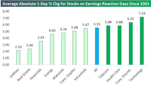
Our final chart today looks at stock price volatility in response to earnings reports. In this chart, we show the average absolute one-day price change for stocks in response to their earnings releases. Overall, the average absolute one-day change for all stocks since 2001 has been +/-5.55%. This means investors can basically assume that in a diversified portfolio of stocks, the average holding will have a one-day move up or down of 5.55% at least once per quarter.
While Technology stocks have the strongest earnings and revenue beat rates, they’re also the most volatile in reaction to their earnings reports. As shown below, the average Tech stocks moves +/-7.19% on its earnings reaction day. After Tech, Consumer Discretionary stocks are the second most volatile in response to earnings reports, followed by Health Care and Telecom.
As expected, the least volatile stocks in reaction to their earnings reports are Utilities and REITs. Utility stocks see an average absolute move of just +/-2.16% on their earnings reaction days!
If you’ve never used our popular Earnings Screener tool, we highly recommend trying it out! You can access it now with a two-week free trial to Bespoke Institutional.
Bespoke’s Idea Generator — Technicals — Most Volatile 8/24/18
Please click the image below to view our most recent Idea Generator report.

Energy’s Bounce Foretold
What a difference a week can make. In our Chart of the Day on August 15th, we noted that extreme oversold conditions (over 3 standard deviations below the 50 day moving averages) in the Energy sector had historically been a bullish signal in the near-term. Below we include the key data from that note.
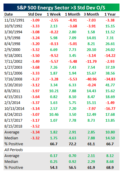
As shown in the chart below, the 3.27% gain over the week following the close on the 15th was even stronger than the 1.82% average for historical Energy sector bounces. As of today, the Energy sector is up over 3.5% from the >3 standard deviations oversold close last week. As shown in the table above, the longer-term outperformance from the lows tends to deliver solid outperformance as well.
Start a two-week free trial to any Bespoke membership level to receive our Chart of the Day in your inbox going forward.
The Closer — Transport Leads, PMI Fades, Eurozone Consumer, New Home Sales — 8/23/18
Log-in here if you’re a member with access to the Closer.
Looking for deeper insight on markets? In tonight’s Closer sent to Bespoke Institutional clients, we discuss negative data points from sentiment indices in the Eurozone today. We also discuss how long it typically takes the S&P 500 to catch up when the Dow Transports make a new all-time high. Finally, we review new home sales data released today by the US Census.

See today’s post-market Closer and everything else Bespoke publishes by starting a 14-day free trial to Bespoke Institutional today!
B.I.G. Tips – The Three Bit Yield Curve
Bespoke’s Sector Snapshot — 8/23/18
We’ve just released our weekly Sector Snapshot report (see a sample here) for Bespoke Premium and Bespoke Institutional members. Please log-in here to view the report if you’re already a member. If you’re not yet a subscriber and would like to see the report, please start a two-week free trial to Bespoke Premium now.
Below is one of the many charts included in this week’s Sector Snapshot, which shows the percentage of stocks in S&P 500 sectors trading above their 50-day moving averages.
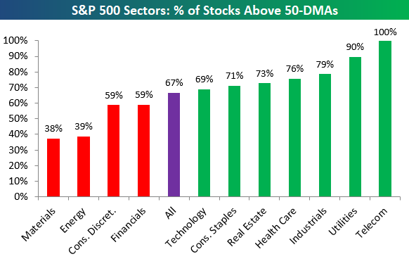
To find out what this means and to see our full Sector Snapshot with additional commentary plus six pages of charts that include analysis of valuations, breadth, technicals, and relative strength, start a two-week free trial to our Bespoke Premium package now. Here’s a breakdown of the products you’ll receive.