Chart of the Day: What Got the Market to New Highs?
Bespoke Stock Scores — 8/28/18
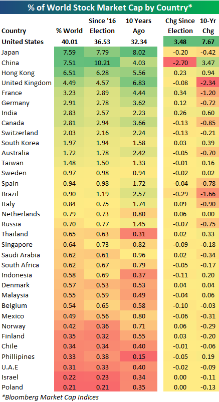
US as % of World Stock Market Cap Tops 40% Again
Below is a look at each country’s percentage of total world stock market capitalization based on Bloomberg indices. (We only include the 35 largest countries by market cap in the table.)
For each country, we show its current percentage of world market cap, where it stood on Election Day 2016, and where it stood ten years ago.
Notably, the US has just recently eclipsed the 40% level for the first time since 2005. At the moment, the US stock market makes up 40.01% of world stock market capitalization. Given dollar strength, gains in US equities, and declines in most international equity markets recently, it’s no surprise that this reading is at multi-year highs.
As the US’ share of world market cap has gone up, China’s share has taken the biggest hit. On Election Day 2016, the US made up 36.53% of world market cap, while China made up 10.21%. Since Election Day, the US has gained 3.48 percentage points, while China has lost 2.7 percentage points.
China’s drop has actually moved it into the third place ranking behind Japan, which currently makes up 7.59% of world stock market cap.
Behind the US, Japan, and China ranks Hong Kong (6.51%), the UK (4.49%), France (3.23%), Germany (2.91%), and India (2.83%).
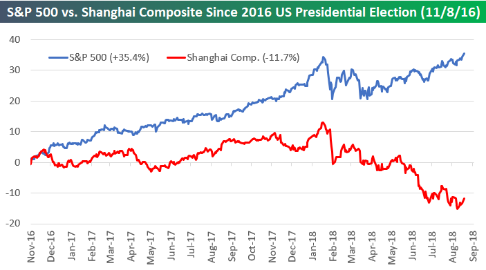
US vs. Chinese Stocks
This is a topic that has been discussed often recently, but it’s worth highlighting it again — US equities have been crushing Chinese equities. Below we show the performance of the S&P 500 versus the Shanghai Composite since President Trump was elected in November 2016. As of yesterday, the S&P was up 35.4%, while the Shanghai Composite was down 11.7%.
While the US has led China throughout Trump’s entire term thus far, we’ve seen significant divergence since the US/China trade battle really began to heat up earlier this year. As US equities have rallied over the last few months, Chinese equities have fallen lower and lower.
5 Fed Manufacturing Index Softer In August
Each month, we aggregate the 5 regional Fed manufacturing activity indices into one gauge that assesses activity around the country. The sample includes manufacturers in the NY, Philadelphia, Richmond, Kansas City, and Dallas Fed districts. As shown in the table below there were a couple of improvements in the current assessment of various categories of activity, with Shipments, Unfilled Orders, Inventory, and Delivery Time all rising versus July. While August wasn’t a horrible result, only one category (Inventory) is up in the last three months. Expectations were much weaker sequentially, with only two categories (New Orders and Capex) rising sequentially. Finally, we note that while indices are declining broadly, most categories are still at very high levels as shown by the percentile column.
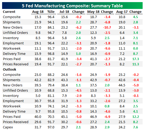
Below we show charts of selected industries from above along with the composite of all series. As shown, the composite is definitely pulling back with New Orders especially weak.
The Closer — Cuts Priced, NAFTA Noise, FX Positioning — 8/27/18
Log-in here if you’re a member with access to the Closer.
Looking for deeper insight on markets? In tonight’s Closer sent to Bespoke Institutional clients, we assess the implications of the very strong gap up in the wake of all-time highs set yesterday. We also review market pricing of Fed cuts in out years, NAFTA news today (as well as some data from Mexico), and finally take a further look at positioning in the FX futures market.

See today’s post-market Closer and everything else Bespoke publishes by starting a 14-day free trial to Bespoke Institutional today!
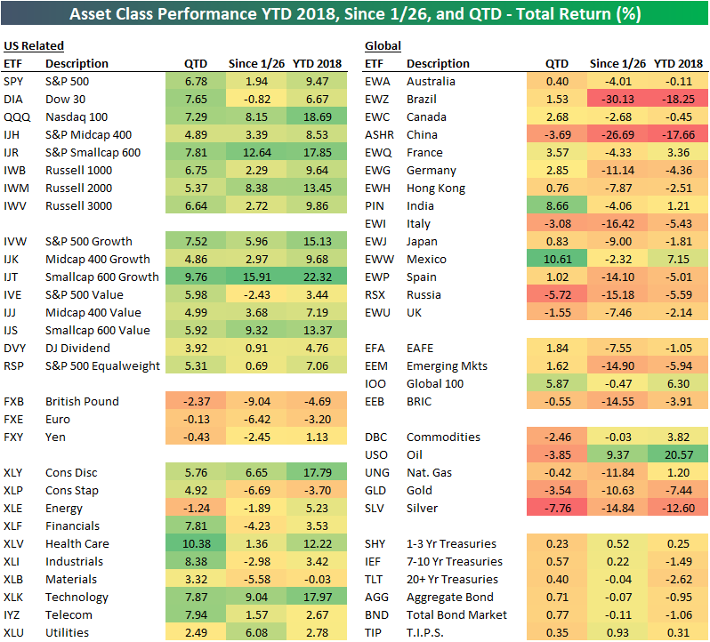
Bespoke’s Asset Class Performance Matrix: 2018 YTD and More
Below is an updated look at our asset class performance matrix. With the S&P 500 finally taking out its January 26th all-time closing high, the matrix allows you to see how other areas of the financial world have performed since that date as well. Note that performance numbers are total return, which is why the S&P 500 is up 1.94% since 1/26 even though it has just barely moved above that level in price.
While the S&P has just crossed above its January highs, the Dow is still slightly down. The tech-heavy Nasdaq 100, however, is up huge at +8.15%. Smallcaps (IJR, IWM) are up even more with gains of 10%+.
Looking at S&P 500 sectors, five are up since 1/26 and five are down. Technology (XLK) is up the most, followed by Consumer Discretionary (XLY) and Utilities (XLU), while Consumer Staples (XLP), Materials (XLB), and Financials (XLF) are down the most.
Outside of the US, equity market performance has been horrendous since January 26th. Brazil (EWZ) and China (ASHR) are both down 25%+, and not one single country ETF in our matrix is in the green. Commodities are also in the red with the exception of oil (USO), while Treasury ETFs are essentially flat.
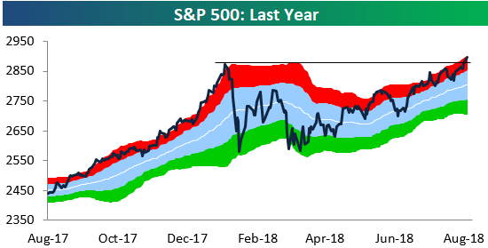
S&P 500 Breakout; Sector Trading Range Charts
After finally closing at a new all-time high on Friday, the S&P 500 continued its push into uncharted waters with a solid gain of 80 basis points today. You can see the breakout to new highs pretty clearly in our trading range chart of the S&P 500 below.
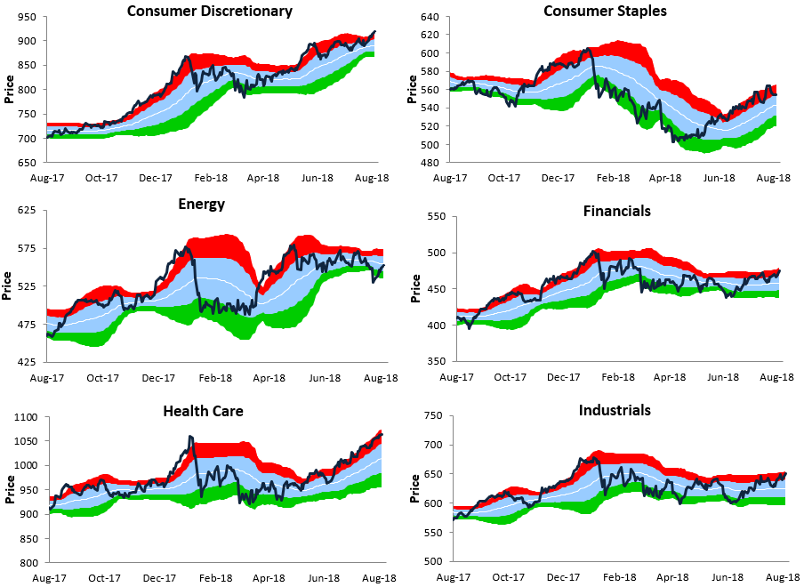
While the S&P (and most major US indices) has indeed broken out to new highs, not every area of the equity market has joined the fun. In fact, only three of the major sectors have traded to new highs along with the S&P — Consumer Discretionary, Health Care, and Technology. Below we show trading range charts for ten S&P sectors (Real Estate not included). In each chart, the white line represents the 50-day moving average, while the red and green areas represent overbought and oversold territory.
While Tech, Consumer Discretionary, and Health Care have broken out, none of the other sectors are really even that close to breaking out. Financials and Industrials are the next likely to test prior highs, but they still have a way to go.

Economic Surprises Improving In The Eurozone, Deteriorating In The US
Recently, the Citi Economic Surprise Index for the Eurozone has started to improve while the Citi Economic Surprise Index for the US has slipped into negative territory. As shown in the first chart below, we show the relative surge in Eurozone data surprise versus the US. Historically, that’s had a relatively mixed message for relative equity performance. As shown in the chart below, forward returns are at times correlated and at times uncorrelated to the relative performance of Eurozone versus US equities. But the bottom line is that longer-run, relative economic surprise index performance is basically uncorrelated to forward performance; we show the long-run lack of correlation in the bottom chart below.
Fed Speakers Dial Back Hawkishness
The Fed is currently engaged in an internal discussion about what to do once interest rates reach “neutral”; that is, the rate at which the economy is neither accelerated nor braked by the overnight interest rate. Where that “neutral” rate lies is part of the debate, but the market has basically priced an end to the current hiking cycle and start of a cutting cycle in about 18 months to 2 years. As that conversation has evolved, the FOMC has shifted into more dovish territory after speaking relatively hawkishly from late April to late June.
We keep track of what the Fed is saying with regular updates to our Fedspeak Monitor, a running summary of what FOMC members say publicly. This is a qualitative assessment, so of course it might differ somewhat from others’ views on how hawkish or dovish a given speech is. Using each speech’s rating, we can keep track over time how hawkish or dovish the FOMC is. The result is shown in the chart below, which tends to track the 3-month change in the 10 year yield pretty well over time. If you’d like access to our Fedspeak Monitor in real time, start a two-week free trial to Bespoke Institutional today.