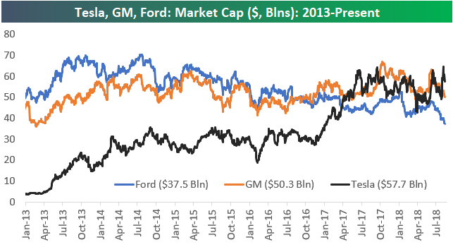
Tesla (TSLA) the 4th Largest Automaker in the World
While all three have seen their market caps drop over the past few days, note below that Tesla’s (TSLA) recent move higher on the “$420” news leaves its market cap higher than both Ford (F) and General Motors (GM). Back in early 2013, Ford and GM both had market caps around $50 billion, while Tesla was at just over $2 billion. Ford saw its market cap top out around $70 billion in mid-2013 and mid-2014, but since then it has been steadily dropping lower. At this point Ford has lost nearly half of its market cap in the last four years. The market cap for GM has been much steadier over the past few years right around the $50 billion level.
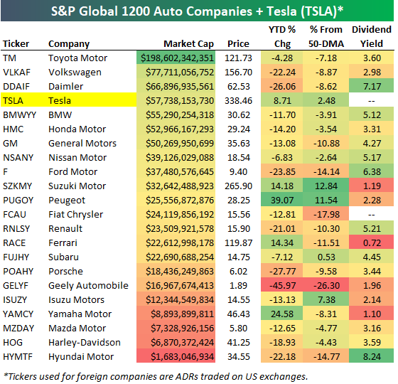
The US automakers aren’t the only ones struggling. Automakers globally have been trading terribly in 2018. Below is a table of the major automakers around the world (from the S&P 1200 Global Autos group). We’ve included Tesla (TSLA) in the table as well even though it’s not in the group. Of the 22 stocks listed, 17 are in the red year-to-date. Along with Tesla, the only ones in the green this year are Suzuki (SZKMY), Peugeot (PUGOY), Ferrari (RACE), and Yamaha (YAMCY).
With all the share-price weakness for autos, dividend yields have gotten pretty elevated. Hyundai now yields over 8%, Daimler yields 7.17%, while BMW, Nissan, Ford, Renault, and Hyundai all yield more than 5%.
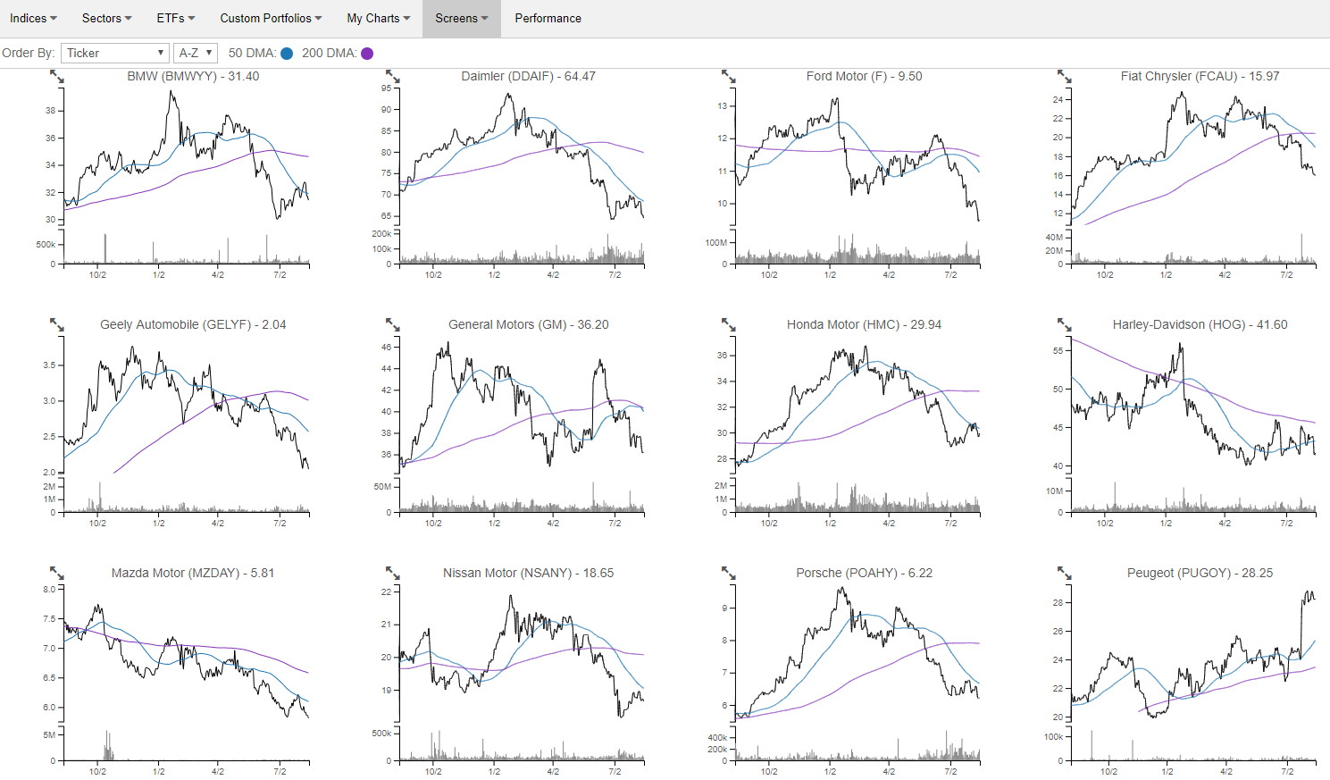
If you haven’t used our Chart Scanner tool, we’ve created a portfolio of the global automakers shown in the table above so you can easily see how horrible most of their chart patterns look. Our Chart Scanner lets users quickly and easily browse through dozens and dozens of charts in mere seconds to identify broad trends (like weakness across autos) or find charts that look bullish or bearish. (We provide a snapshot below.) If you’re a Bespoke Premium subscriber or higher, you can click on the charts to mark them as bullish or bearish, and we’ll save them all for you so you can come back to them whenever you want. Go ahead and check out the autos in our Chart Scanner now. If you’d like to unlock the full version, you can start a free trial to Bespoke Premium.
Share of Consumers Facing Collection Collapsing
One of our favorite obscure US economic data releases is the New York Fed’s quarterly cut-up of US household debt numbers. In addition to a variety of interesting data points on the level, growth rate, and composition of household debt, the report also discusses credit performance in very close detail. Among the metrics included are estimates of the number of Americans facing foreclosure, bankruptcy, or collections proceedings. We show these in the chart below.
You’ll notice a huge spike in bankruptcies in the early-2000s, way before the recession. That was driven by changes in bankruptcy law that made the option less attractive for consumers, hence the huge spike and sudden halt in bankruptcy filings. While bankruptcies did rise a bit in Q2 versus Q1 (part of a normal seasonal pattern), both the number of foreclosures and the number of bankruptcies remain extremely low. Even more impressive is the recent collapse in the share of consumers who are facing collection proceedings. As shown, those have swung from nearly 15% in 2012 to a paltry 9% today. That’s a good sign for both the current state of consumer credit performance and the outlook for consumers’ ability to access credit.
Bespoke’s Global Macro Dashboard — 8/15/18
Bespoke’s Global Macro Dashboard is a high-level summary of 22 major economies from around the world. For each country, we provide charts of local equity market prices, relative performance versus global equities, price to earnings ratios, dividend yields, economic growth, unemployment, retail sales and industrial production growth, inflation, money supply, spot FX performance versus the dollar, policy rate, and ten year local government bond yield interest rates. The report is intended as a tool for both reference and idea generation. It’s clients’ first stop for basic background info on how a given economy is performing, and what issues are driving the narrative for that economy. The dashboard helps you get up to speed on and keep track of the basics for the most important economies around the world, informing starting points for further research and risk management. It’s published weekly every Wednesday at the Bespoke Institutional membership level.
You can access our Global Macro Dashboard by starting a 14-day free trial to Bespoke Institutional now!

The Closer — Vol Review, Household Credit Update, Canada Real Estate — 8/14/18
Log-in here if you’re a member with access to the Closer.
Looking for deeper insight on markets? In tonight’s Closer sent to Bespoke Institutional clients, we break down the quarterly report on consumer credit from the New York Fed. Lending has slowed, but performance in terms of delinquencies and other metrics of stress look strong. We also discuss recent trends in volatility markets and Canadian home prices.

See today’s post-market Closer and everything else Bespoke publishes by starting a 14-day free trial to Bespoke Institutional today!
Small Business Survey Says…
Earlier today the NFIB released its monthly reading on small business sentiment. As we noted in our Chart of the Day (available with a Bespoke membership), small business sentiment hit its highest level since 1983 in July. That’s quite an impressive reading!
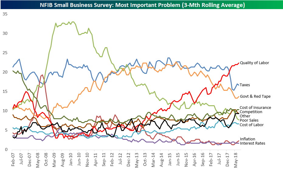
In addition to its main sentiment indicator, NFIB also asks survey takers what their number one problem is as a small business owner. Below is a chart showing the results from this question going back to early 2007. We’ve smoothed out the chart by showing the rolling 3-month average.
As shown, Quality of Labor has shot up to the number one problem spot in recent months, over-taking Taxes and Government Red Tape, which have both been drifting lower for the last couple of years. After these three problems, the next biggest are Cost of Insurance, Competition, Other, Poor Sales, and Cost of Labor.
While inflation and interest rates have definitely been a concern for investors recently, these two categories are still at the very bottom of the barrel when it comes to the concerns of small business owners.
There’s a lot to glean from the historical trends in the chart below, so be sure to give it a long look!
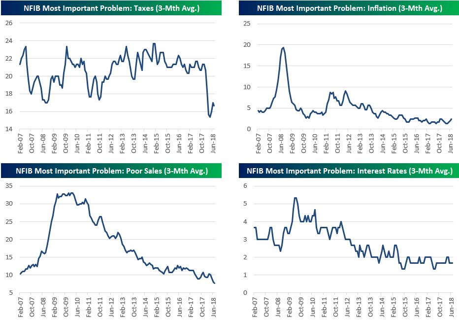
Below we chart each of the various problems for small business owners that are shown in the chart above. After the Trump tax cuts were passed, we saw a notable drop in the number of survey takers listing “Taxes” as their number one problem. That’s to be expected of course, but it’s still notable to see the impact the tax cuts had on sentiment.
Inflation concerns spiked significantly during the Financial Crisis, but it remains an after-thought as a problem for small business owners right now. We’ve seen a very slight tick up, but nothing significant yet. (You’ll see below that the “Cost of Labor” category has started to tick higher, though, which is an inflation measure as well.)
Poor Sales is the main reading that you don’t want to see start ticking higher in this survey, and at this point, it’s still making new lows.
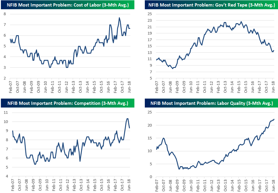
Cost of Labor has been increasing as a problem for small business owners for more than six years now after bottoming in June 2012. Government Red Tape saw a huge rise throughout the first seven years of the Obama administration, but since late 2015 it has been drifting lower and lower.
While Poor Sales is hitting new lows as the number one problem for small businesses, Competition has been on the upswing basically since the lows of the Financial Crisis. The same goes for Quality of Labor, which small business owners currently rank as their number one problem.
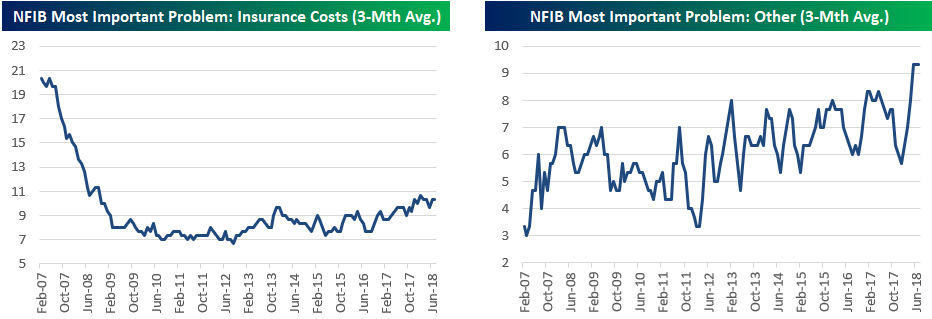
Just before the Financial Crisis, “Insurance Costs” were cited as the number one problem by 20% of small business owners. At that time it ranked right at the top of the list of problems. Once the Financial Crisis hit, though, small business owners became much more worried about things like Poor Sales, and the reading began to fall dramatically. Once Obamacare was passed in 2010, the reading for “Insurance Costs” remained at its lows, but it started to tick higher towards the end of 2012 and has been edging up ever since.
S&P 500 Industry Groups vs 50-Day Moving Averages
It was a nice day for US markets Tuesday as the S&P 500 broke a streak of four down days in a row and avoided setting the record for the longest losing streak since the 2016 election. The table below summarizes where individual S&P 500 Industry Groups stand on both a YTD basis in terms of performance and relative to their 50-DMAs. Looking through this table, there are a lot of new names at the top compared to what we would have seen earlier in the year. At the top of the list is Tech Hardware, which is up 19.7% YTD and closed today 6.18% above its 50-DMA. The primary driver of this group is Apple (AAPL), and its earnings-related breakout in July pushed the Industry Group up above its trend of higher highs. The group is clearly extended here (see chart below). While Tech Hardware being at the top isn’t much of a surprise, some of the groups like Food & Staples Retail and Drugs and Biotech are new in terms of market leadership.
To the downside, just six Industry Groups finished the day below their 50-DMA on Tuesday, and three of them are less than 1% below that level, so one good day for the market could push them back above. Of the remaining three, Energy and Semiconductors (talk about a role reversal; semis lagging the market?) are less than 2.5% below their 50-DMAs, while Autos is bringing up the rear at 8.32% below. A look at the chart of the group shows just an ugly picture as it recently broke down through support to 52-week lows. Also, as we tweeted earlier, it’s not just US names that look bad; on a global basis, the only two that aren’t in downtrends are Tesla (TSLA) and Suzuki (SZKMY). You can see all of the global auto charts at this Chart Scanner page. Like charts? With a Bespoke Premium membership, you receive full access to our Chart Scanner tool, which allows you to quickly browse charts of every US equity today. Sign up for your trial today!

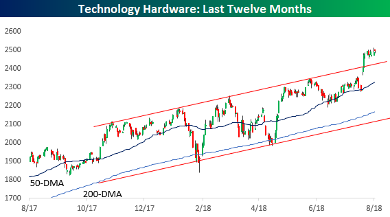
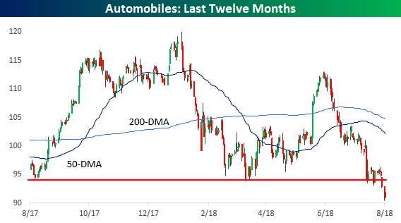
Chart of the Day: Small Business Sentiment Doesn’t Get Much Better Than This
Bespoke Stock Scores — 8/14/18
Heavy Trading Metals
Copper is down a bit over 1.5%, and at this level would be closing at a new 52-week low. As we noted in our Chart of the Day yesterday, the decline in gold yesterday to new 52-week lows was relatively large. For copper, that’s not so true: this is only the 60th largest decline to a new 52-week low for the metal over the past 20 years. Still, copper has been hit hard, with relatively weak Chinese industrial production and fixed asset investment numbers reported overnight helping push futures to new lows as part of a longer stretch of dollar strength and EM weakness hurting prices. It’s hard to believe that prices were near multi-year highs less than three months ago.

Iron ore had rallied to a multi-month high to start the month of August, but it too is pulling back as metals continue to trade heavy.
The Closer — Don’t Fade The Red White & Blue, Or Maybe U Should Do — 8/13/18
Log-in here if you’re a member with access to the Closer.
Looking for deeper insight on markets? In tonight’s Closer sent to Bespoke Institutional clients, we review what the dramatic outperformance of US equities relative to the rest of the world means for that relative performance going forward. We also take a look at the performance of gold in other currencies and recent trends in policy uncertainty.
See today’s post-market Closer and everything else Bespoke publishes by starting a 14-day free trial to Bespoke Institutional today!